The Brand Monograph
Instagram brand identity by Koto
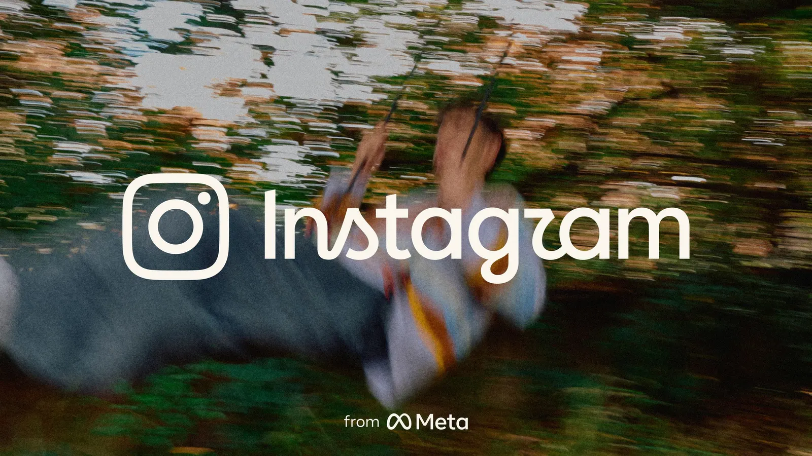
↗Few logos are as risky to touch as Instagram's. Koto redrew the wordmark for the first time in more than a decade, and what stands out is how restrained the result feels. Most people will read it as the name they have always known, now sitting more comfortably beside the glyph.
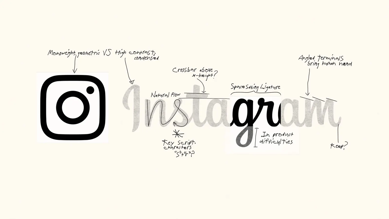
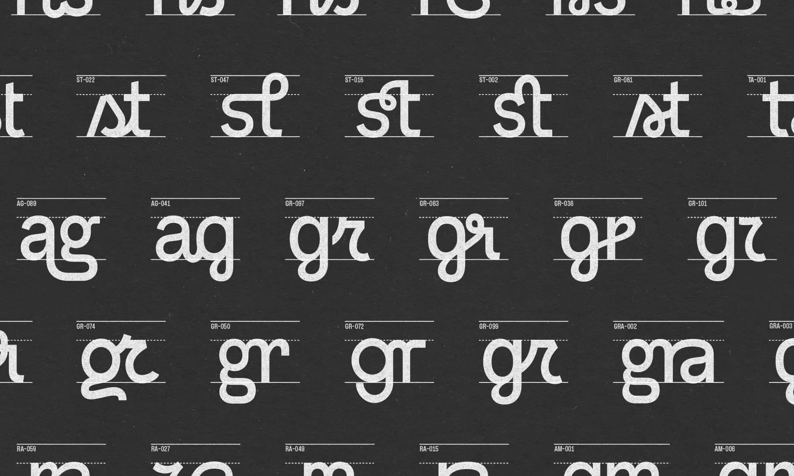
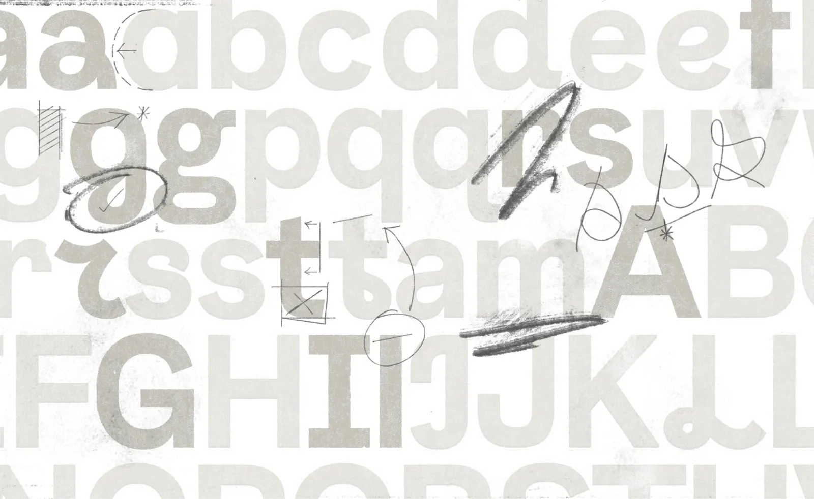
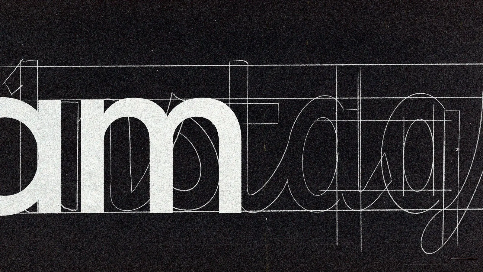
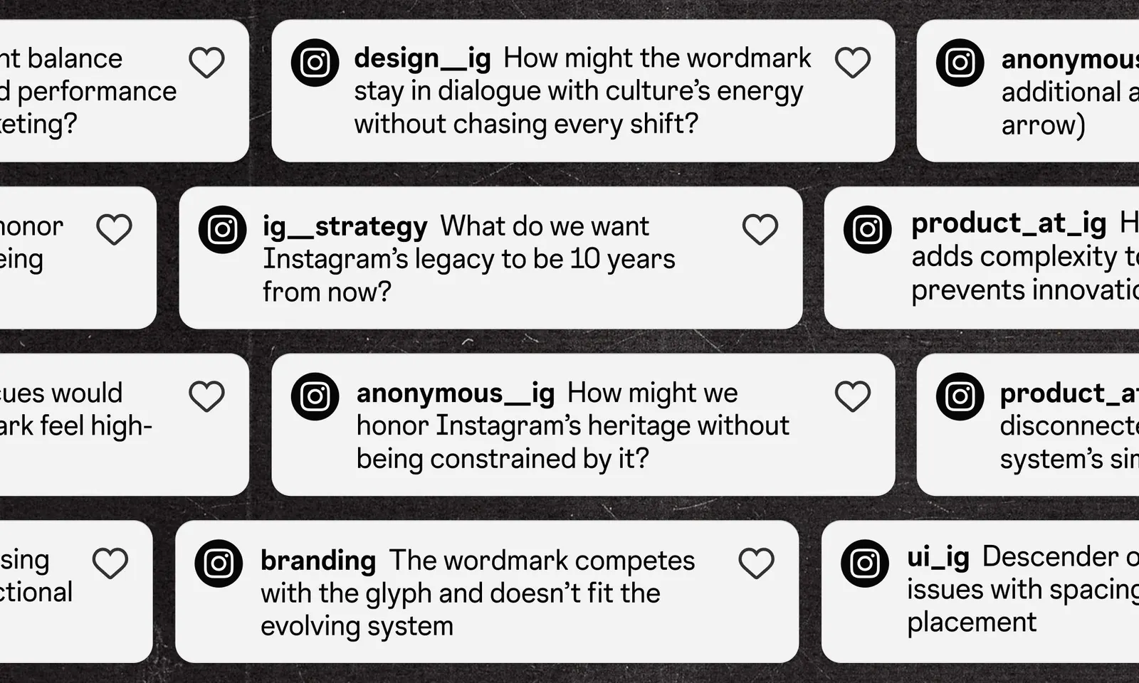
The brief called for a mark that could carry campaigns, product surfaces, creator programs, and newer apps like Instants and Edits, without disrupting a recognition built over billions of daily encounters. Koto worked with the Instagram team and typographer Jeremy Mickel, testing hundreds of options drawn from handwriting and calligraphy. The detail to look for is the "r" in the "gr" ligature, simplified yet still echoing the old script. Something Special Studios handled motion.
Why it works
The smartest decision here is where the change is concentrated. Rather than reworking every letter, the studio focused on a few details, like the "gr" ligature, and left the rest familiar. The result still looks drawn rather than set, which keeps a personal, human tone in a category dominated by neutral sans-serif wordmarks. It also gives the name a firmer, more consistent presence next to the glyph, so the two can work as a pair or stand alone across very different contexts.
Logo
Typography
Applications
Images and video from koto.com, by Koto.