The Brand Monograph
Whatsapp brand identity by Koto
↗Koto's work for WhatsApp takes on an unusual problem: how do you redesign a brand that more than 2 billion people already carry in their pockets, and make it read as a tool rather than a feed? The studio set out to close the gap between the app itself and the way WhatsApp speaks in public, without losing the plainness that lets anyone, anywhere, use the product.
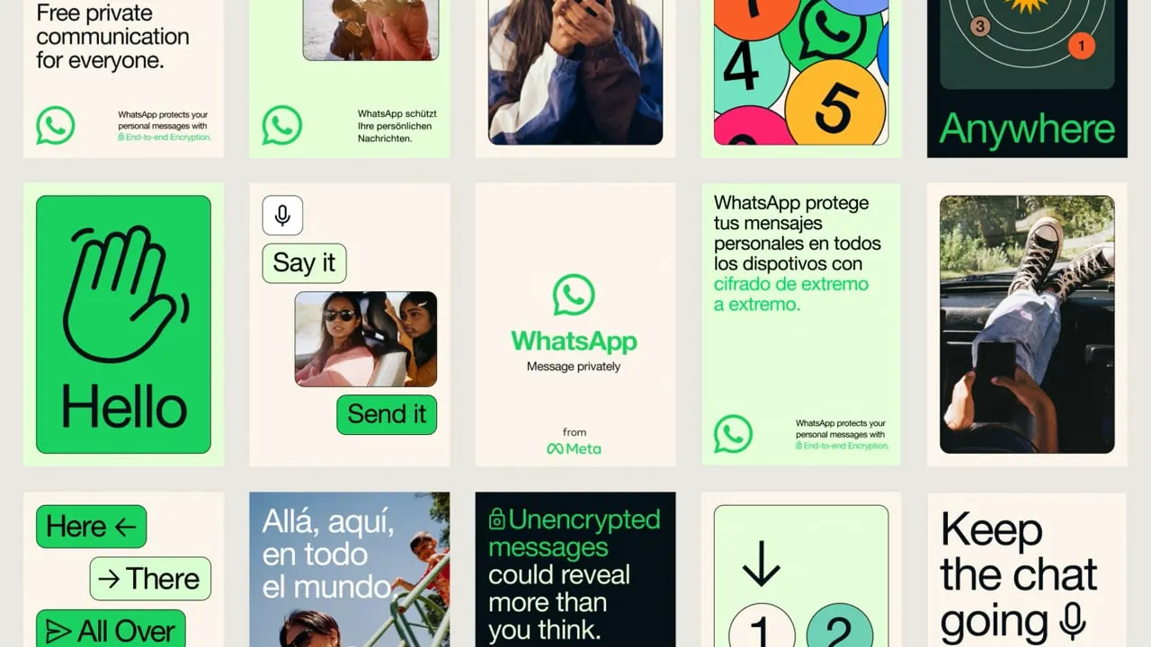
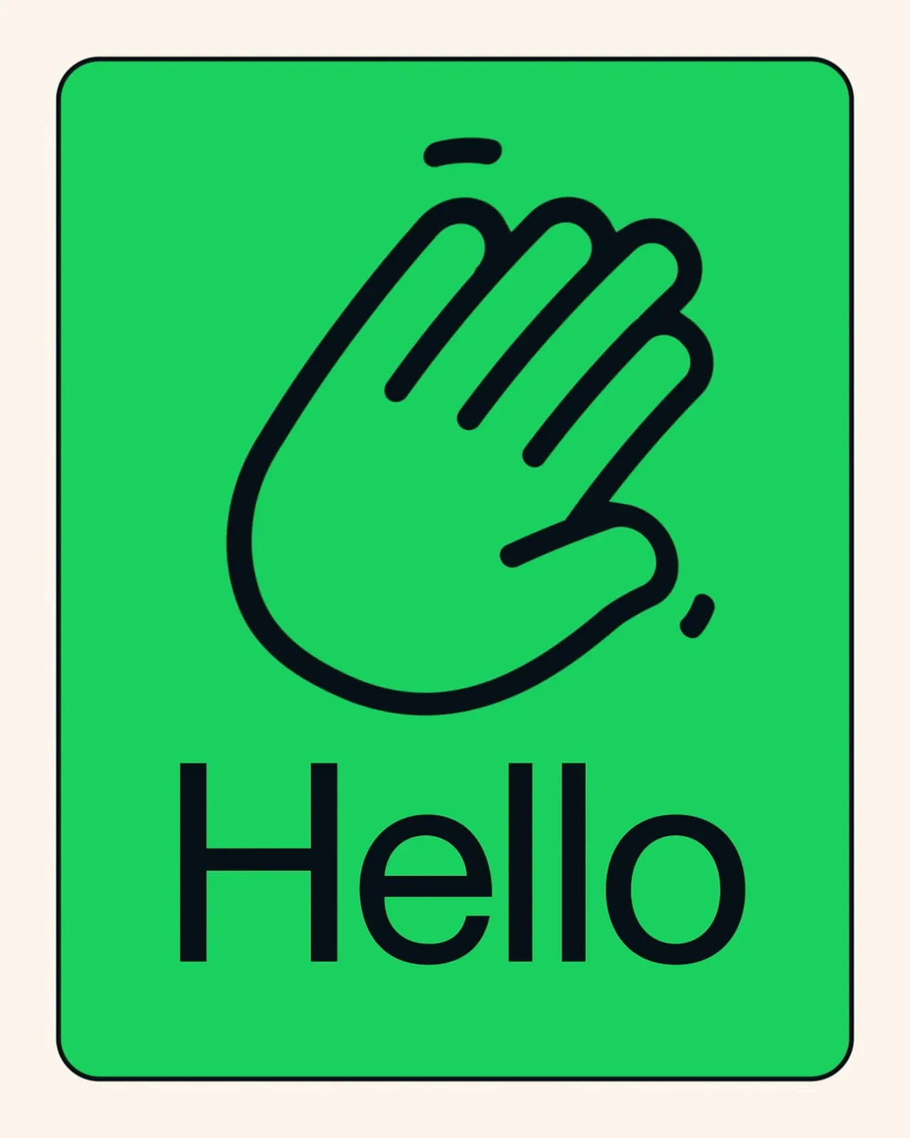
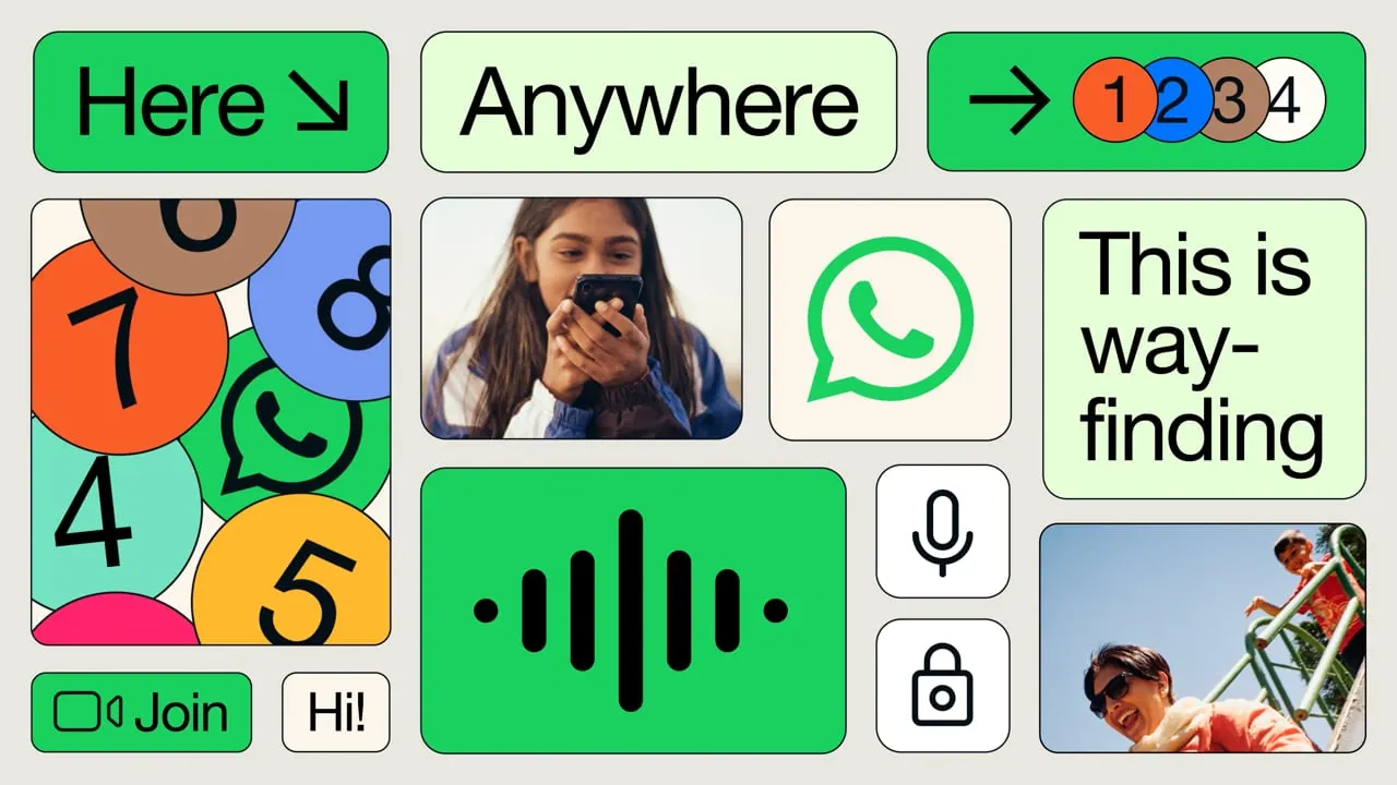
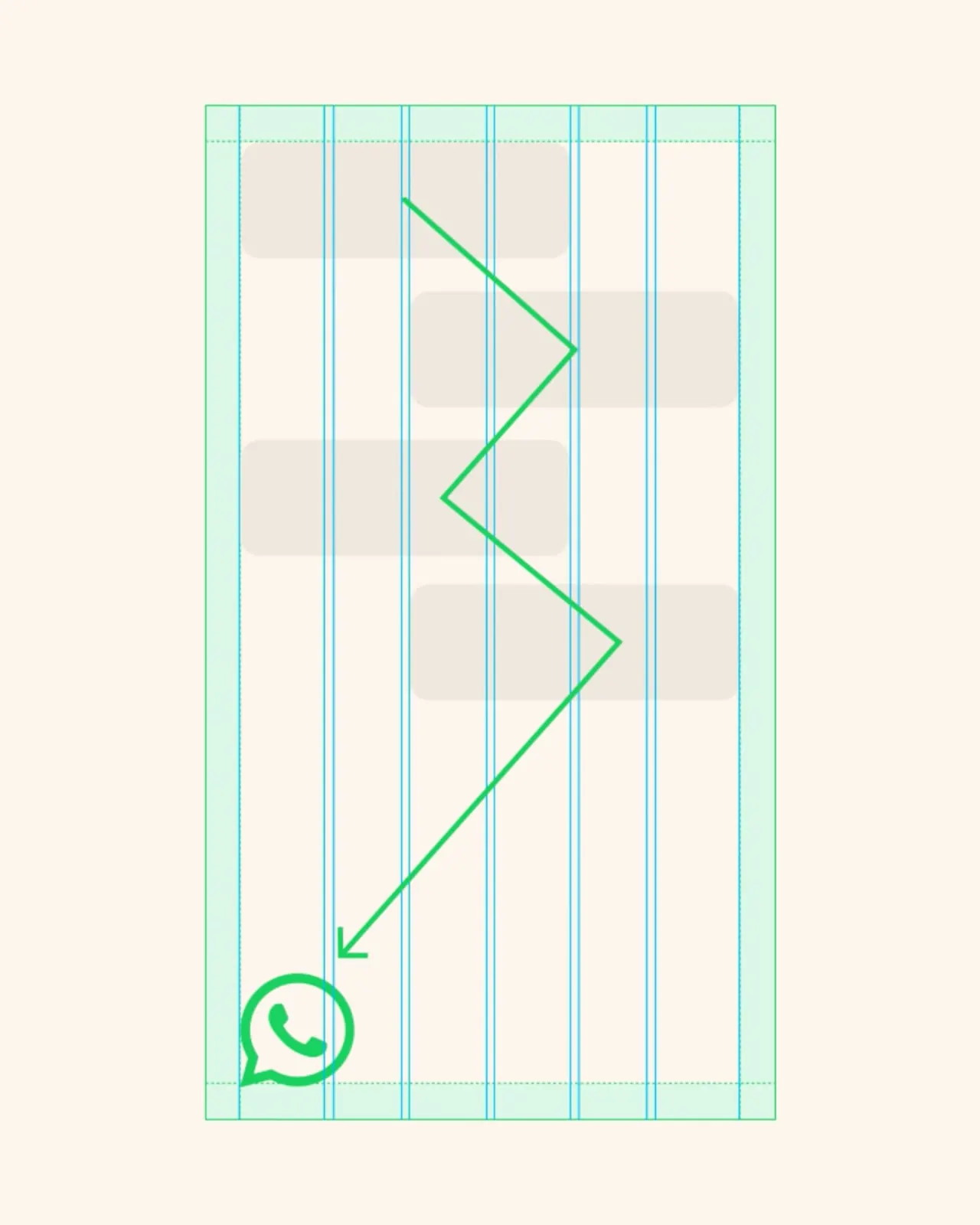
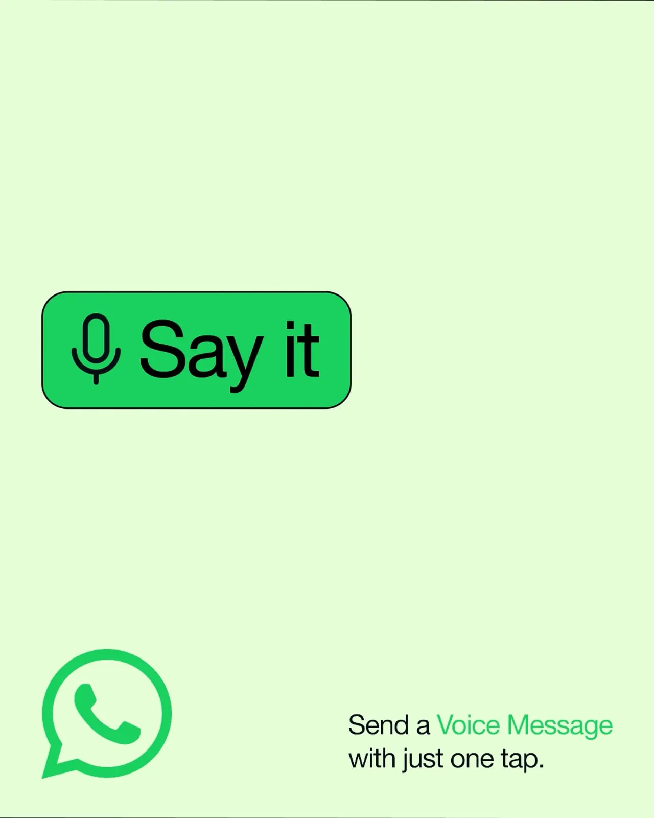
Koto's answer is a system led by the product. The palette starts with the familiar green and extends into dark mode, so marketing looks like the app. Modular graphic blocks stack and alternate like messages in a thread, giving layouts a built-in sense of turn-taking. The same pieces handle wayfinding and storytelling, moving from digital screens to physical spaces and from one-to-one moments to global campaigns, with room for local nuance.
Why it works
Starting from the app's own colors is the smartest move here. Green and dark mode are things people already see every day, so the brand feels like the product rather than a costume laid over it. It also sets WhatsApp apart from social platforms that rely on loud, attention-seeking visuals. The block structure does similar work: it borrows a behavior everyone understands, so layouts read quickly regardless of language or literacy. Restraint is the point. A utility earns confidence by looking calm, consistent, and easy to use.
Logo
Typography


Applications

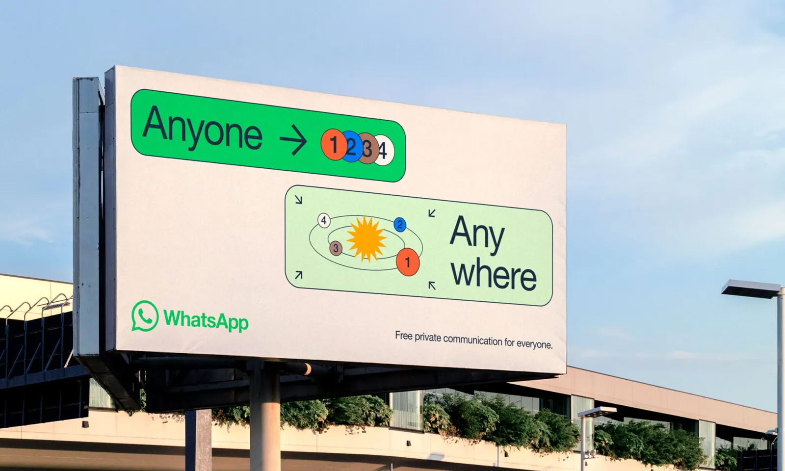
Images and video from koto.com, by Koto.