The Brand Monograph
BaptistCare brand identity by re.design
↗Care brands often default to soft focus and reassurance, so re.design's work for BaptistCare is interesting for starting somewhere more specific: the real spread of what the organization does. As the third largest integrated care provider in Australia, BaptistCare works with people at very different moments, from addiction recovery at one end to retirement living at the other.
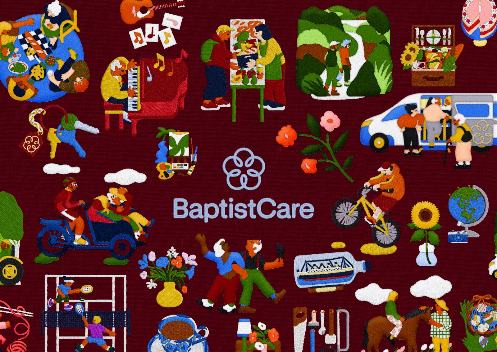
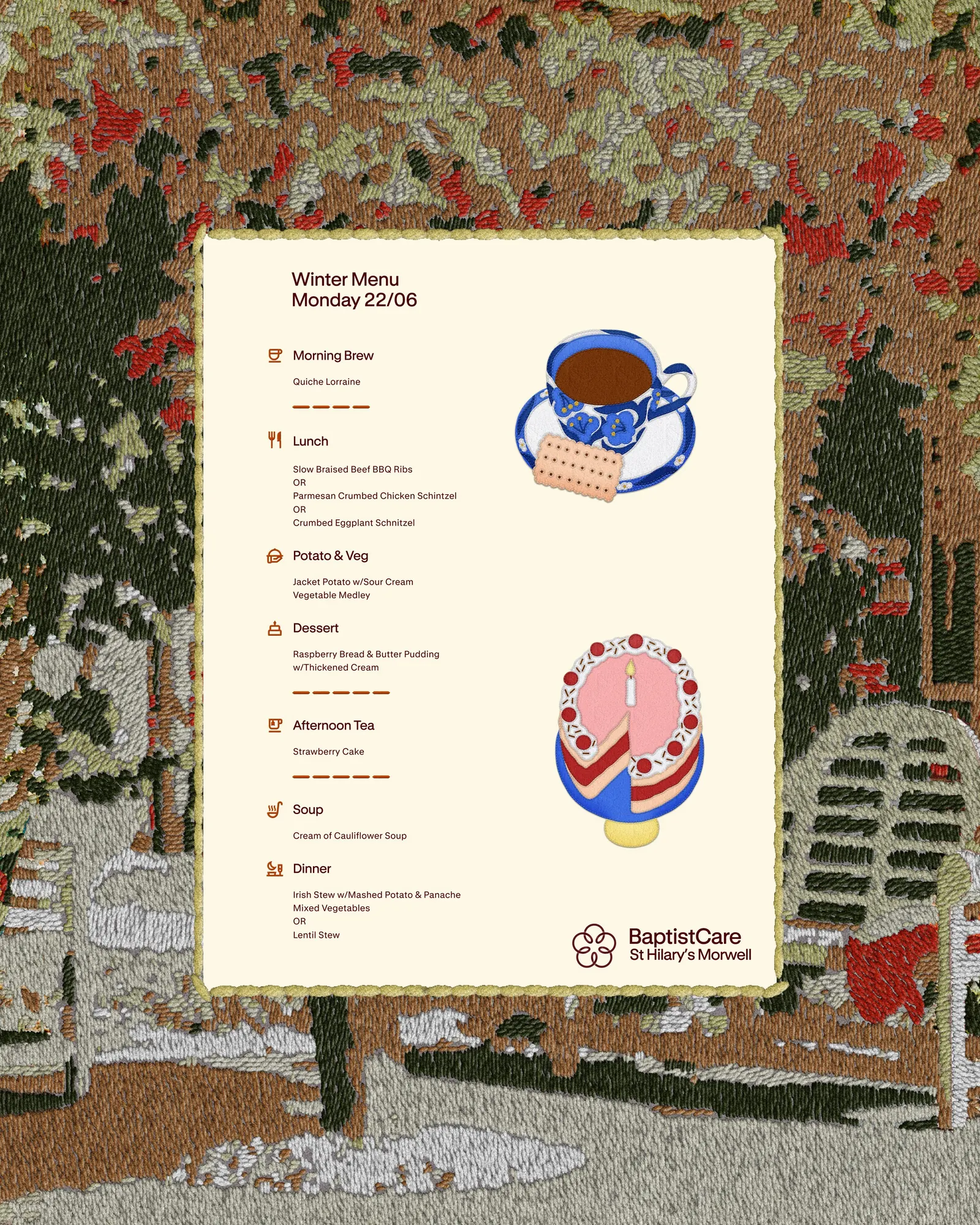
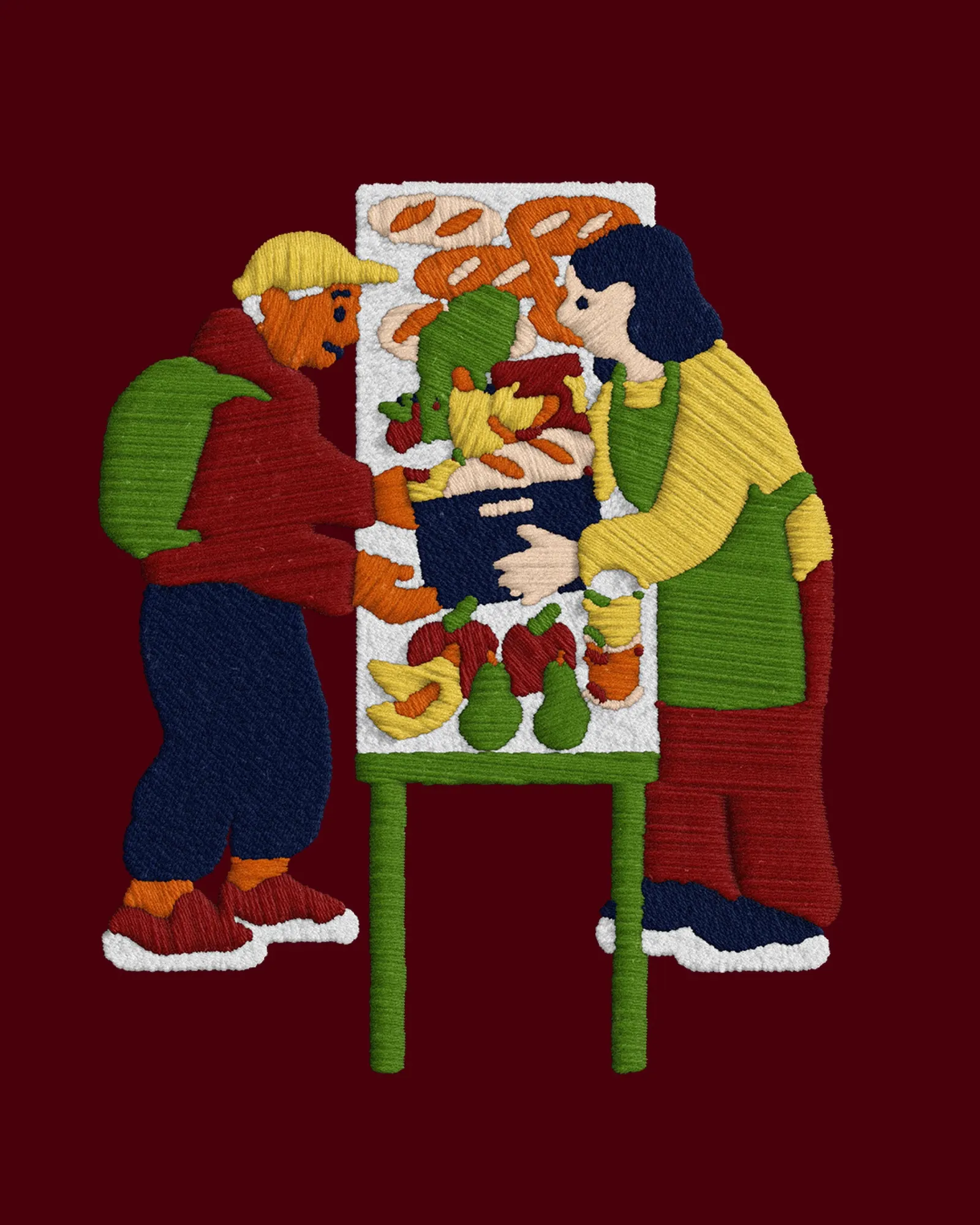
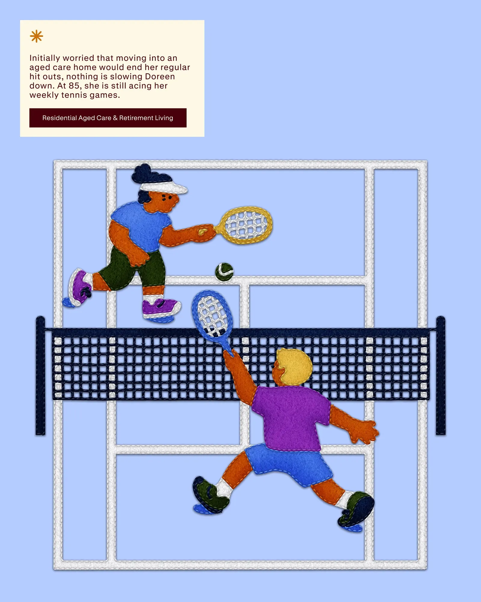
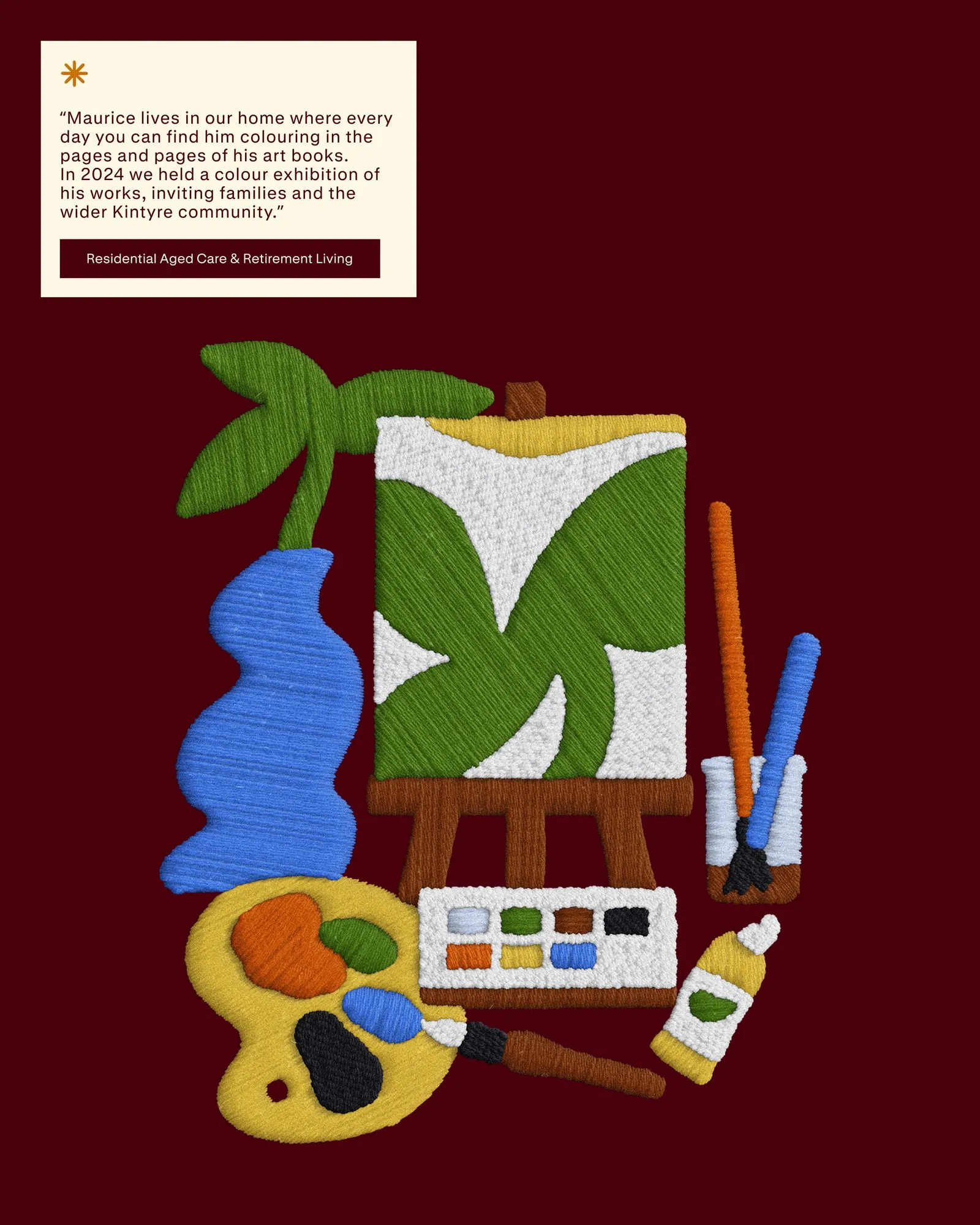
The brief arrived as BaptistCare grew into a national organization, which meant a single identity had to hold all of those situations together without flattening them. re.design brought in illustrator Carla McRae, so the brand could tell individual stories through drawn imagery rather than leaning on generic symbols. The result is a system built around people first, with illustration doing much of the talking.
Why it works
Illustration is a smart call in a category crowded with stock photography. It can portray sensitive situations, like recovery from addiction, with warmth and dignity, and without putting a real person on display. It also gives a large, multi-service organization one recognizable voice that can stretch across very different audiences, from young adults to families choosing aged care. In a sector where most brands look interchangeable, a distinct illustrator's hand makes BaptistCare feel authored, personal, and easier to trust.
Logo
Applications
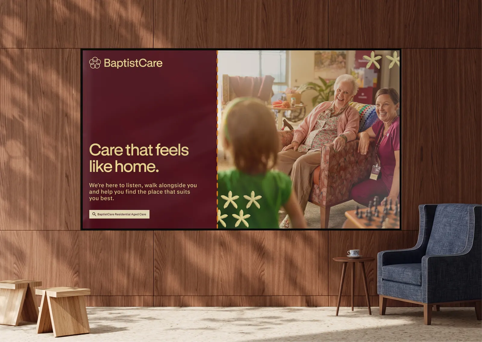
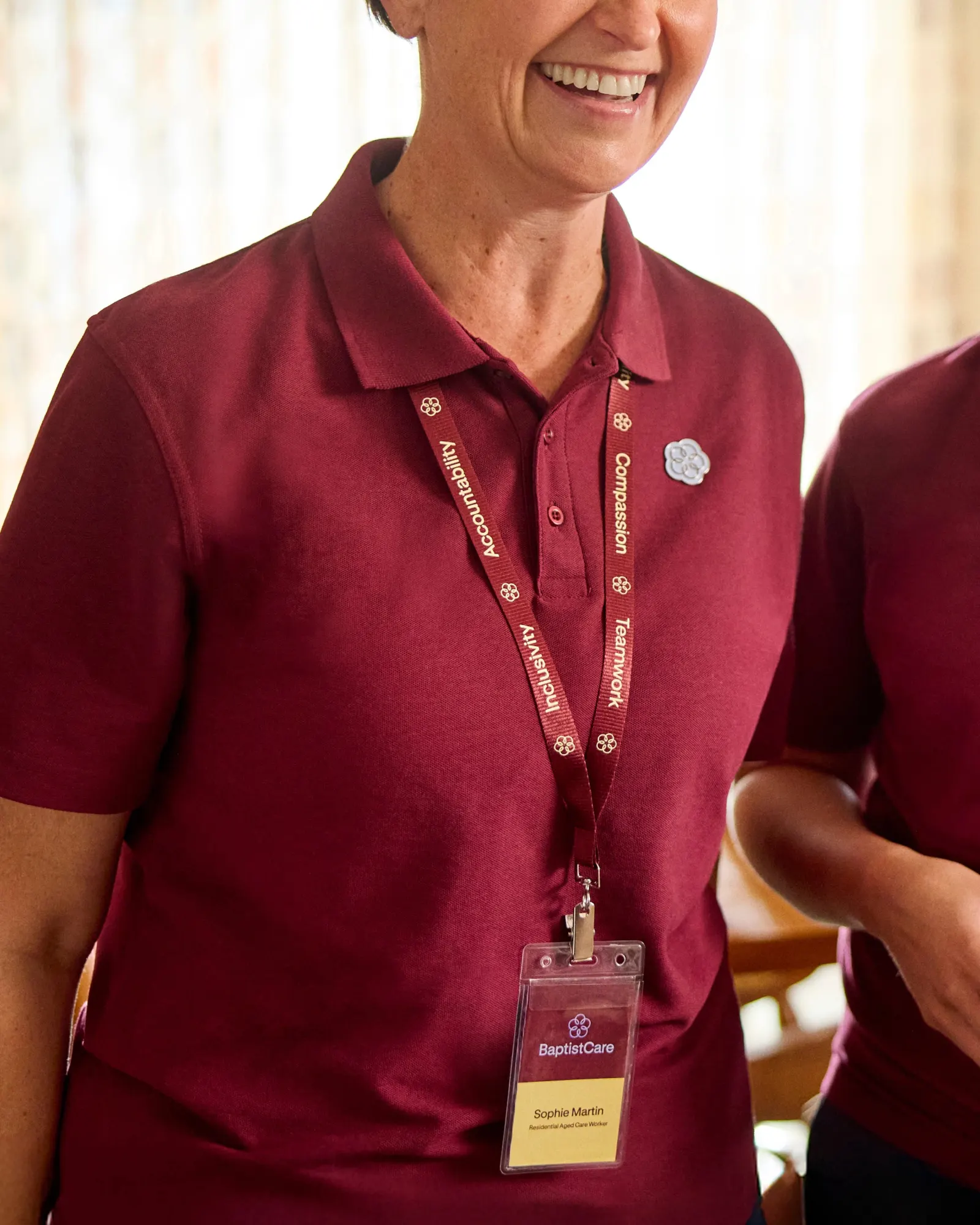
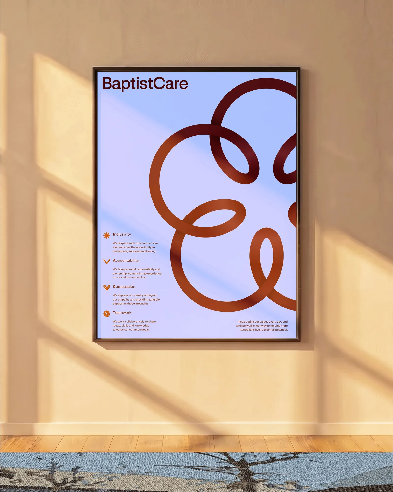
Images and video from re.design, by re.design.