The Brand Monograph
MoMA PS1 brand identity by PORTO ROCHA
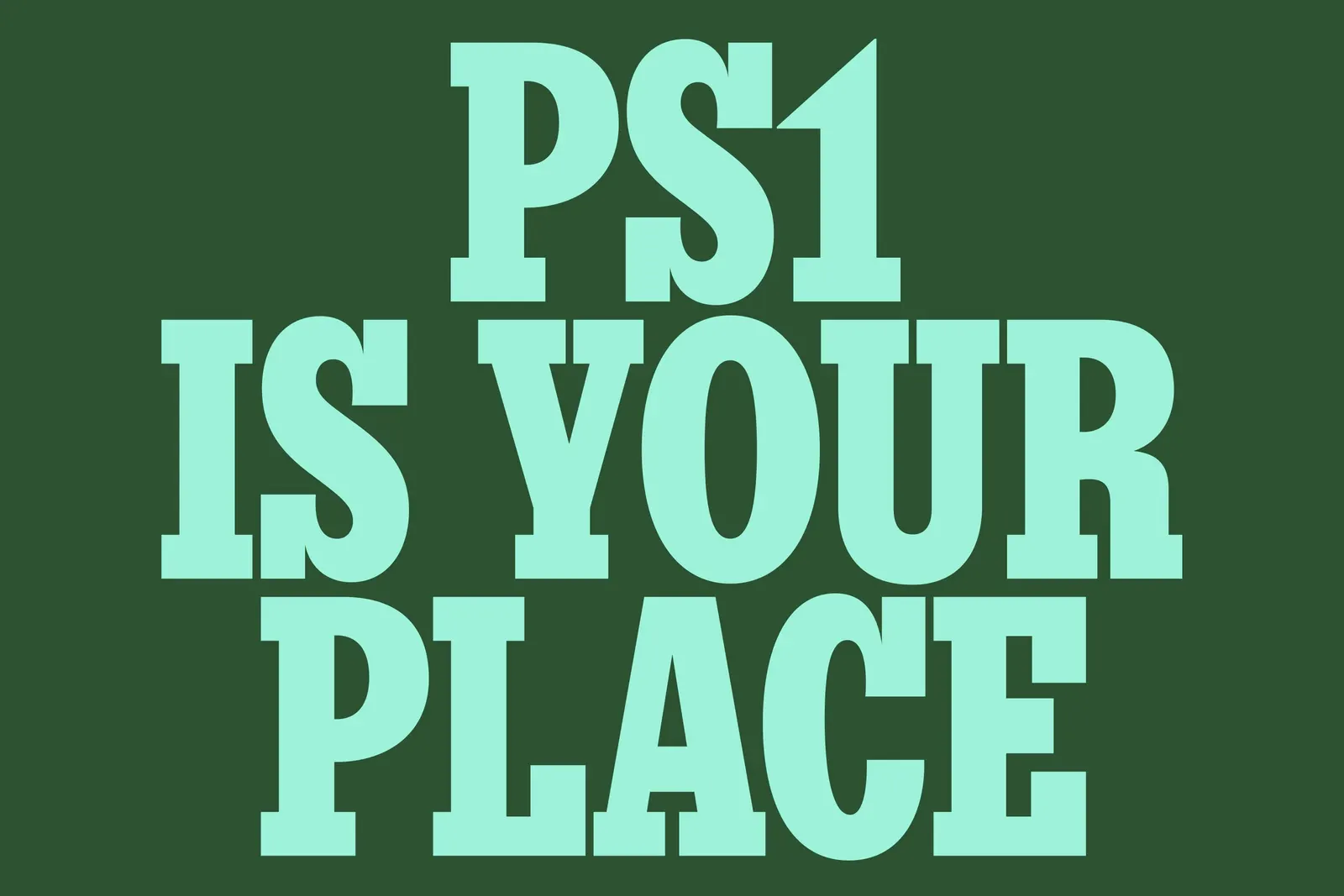
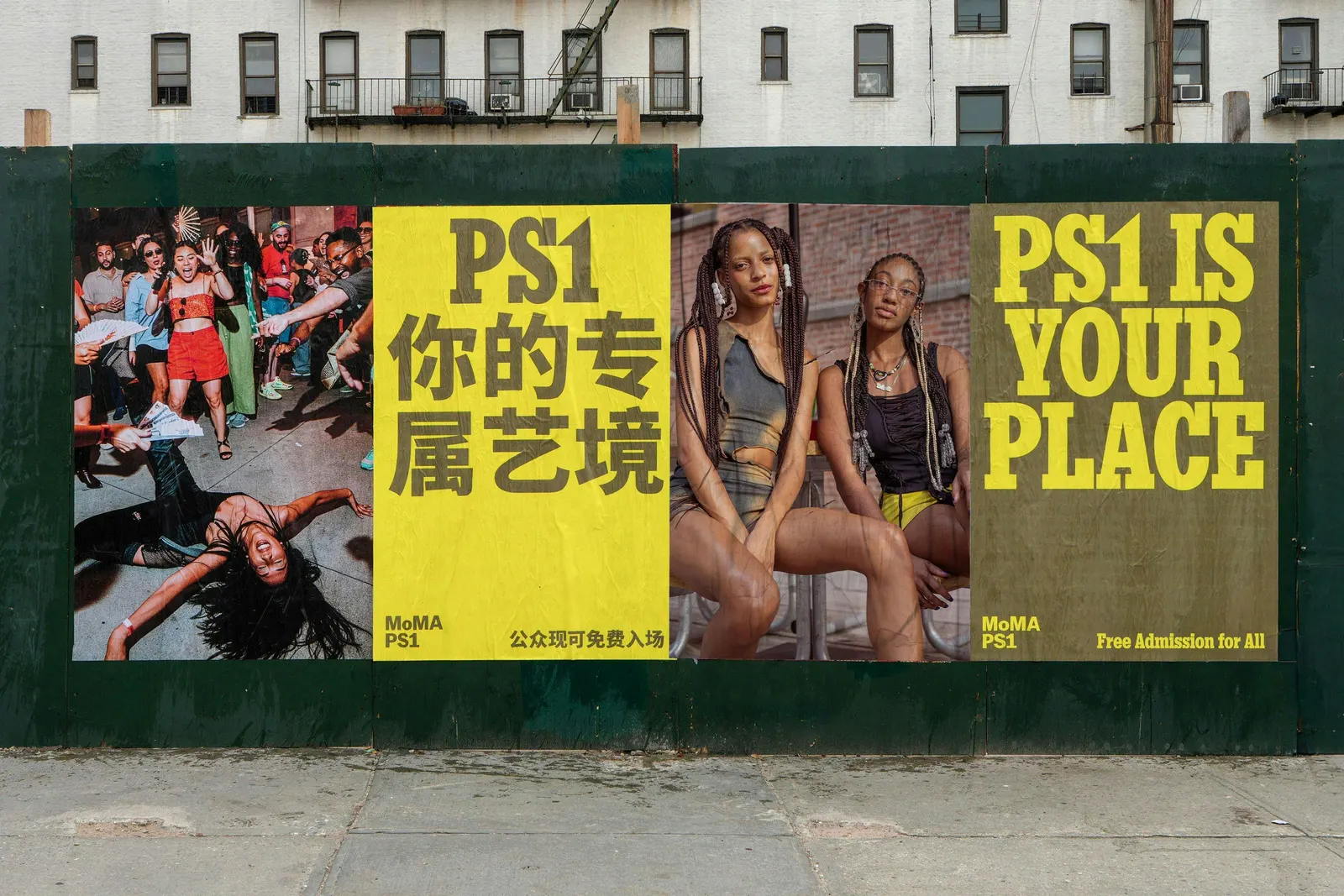
↗PORTO ROCHA gave MoMA PS1 a front door in the form of a sentence. PS1 IS YOUR PLACE greets celebrated artists and first-time visitors the same way, and the studio built a loose, adaptable identity around it so it never reads as a tagline stuck on a museum.
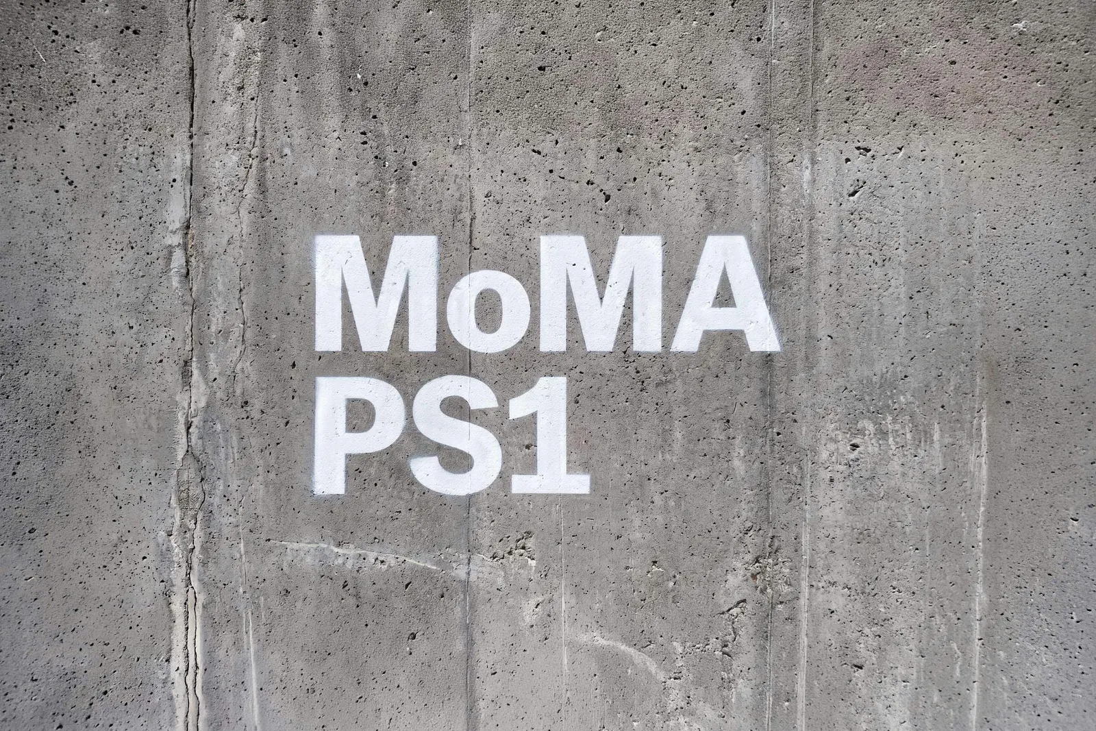
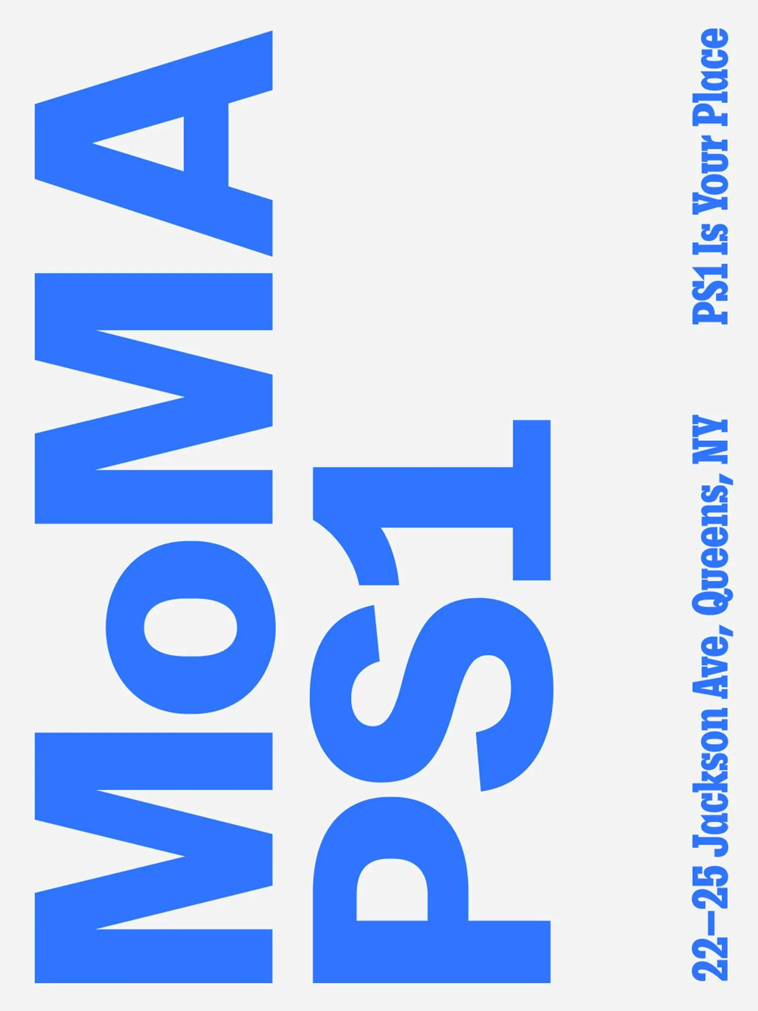
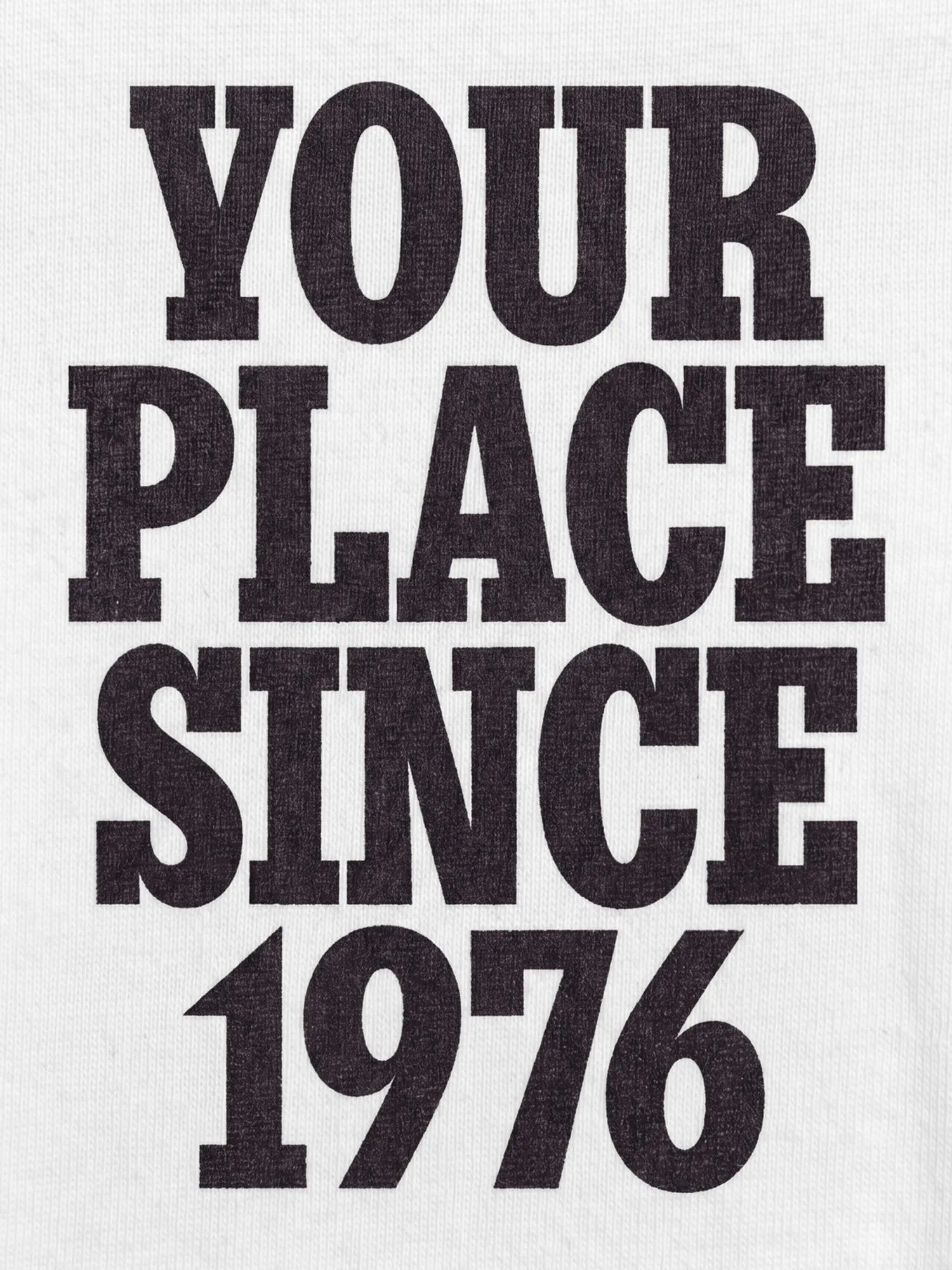
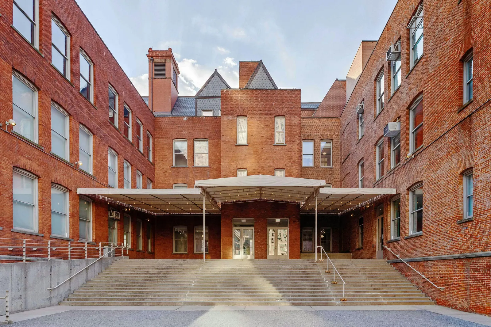
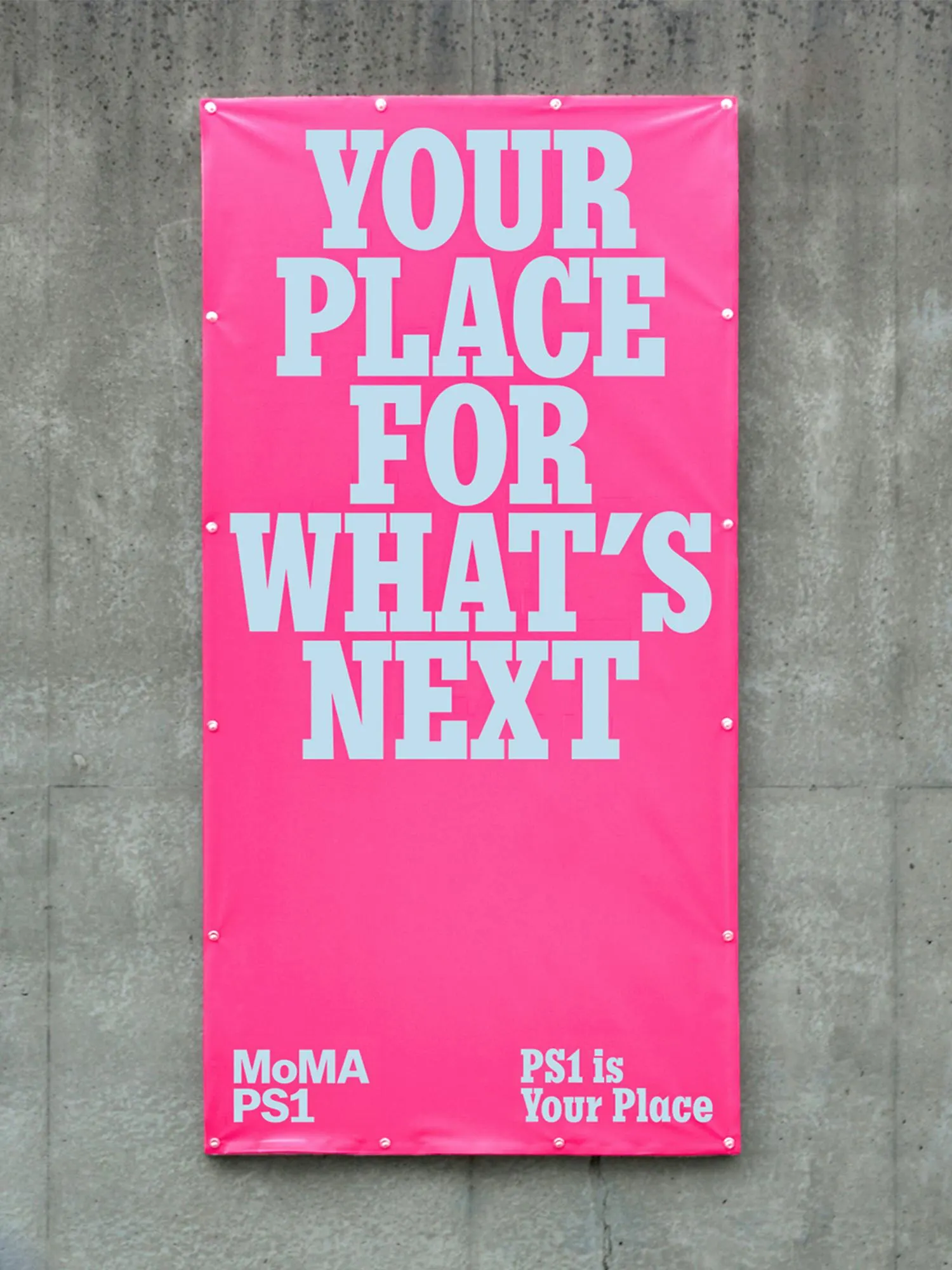
The brief: draw new audiences to Queens ahead of the 50th anniversary, with free admission and plenty of competition. Strategists Claren Walker, Natalee Ranii-Dropcho, and Nick Drain grounded the idea in New York's shrinking supply of public gathering spots. The design team, including Alessandro De Vecchi, Julia Schäfer, Leo Porto, and Martin Azambuja, then loosened the identity with Queens-flavored, multilingual copy, a logo that often turns on its side, Berton Hasebe's PS1 Slab leading type-driven layouts, and a broader palette. Josh Krauth-Harding added motion, and a schoolroom-green mural nods to the building's past.
Why it works
Most museum identities ask for reverence. This one asks for ownership, and the design choices back that up. Tilting the logo makes the mark feel handled rather than preserved, which suits an institution built on experiment. PS1 Slab is sturdy and a little institutional, so the type-led layouts feel like signage from a place with history, while the playful voice keeps them from feeling stiff. A wider palette lets each program look distinct without breaking the family, which matters for a venue with this much going on.
Logo
Typography
Applications
Images and video from portorocha.com, by PORTO ROCHA.