The Brand Monograph
MATE brand identity by Forner
↗Forner's rebrand for MATE stands out for what it chooses not to say. Sustainable clothing often leans on urgency, guilt, and a long list of rules for the customer to follow. The studio steered MATE away from that register and toward a calmer, more assured position built on intentionality.
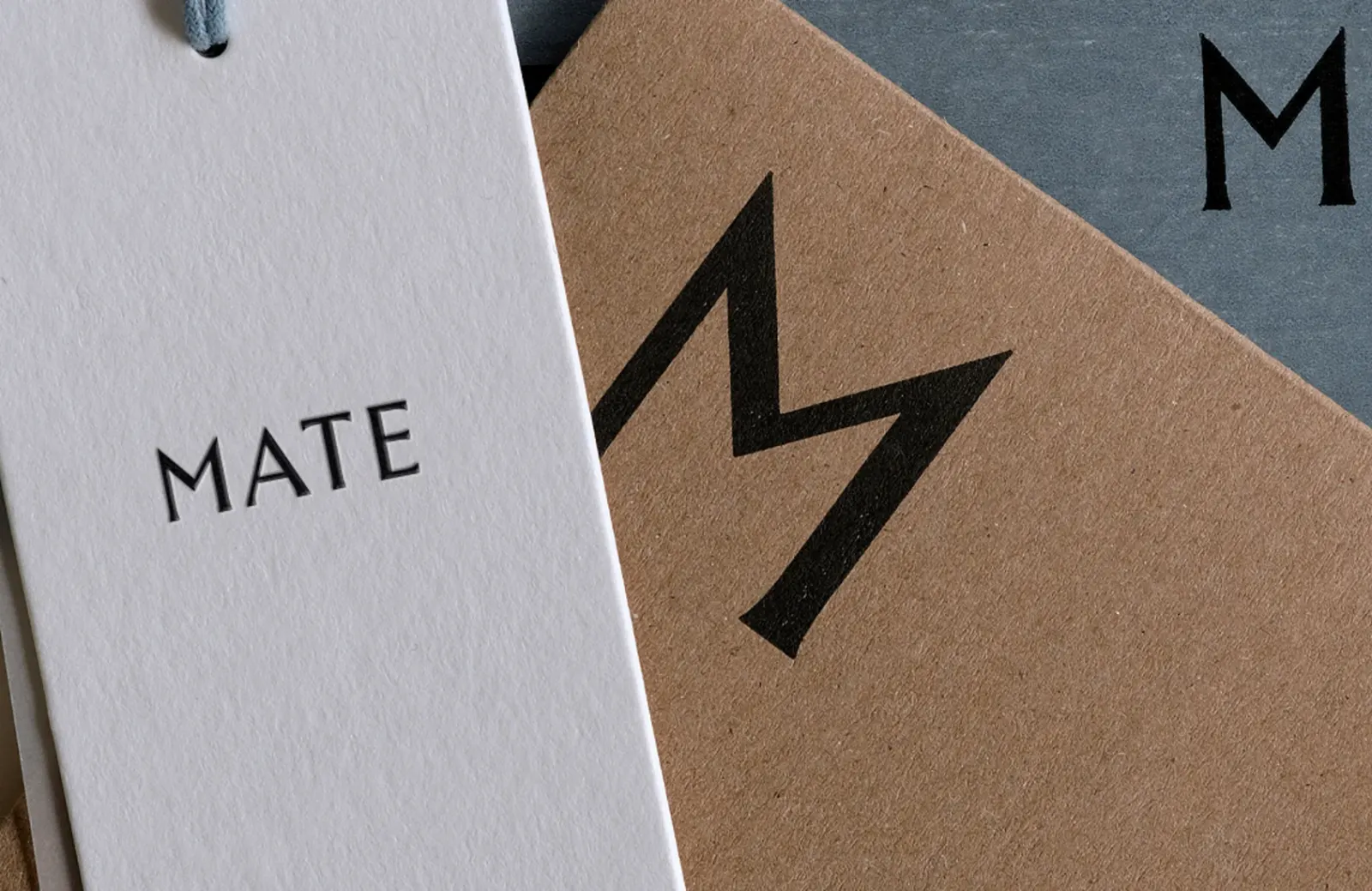
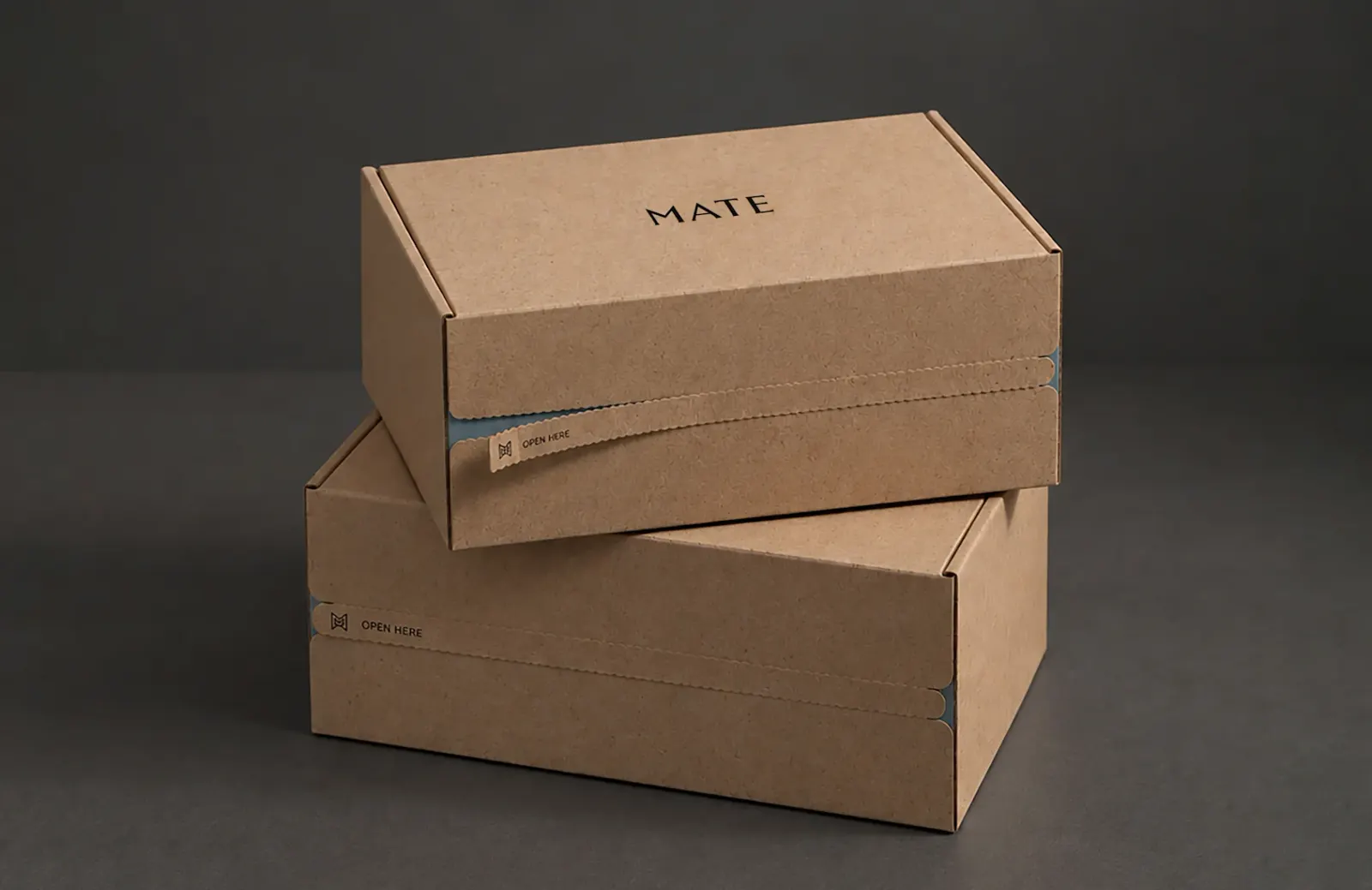
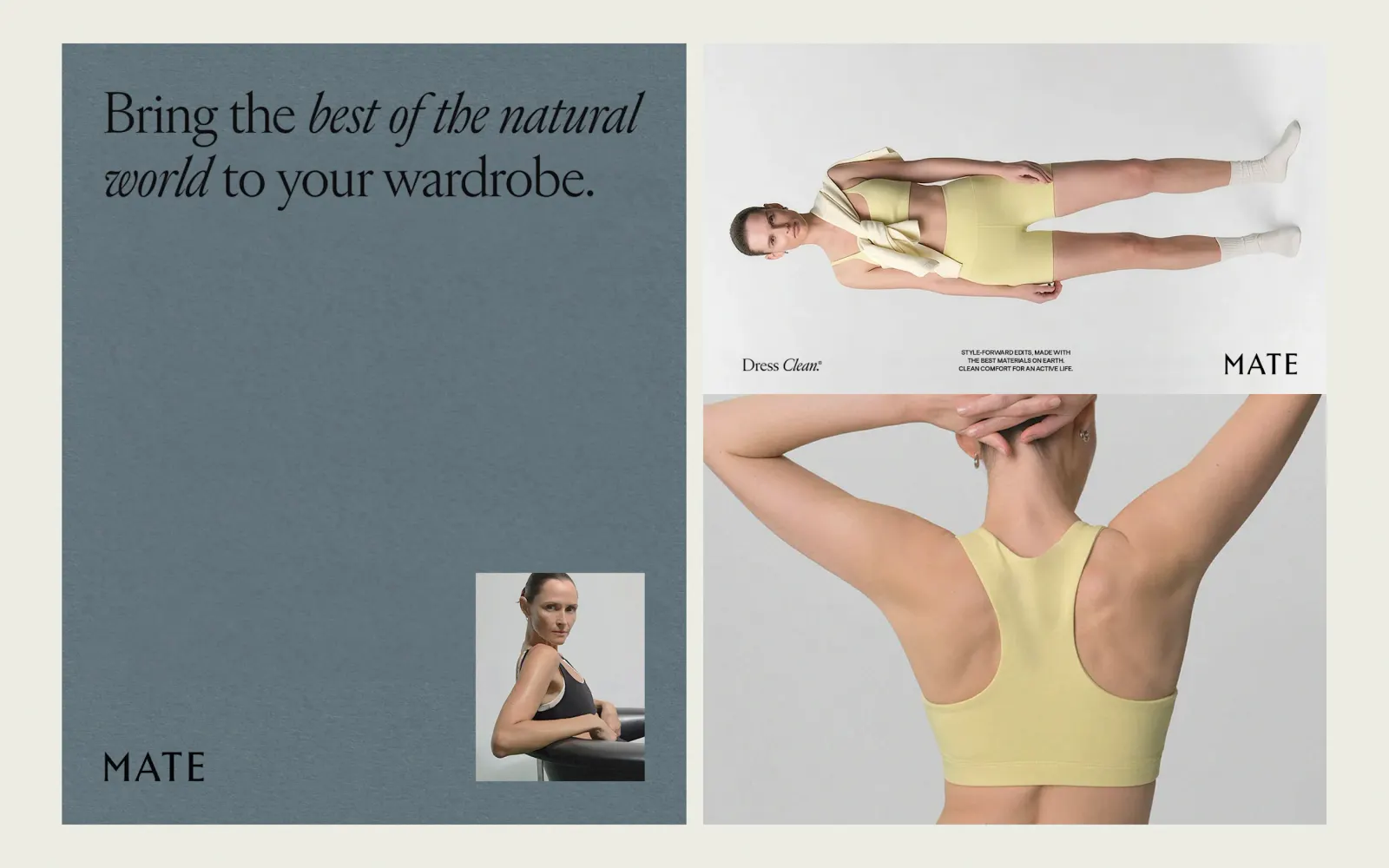
The job was to bring the brand into its next era alongside its customer. Forner started with strategy and messaging, then refined MATE's visual identity into a more polished, fashion-minded language that puts minimalist style, material quality, and everyday wearability up front. That language runs through a full design system covering the website, packaging, and apparel branding, so the brand feels consistent whether someone is browsing, unboxing, or getting dressed.
Why it works
The smartest move here is sequencing. Because the visual language grows out of a clear position, the values come across as taste rather than talk, and the materials and silhouettes carry the argument. Refining the existing identity instead of starting over also lets current customers recognize the brand as it matures. Applying one system across site, packaging, and apparel makes MATE read as a considered label first and a cause second, which sets it apart from competitors that lead with their mission and hope the product follows.
Applications


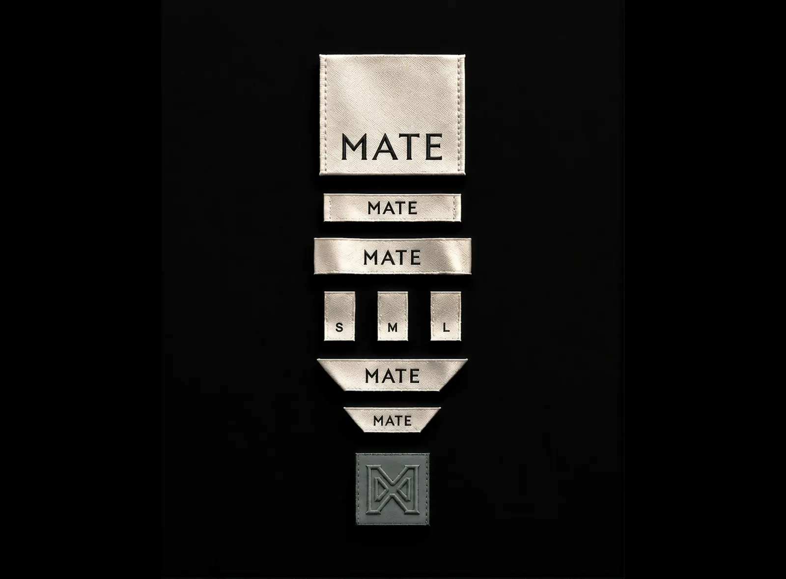
Images and video from forner.studio, by Forner.