The Brand Monograph
Robinhood brand identity by COLLINS
↗Few fintech rebrands begin by rejecting how the category talks about itself, but COLLINS's work for Robinhood does. It treats investing as an act of imagination rather than a gamble. The brief arrived after commission-free trading became standard across the industry and stopped being Robinhood's edge. The company needed to offer more, from cash management to retirement accounts, without losing the younger audience that built it.
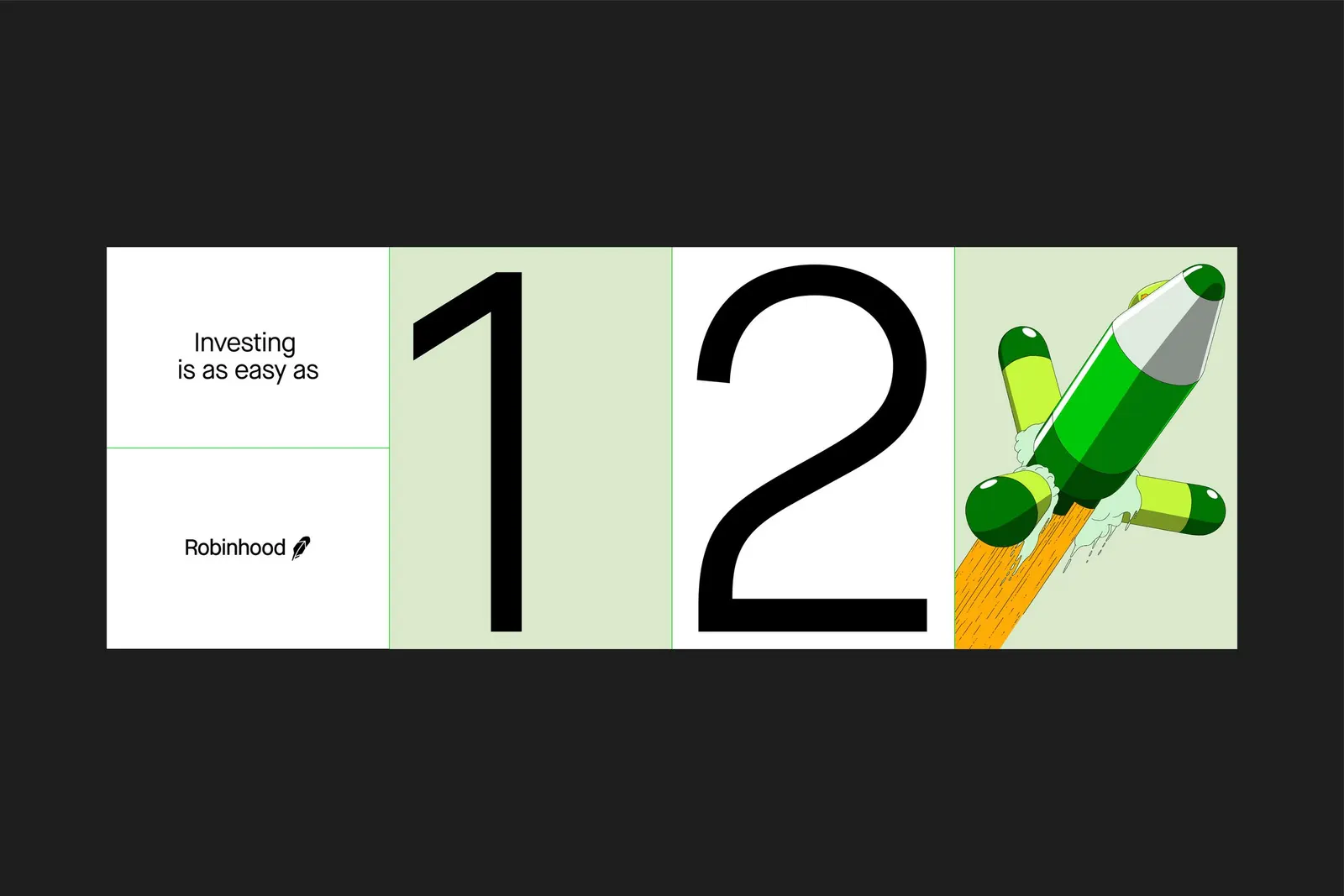
The studio's answer is an illustration-led system, with Ilya Milstein, Jaedoo Lee, Liam Cobb, and Matias Basla contributing the artwork. Visual metaphors make ETFs, fractional shares, bull markets, and even the American Dream easy to grasp, and large information graphics put data to work inside the product. The same teaching instinct runs through the Learn resource and the Snacks podcast, so the brand feels consistent from app to audio.
Why it works
Finance branding often leans on charts and stern authority, which can leave newer investors feeling like outsiders. COLLINS used illustration to make abstract products concrete, so the brand earns credibility by being useful rather than by looking serious. That choice also gives Robinhood room to grow. Crypto, gold, and IRAs all sit comfortably under an idea about looking ahead, so each new product feels like part of one story instead of an add-on to a trading app.
Applications
Logo

Typography


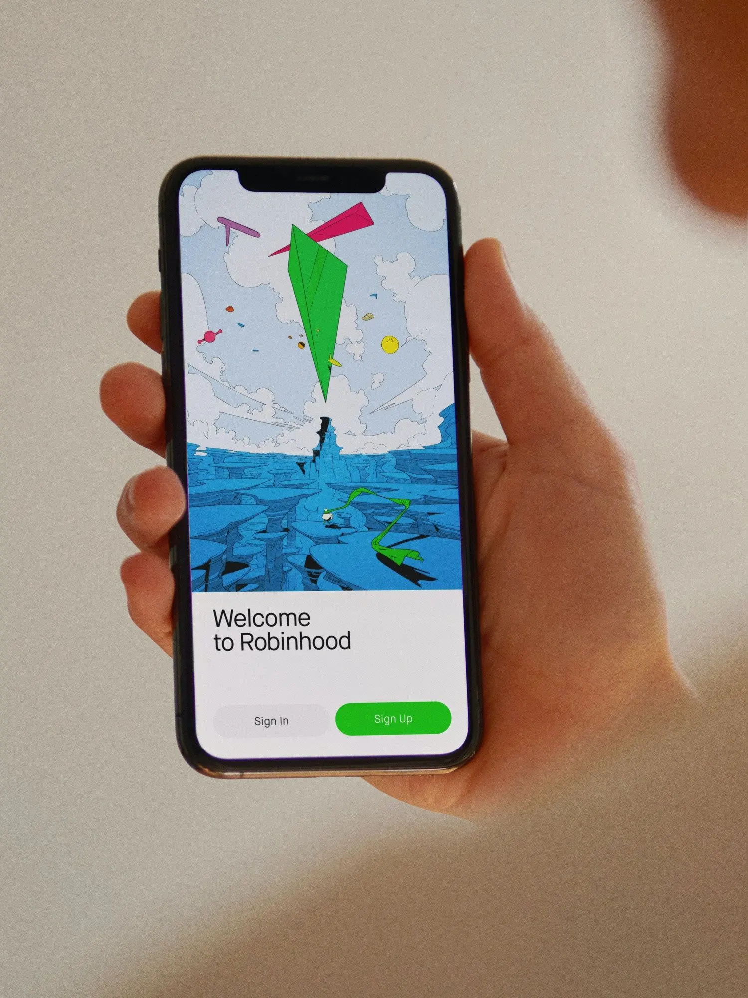

Images and video from wearecollins.com, by COLLINS.