The Brand Monograph
Red Wing Shoes brand identity by COLLINS
↗Few heritage brands have to answer to a concrete pour and a runway at the same time. Red Wing Shoes does, and by the time COLLINS got involved, that range had left it with competing sub-brands, internal debate about what it stood for, and uneven execution that put its premium prices at risk.
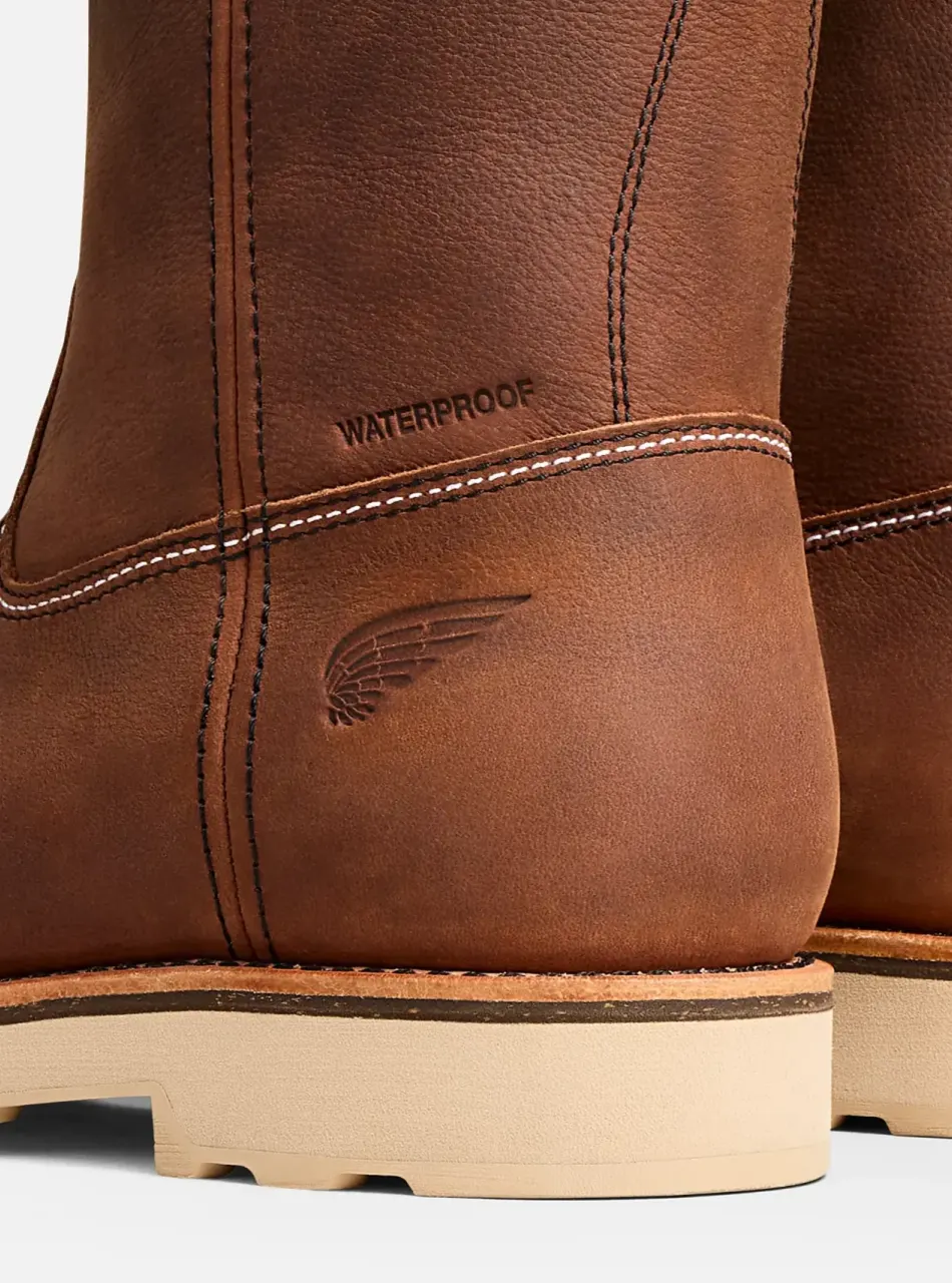
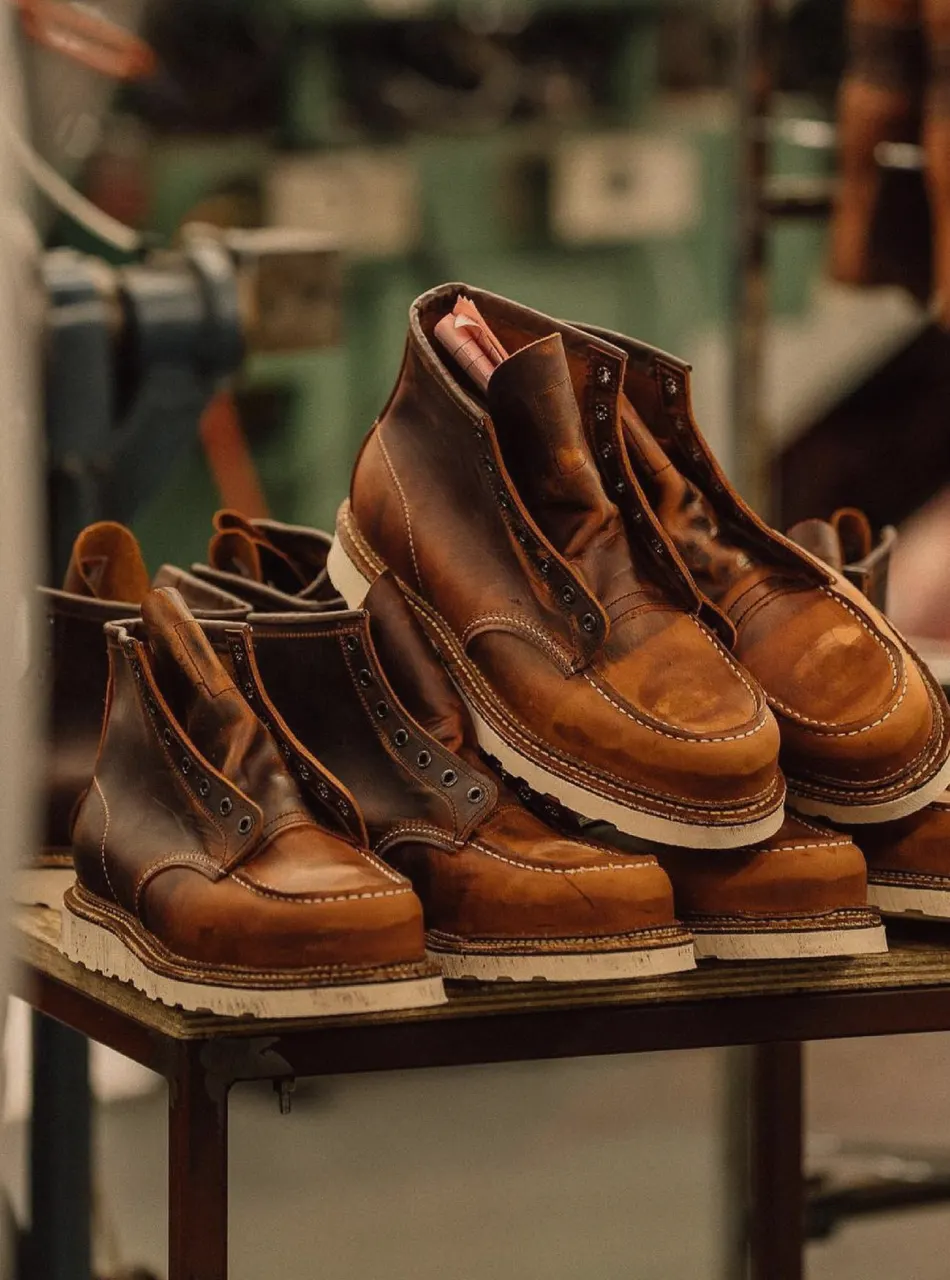
COLLINS built the answer around craft as a value shared by maker and wearer, not a look. The studio reorganized the brand architecture, redrew the visual expression, restructured the storytelling, and rebuilt the digital flagship. Construction details, like triple-stitched seams sewn on Puritan machines in a method unchanged since the 1920s, are pulled forward at every touchpoint. The outcome is one masterbrand, a design system made to scale globally, and a RedWingShoes.com that doubled demand sales, lifted conversion 91%, and generated $107M in ecommerce GMV in 2025.
Why it works
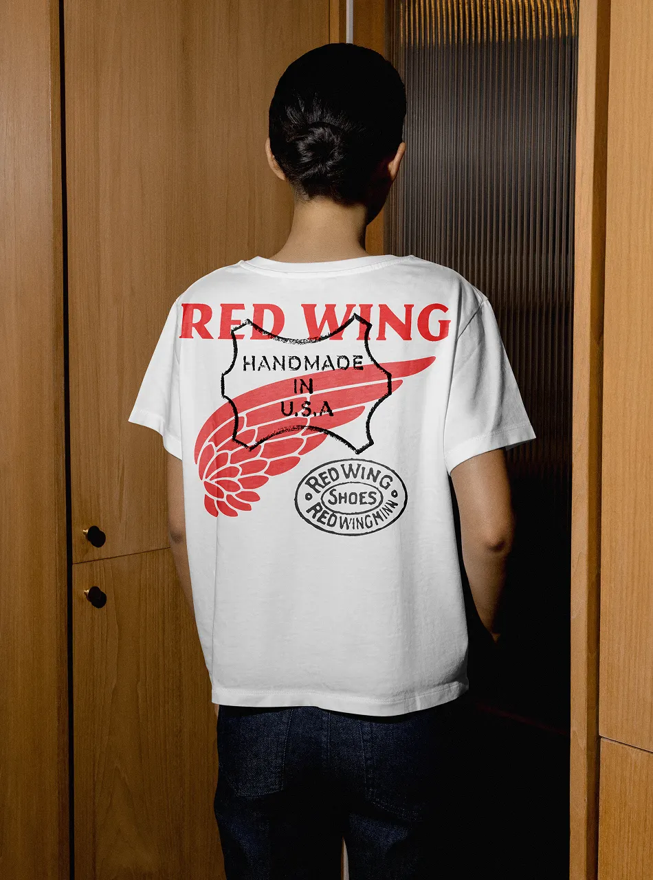
The smart move is choosing an idea the customer already owns. A welder and a streetwear collector will never share a style, but both recognize precision, so the brand stops asking them to look alike and gives them the same reason to buy. Treating the stitching as proof matters too, because it turns a price gap into something you can inspect. That lets a $200 boot and a $500 one sit under one name without either feeling like a compromise, and lets collaborations borrow credibility instead of diluting it.
Applications
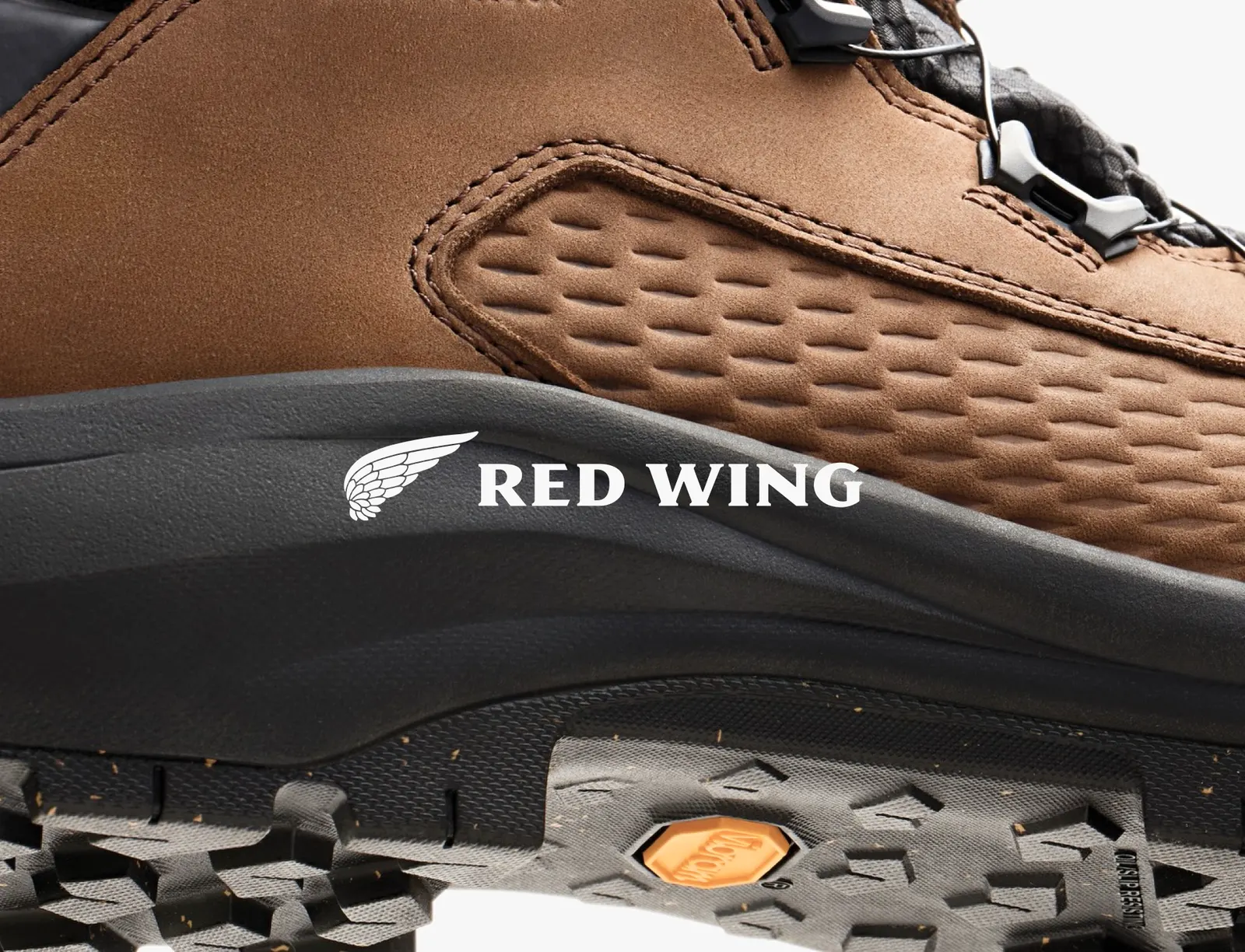
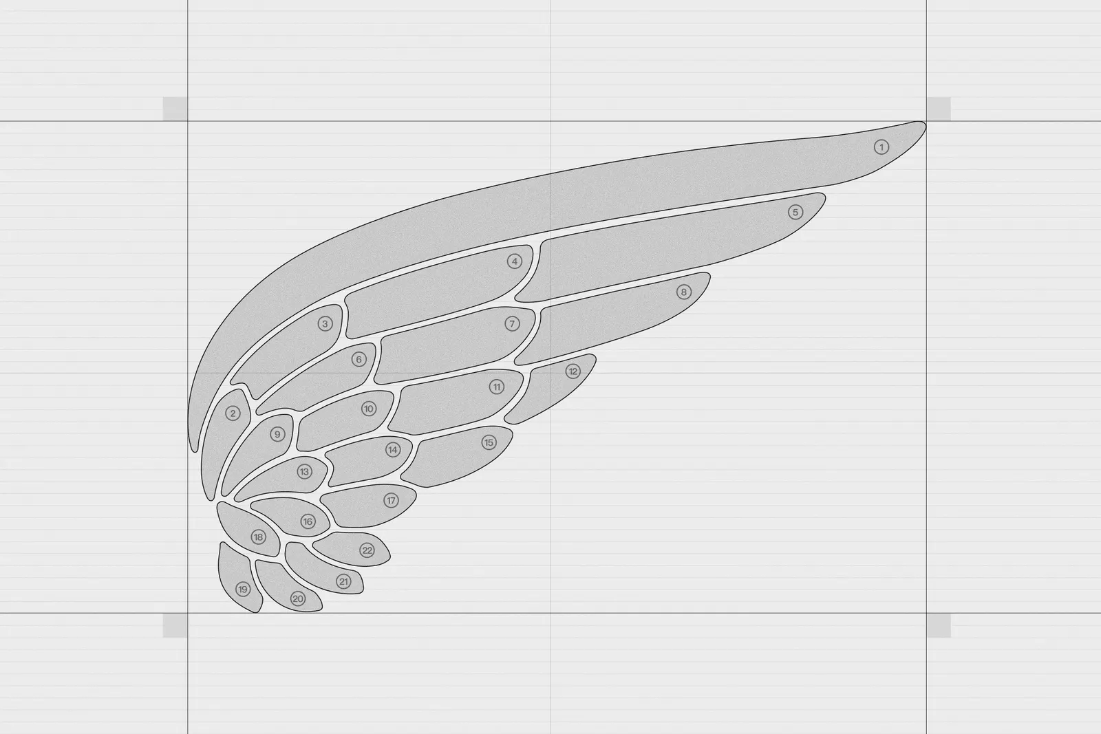
Logo
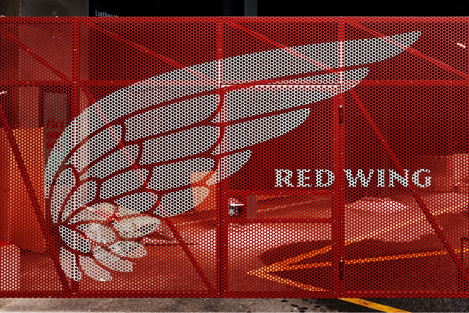
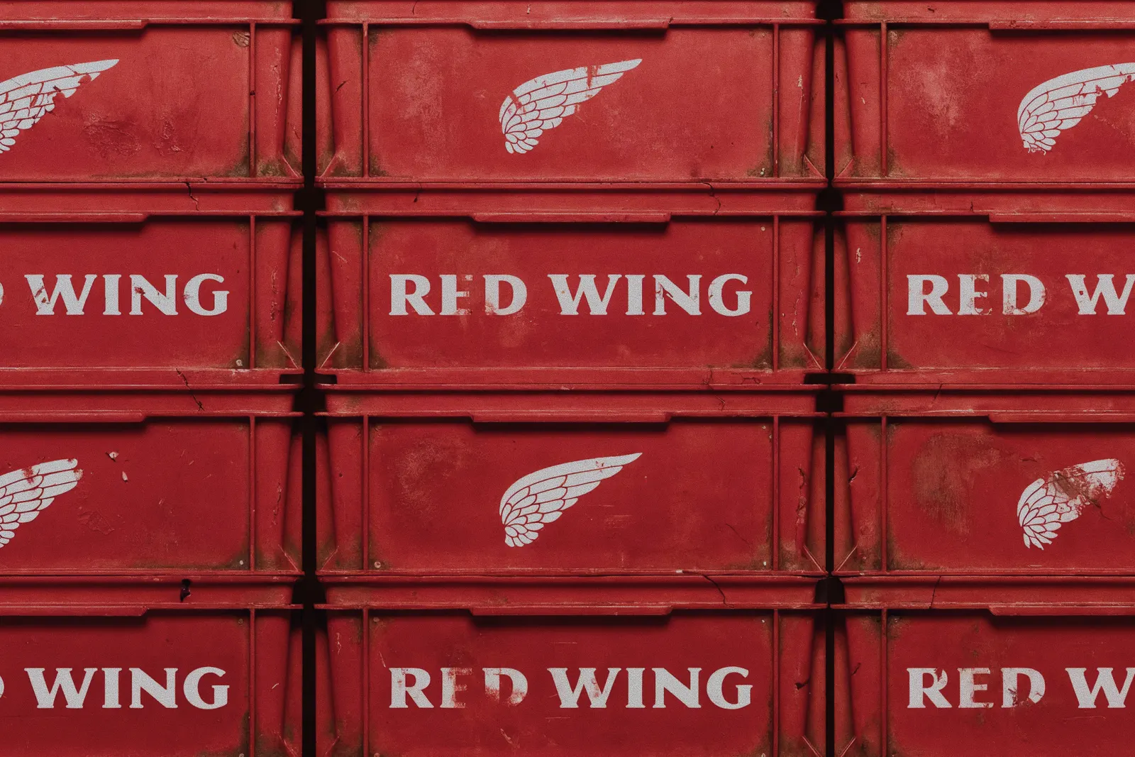
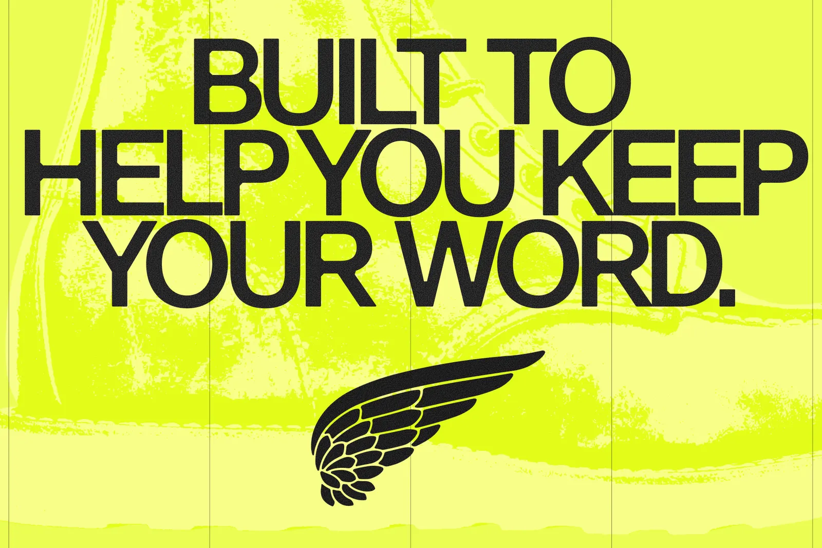
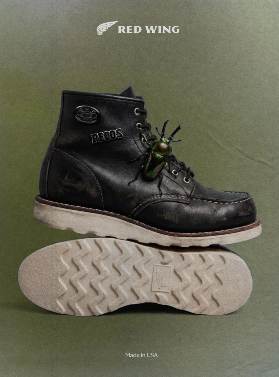
Images and video from wearecollins.com, by COLLINS.