The Brand Monograph
GoFundMe brand identity by Koto
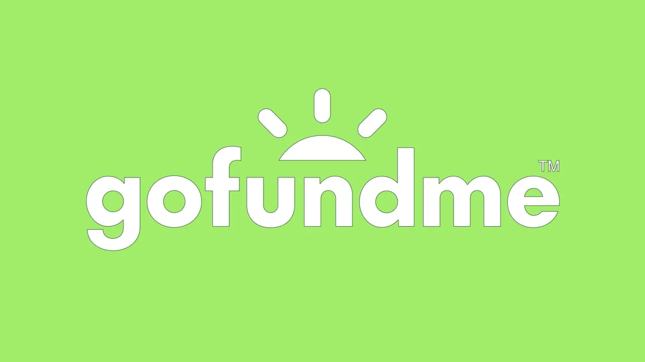
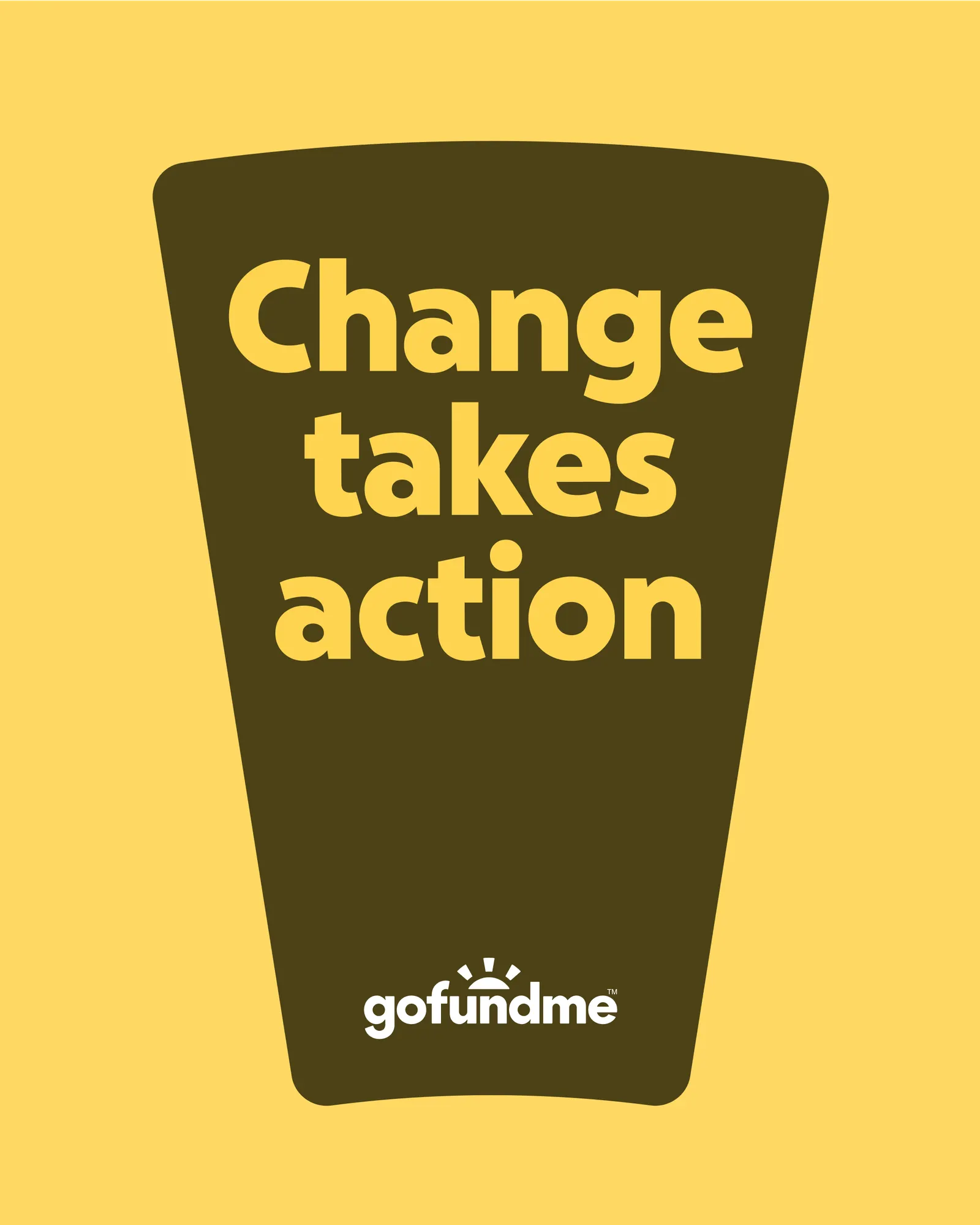
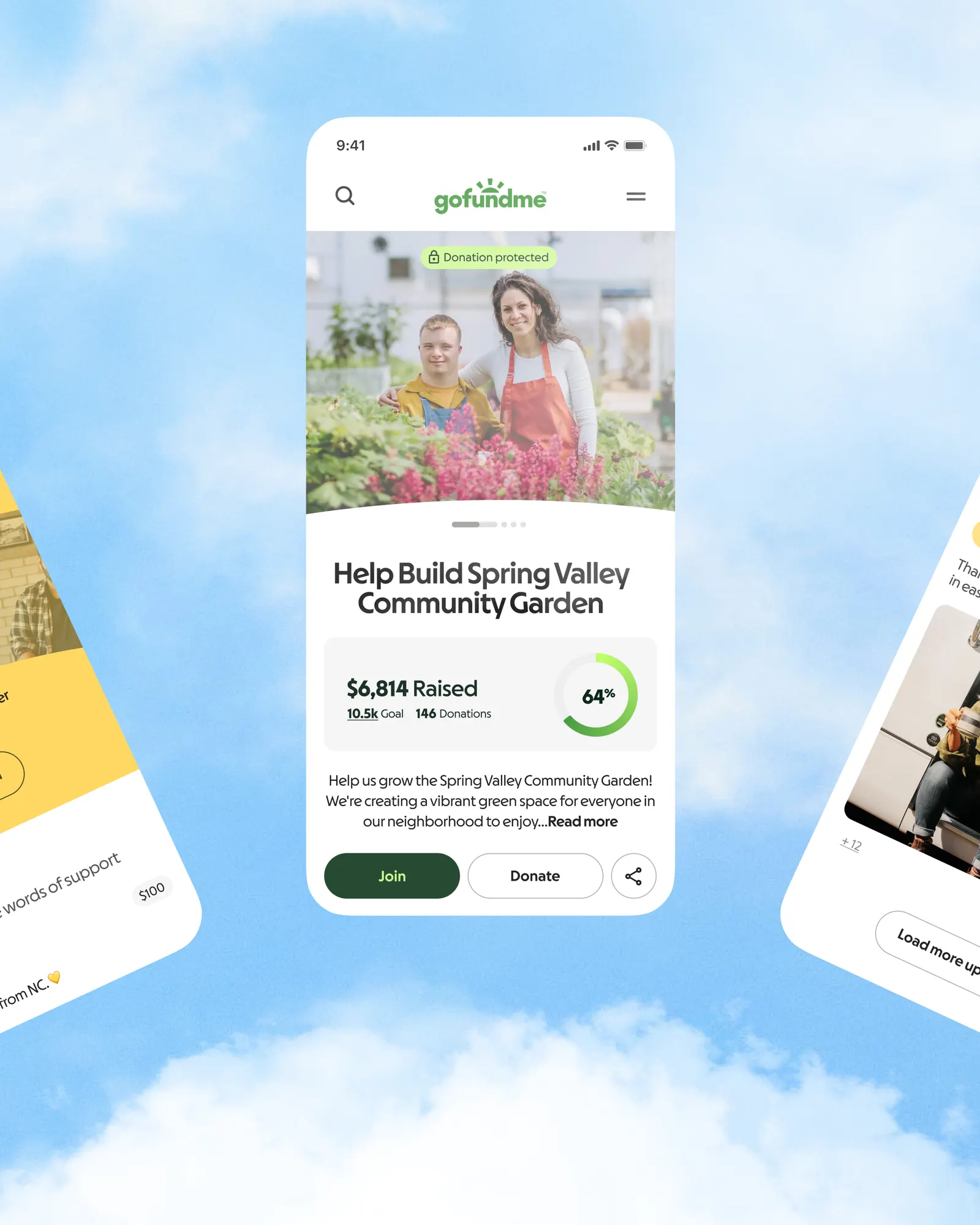
↗Few fundraising brands start from something users have already watched fill up, but Koto did exactly that for GoFundMe. After the Classy acquisition, the product had moved deep into nonprofit territory while the brand still looked like a consumer crowdfunding tool. The studio took the familiar horizontal goal bar, bent it into a circle, and let that circle open into an arc that anchors the logo.
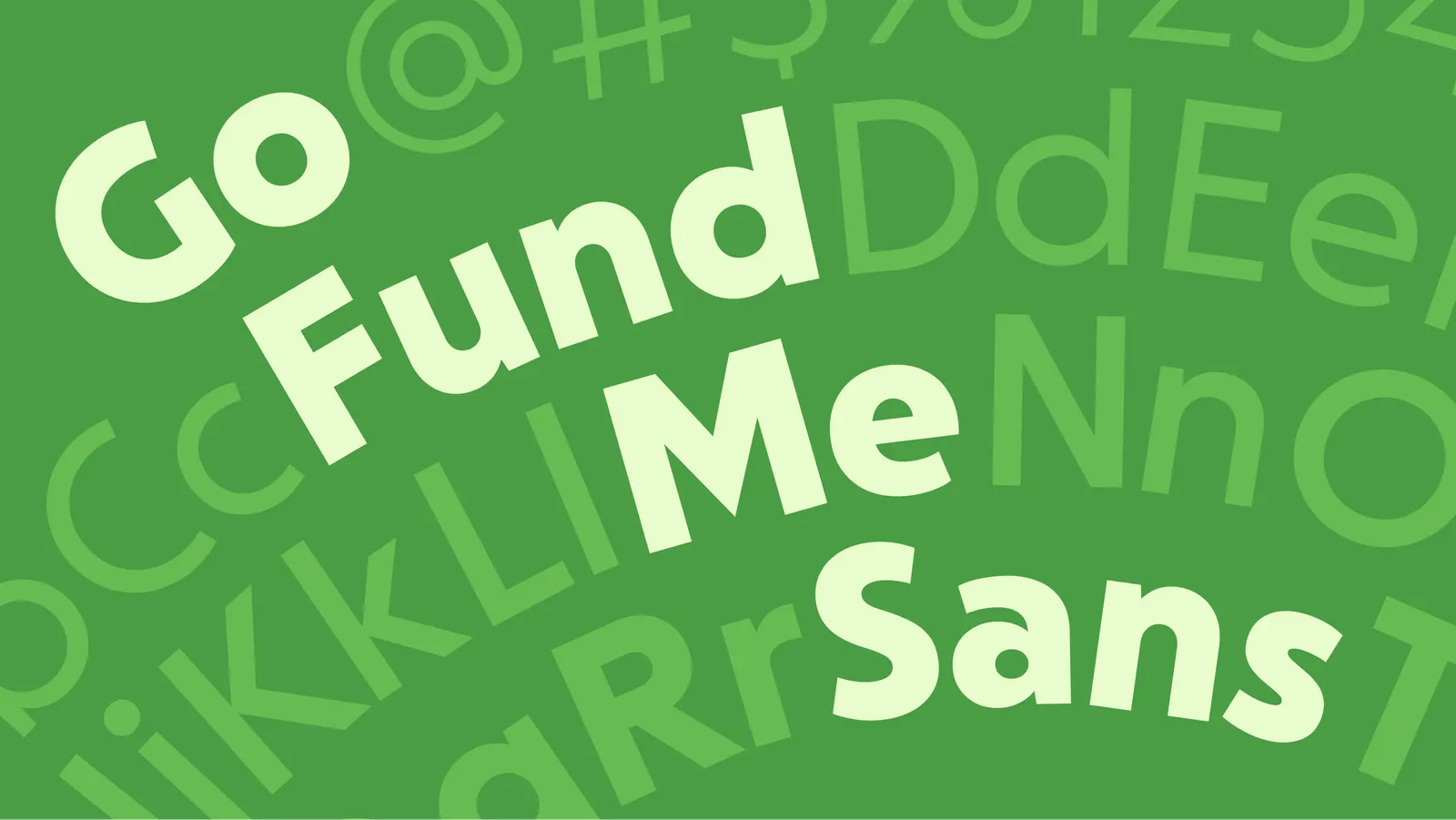
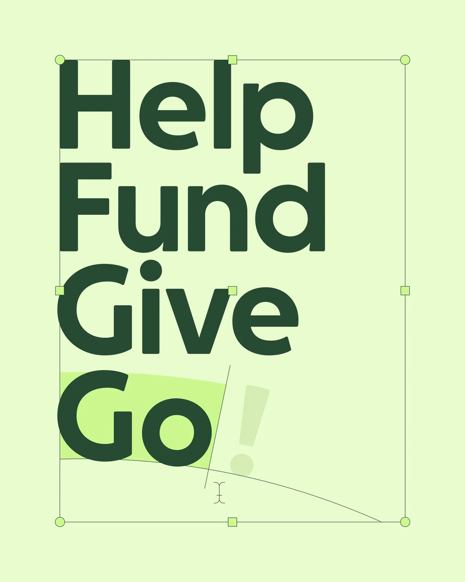
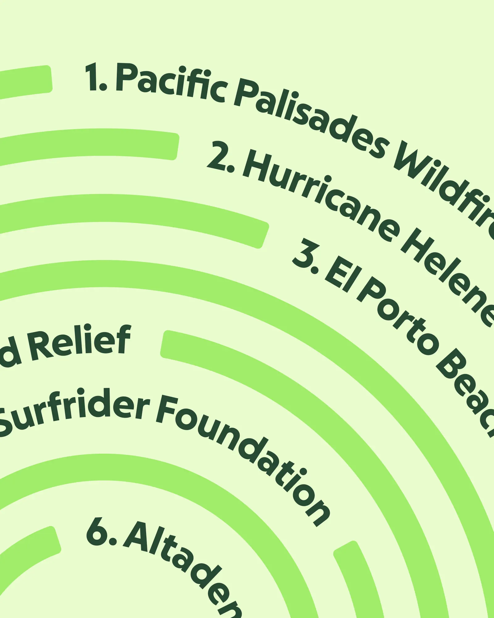
That arc does a lot of work. It scales up to introduce GoFundMe Pro, so the two offerings read as chapters of one story. Working with Lift Type and Romain Oudin on design and typography, Koto pushed the geometry into radial type and fingerprint-like patterns, then built it into goal tracking, donation flows, and campaign pages, where progress shows up as small, repeated moments rather than a campaign-level gesture.
Why it works
Building on the goal bar is the smartest decision here. It's the one device every donor and fundraiser already understands, so the update feels like growth rather than replacement. A circle is also more versatile than a bar: it can sit in a logo, shape type, or become a pattern, and it suggests people gathering around a goal instead of one person's meter. The fingerprint motif keeps a platform of this scale personal, which helps it earn trust from institutions and individuals alike.
Logo
Typography
Applications
Images and video from koto.com, by Koto.