The Brand Monograph
AllTrails brand identity by Red Antler
↗Red Antler's work for AllTrails stands out because it makes a category known for summits and serious gear feel open to someone who just wants a walk after dinner.
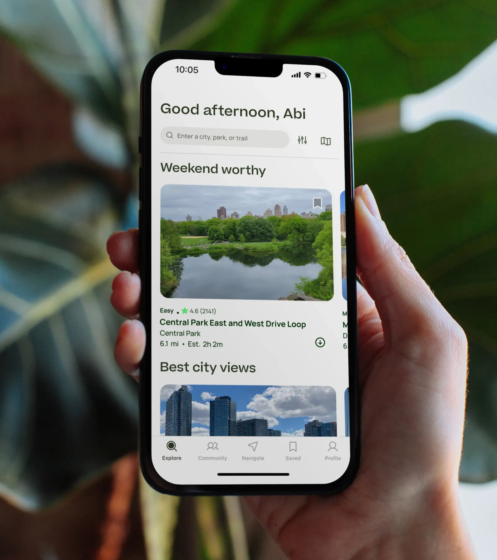
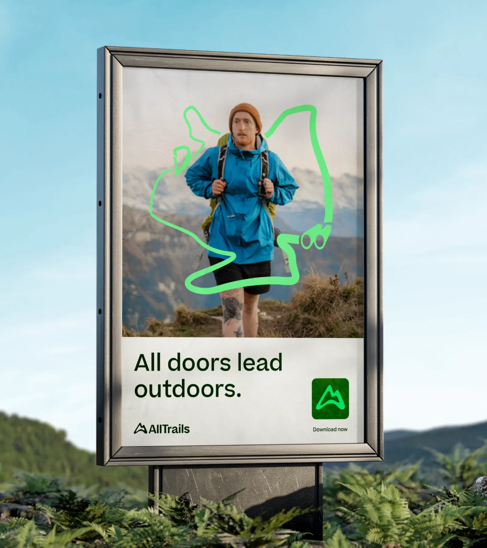
The studio evolved the identity for the community-built app, which people use to plan, record, and share their outings, so that it feels livelier and friendlier. At the center is a path, used as a framing device that can hold a story of any scale, from a mountain climb to a loop around the block. Inclusive imagery sits alongside it and shows a broader range of people outside than the genre usually does. Red Antler also lets the product's performance and capabilities come through in human, relatable stories.
Why it works
The path works because it's the one thing every outing shares, whether it ends at a summit or a park bench. It gives the brand a recognizable device that belongs to the product rather than to the peaks and sunsets most of the category leans on. Pairing it with imagery of everyday people tells newcomers they're the intended audience, while the emphasis on performance reassures seasoned hikers that the app is a serious tool. Being welcoming and capable at once is a hard balance, and this identity holds it.


Images and video from redantler.com, by Red Antler.