The Brand Monograph
Deezer brand identity by Koto
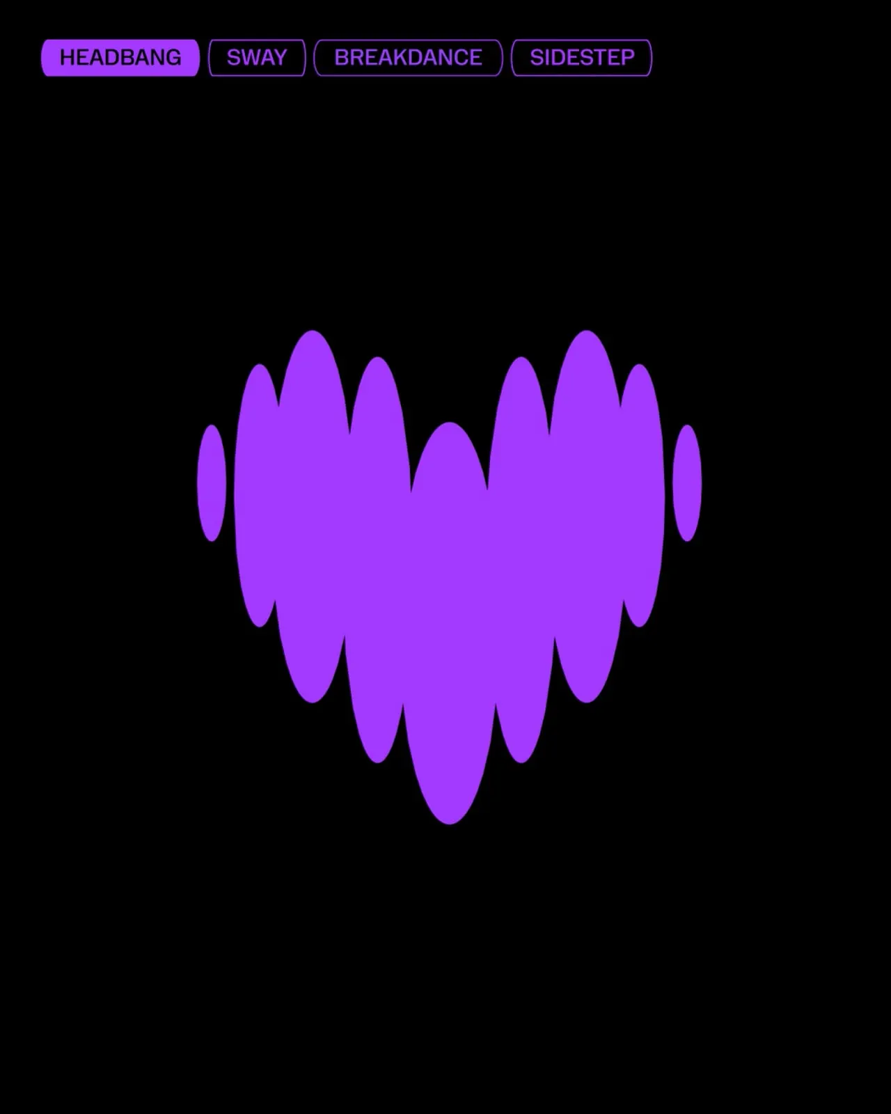
↗Deezer's new identity starts from a physical idea: music is felt before it is analyzed. Koto drew the logo from a heartbeat, then let that pulse set the rules for everything around it, which gives the brand a more human sound than most streaming services manage.
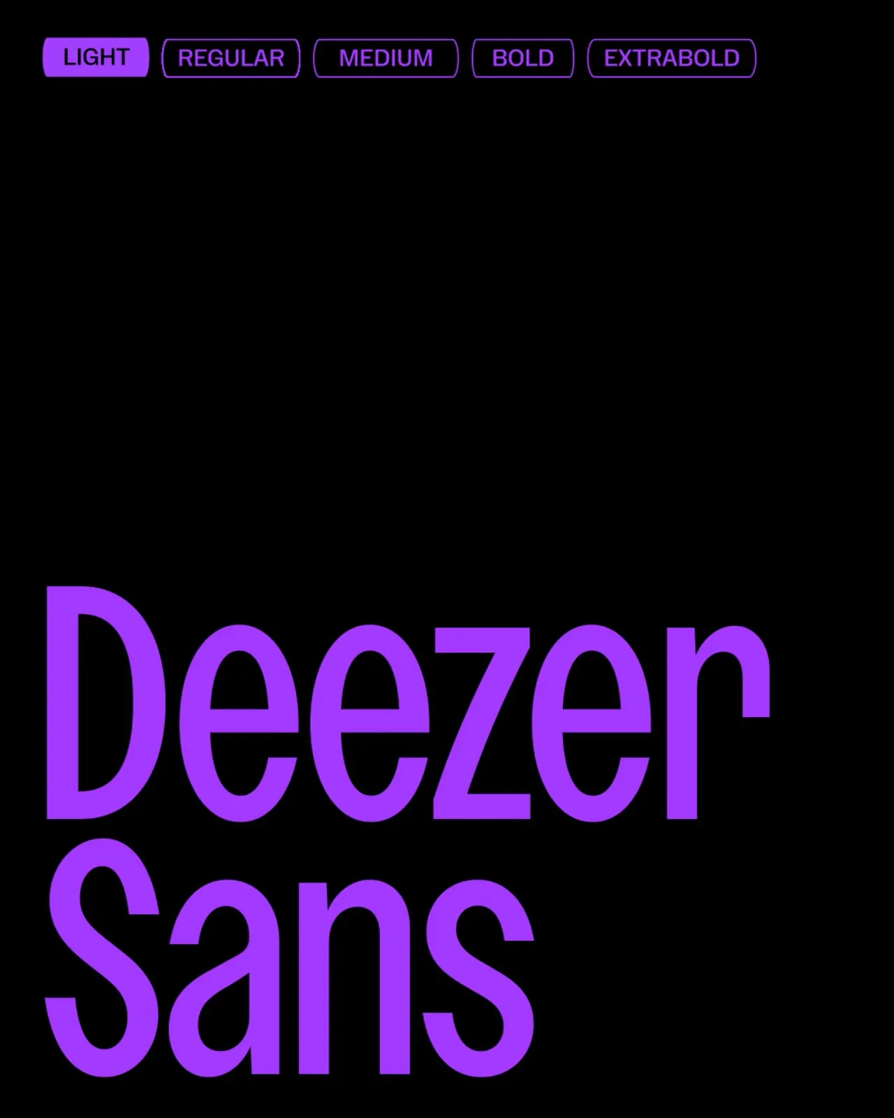
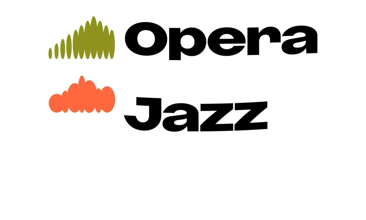
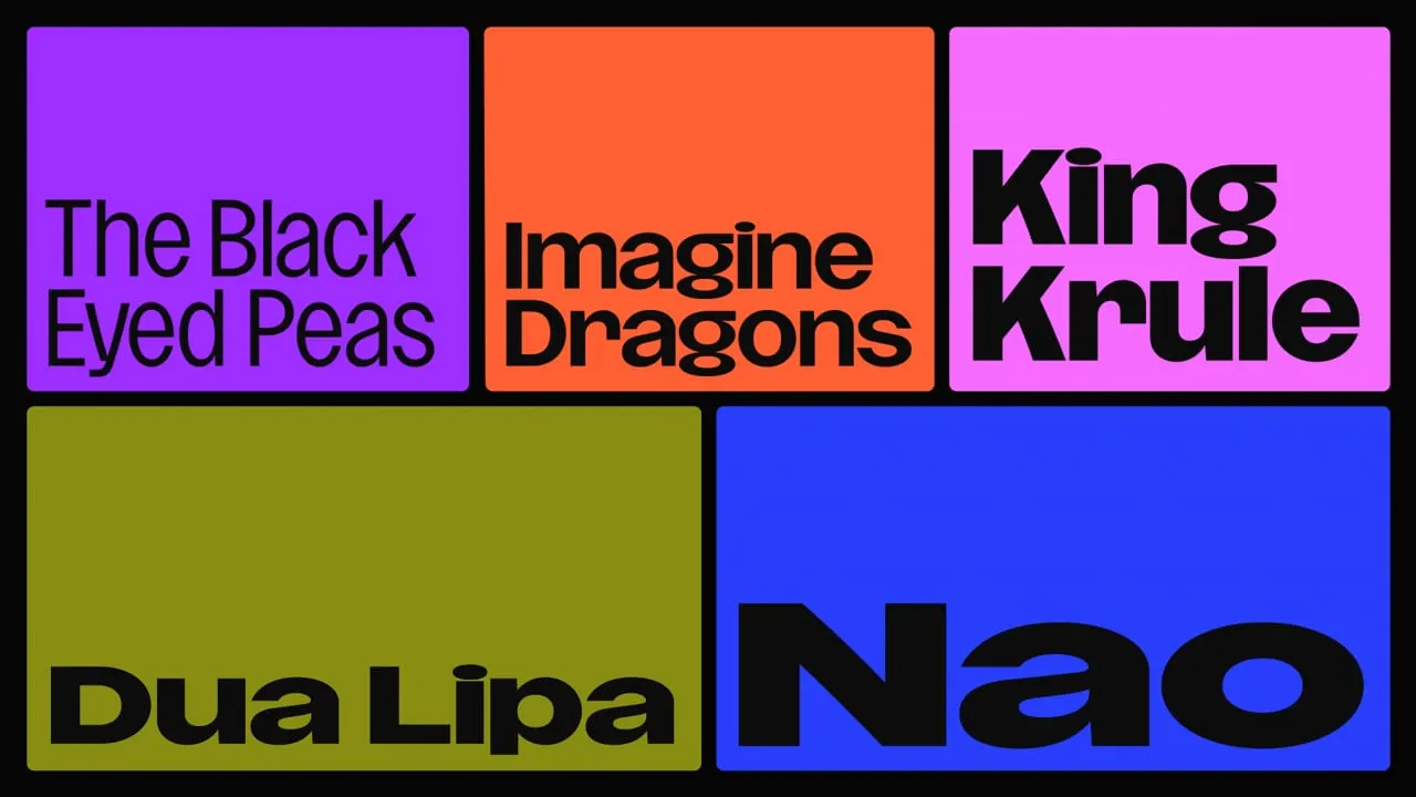
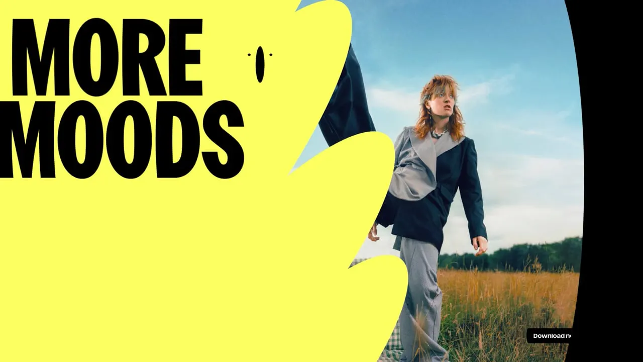
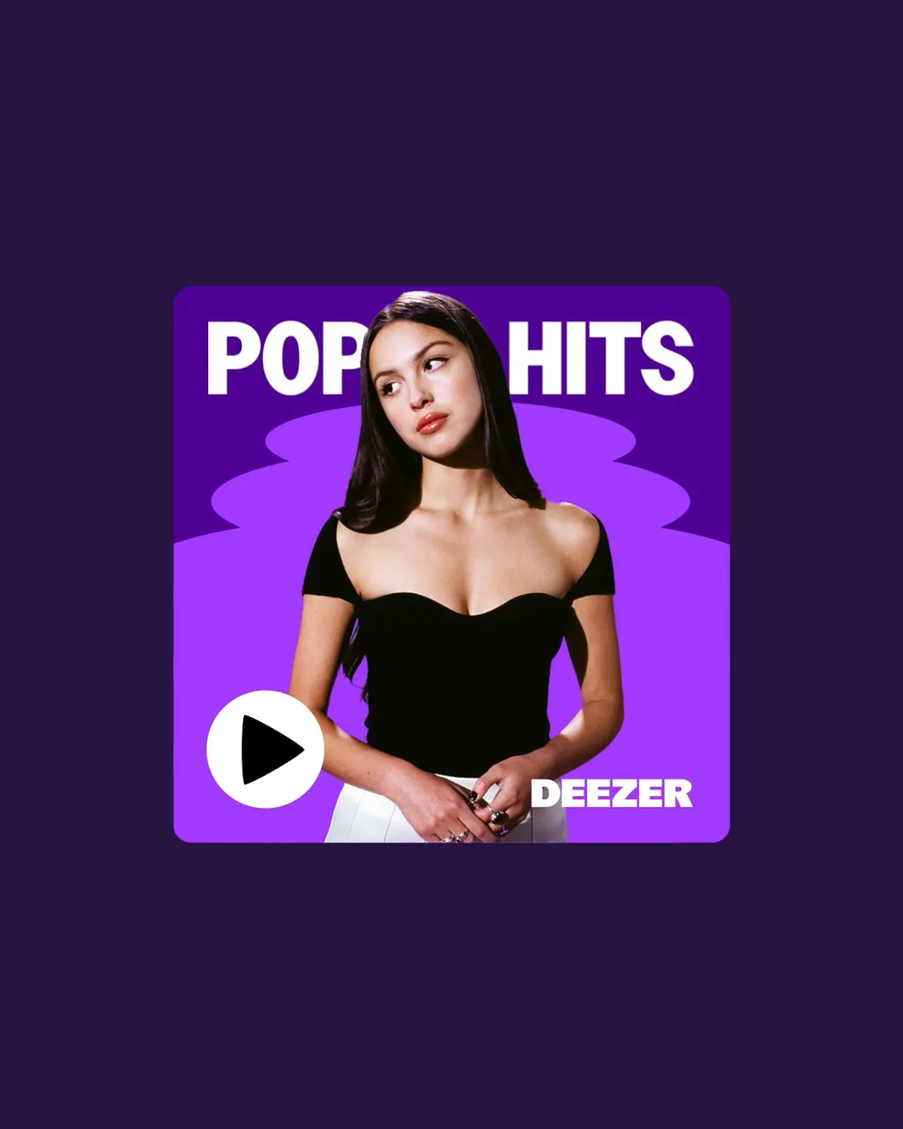
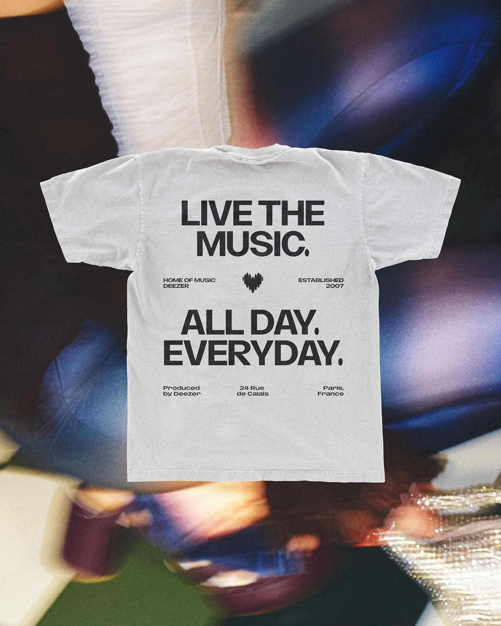
The brief was to make a service founded in 2007, with nearly 10 million paid subscribers, resonate with listeners just coming up in a crowded category. Koto's answer is a set of adaptable beats that stretch, repeat, and stack into patterns, textures, and graphic elements. One simple unit can work on a phone screen, a social post, a playlist cover, or a live event stage. The system launched alongside an enhanced mobile app and web experience and carries into partnerships, with NaN type foundry handling the typography.
Why it works
A heart is an easy symbol to get wrong, but here it is tied to rhythm, which makes it feel native to music rather than borrowed from greeting cards. The beat is a strong choice for the system: a single, simple module gives Koto consistency without forcing every application to look the same. That matters for an audience that expresses itself through taste. Working with a type foundry also suggests the lettering was treated as part of the brand's voice, not an afterthought.


Images and video from koto.com, by Koto.