The Brand Monograph
Supergoop! Campaign brand identity by Red Antler
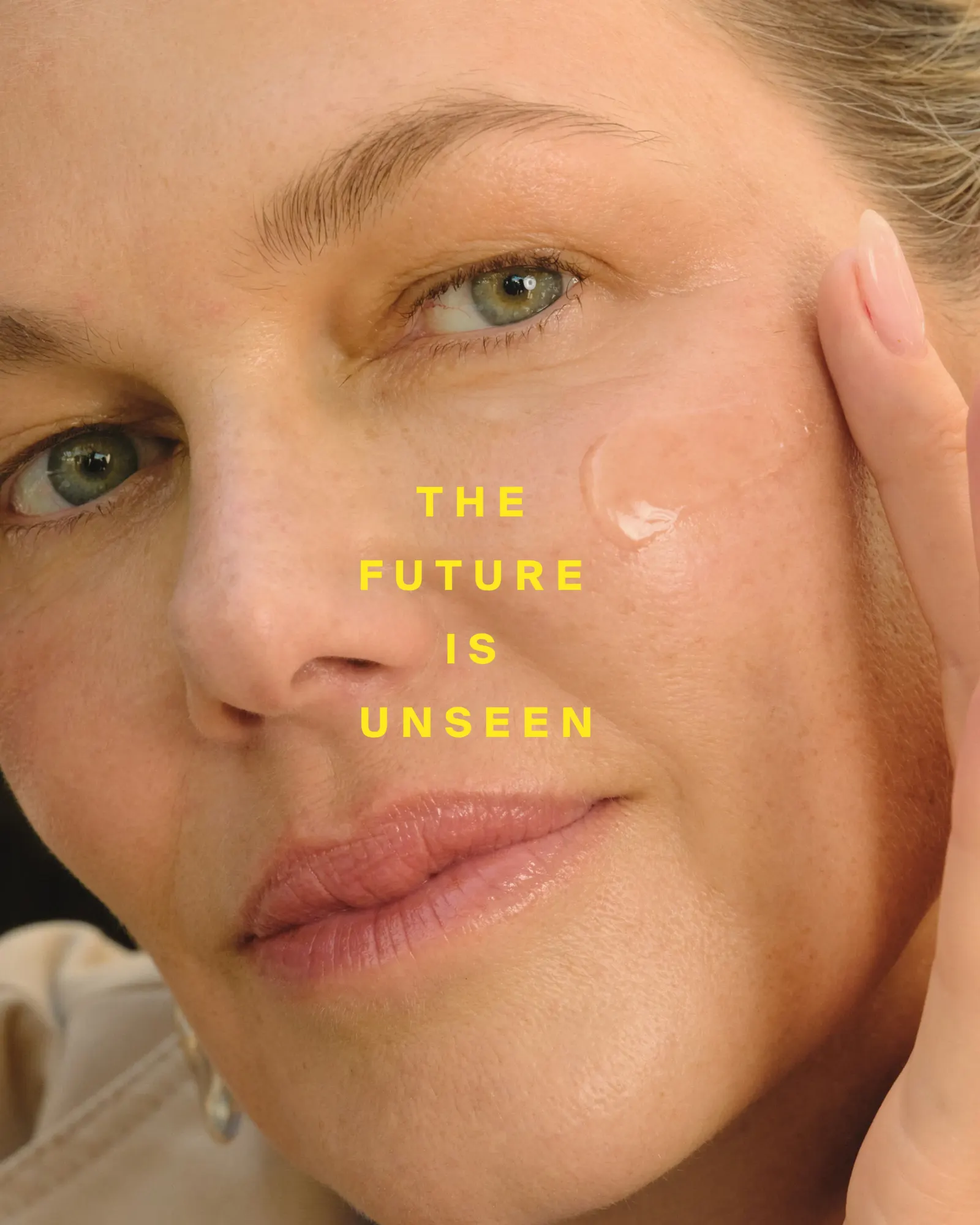
↗Red Antler's campaign for Supergoop! stands out because it sells a sunscreen by talking about what shoppers won't notice. Made for the brand's arrival at Target, the work had to speak to a far broader audience than the Sephora regulars who already loved it, many of them carrying old memories of sticky, greasy, irritating SPF.
The studio built the idea around the hero product, Unseen Sunscreen, and let its name set the rules. Copy dismisses the old complaints with a family of "un-" words, while vibrant, optimistic art direction fills in the positive picture. Alena Schiappacasse worked with Red Antler on production, bringing the concept to market as a confident claim about where the category is headed.
Why it works
The smartest move is that the product name is already a negation, so the campaign needs no invented device. A single prefix becomes a system that can stretch across headlines and placements. It also divides the labor cleanly: language removes the annoyances, while color and imagery add energy. That pairing makes sunscreen feel less like a chore and more like a treat, which suits shoppers who need convincing. On a crowded Target shelf, a name-led idea like this reads quickly and is hard to confuse with anything else.
Applications
Logo

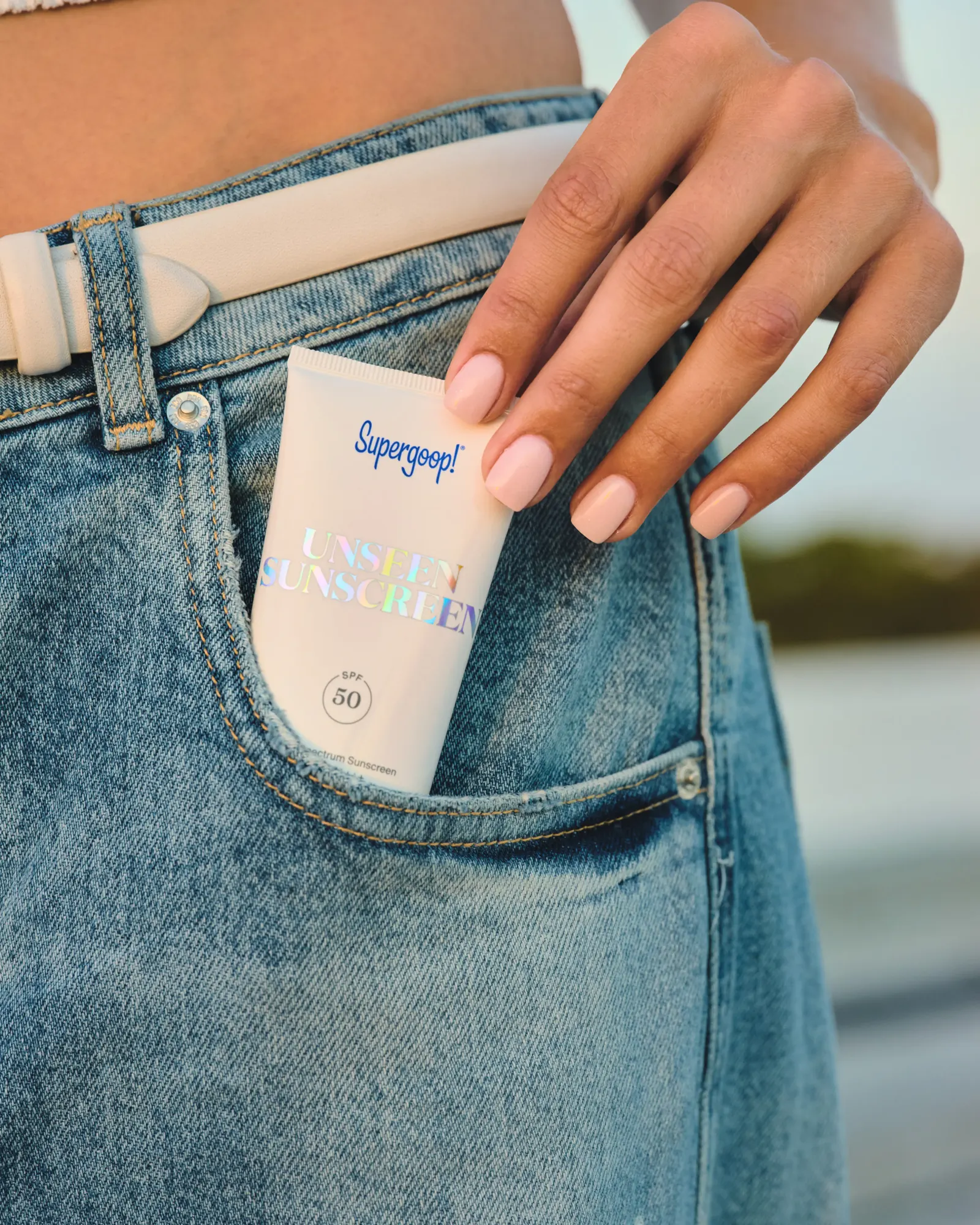

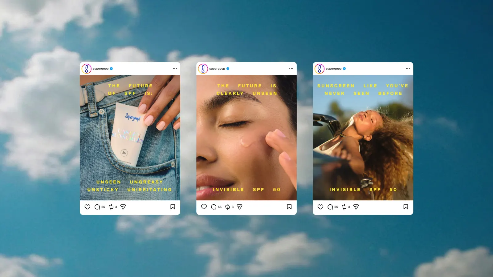
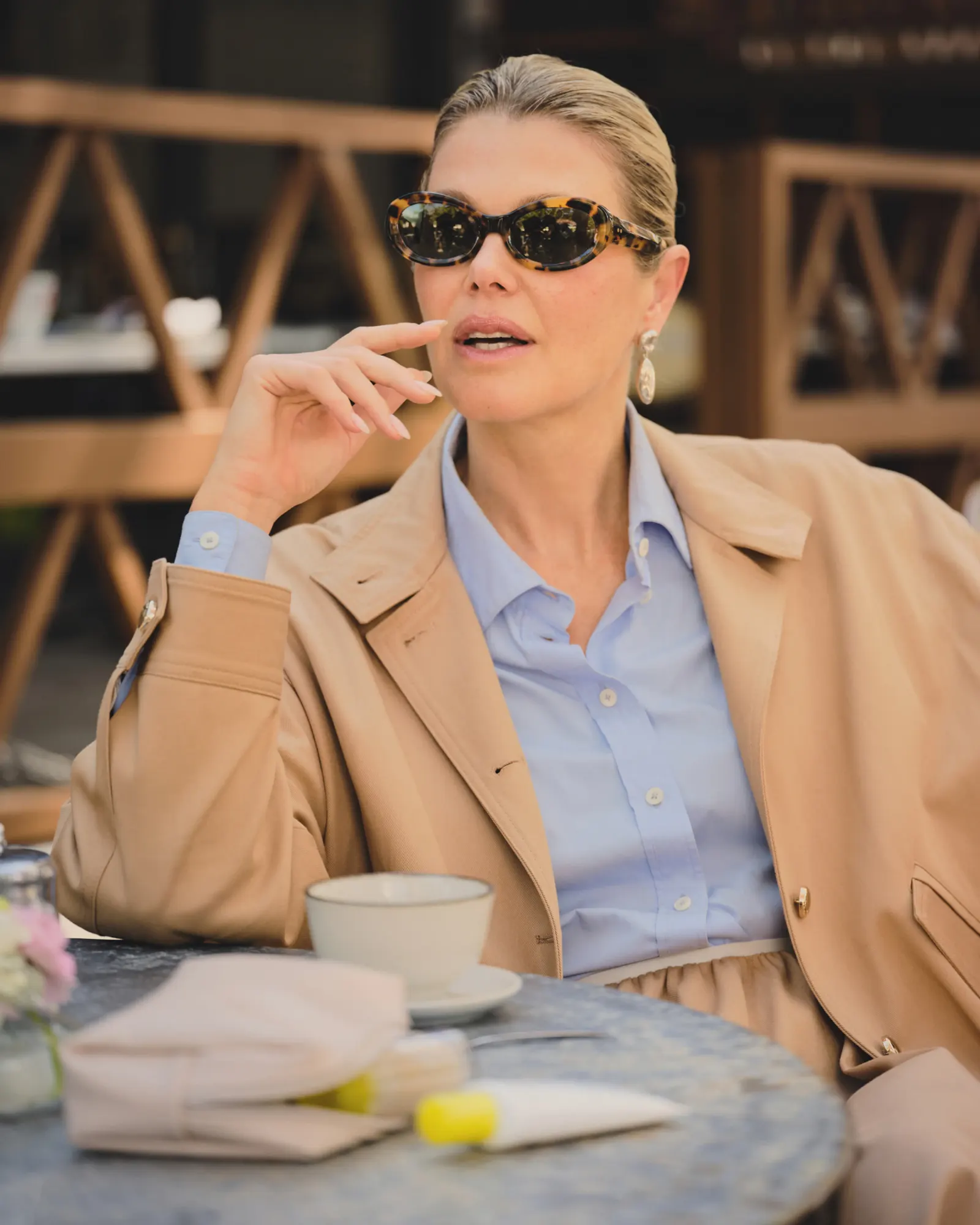
Images and video from redantler.com, by Red Antler.