 The Brand Monograph
Castelfalfi brand identity by Base Design
↗Few brand projects cover as much ground as Castelfalfi, literally. The Tuscan estate spans 2,700 acres and already works like a small town, with a village, a church, a golf course, vineyards, olive groves, and homes for sale. When its new owners wanted to move it from four stars to five, Base Design treated the job as far more than a logo refresh.
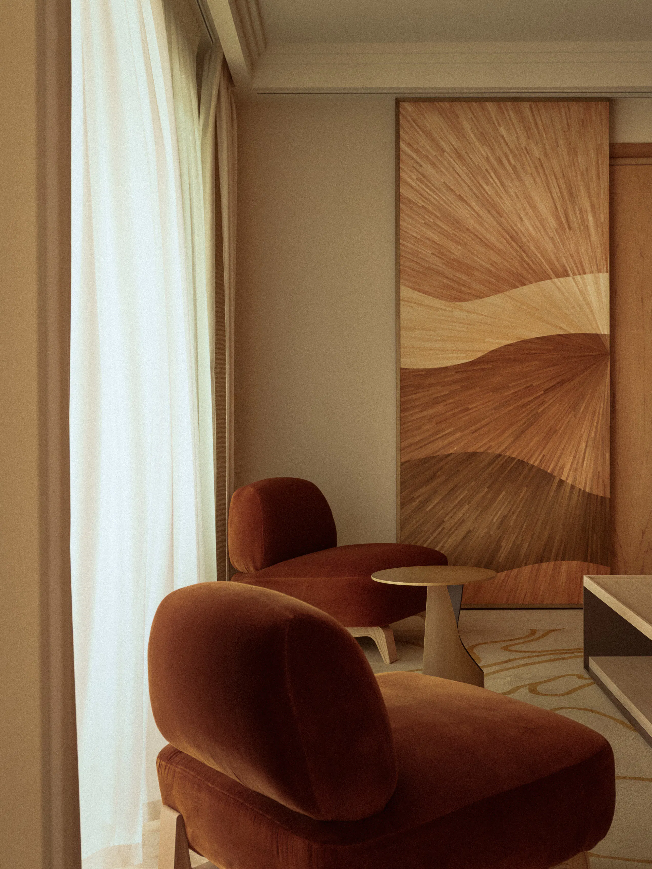
The studio built a system that runs from art direction through to how the place is experienced, including staff training, art curation, and a set of visual codes. The details reward a closer look: a custom-drawn logotype inspired by 15th century Florentine stone engraving, and a horse emblem that blends Pegasus with an ancient Etruscan bronze. A handwritten-inspired typeface gives the estate's wine and olive oil a more personal voice. Jeanne Viviès, Léa Wolf, and Sander Vermeulen handled design, with Christine Van Wassenhove on illustration and Antoine Barras on motion.
Why it works
The identity gets its luxury from sources that belong to the place. Lettering based on carved stone feels permanent, and it avoids the cypress-and-sunset imagery that Tuscan hospitality often leans on. The horse draws on two local references, so it reads as a real emblem rather than a generic crest. The handwritten typeface adds warmth where the engraved logotype stays formal, which keeps the products approachable. Extending the system to staff and art matters most: five-star guests judge by how a place feels, and the studio designed for that.
Logo

Applications



Images and video from basedesign.com, by Base Design.


