 The Brand Monograph
Hanbury brand identity by Base Design
↗Few architecture firms let their logo behave like a material, but Hanbury's does. Base Design built the firm's new identity around a wordmark that physically extends, then carried that elasticity through custom typefaces, imagery that shifts with motion, and a website that responds as you move through it.
The brief arrived as Hanbury grew from 40 people to 160 across eight offices, under a new CEO and with a reputation still tied to higher education. Working with strategist John Hearn, Base Design set out to show a way of working rather than sell a product. Typographer Matthieu Cortat and motion designer Mirko Mammarella shaped the visual language, and BaseDGTL built the site on Craft CMS and Next.js. Visitors move through a stream of cards, choose between classic and experience modes, and search with Algolia, while three.js drives the animation.
Why it works
Stretching is a simple, physical gesture, and it gives Hanbury something most architecture firms lack: a mark that demonstrates flexibility instead of claiming it. Custom type also helps it stand apart in a category full of neutral sans serifs and quiet wordmarks. The two site modes show good judgment about audience. Classic mode serves clients and candidates who want answers quickly, while experience mode gives the motion work room to impress the people Hanbury hopes to recruit.
Logo

Applications


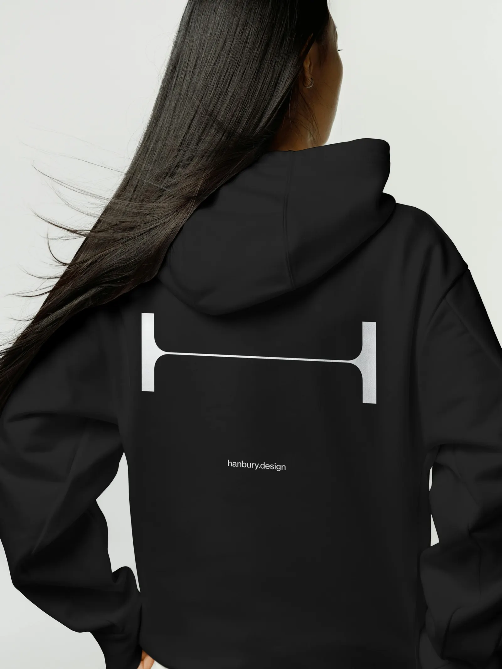
Images and video from basedesign.com, by Base Design.


