 The Brand Monograph
Deezer brand identity by Base Design
↗Deezer's identity stands out because it solves a category problem with a sentence rather than a gimmick. Streaming services offer much the same catalog, so Base Design set out to make Deezer feel personal instead of just big. The studio built the brand around a simple template: the listener brings a situation, and Deezer answers with the right music.
The craft is in how far that template travels. Base Design, with designers Aurélia de Azambuja, Delphine Volkaert, Sander Vermeulen, and Thomas Leon, assembled a kit of typefaces, icons, colors, and shapes that works like a pictorial language. It is applied the same way in the app, in print, and in advertising. The tone of voice is playful and made to flex by market, which matters for a French company with listeners in 180 countries.
Why it works
The fixed structure is the smartest choice here. Only the moment changes, so any team in any market can write new lines without the voice drifting. Icons and shapes carry meaning without translation, which suits a global audience, and the playful copy gives the brand warmth in a category that can feel like a utility. Because the app and the advertising share one visual language, people meet the same personality wherever they encounter Deezer.
Applications
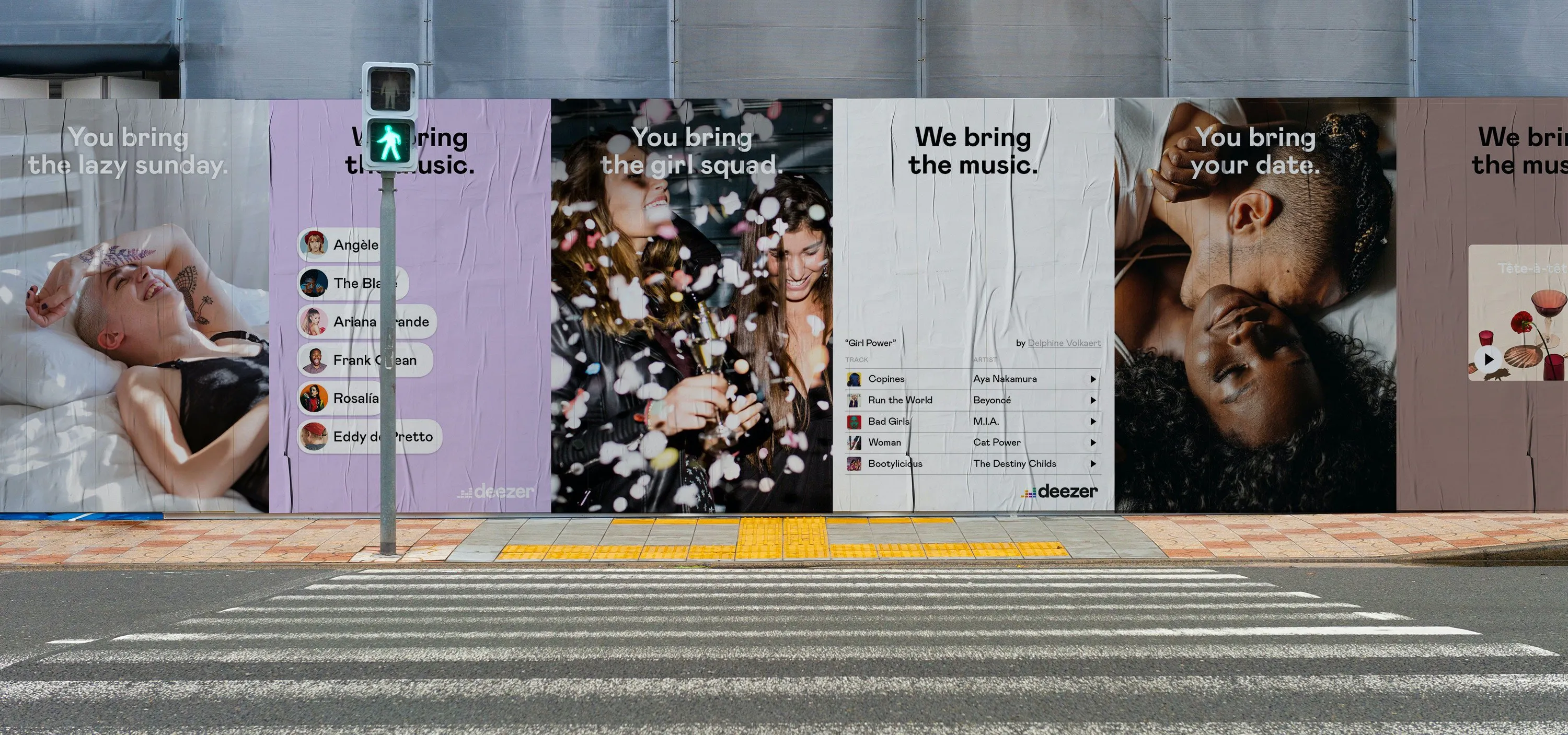


Images and video from basedesign.com, by Base Design.


