The Brand Monograph
Chubb brand identity by Collins
↗Most merger rebrands are really about retiring a name. Collins faced something harder with Chubb: after ACE Group's $28B acquisition, two companies with little in common had to become one, under the name of the older partner. ACE, founded in 1985, was a Swiss-born, tech-driven specialist in complex risk. Chubb, American and dating to 1882, was best known for how it treated clients when something went wrong.
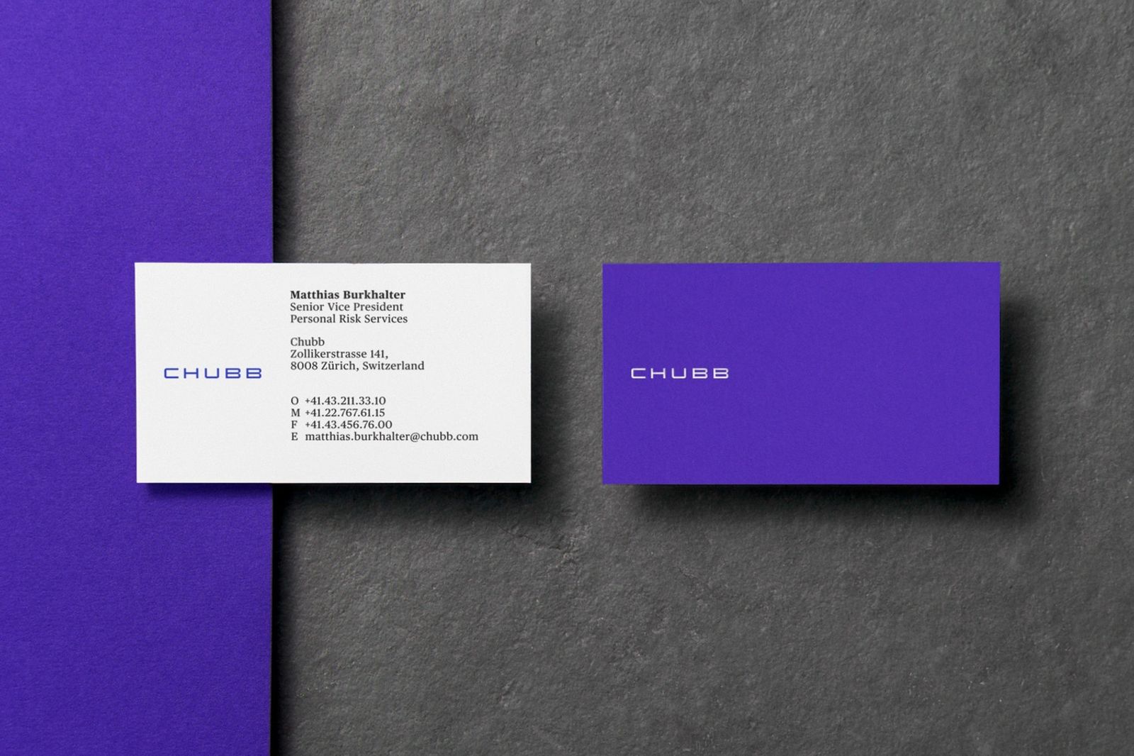
CEO Evan Greenberg brought in Collins to bridge the two. After interviewing stakeholders and assessing both cultures, the studio landed on craftsmanship as the shared value and shaped a central idea Greenberg could keep returning to as the integration unfolded. The visual identity carries that idea through a deliberately simple logo and a palette of vibrant colors that change across the system. Fictive Kin handled development, with Eskimo and Pure Production also contributing.
Why it works
The restraint is the smart part. Insurance is a low-interest category where people meet a brand mostly at stressful moments, so a simple mark reads as calm and dependable, and it sits comfortably on everything from a policy document to a global campaign. The shifting color then supplies what the logo withholds: energy, recognition, and a way to signal the breadth of the business without cluttering the identity. Together they make Chubb look confident and approachable in a field that rarely tries to be either.
Logo
Applications



Images and video from wearecollins.com, by Collins.