The Brand Monograph
Goalkeepers brand identity by Pentagram
↗Pentagram turned the tilt of the SDG wheel into a complete brand language for Goalkeepers, the Gates Foundation initiative that tracks global progress on the UN's Sustainable Development Goals. Over two years, the studio redrew the word mark in Commercial Type's Giorgio Sans, adjusted the wheel symbol, and built a family of lock-ups, including a monogram, for print, screen, and outdoor use.
The same 10.6-degree slant cuts through layouts, image crops, and graphic details. Pentagram backed it with guidelines, templates that range from sober research reports to lively social posts, and a motion toolkit for title cards and lower thirds. Giorgia Lupi and the data team developed a chart style that runs through the 2022 report website, where 18 indicators get the same treatment as the rest of the brand.
Why it works
Taking the angle from the SDG wheel gives Goalkeepers something ownable that still points back to the goals it serves. Institutions in this space often default to earnest photography and globe imagery, so a single sharp diagonal reads as confident and forward-leaning, a fitting signal for an initiative about measuring progress. Because the rule is simple, partners can apply it consistently, and the saturated palette keeps data-heavy material from feeling like another gray policy report.
Logo

Typography

Applications


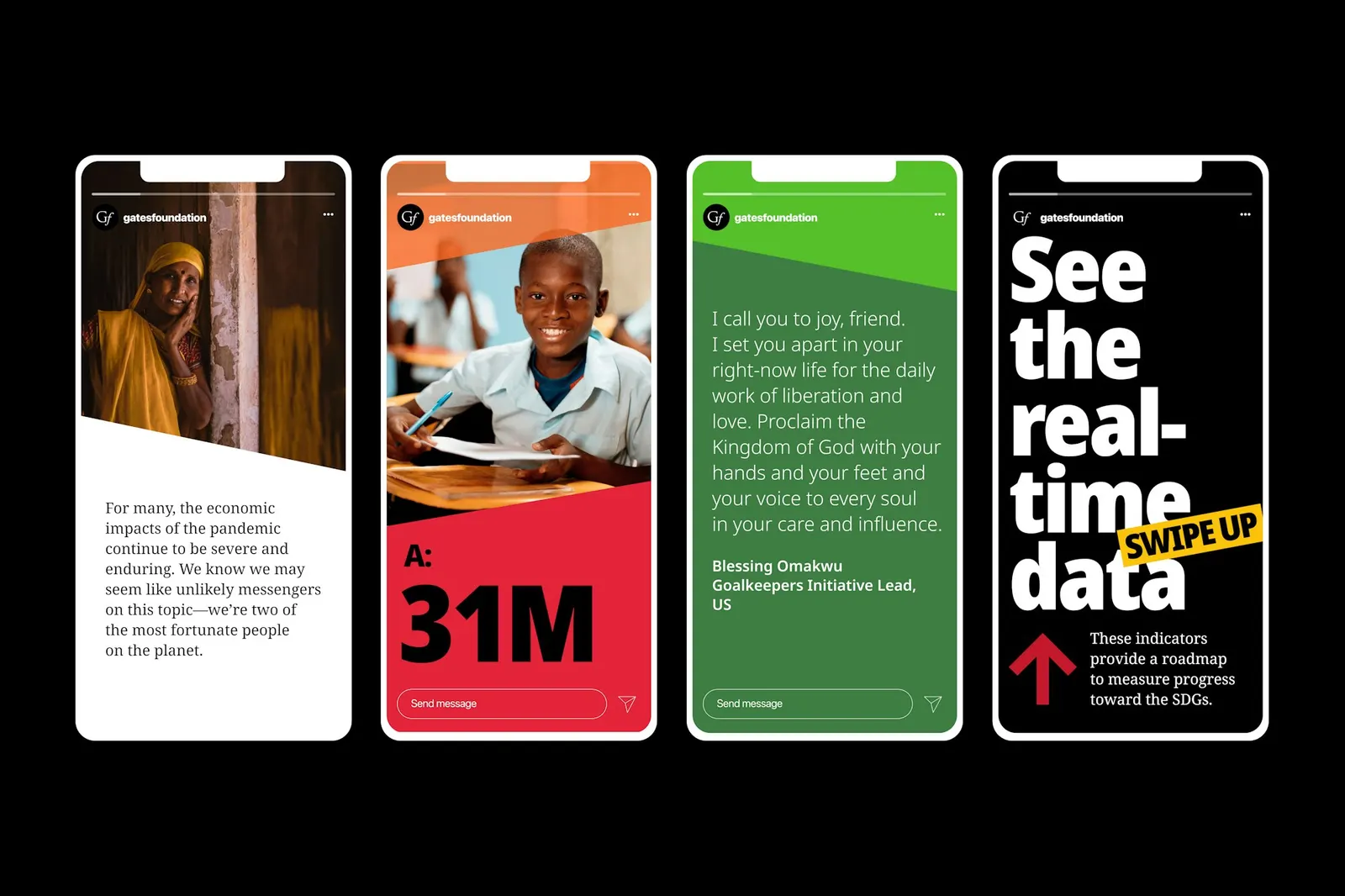
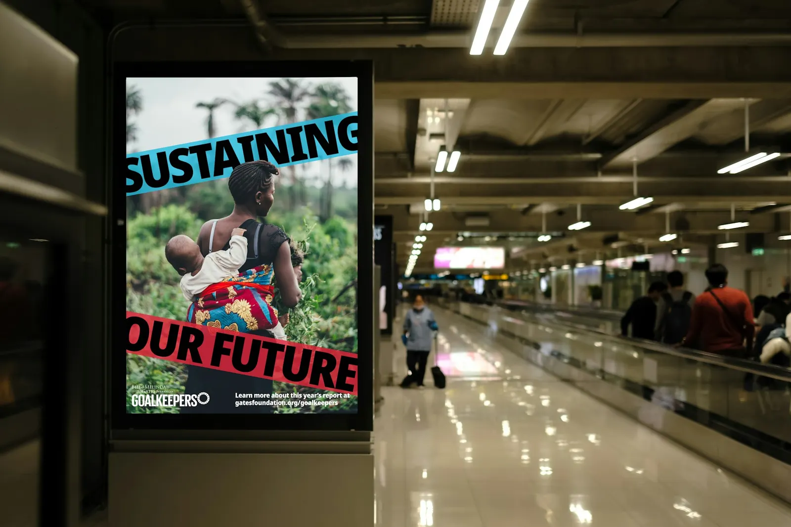
Images and video from pentagram.com, by Pentagram.