The Brand Monograph
Scenario brand identity by Pentagram
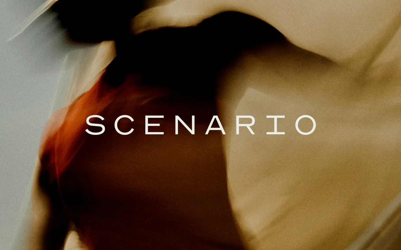
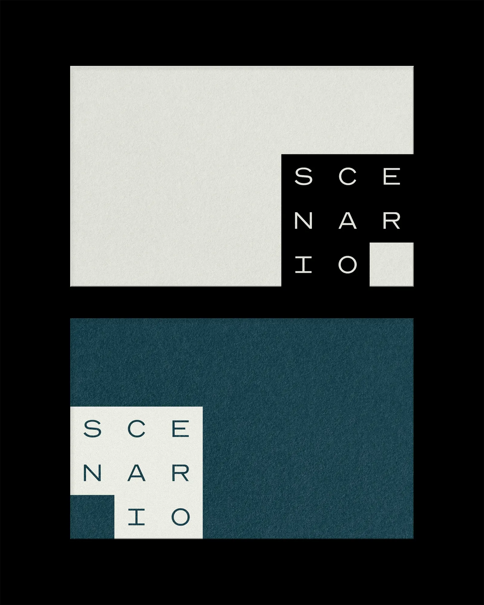
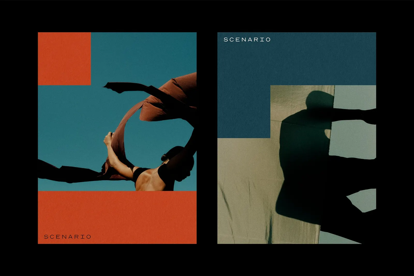
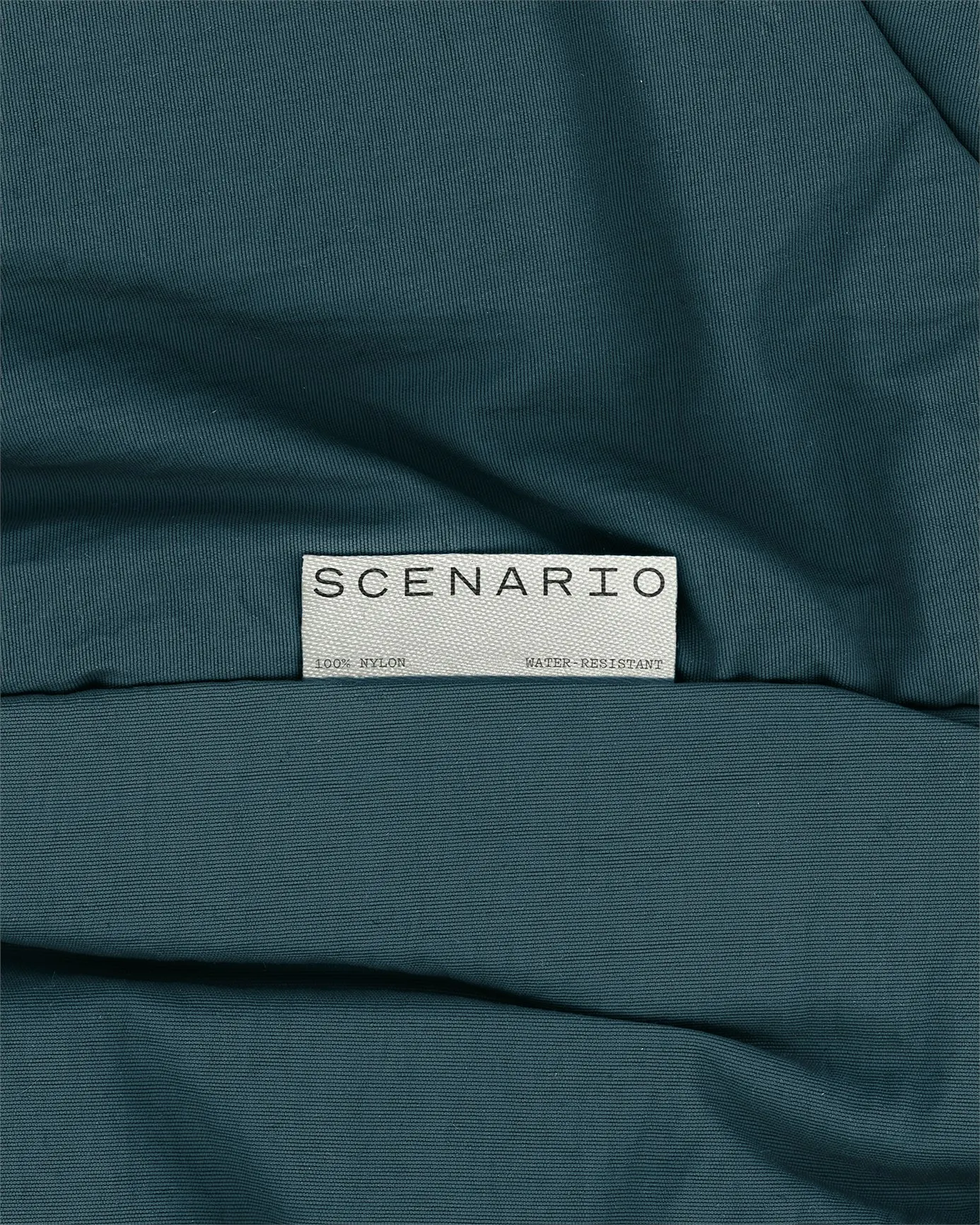
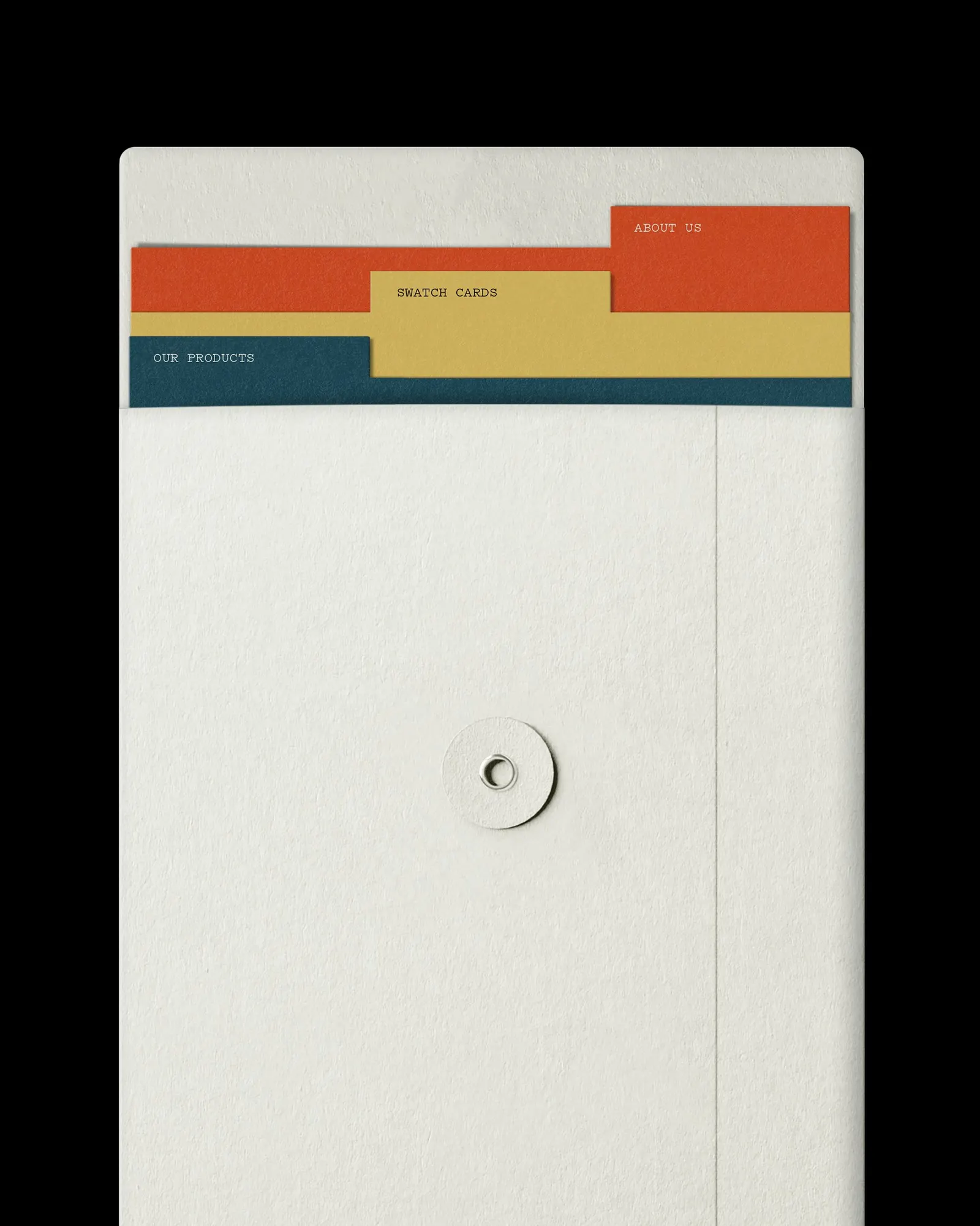
↗Pentagram gave SCENARIO an identity built from one repeatable unit: a nine-cell grid. The custom wordmark sits inside it as the logo, and the same grid returns as colored blocks that frame photography across print and digital. For a Keqiao textile maker that creates fabrics to order for each client, it is a simple structure with plenty of room to flex.
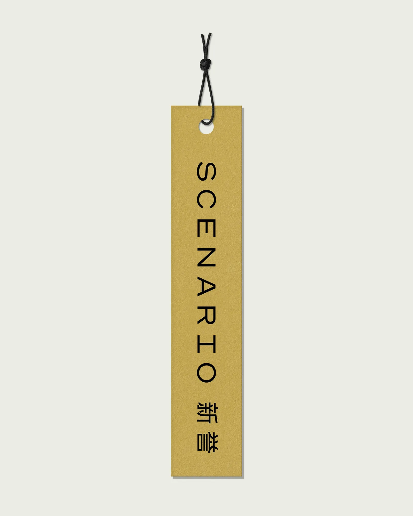
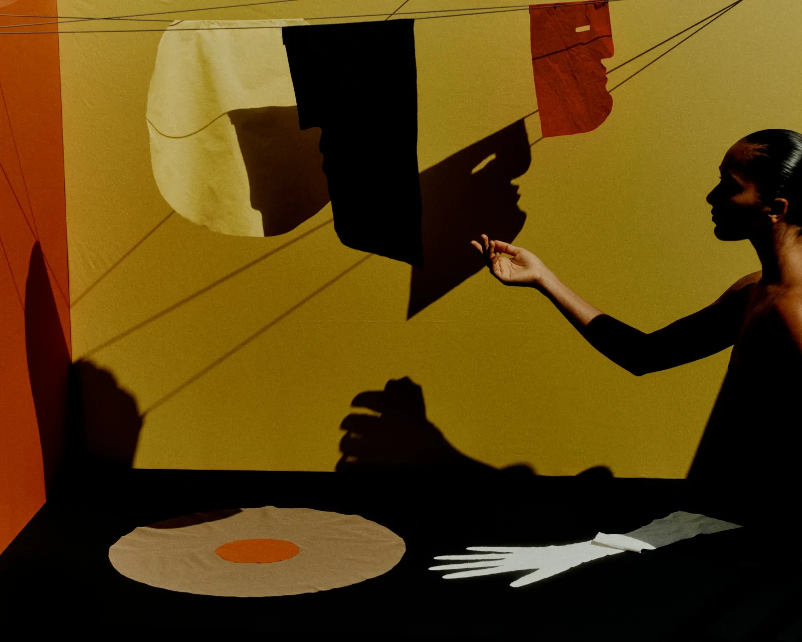
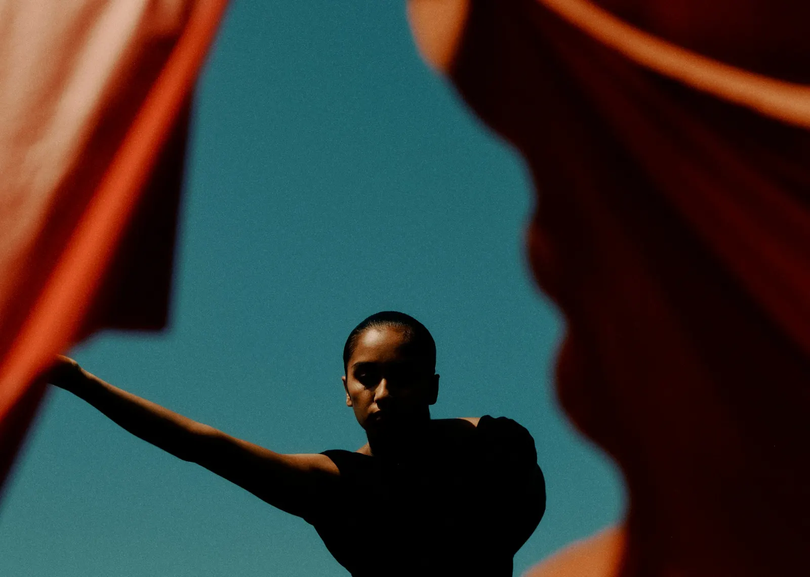
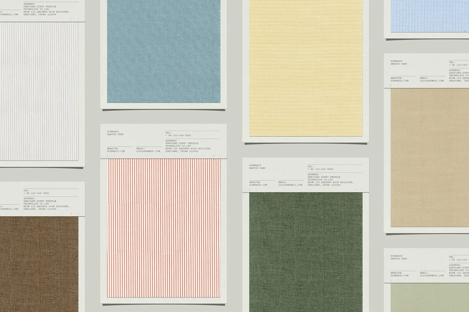
The typography gets equal care. Pentagram's designers, August Dine, Huiting Lian, Matt Willey, and Nick Marabella, drew Chinese characters to match the Latin wordmark in weight and structure, then paired them with Noto Sans SC and Pitch for supporting text. The system carries into the swatch book and a website developed with Chris Corby, and photographer Jack Davison shot the brand's first product imagery.
Why it works
A grid is a natural fit for a company that sells cloth. It echoes the logic of woven thread and the tidy layout of a swatch book, so the identity feels tied to the product rather than applied over it. Because the blocks frame photographs instead of competing with them, the fabrics stay the focus. The matched Chinese and Latin lettering gives clients who read either language equal standing. The structure is strict enough to be recognized instantly, yet its colors and images can change without the brand losing its shape.
Applications
Images and video from pentagram.com, by Pentagram.