The Brand Monograph
Tenable brand identity by Jones Knowles Ritchie
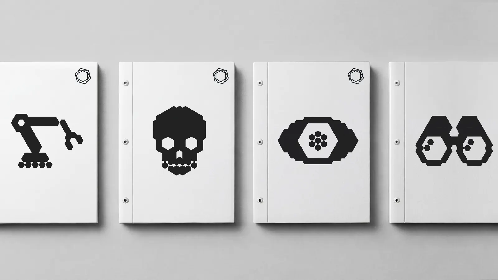
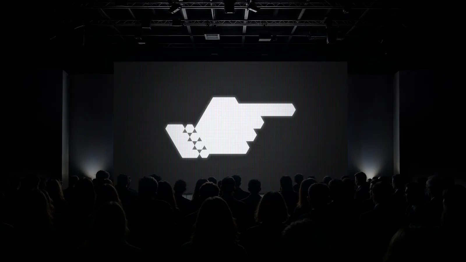
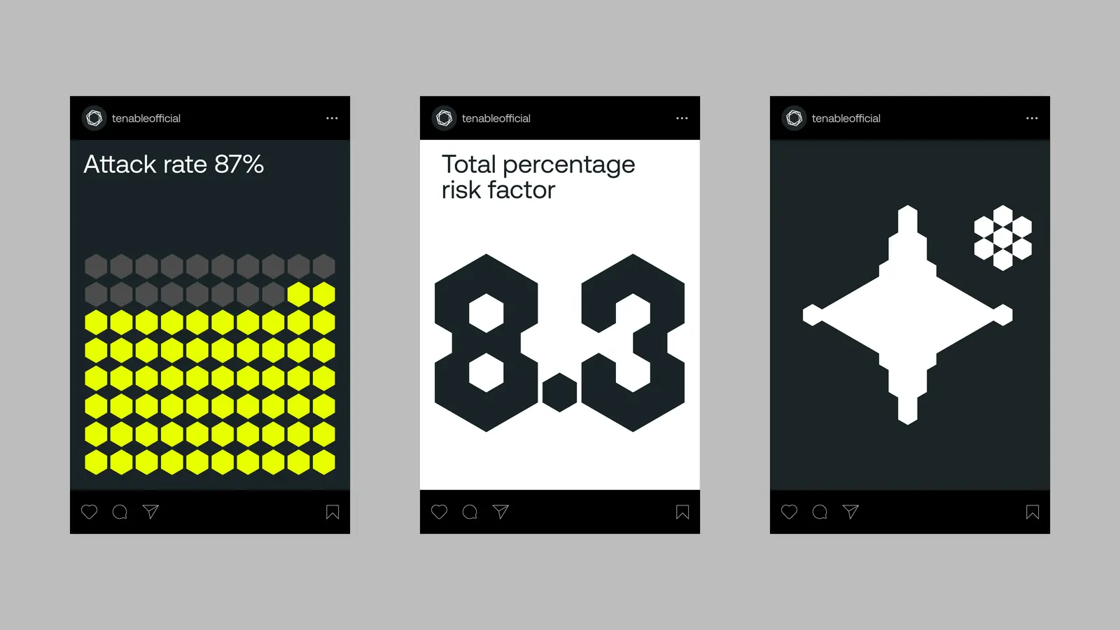
↗Jones Knowles Ritchie gave Tenable an identity built from a single shape, and it's rare to see a cybersecurity brand commit that fully. Every element is a cube placed on a hexagonal grid, and the studio allowed only three angles and three sizes.
The brief centered on Exposure Management, Tenable's approach to pulling views from separate security tools together for teams buried in alerts and working in silos. The studio built a system that behaves the way the product promises: loose pieces lock into order. Motion carries much of that idea. Anamorphic movement draws scattered forms into focus, so the brand demonstrates the benefit instead of just describing it.
Why it works
The category is crowded with shields, padlocks, and glowing network imagery, so a brand made of nothing but cubes stands apart immediately. The tight rules also suit the audience. Security professionals tend to trust precision, and a system with visible limits reads as rigorous. The cube works as a unit of data and a building block at once, while the hexagonal grid gives it an engineered feel. Limiting angles and sizes keeps the identity recognizable wherever it appears, and the motion shows what Tenable does for its customers.
Logo
Applications
Images and video from jkrglobal.com, by Jones Knowles Ritchie.