The Brand Monograph
MacroFactor brand identity by Pentagram
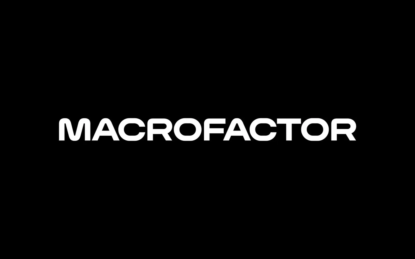
↗Most nutrition apps sell convenience or a lifestyle fantasy. Pentagram's identity for MacroFactor takes a more serious route, giving an algorithm-driven app a look that feels rigorous without going cold. At its center is MacroSans, a custom variable typeface developed with Reset Type Studio, whose range of weights and widths lets a single voice cover interface, editorial, and motion.
The app is made by scientists, coaches, and engineers for people who train seriously, and the studio's team, including designers Natasha Jen and Whitney Badge, built a system to match. A flexible "M" expands, contracts, and wraps around type and images, animated with motion designer Edgar Ferrer. More than 450 food icons were redrawn for the logging routine, and in-app illustrations, some of them funny, mark milestones. Photography with Jaison Lin keeps food plain and clear and gives workouts a sense of movement, with strategy from Eva Green and Kyle Barron-Cohen.
Why it works
The smartest decision is where the rigor is spent. Users spend most of their time in the logging flow, so redrawing every food icon puts the craft where the product is actually used and gives the data a consistent, readable vocabulary. The variable typeface and the moving "M" share the same logic of stretching to fit, which makes the brand feel like an extension of the app's adaptive algorithm rather than decoration on top of it. Humor in the illustrations keeps the discipline from turning severe, a tone that sets MacroFactor apart from both clinical trackers and glossy wellness apps.
Applications
Logo
Typography
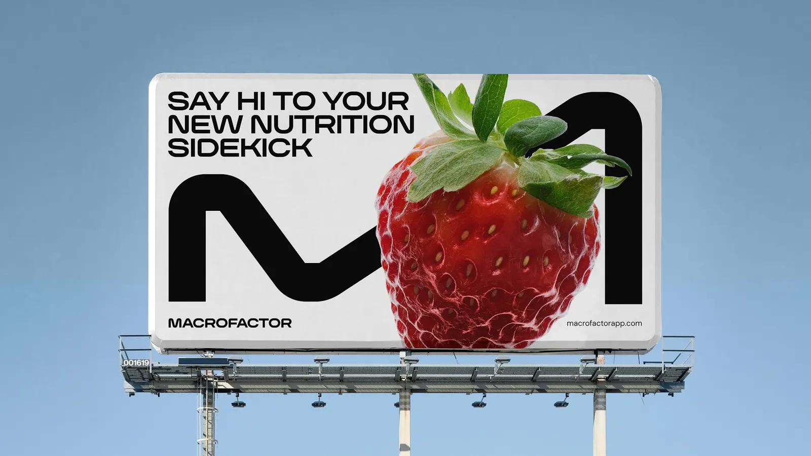

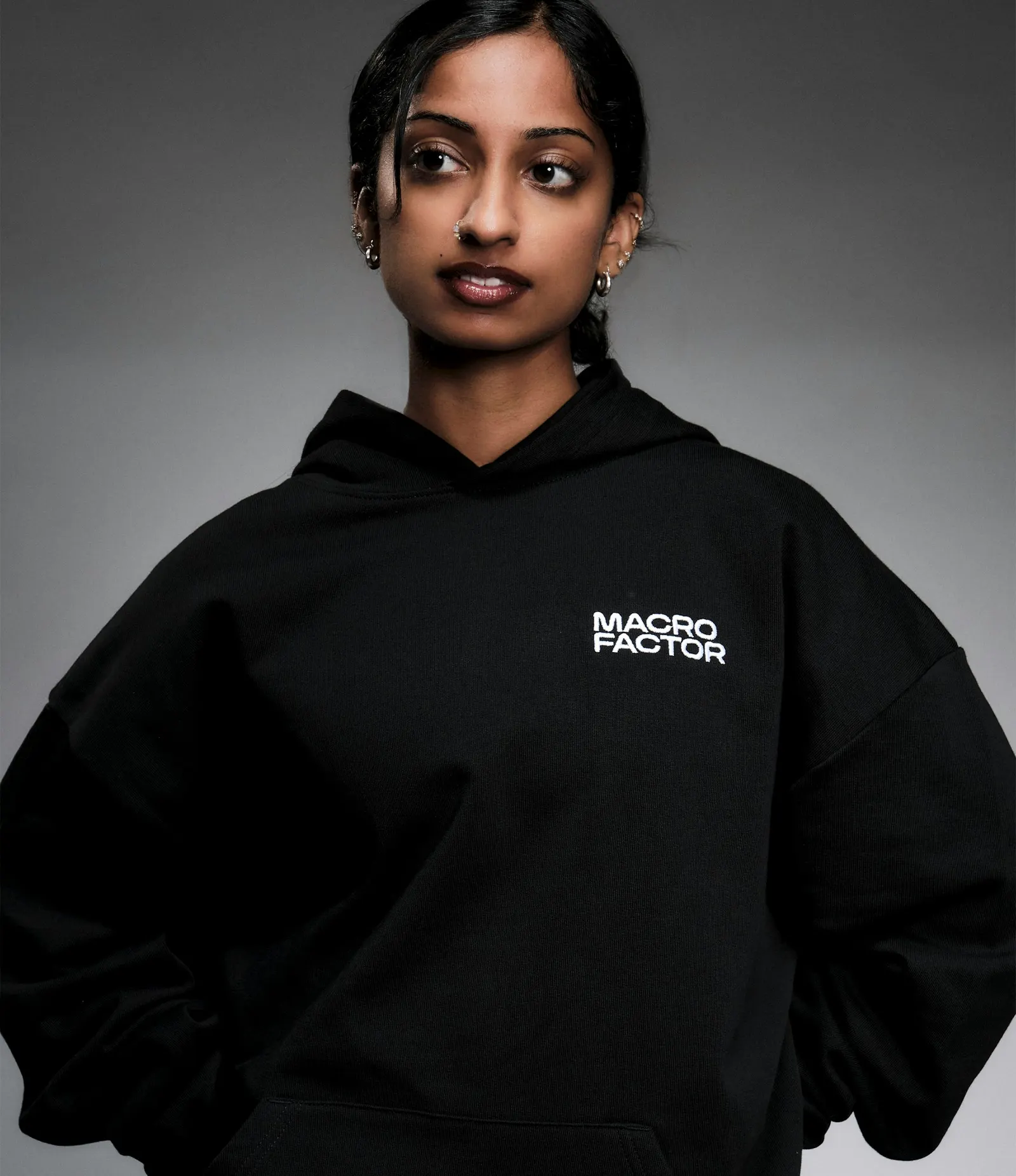
Images and video from pentagram.com, by Pentagram.