The Brand Monograph
W Hotels brand identity by Porto Rocha
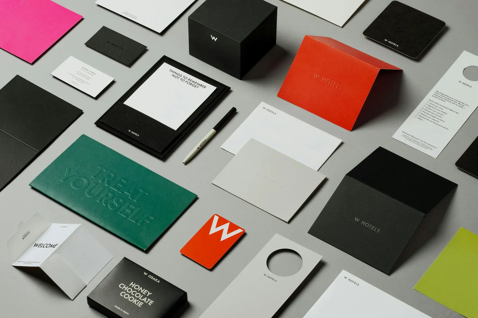
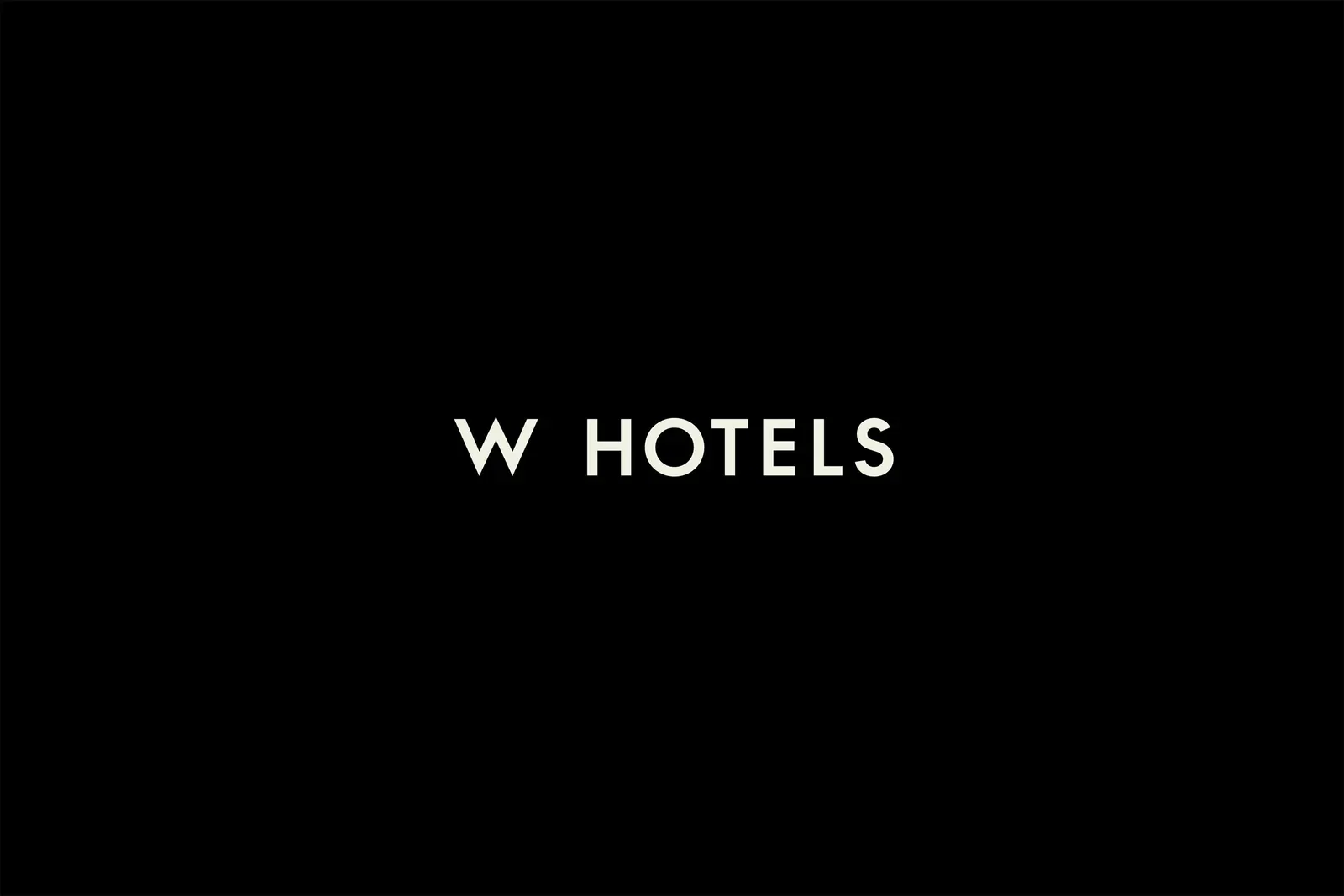
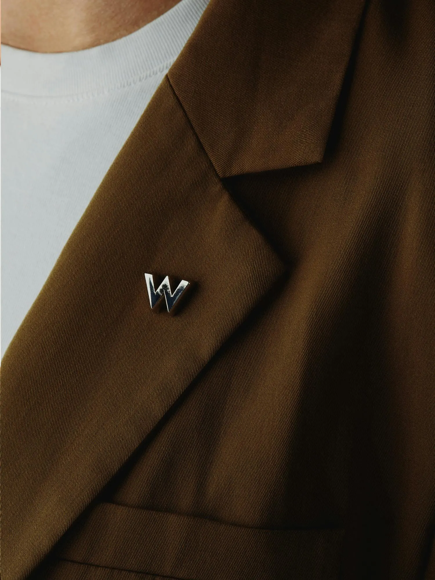
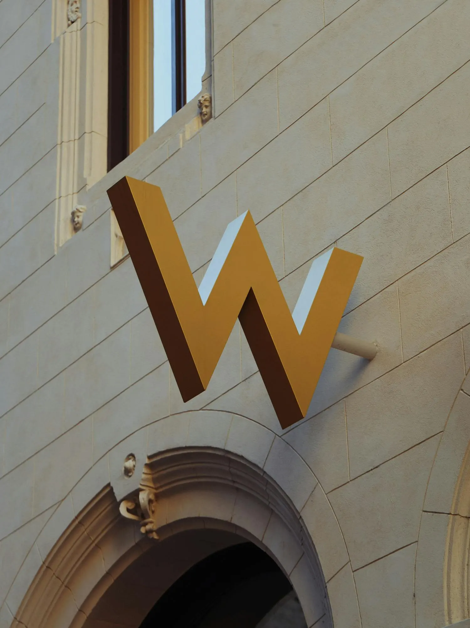
↗Porto Rocha's work for W Hotels shows how a loud brand can grow up without going quiet. W built its name in the 2010s on playful, colorful luxury for a creative crowd, but taste shifted toward restraint just as the company was scaling into a global portfolio of 65+ hotels. The studio kept the W symbol that crowns the buildings and rebuilt everything around it, folding the mark into a single wordmark in place of a stacked lockup with several typefaces.
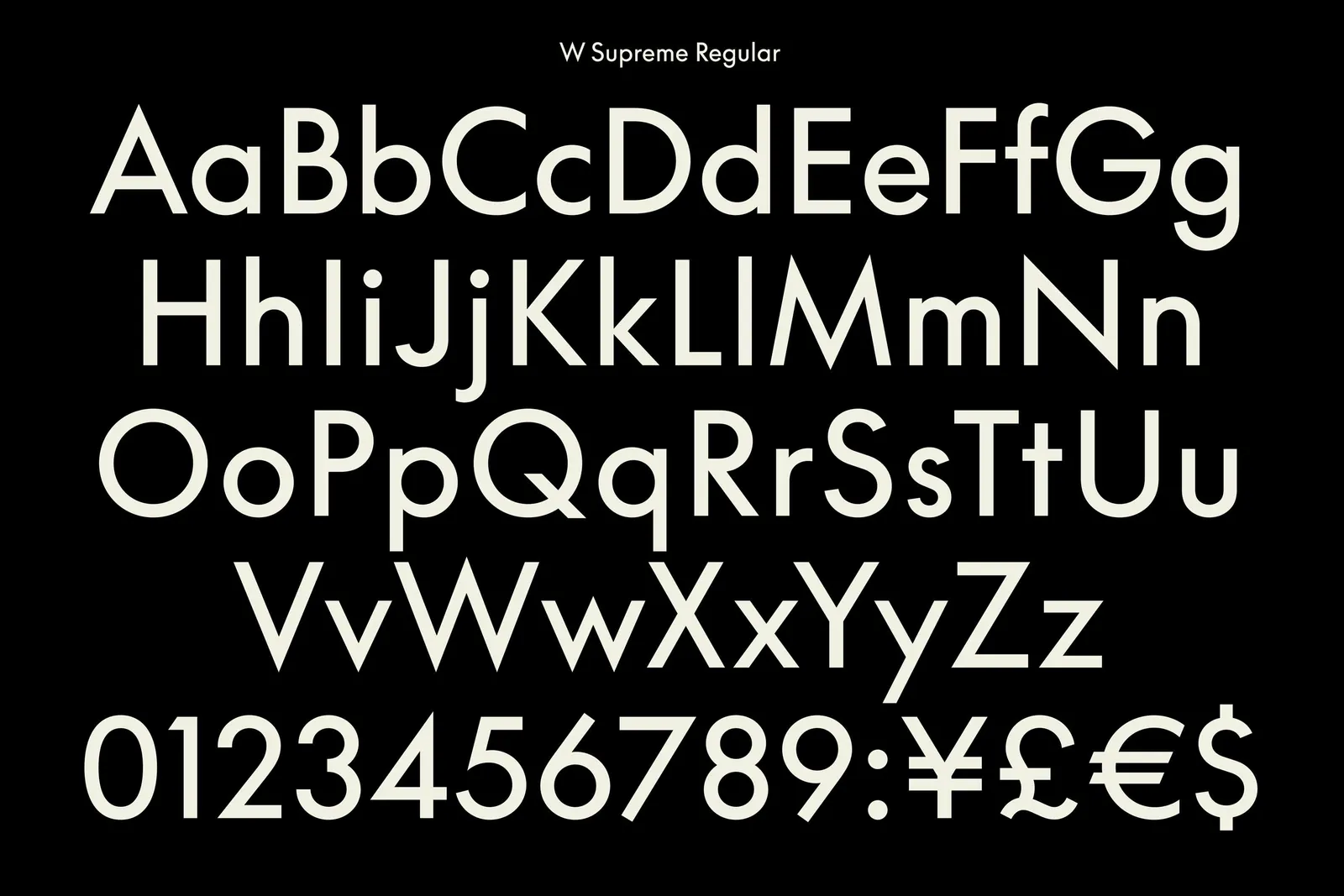
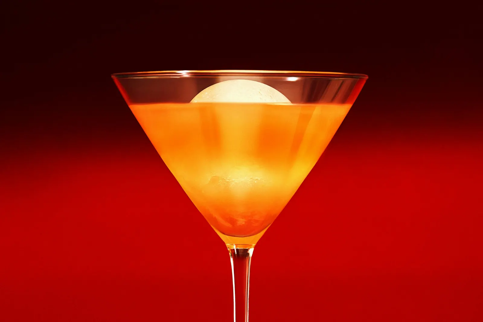
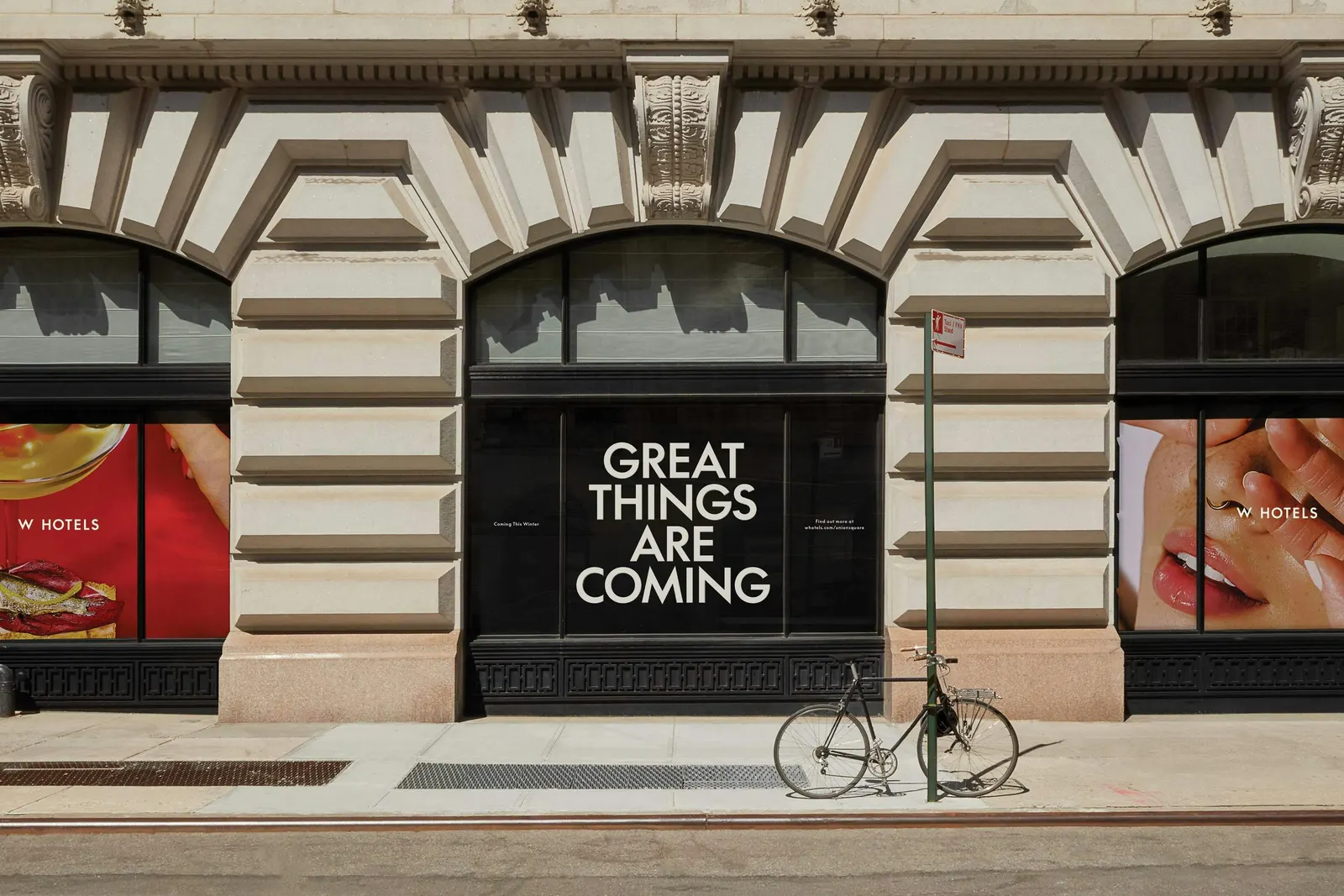
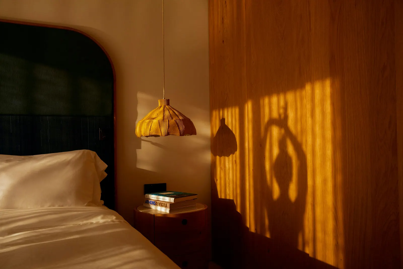
That wordmark became the starting point for W Supreme, a custom typeface developed with Lineto, with an Arabic script and Mandarin and Japanese alternates so the voice holds across markets. Neon gave way to a broader palette, with color pairings assigned to each location, while Sergiy Barchuk's still-life photography and Claren Walker's copy carry the campaign work. Inside the hotels, the system turns the volume down, favoring neutral tones and tactile materials.
Why it works
The smartest move is restraint in the right places. Keeping the W preserves the brand's most recognizable asset, while the single wordmark and the typeface drawn from it make every touchpoint feel related, which matters when properties range from resorts to urban hotels. Color is where the attitude survives. The palette is still unmistakably W, just more grown-up than neon, so it stands apart from the muted codes of much of the luxury category. Separating loud marketing from calm interiors also mirrors how guests actually meet a hotel: first as an invitation, then as a place to stay.
Applications
Logo
Typography

Images and video from portorocha.com, by Porto Rocha.