The Brand Monograph
Robinhood brand identity by Porto Rocha
↗Robinhood's new identity looks like a company that no longer needs to prove it belongs. PORTO ROCHA, working alongside the brand's in-house team, gave an app known for bringing trading to the masses the composure of a full wealth platform spanning stocks, crypto, and the Robinhood Gold subscription.
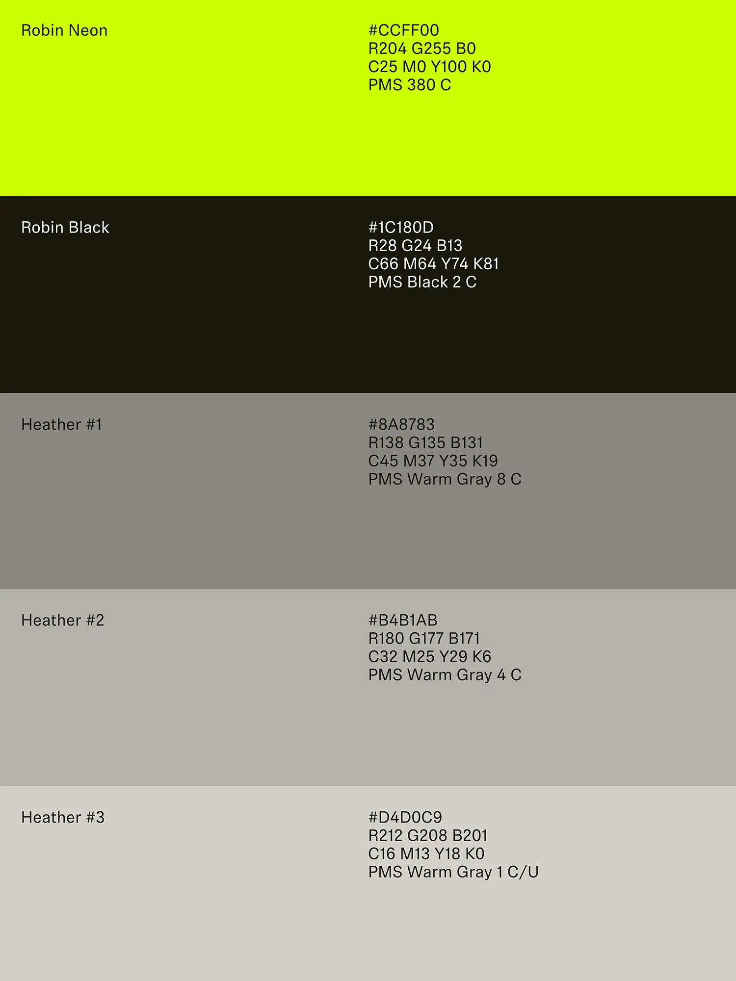
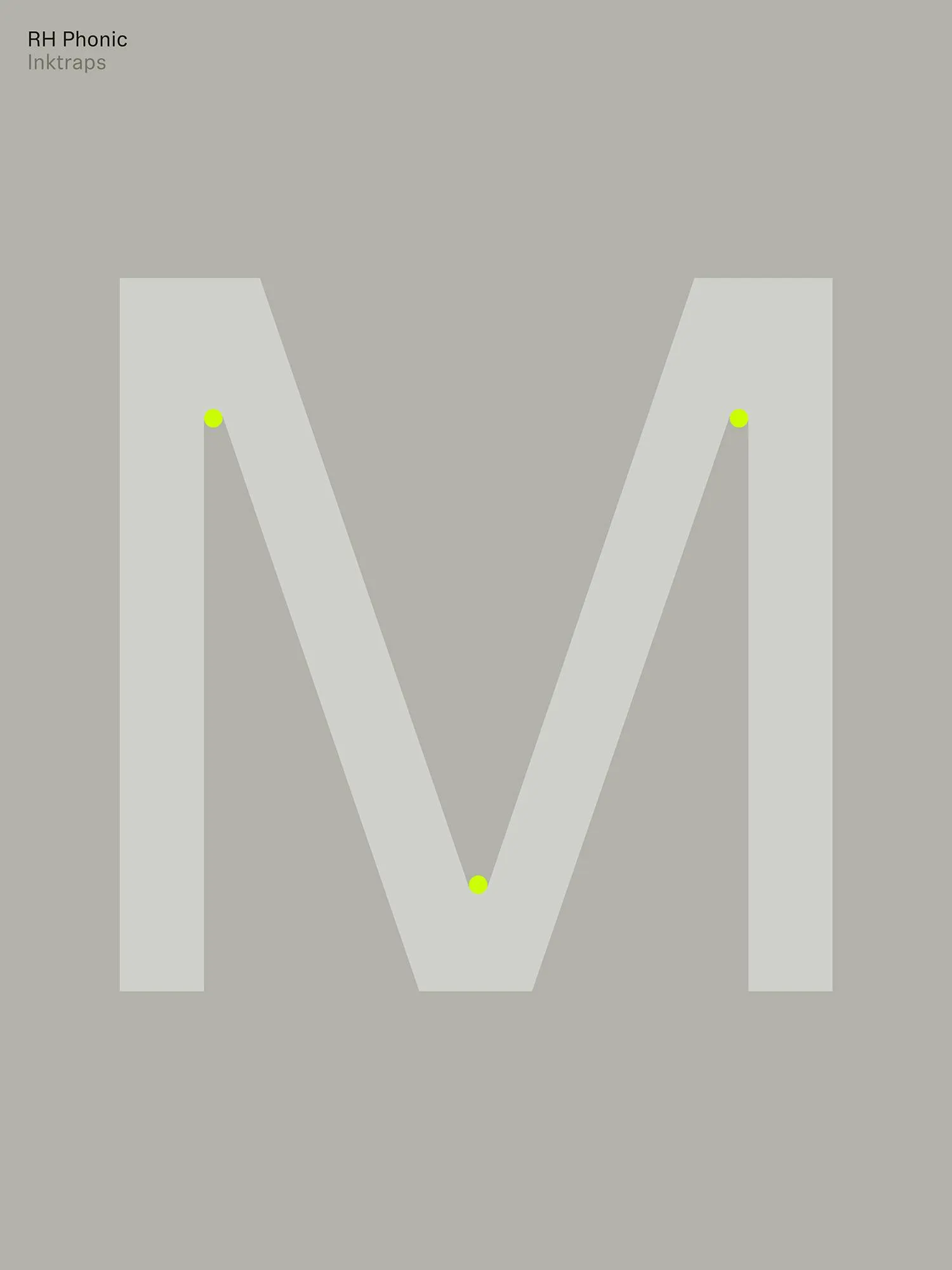
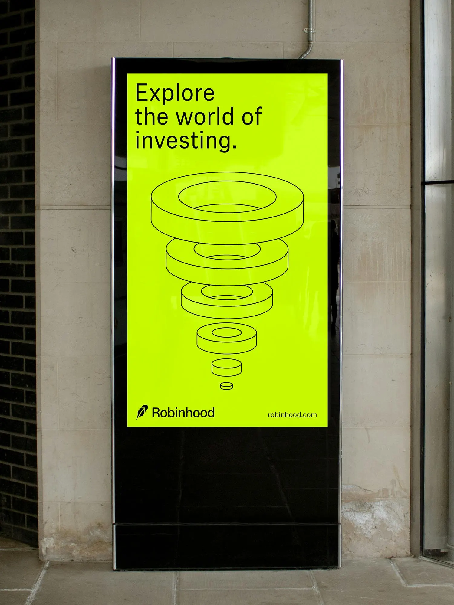
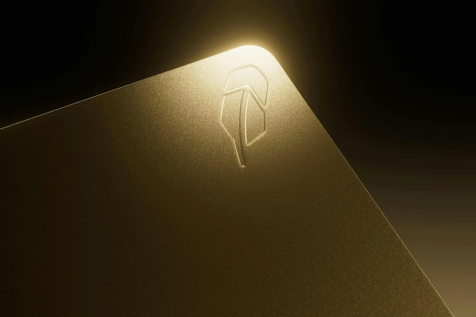
The feather is pared back so the upward arrow inside it leads, and the wordmark is redrawn with more care. With Klim Type Foundry and Schick Toikka, the studio paired the sans serif Robinhood Phonic with the serif Martina Plantijn for headlines. Black, white, and neutrals are lit by Robin Neon, illustrations borrow the language of financial charts, and Lauren Bamford's still lifes, like a double-yolked egg, add an editorial eye. Josh Krauth-Harding handled motion.
Why it works
The restraint is the strategy. Focusing the mark on the arrow turns a friendly emblem into a statement about direction, which is what investors care about. The serif brings the gravity of financial publishing, while the ink-traps keep the sans from feeling stuffy. In a category full of multicolor palettes, a mostly neutral system makes one neon green feel ownable. Chart-inspired graphics also speak to people who already read graphs fluently, so the brand sounds like it knows its audience.
Applications
Logo
Color
Typography

Images and video from portorocha.com, by Porto Rocha.