The Brand Monograph
FURSYS brand identity by PORTO ROCHA
↗PORTO ROCHA's work for Fursys shows how a heritage brand can look forward without disowning its past. Founded in Seoul in 1983, the workplace furniture maker was heading into the US, a category split between premium names and cheap copies. The studio built its repositioning on research, from workshops at headquarters to a US survey and customer interviews, and shifted Fursys from selling furniture toward being a long-term partner in how people work.
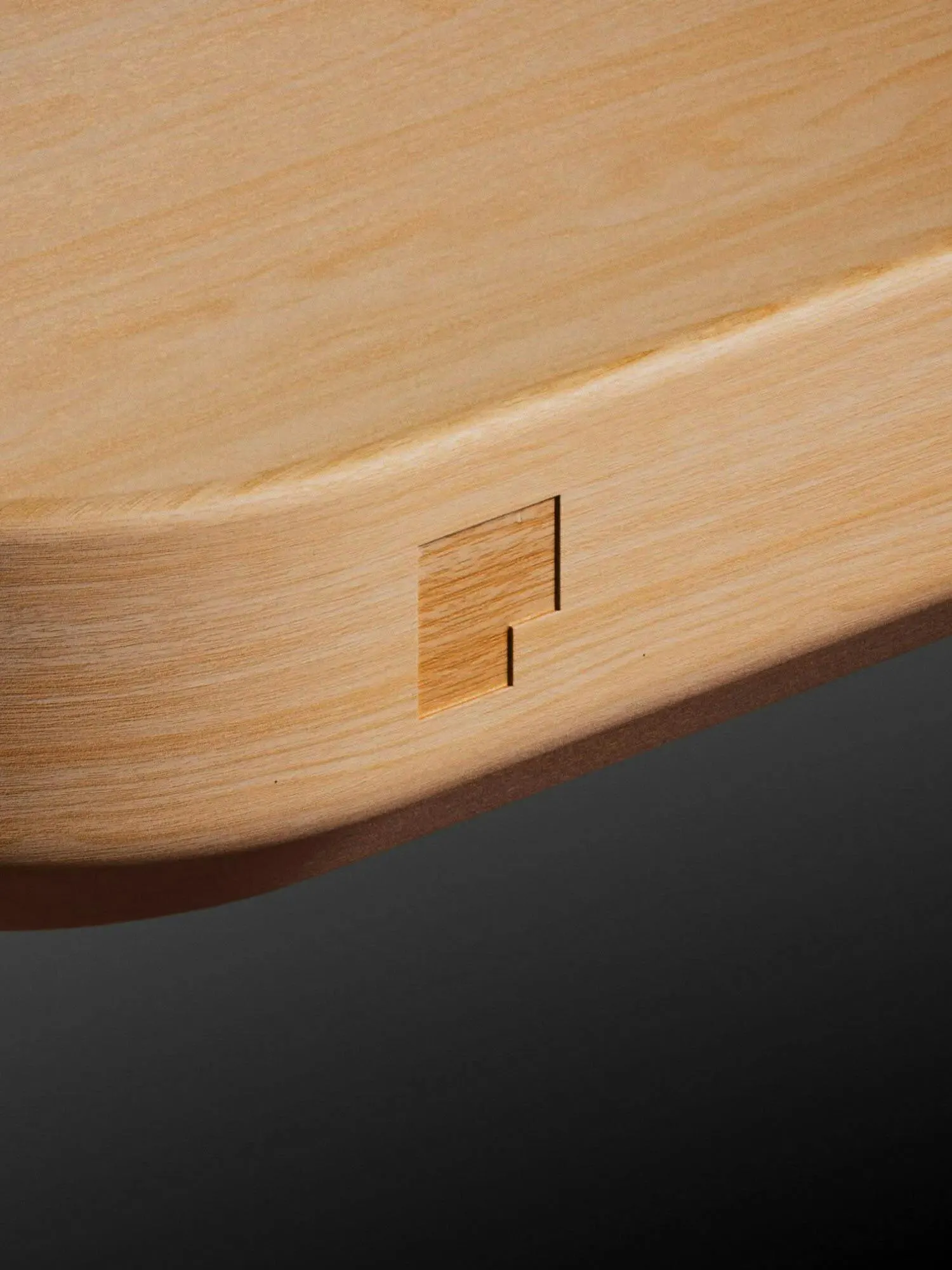
The identity borrows the logic of the products: modular, exact, carefully finished. A wordmark sits on a shared grid, the symbol is redrawn as The Corner, and a custom typeface, Fursys Sans, covers Latin and Korean. The red is refreshed and joined by a wider palette. Photography follows a product, process, and placement structure, while Reframe Studio's motion and 3D and Mari Juliano's photography give the system momentum. Zosia Swidlicka's copy adds a confident, curious voice.
Why it works
Furniture brands tend to compete on materials and specs, and a knock-off can match a silhouette. A system built on a grid is harder to copy, because the same logic runs through the mark, the type, the layouts, and the products. The Corner turns a familiar symbol into a modular unit, so adaptability is something you see rather than something the brand claims. Drawing Korean and Latin letterforms from the same geometry makes Fursys feel like one company in both markets, not a translation. The red keeps the recognition four decades have earned.
Logo

Applications
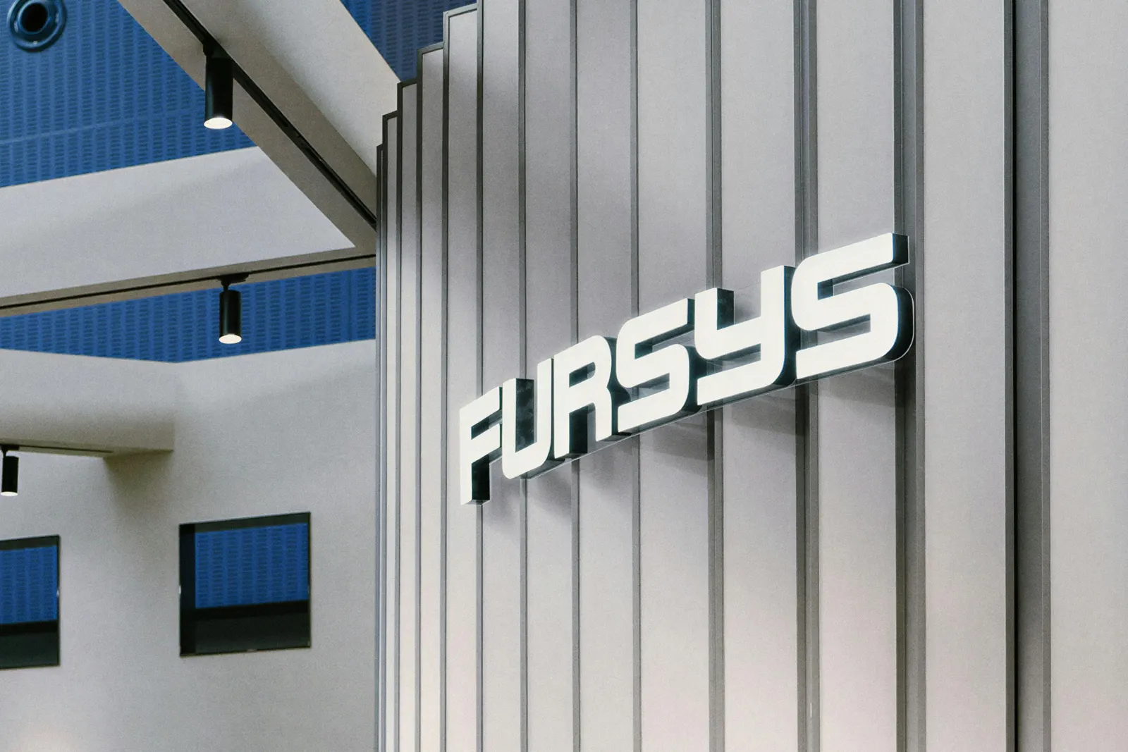
Typography


Images and video from portorocha.com, by PORTO ROCHA.