The Brand Monograph
Granola brand identity by Ragged Edge
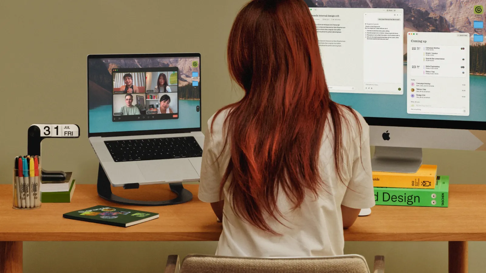
↗Most AI products want to look frictionless. With Granola, a meeting notepad already popular with Silicon Valley executives, Ragged Edge went the other way and built a brand that looks handmade and a little rumpled, like real work in progress. The studio delivered the full rebrand and launch, with Ellis Hamburger on strategy, aiming to take Granola well beyond its early tech audience.
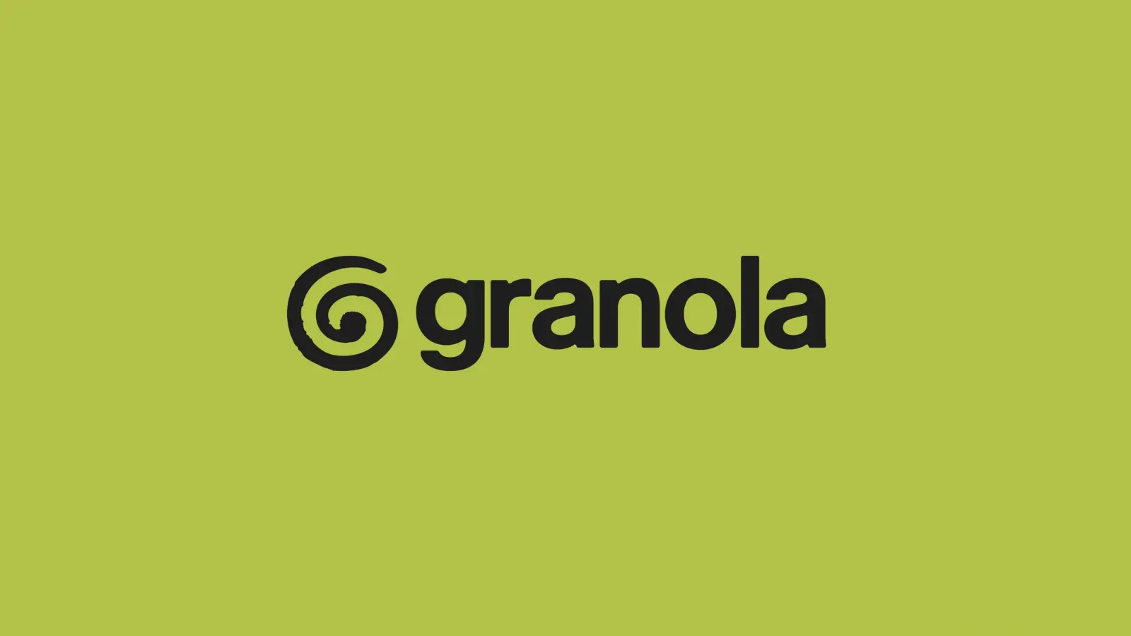
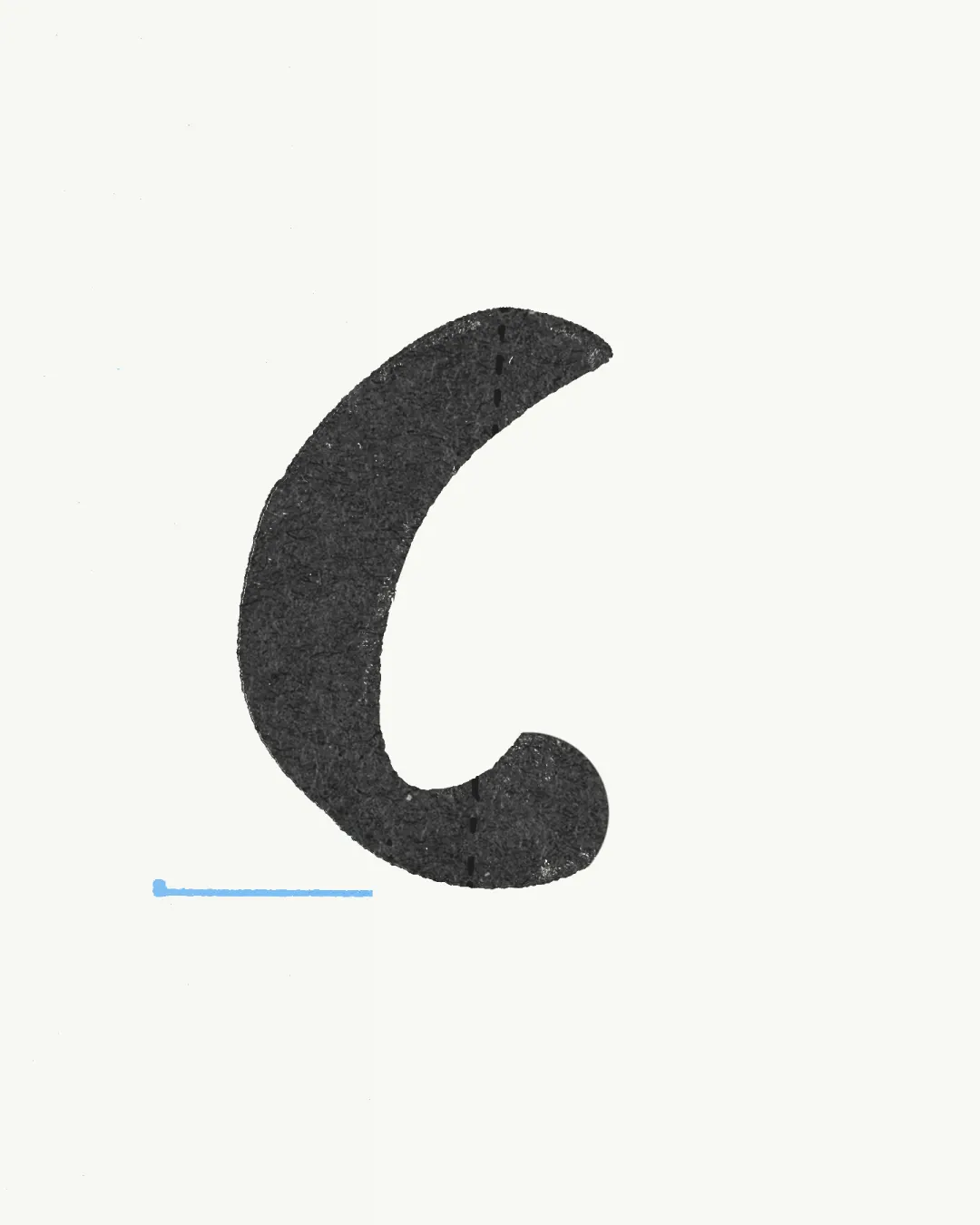
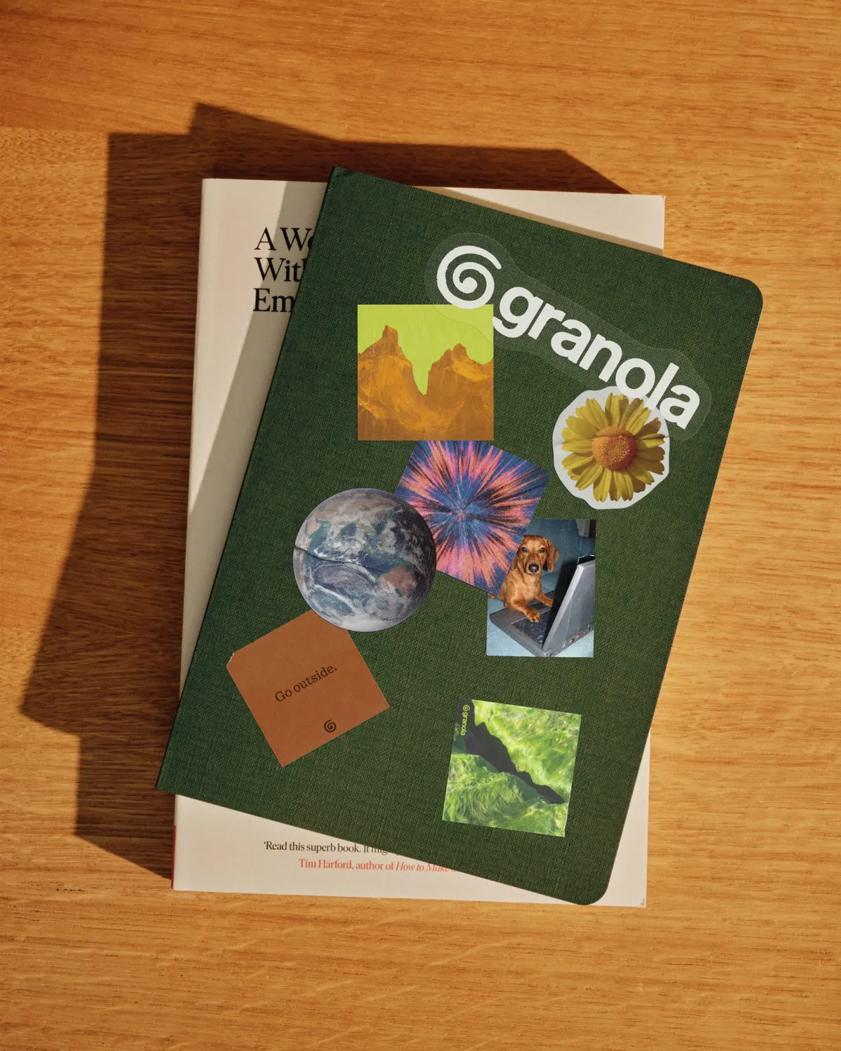
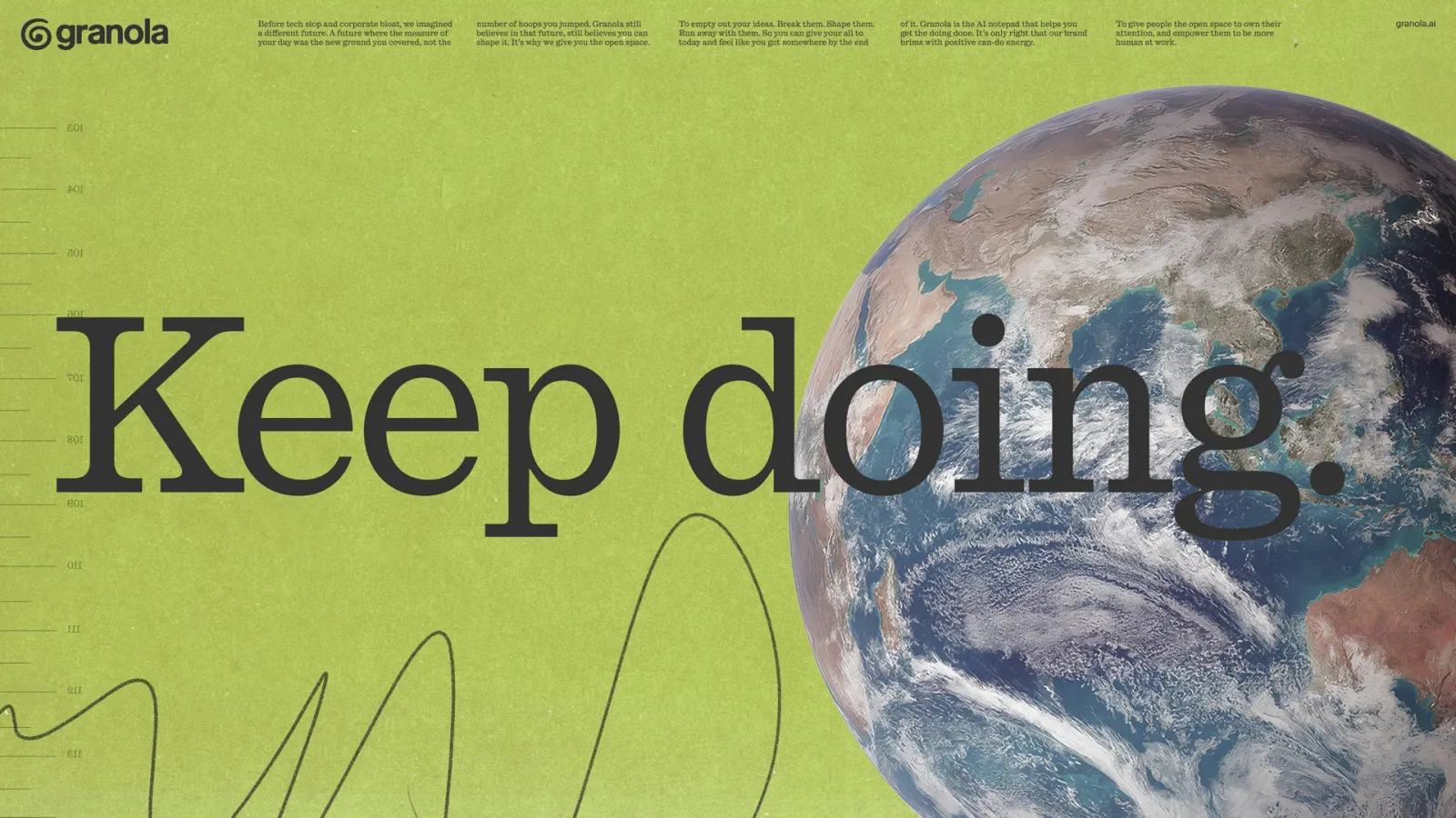
The idea frames Granola as a tool that clears space to think rather than one that speeds up the grind. That shows up in a hand-drawn logo, a slab serif paired with a grotesque, and a bespoke script drawn from co-founder Sam's handwriting, developed with NaN and Vincent Chan. A cut-and-paste illustration style called findings runs through the system, backed by an in-house interactive tool for producing new executions. Campaigns in San Francisco, New York, and London followed, and launch day put Granola at the top of X's trending topics.
Why it works
A product that listens to your meetings has to feel trustworthy, and a human hand does that better than another gradient. The handwriting-based script and hand-drawn mark make Granola feel personal, while the slab serif and grotesque pairing adds warmth without losing clarity. The findings illustrations look like notes in progress, which fits what the product actually handles. Because the interactive tool keeps the roughness consistent at scale, the imperfection reads as a deliberate stance. Among polished, glowing competitors, that makes Granola easy to remember.
Logo
Typography
Applications
Images and video from raggededge.com, by Ragged Edge.