The Brand Monograph
Palmetto rebrand by Ragged Edge brand identity by Ragged Edge
↗Most clean energy brands ask you to feel bad and do less. Ragged Edge's identity for Palmetto does the opposite, which is what makes it stand out in a category full of panels and blue skies. Palmetto already had a marketplace for clean tech and a financing model to pay for it, so the studio's brief was to make the whole thing desirable. Its answer was an idea built on swapping, not stopping.
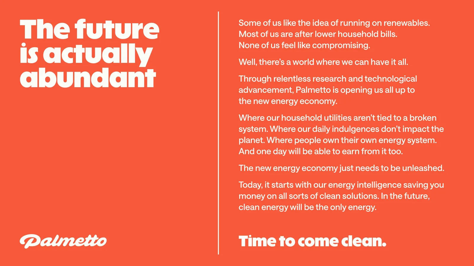
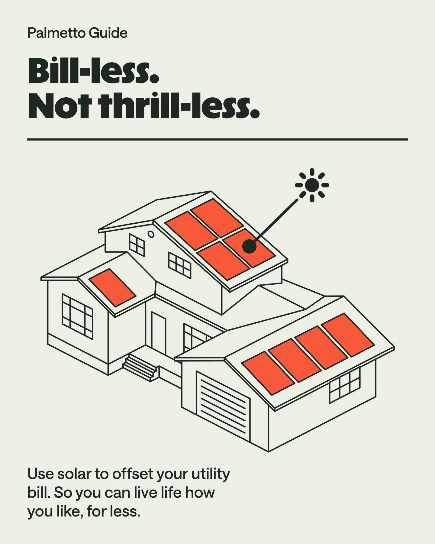
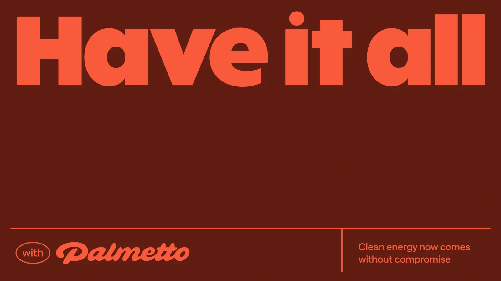
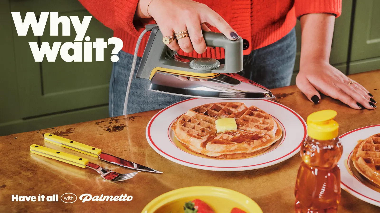
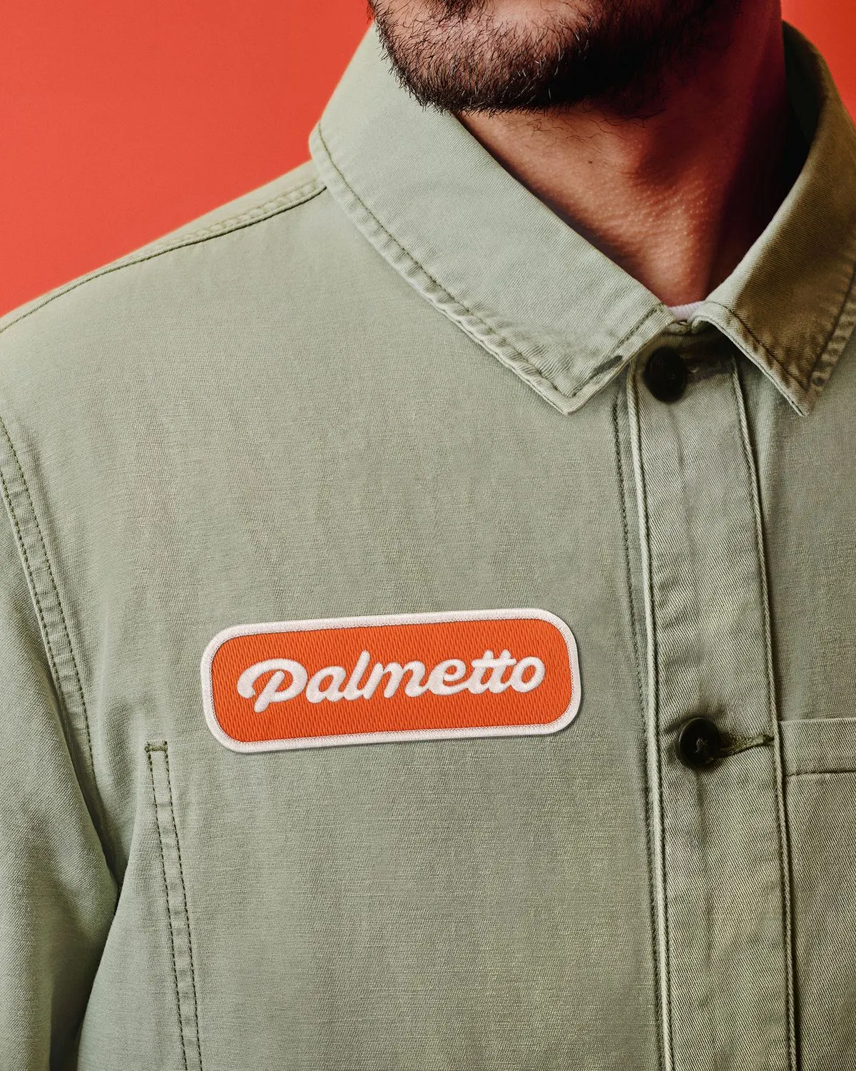
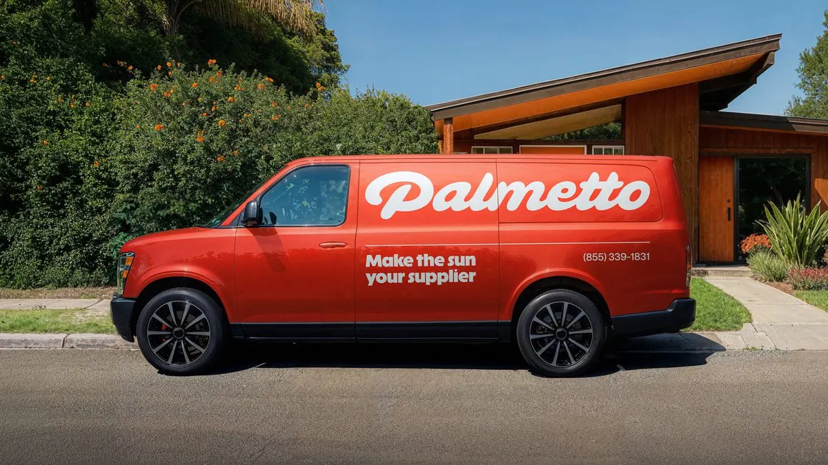
The identity starts with a relaxed script logotype and a warm red called Palmetto75, set alongside ABC Solar from Dinamo, with typography work from Chris Caldwell. Charlie McKay's photography shows people enjoying energy at home, and illustration replaces the usual stock imagery. The website skips CGI and rooftop shots, and the same tone carries through to billboards at sponsored summits. Since launch, follower growth rate is up 92%, daily reach is up 729%, and impressions are up 518%.
Why it works
Clean energy is usually sold with earnest greens, blues, and sunny yellows, so a warm red script mark is an instant break from the pack. It reads as comfort and pleasure, which is the feeling Palmetto wants customers to link with switching. It also suits an audience that distrusts being lectured: nothing here sounds like a campaign or a cause. The look is consistent enough to recognize from a billboard, and personal enough to feel like a lifestyle brand.
Logo
Typography
Applications

Images and video from raggededge.com, by Ragged Edge.