The Brand Monograph
Papier rebrand by Ragged Edge brand identity by Ragged Edge
↗Plenty of stationery is beautifully made, but very little of it is memorable as a brand. Ragged Edge's work for Papier gives the products something to stand for. The studio took a direct-to-consumer business with a million customers and prepared it for the US and for retail shelves, covering research, strategy, identity, delivery, and a website co-created with the Papier team.
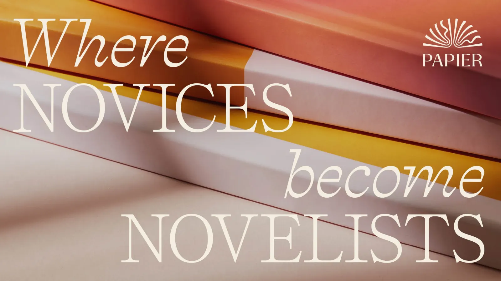
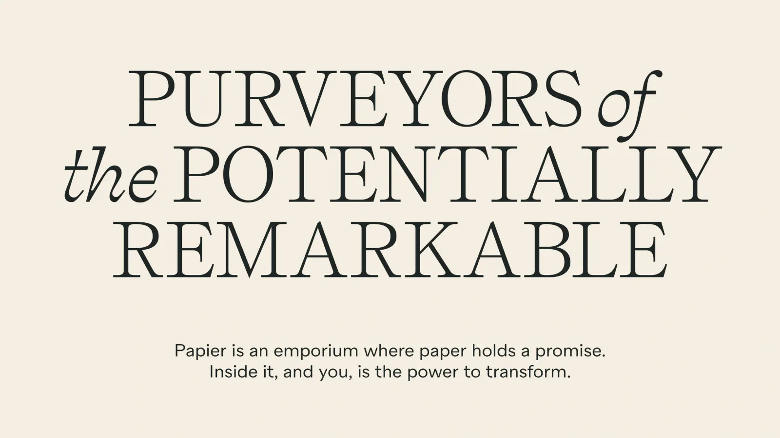
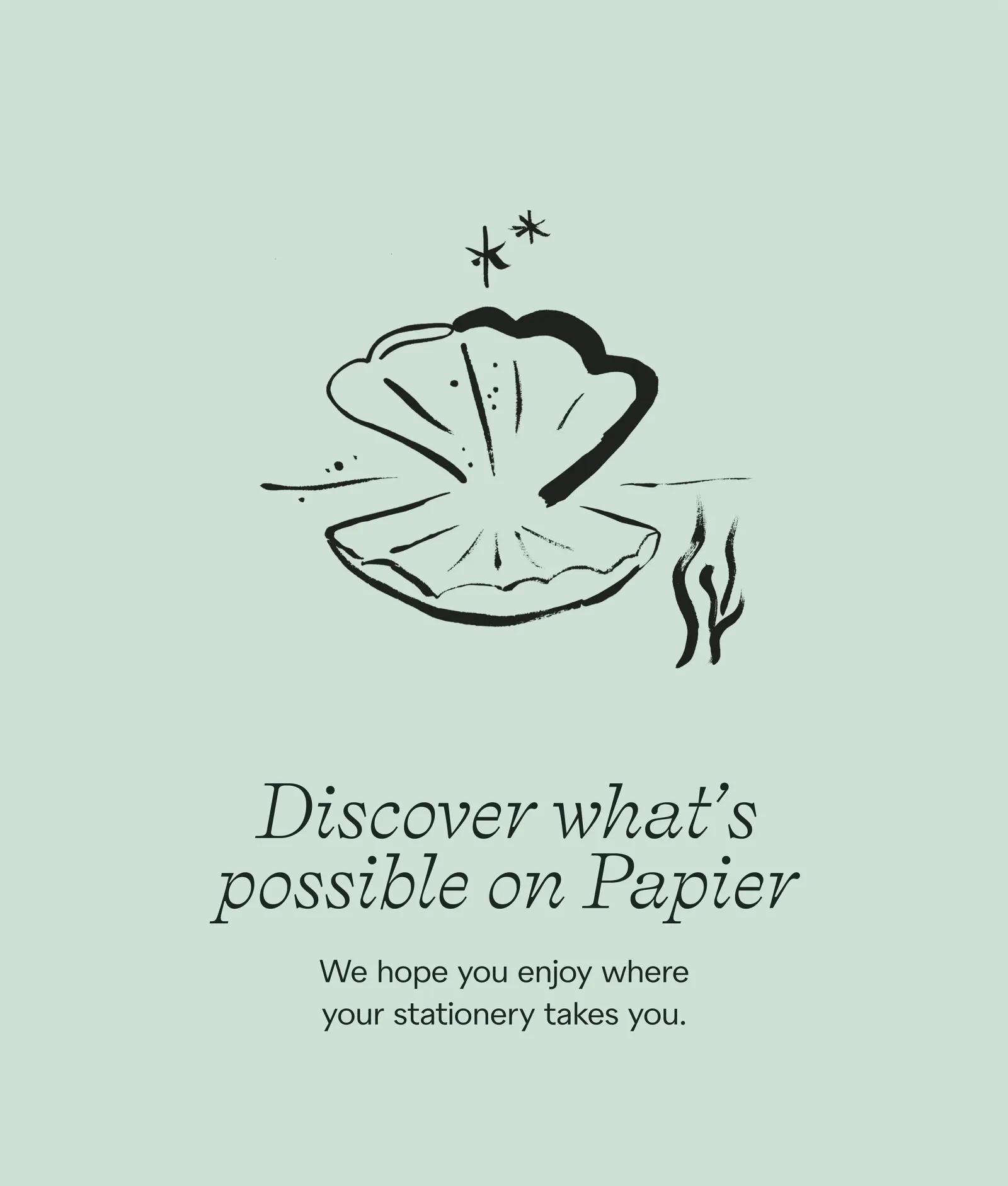
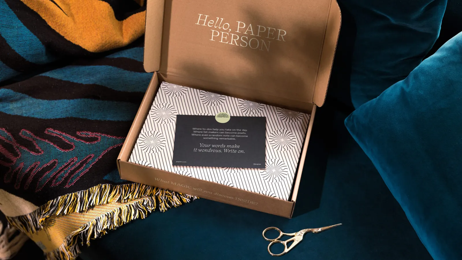
Customer interviews showed that picking up a new notebook or planner is a small promise to yourself. The studio built the brand around that feeling, with magic as the invitation. The logo is an open book, and the verbal identity speaks to people who love paper. The art direction aims for atmosphere over style. Chiara Perano, working as Ciao Chiara, made illustrations that each tell a story, and Charlie McKay's photography adds to the mood. A $50 million Series C followed within three months, then 2,500 Target stores.
Why it works
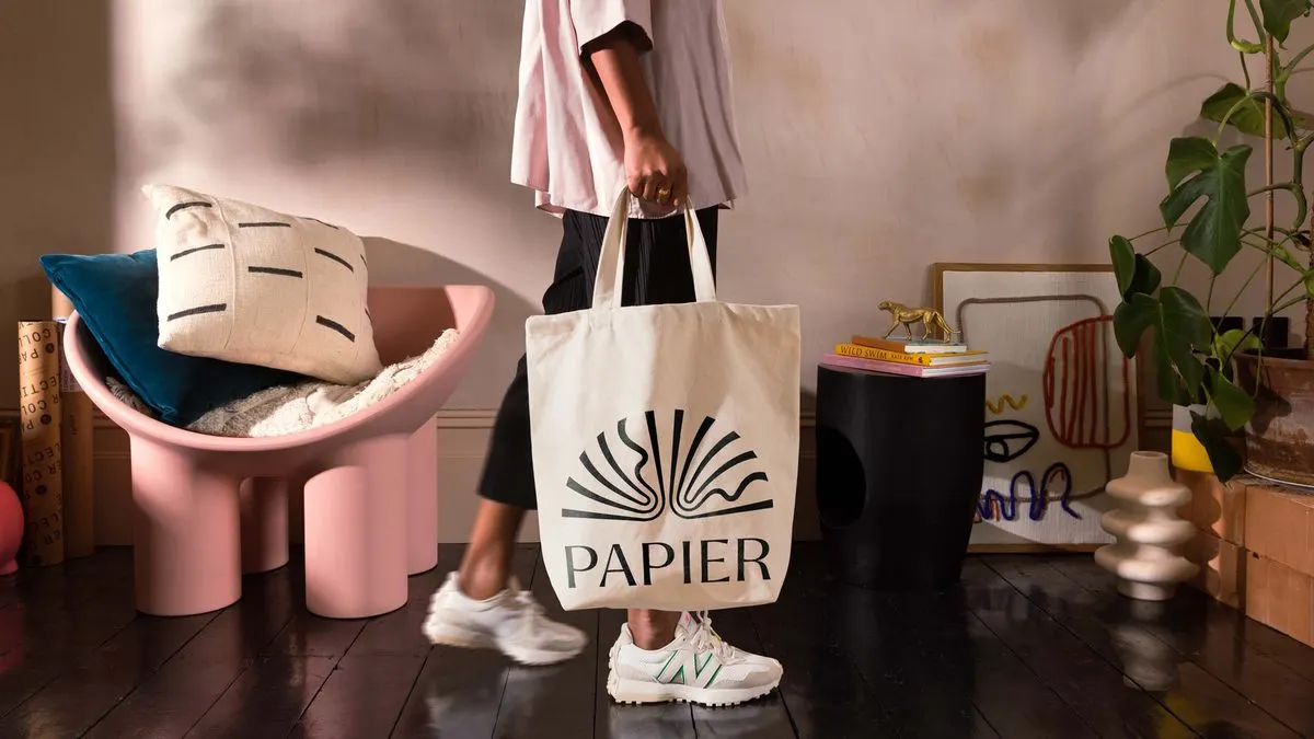
The open-book logo is the smartest move here. It reads instantly on a shelf, and it shifts the meaning from something you buy to something you begin, which suits a product whose value is whatever you put into it. The stationery aisle is crowded with tasteful, similar-looking objects, so story-led illustration and atmospheric photography give Papier a point of view that good products alone can't. It feels like a brand with a worldview rather than good taste, and that holds up across very different retailers.
Logo
Typography
Applications
Images and video from raggededge.com, by Ragged Edge.