The Brand Monograph
Royal Ballet and Opera: A New Brand Era for a Cultural Icon brand identity by Further
↗Merging two companies under one name is easy to announce and hard to make feel true. Further's work for the Royal Ballet and Opera stands out because it gives the combined institution a shared identity without flattening what makes ballet and opera different. The studio worked alongside RBO's Creative Studio, and the brief went beyond a new look to a system the in-house team could run and extend from the 2024/25 Season onward.
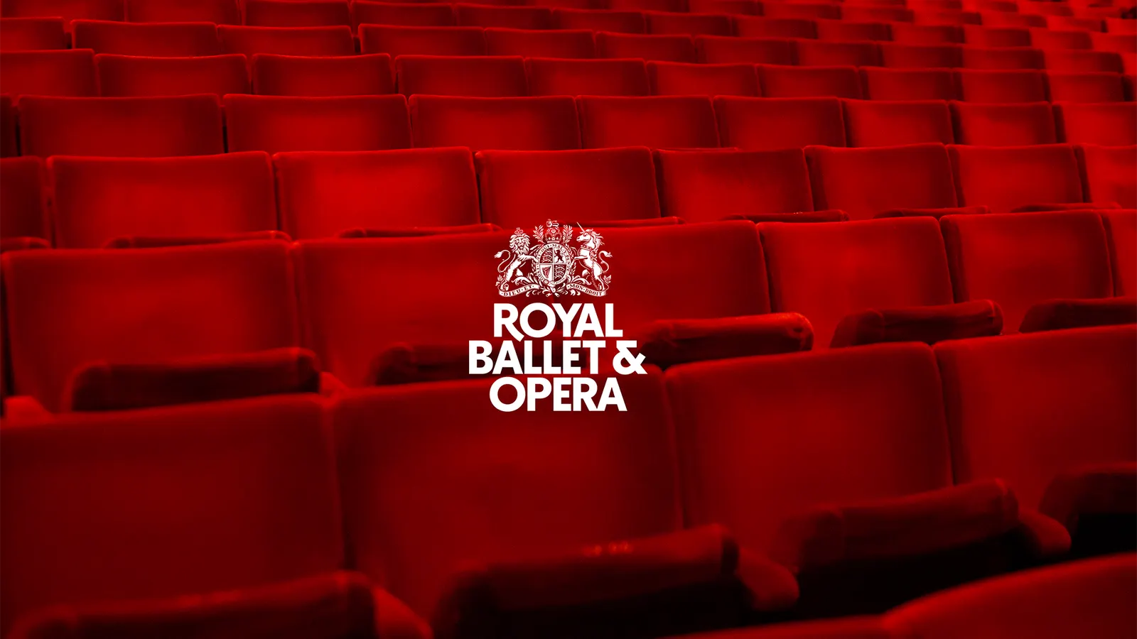
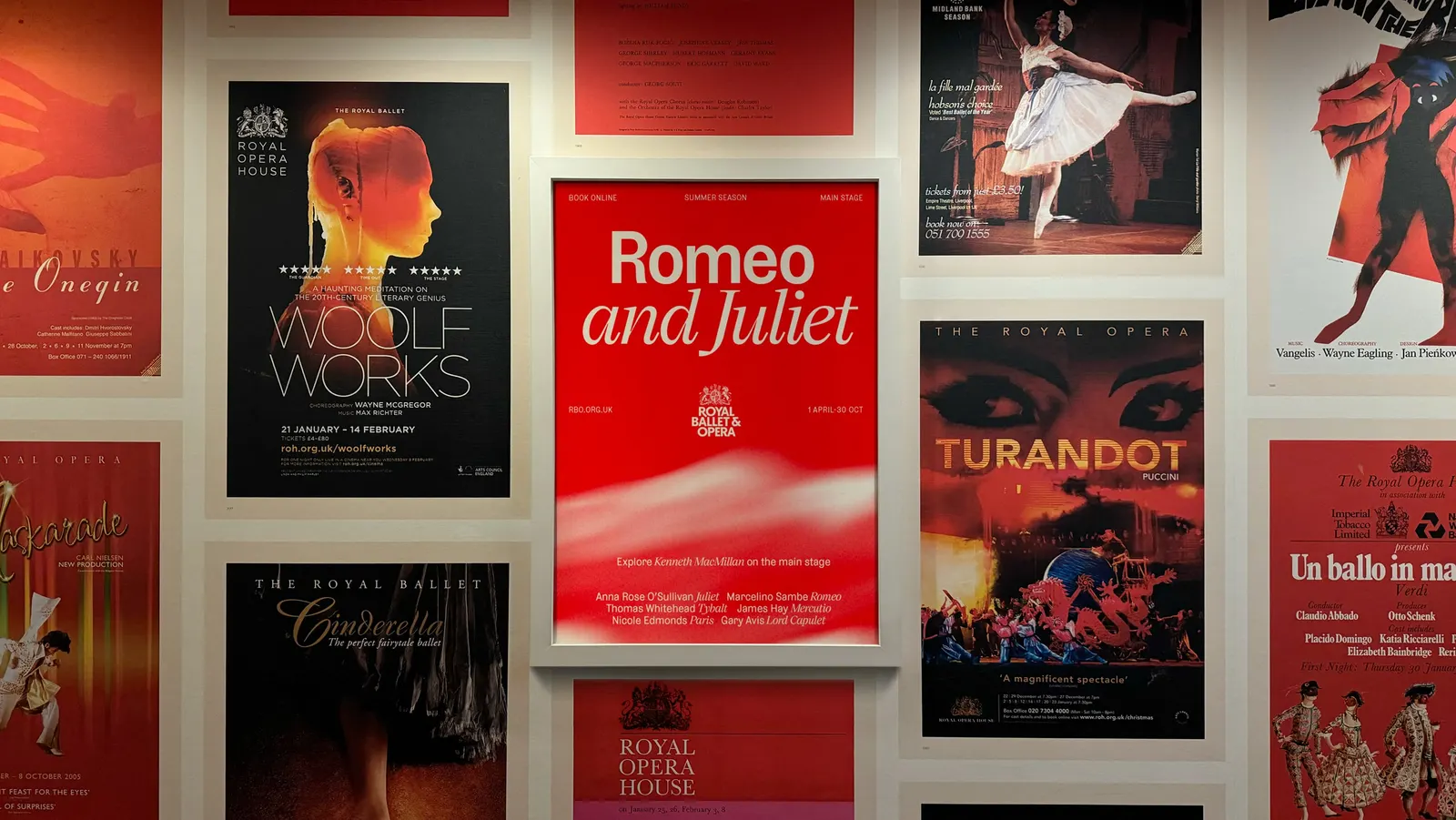
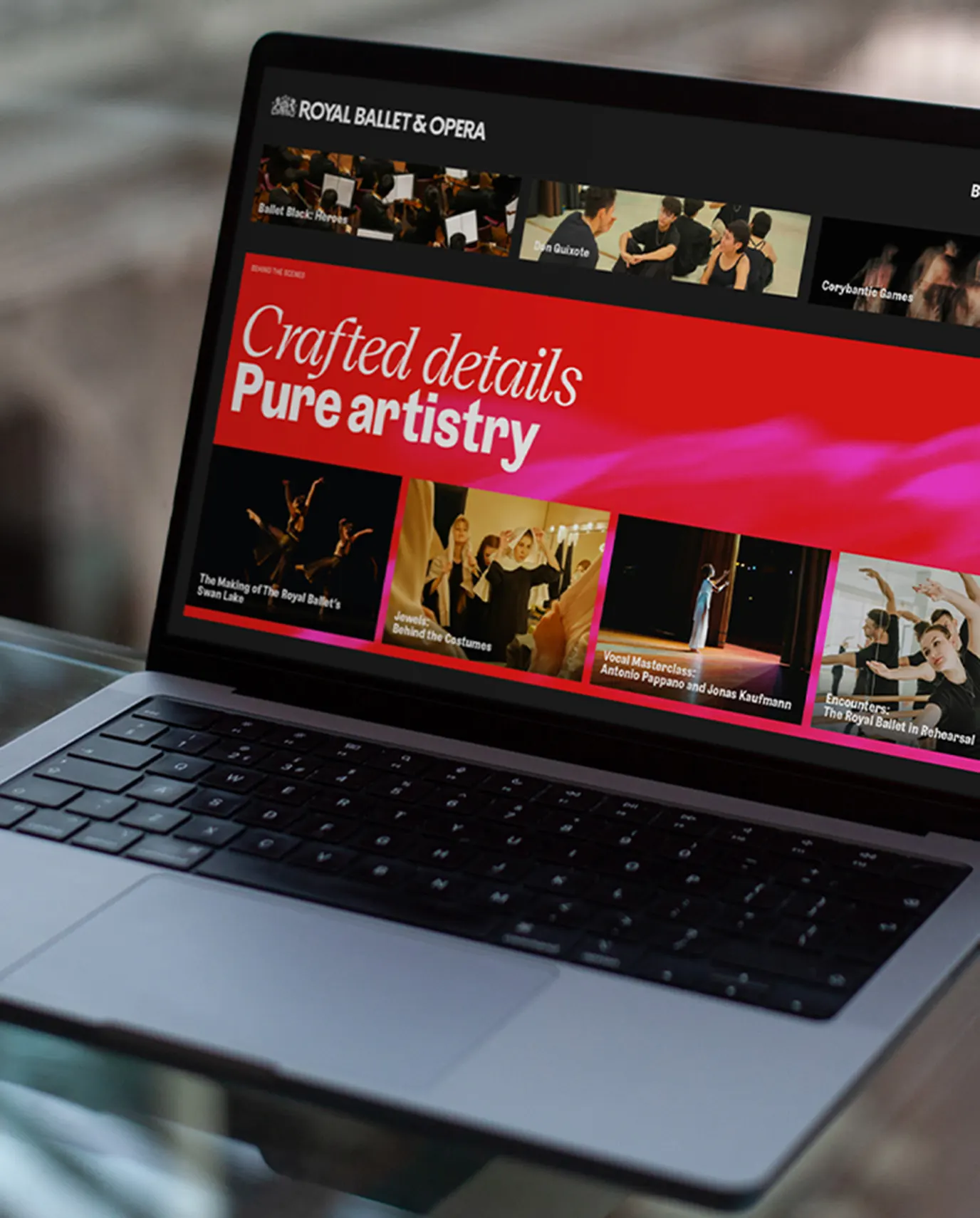
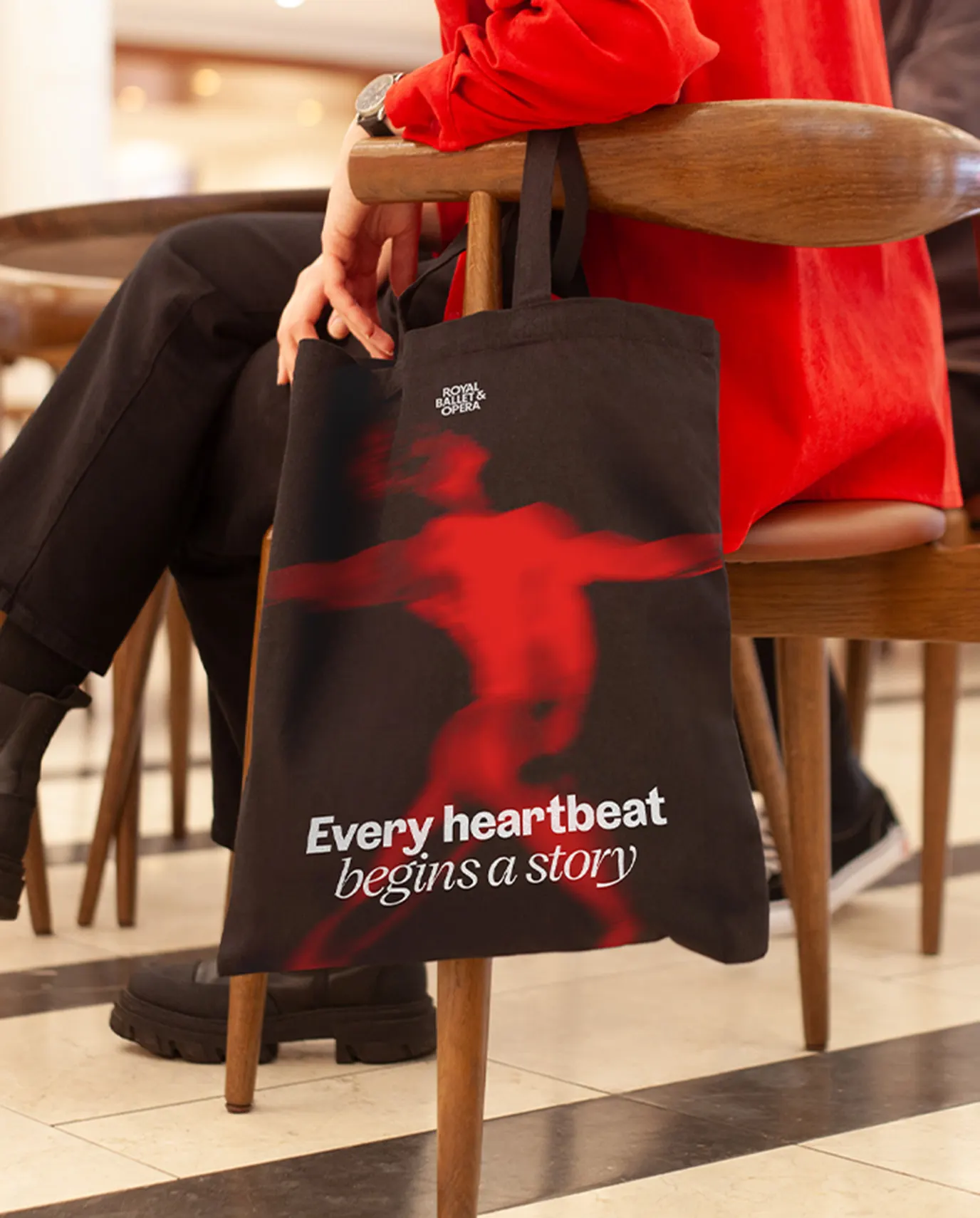
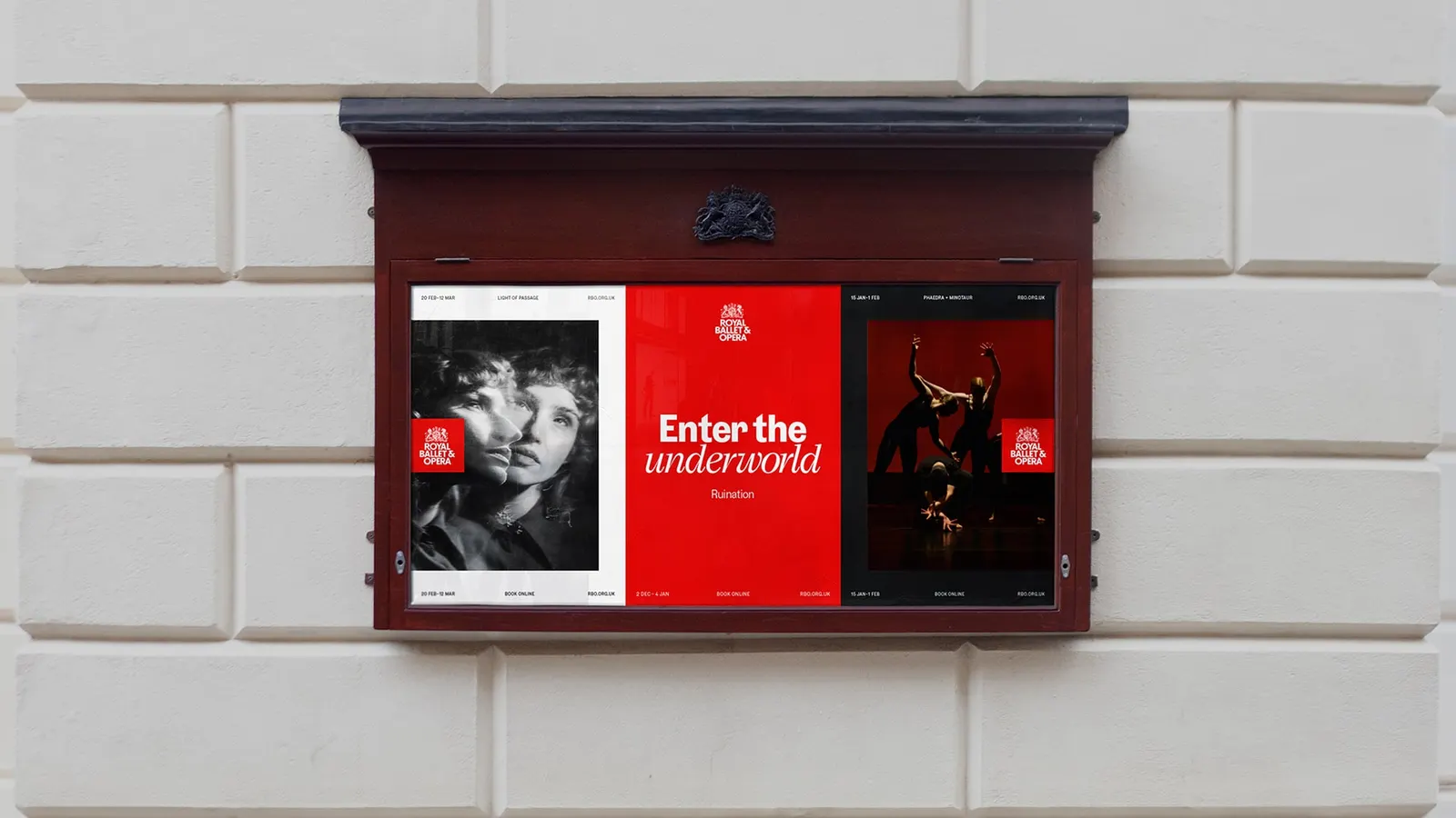
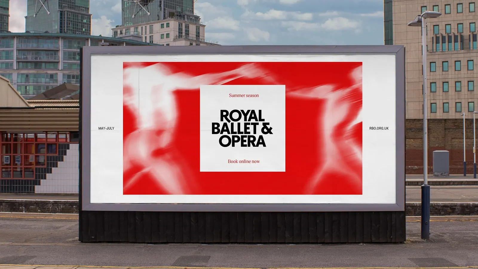
Further's research ran from Das Rheingold to Don Quixote, and the thread it found was a Living Timeline linking the archive to the present and future. The marque reworks the organization's oldest mark, the signature red is extended with archive-led shades, and a modern serif sits against a blunt grotesque. Layouts stack in directional layers that suggest forward motion, and a texture treatment covers moments when photography isn't available.
Why it works
Starting from the oldest marque rather than making a clean break lets the new name feel inherited, not imposed, which matters for an audience with deep loyalties. Pairing a serif with a grotesque lets the type sound ceremonial and current at once, a useful balance in a category that often defaults to either gilded tradition or sterile minimalism. Red stays the anchor, so recognition survives the rename, and the texture fallback shows the studio planned for daily use, not just launch-week highlights.
Applications
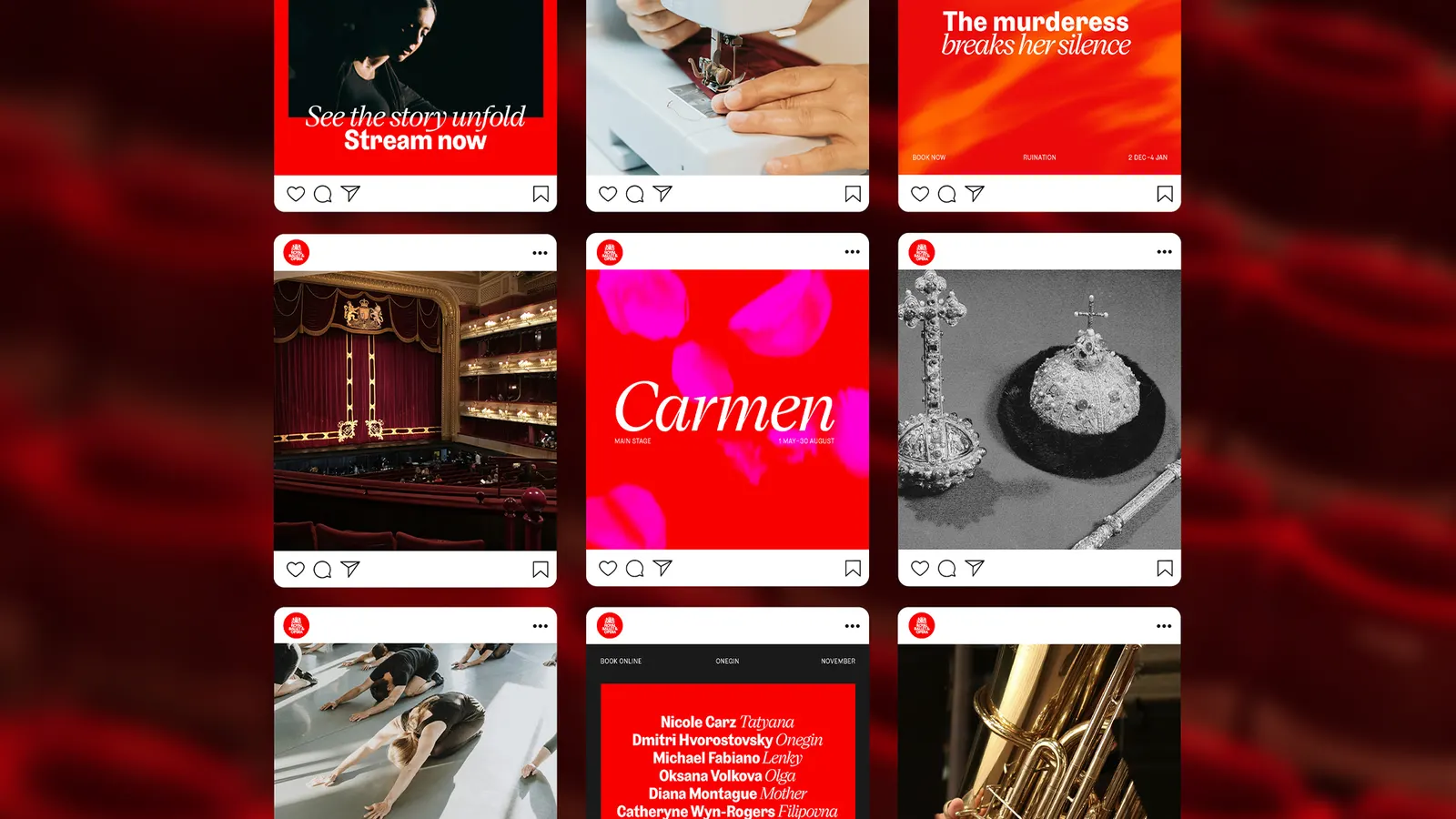
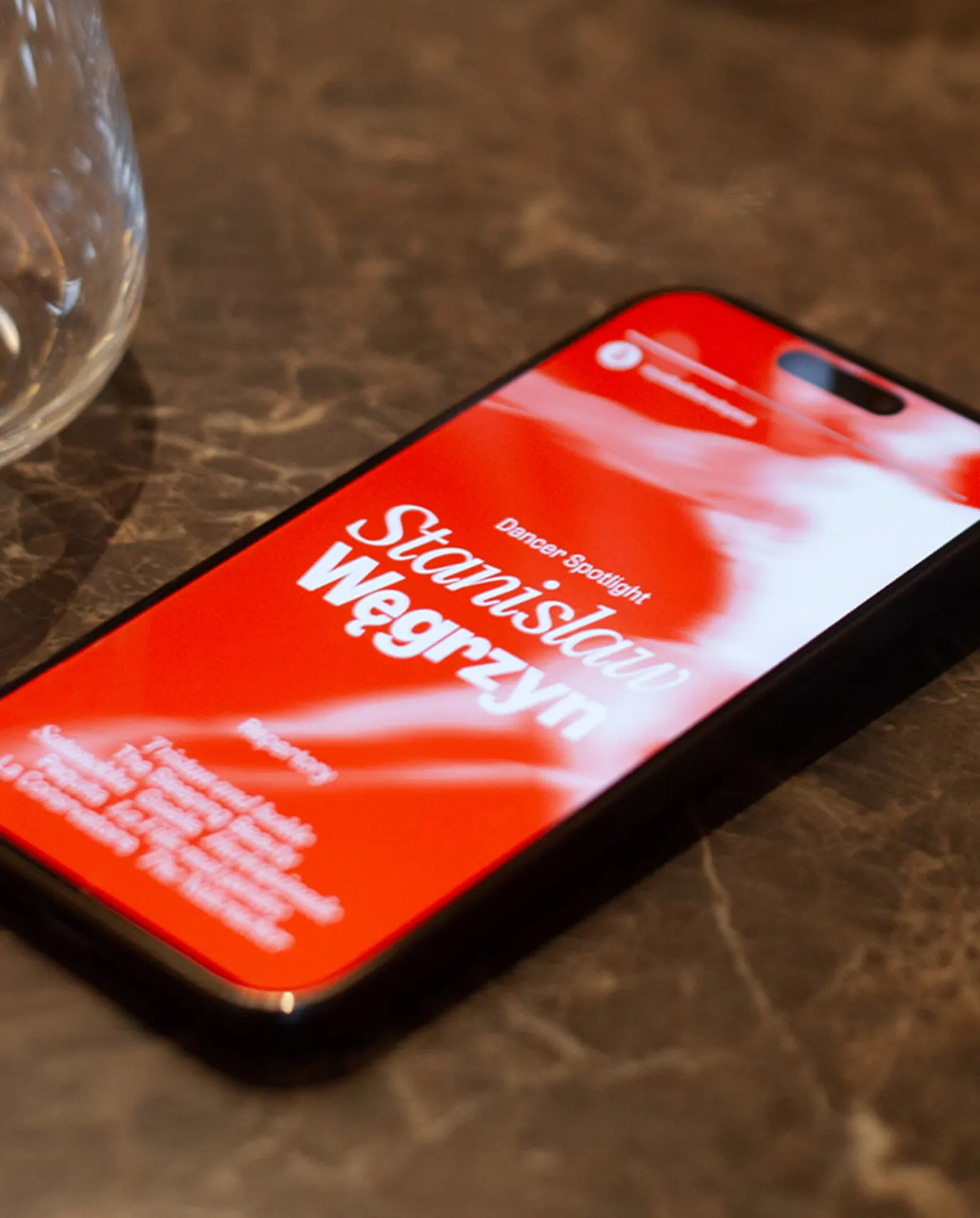
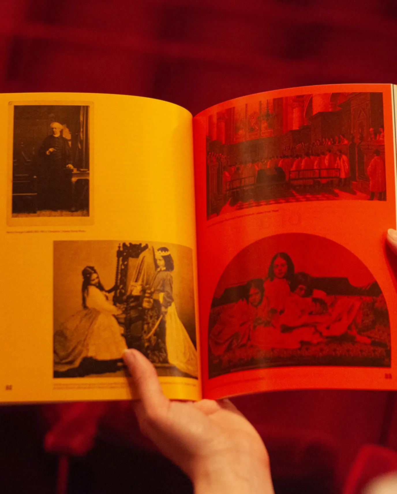
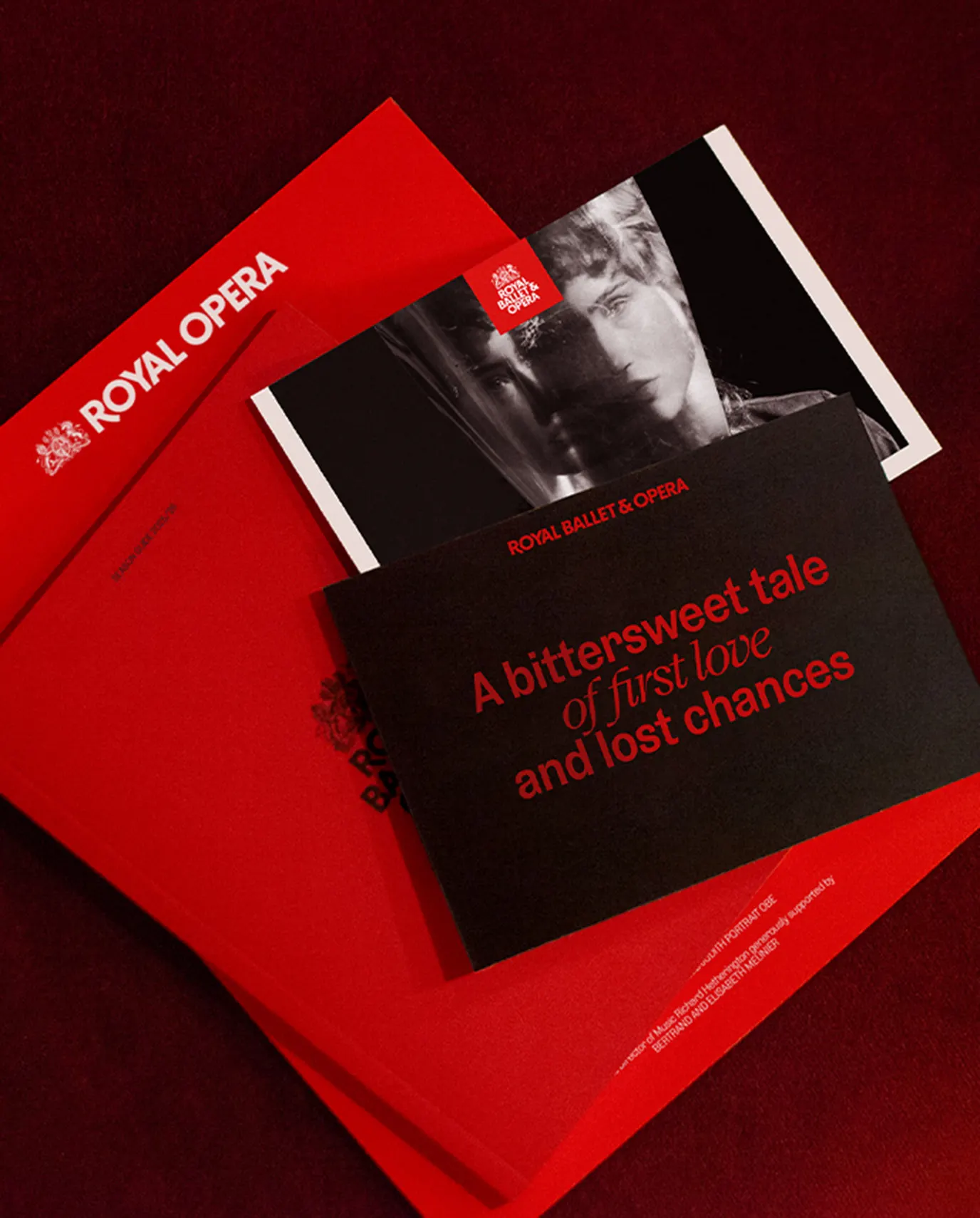
Images and video from further.group, by Further.