The Brand Monograph
Wise rebrand by Ragged Edge brand identity by Ragged Edge
↗Few rebrands go live in 175 countries on the same day, and fewer can point to results as clear as these. After Ragged Edge's work for Wise, website conversions rose 10% and the share price climbed 58% over the following year. The partnership is now in its fourth year.
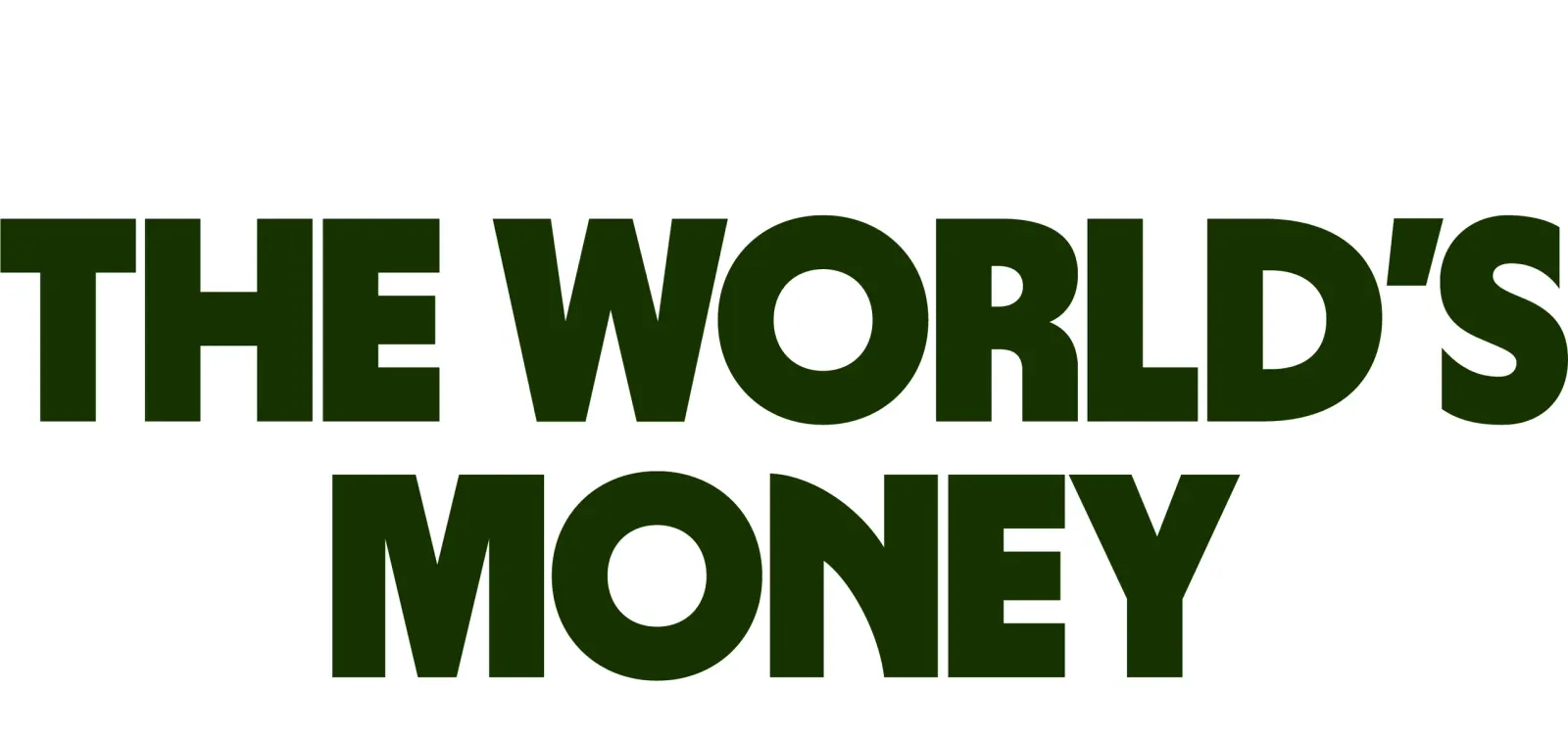
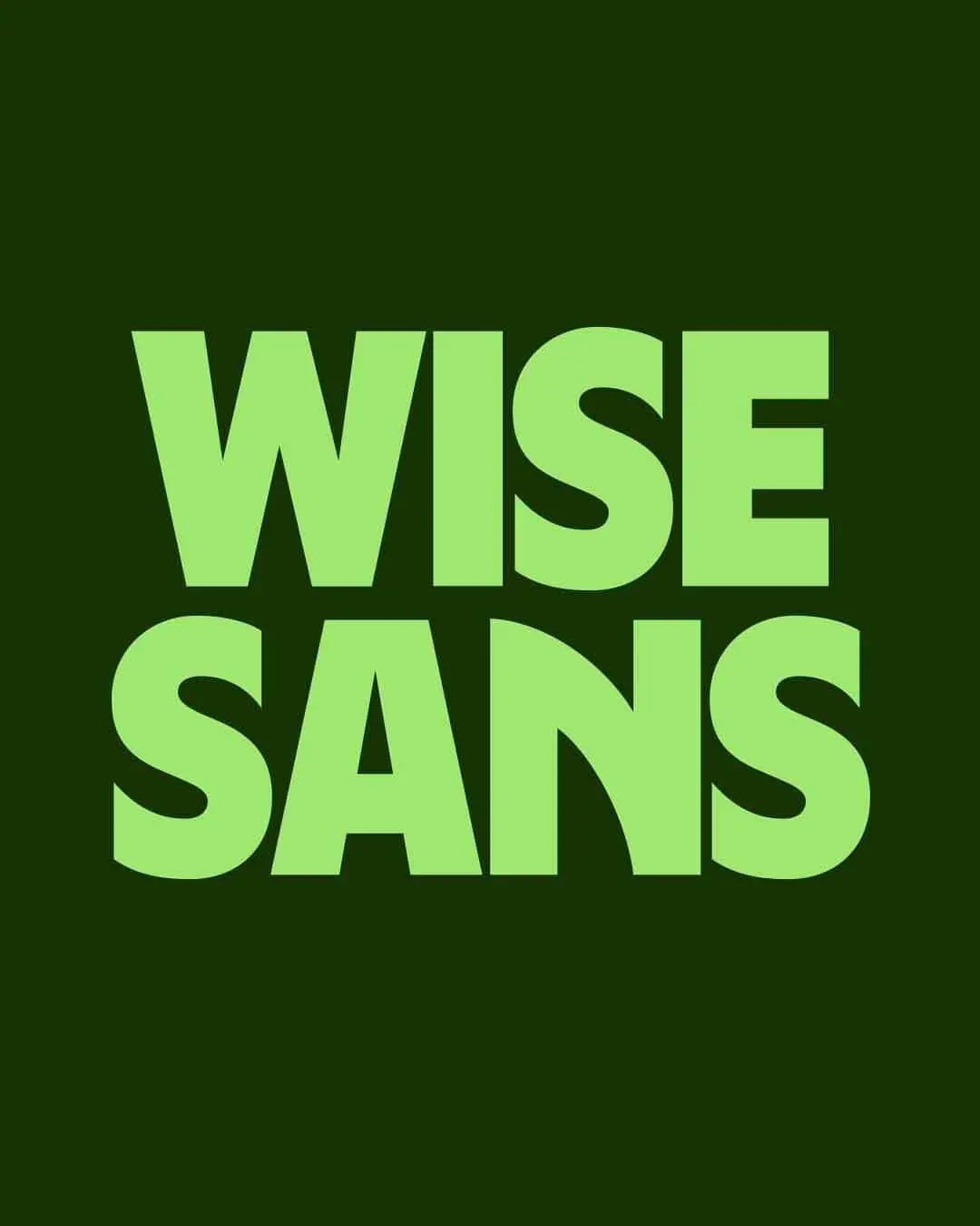
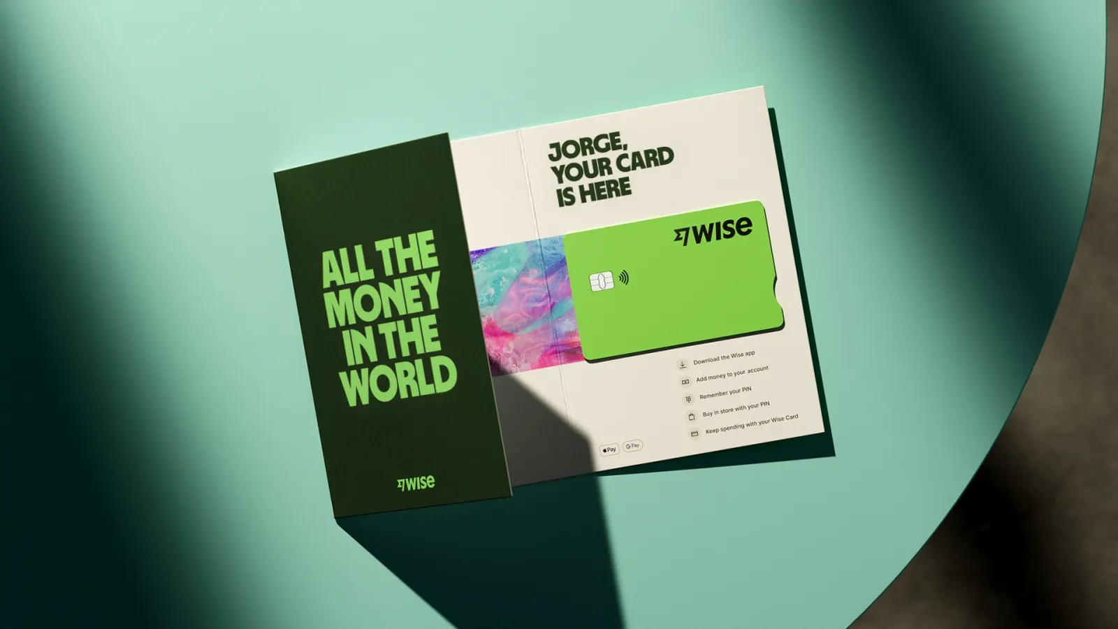
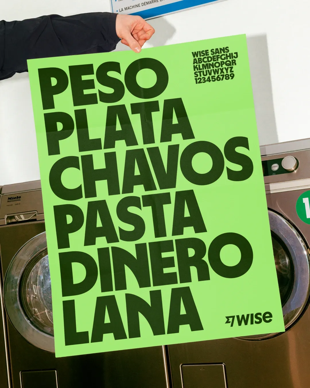
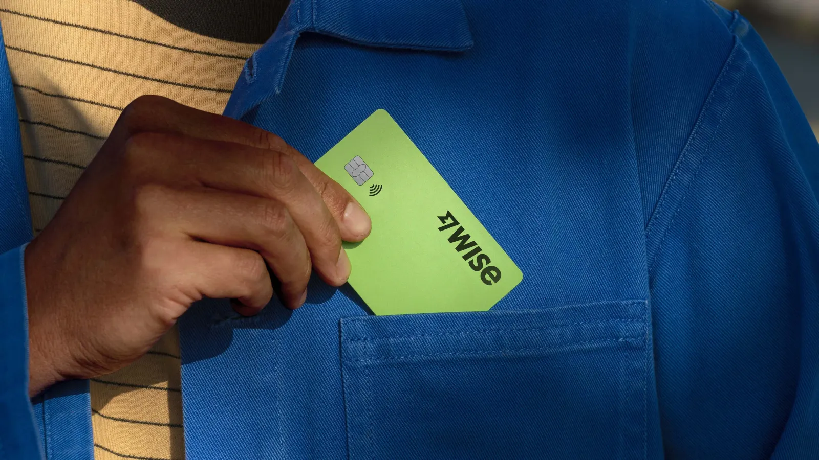
The brief was to set Wise apart from a crowded field of imitators and prepare it for life beyond transfers. Ragged Edge positioned the company as a new money system for anyone, anywhere, then built the identity to match: a bright green, a redrawn logo that keeps the flag symbol, graphic tapestries, and Wise Sans, a typeface inspired by scripts from around the world that covers 960 languages. Feliciano Type (Mario Feliciano), Luke Prowse, and NaN contributed to the typography. A Wise Platform sub-brand, a product design system, and a growing film and photography library extend it further.
Why it works
The green is the smartest move here. It stands out in a category that leans heavily on blue, and it reads as both money and momentum without needing a symbol to explain it. Keeping the flag means existing customers see a sharper Wise, not a stranger. Wise Sans carries the most weight: a typeface that works across 960 languages turns the "global" claim into something people can actually read. The separate Wise Platform sub-brand also lets banks and enterprises see a partner, not a consumer app.
Logo
Typography

Applications
Images and video from raggededge.com, by Ragged Edge.