The Brand Monograph
Tinder brand identity by PORTO ROCHA
↗PORTO ROCHA's Tinder identity stands out for how much personality it restores to a brand flattened by its own reputation. After a decade of copycats, Tinder was widely read as a hook-up app, and the studio aimed to win back Gen Z women who wanted more control over how they date. Instead of steering people toward one kind of romance, the team built around the appeal of not knowing what comes next.
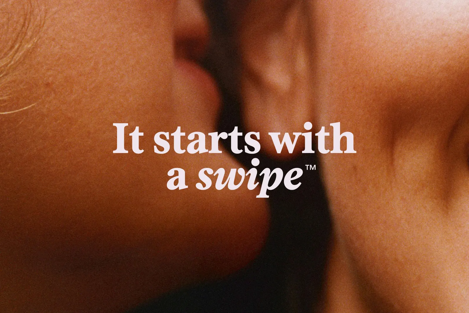
The system begins with a heavy all-caps wordmark and a leaner, sharper flame. T, a voice modeled on a dating columnist, adds wit and empathy. With AllCaps and Formula Type, the studio paired the serif Society with the technical FT Regola, then set a vivid red called Flame among warmer supporting hues. Motion designers Josh Krauth-Harding, Nabill Parvizi, and Thales Muniz turned the swipe into animated typography, and Q2 reports showed match growth doubling.
Why it works
The type pairing does the most work. A serif with a flirtatious edge gives Tinder an editorial warmth that categories built on friendly, rounded sans serifs rarely attempt, while FT Regola keeps the interface credible and practical. The all-caps wordmark reads as confident rather than coy, which suits an audience asking for agency. Building motion from the swipe ties the brand to what people actually do in the product, so the identity feels like using Tinder, not just looking at it. A single committed red keeps the heat without drifting into pastel romance.
Logo

Typography
Color
Applications



Images and video from portorocha.com, by PORTO ROCHA.