The Brand Monograph
Eurostar: Uniting Rail Giants with a Bold New Brand brand identity by Further
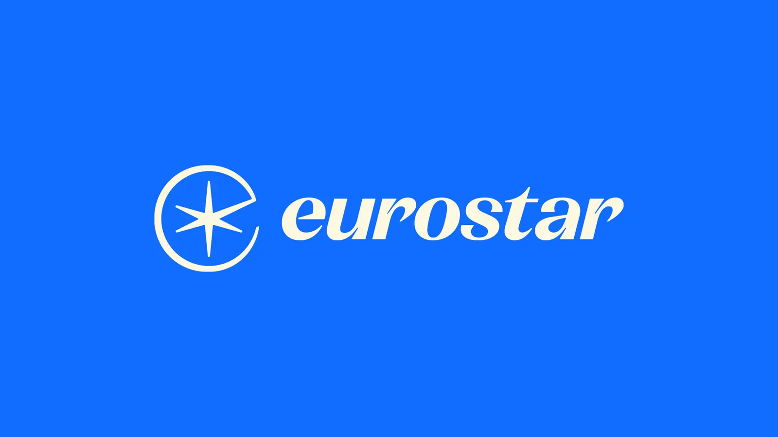
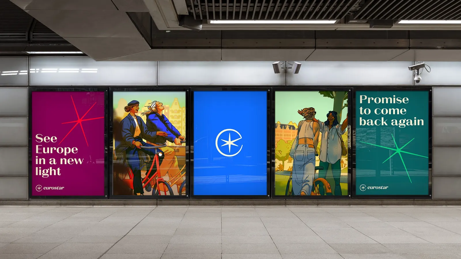
↗Mergers rarely produce brands with this much energy. When Eurostar and Thalys became one company, Further was asked to build a single identity for a network spanning the UK, France, Belgium, the Netherlands, and Germany, one meant to carry a target of 30 million passengers a year by 2030. After workshops with stakeholders from both sides, the studio arrived at Spark New and a symbol that fuses the Eurostar E with a star.
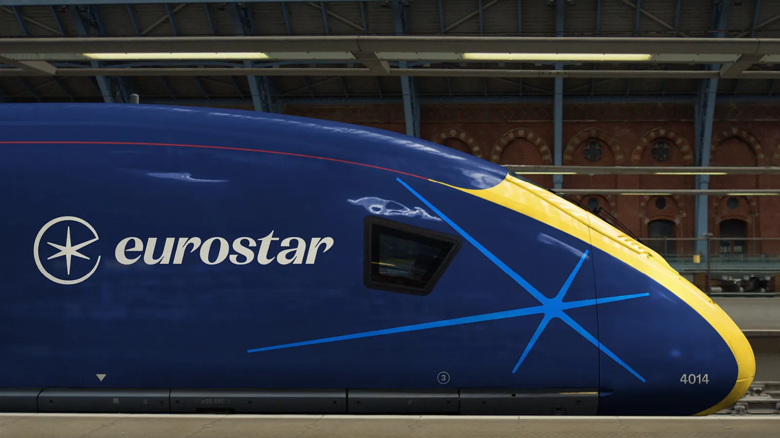
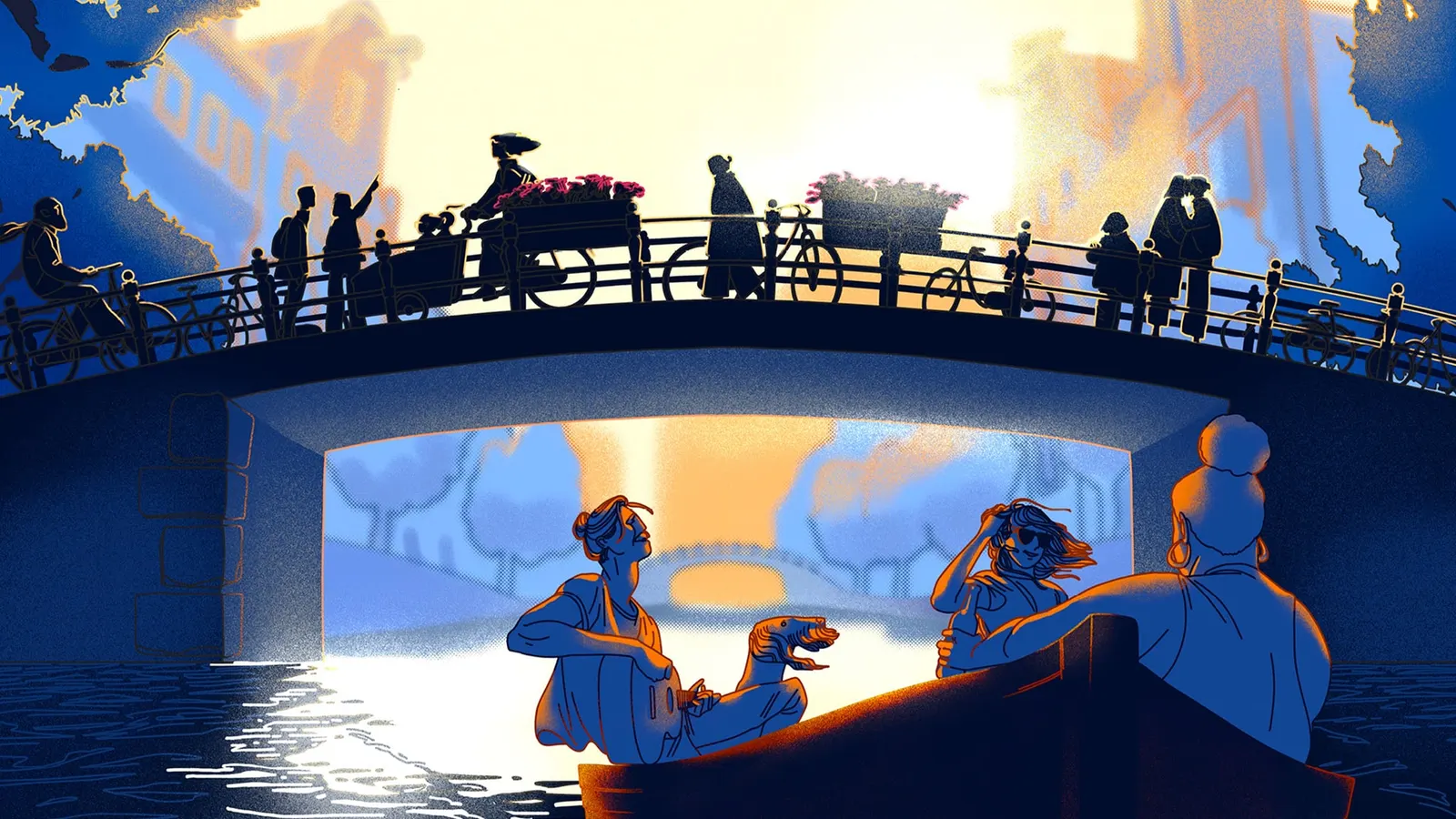
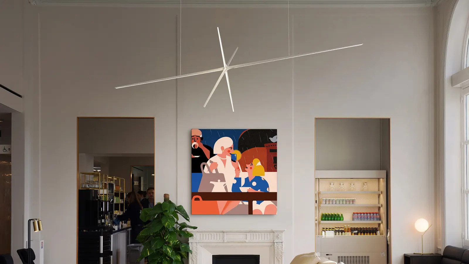
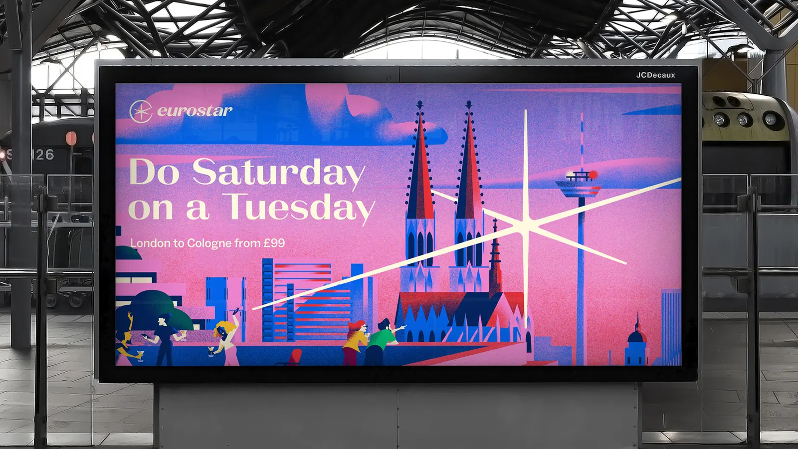
The lowercase italic word mark, developed with Luke Prowse, echoes the 1994 original, while La Pontaise adds warmth to headlines. Blue and navy anchor a palette of six secondary colors. The Spark detaches from the symbol, rotating, extruding, and landing in place across trains, stations, and screens. Seven illustrators from across the network and photography art directed with John Adrian give the system a human side. Snap, the last-minute fare line for younger travelers, later reworked the motion into a snap-to-reveal device.
Why it works
Rail branding tends toward either heritage or generic speed, and this identity avoids both. The E-and-star mark is simple enough to hold up at small sizes, yet it keeps the name's initial and a memorable symbol in one shape. Italic lowercase letters suggest momentum without leaning on arrows. Blue and navy keep the trust a transport brand needs, while the wider palette and commissioned illustration make it feel European rather than tied to one country. Best of all, the Spark gives the brand a movement of its own.
Logo
Applications
Images and video from further.group, by Further.