The Brand Monograph
Nike Run brand identity by PORTO ROCHA
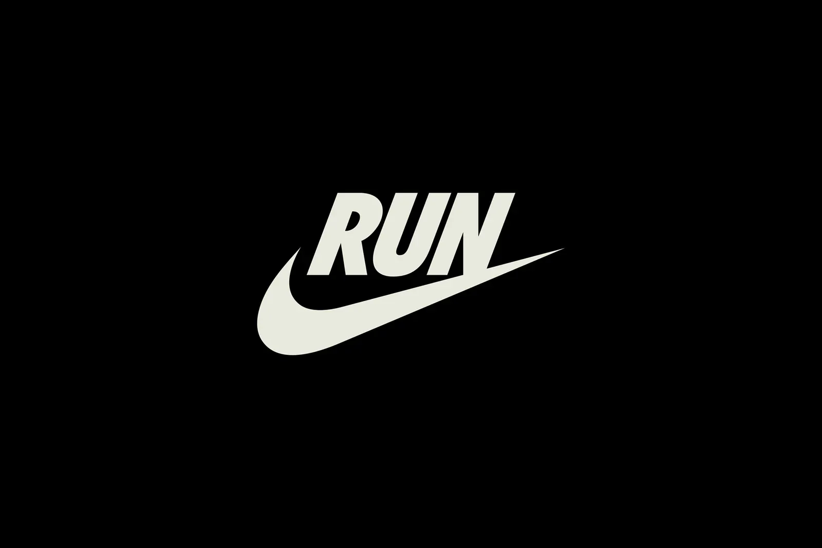
↗PORTO ROCHA's Nike Run work stands out for how little it invents. The studio went into Nike's own archive, pulled out a 1980s lockup, and swapped the brand name for a single word: RUN. The resulting mark, RUNSWOOSH, works as both a label and an instruction.
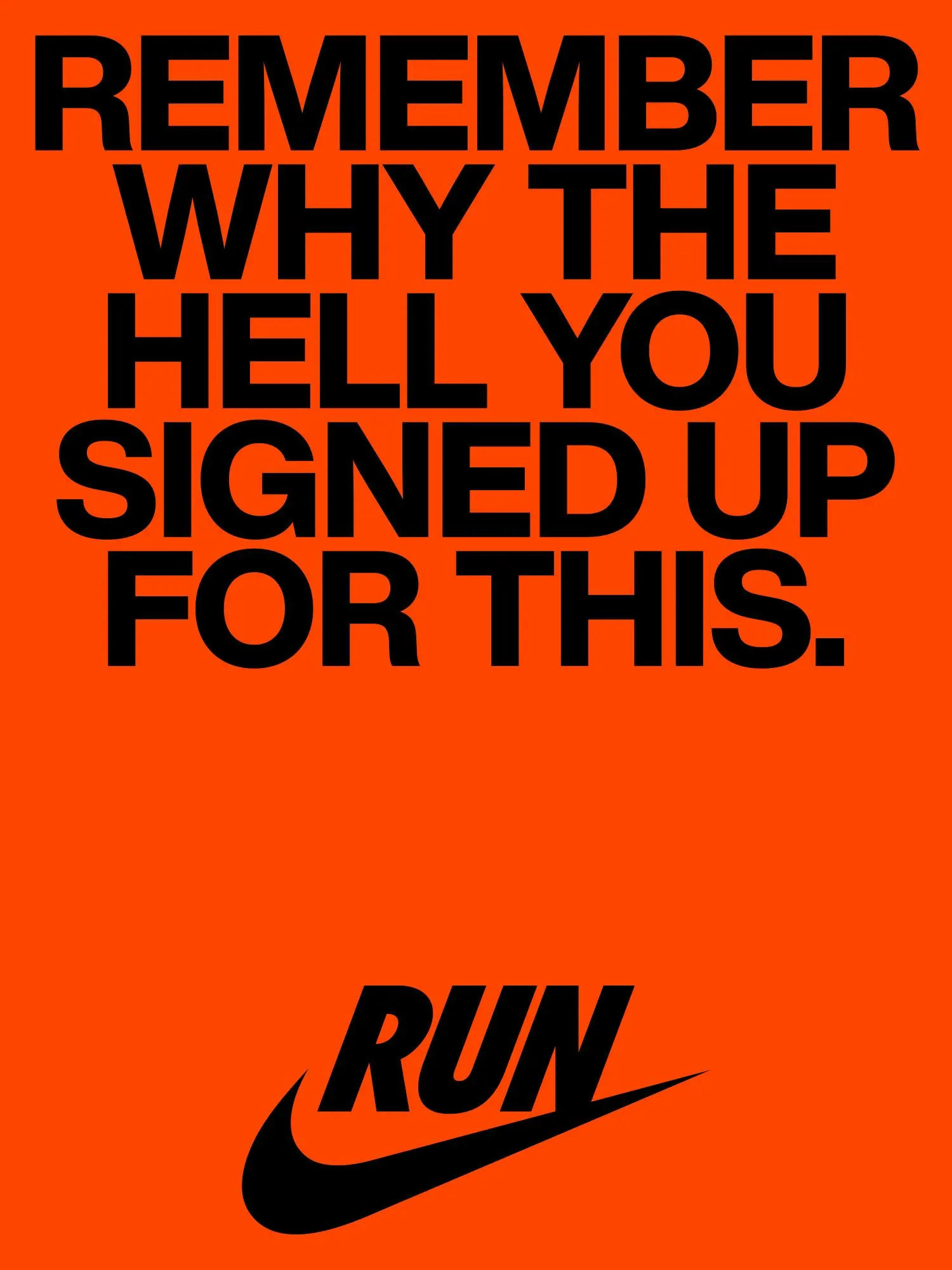
The brief was to restore Nike's authority in the category it created, now crowded with challengers, across campaigns, retail, product, and global events. Working with strategists Ayo Fagbemi and Natalee Ranii-Dropcho, and alongside Wieden+Kennedy, Mutant™, and Monotype, PORTO ROCHA paired the mark with Helvetica Now and a palette led by Volt Orange, a nod to the shoe box Phil Knight envisioned in 1972. A brighter Volt Yellow from Nike Running Club adds range. A modular layout system holds it together from marathon events to store takeovers.
Why it works
The strongest decision is putting the verb inside the mark. Nike keeps the equity of the Swoosh while narrowing it to one category, and that history is something newer rivals can't fake. Helvetica Now is a smart partner: neutral enough to let athletes and product carry the personality, flexible enough to shout in a headline or read like a split time. Volt Orange gives the line a color tied to Nike's own story rather than to the neon of the category, so it feels owned rather than borrowed.
Logo
Typography
Applications
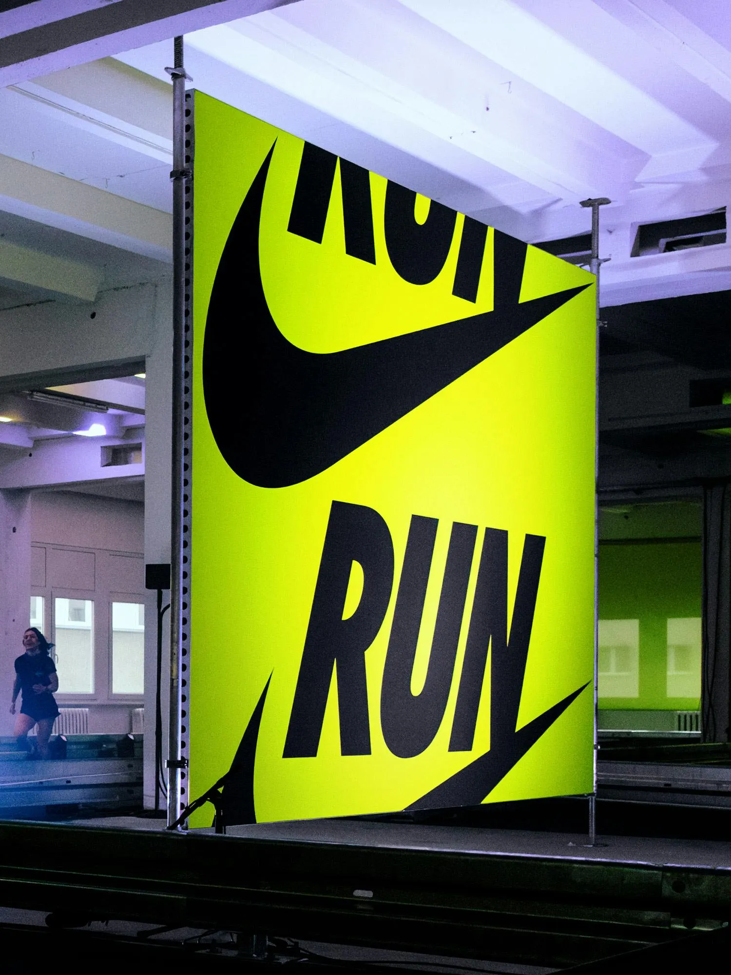
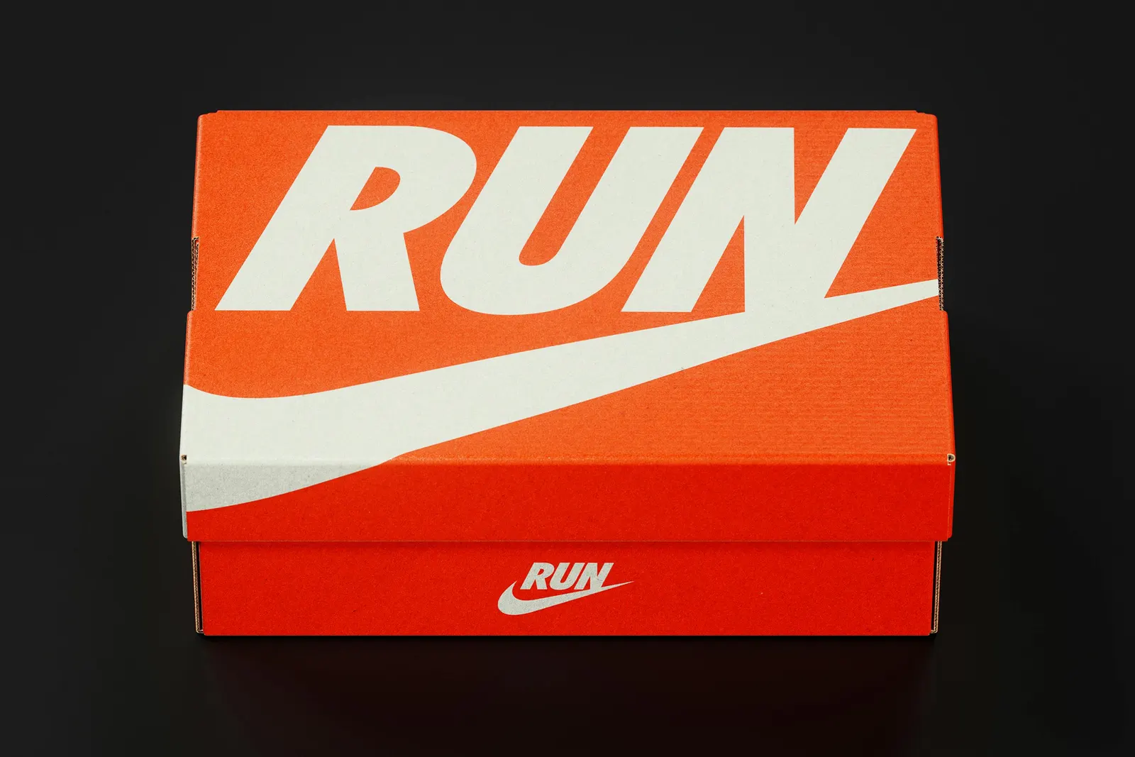
Images and video from portorocha.com, by PORTO ROCHA.