The Brand Monograph
Almeida & Dale brand identity by PORTO ROCHA
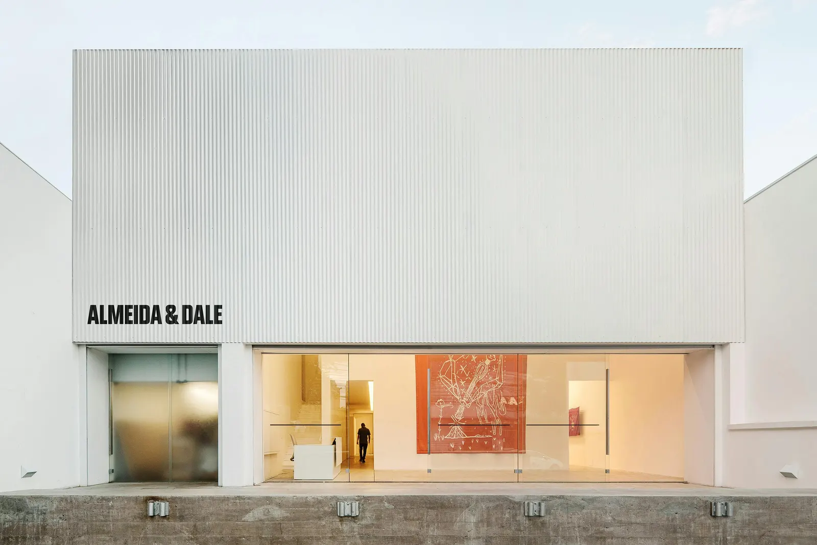
↗PORTO ROCHA has given Almeida & Dale, Brazil's biggest gallery, an identity that finally feels at home among the artist-first names it wants to be mentioned alongside. The brief came at a turning point: a 2025 merger with Millan created Latin America's largest gallery, a new São Paulo flagship was on the way, and the brand still felt more like a market operation than a champion of artists.
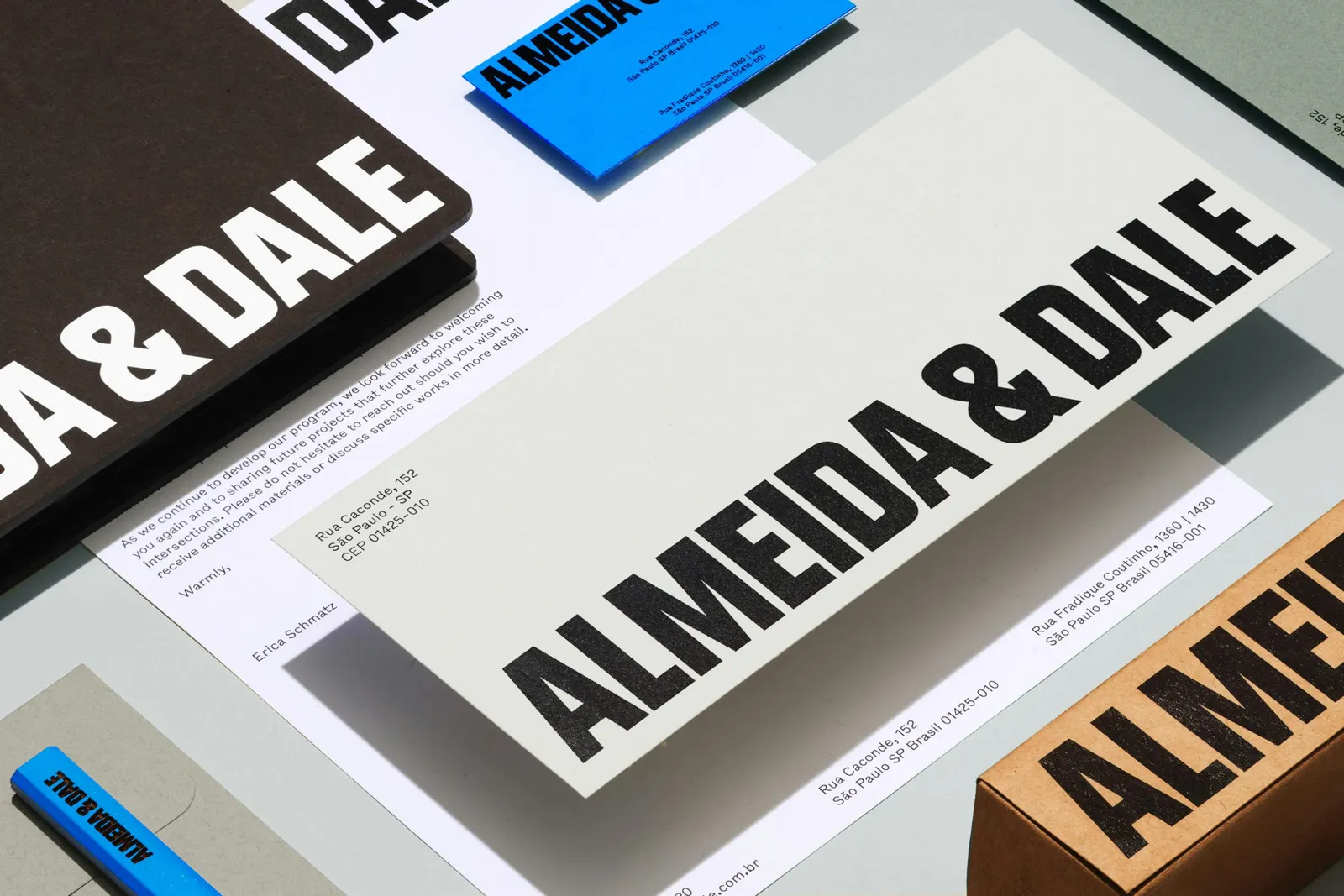
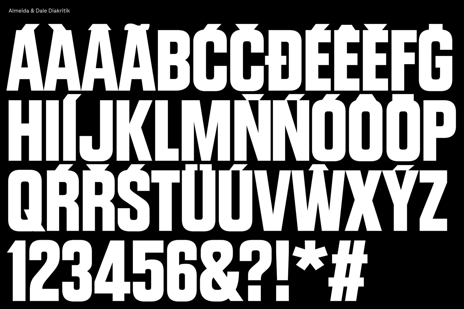
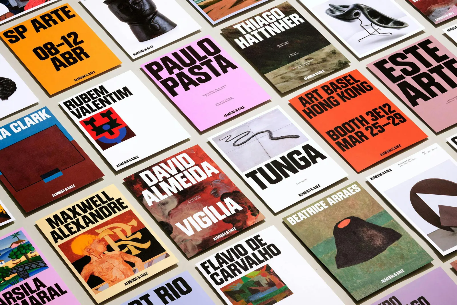
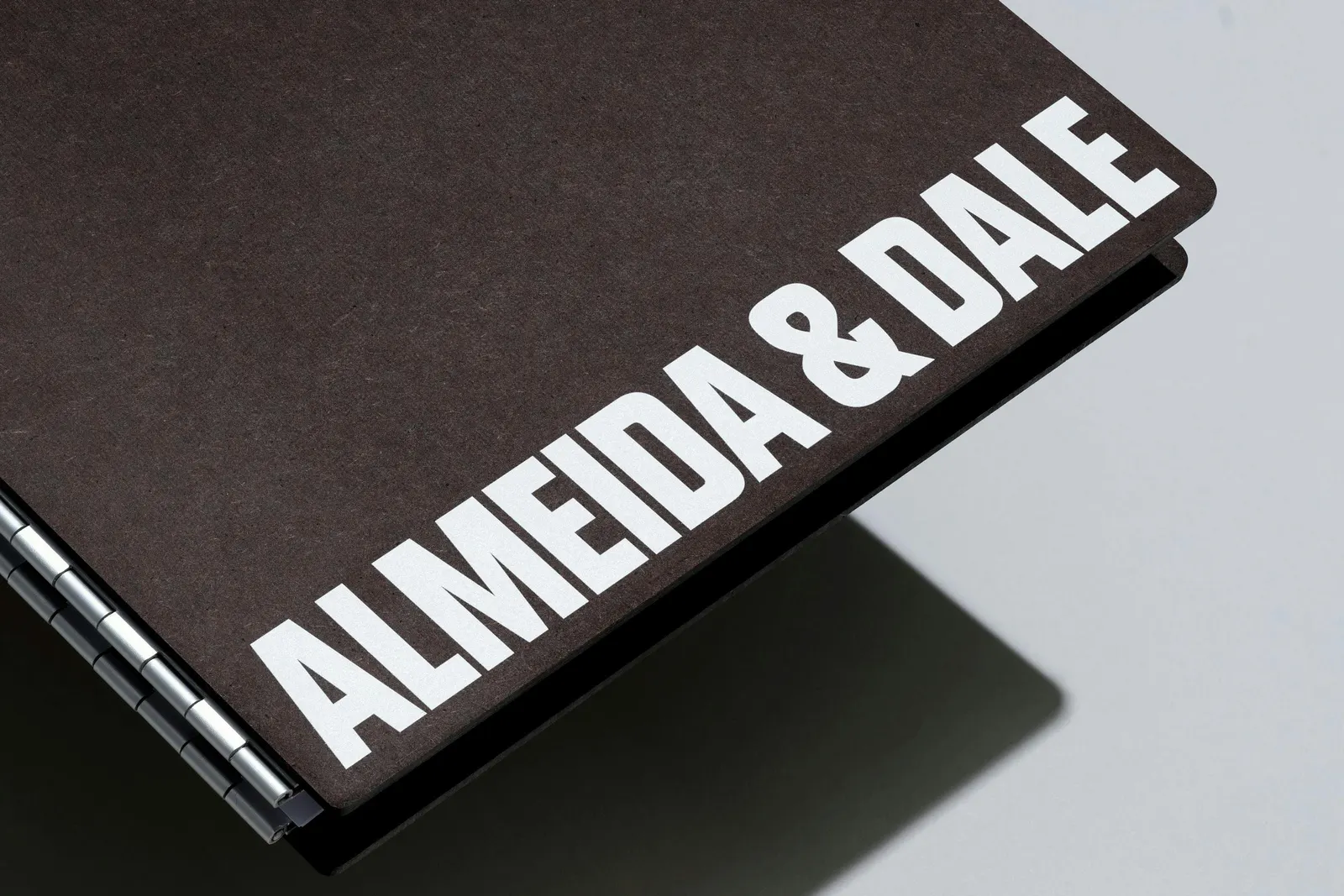
The studio's answer starts with Diakritik AD, a condensed custom typeface developed with type designer Marek Nedelka, with accents drawn at the same weight as the letters for Brazilian Portuguese. Bull-5, a typewriter-style face borrowed from 1980s American newspaper labels, adds a rougher counterpoint, and a single strong blue ties the two together. The system stretches across catalogues, fair materials, and signage, with full-bleed imagery, shifting grids, and quick motion from Charles Carlos, Nabill Parvizi, and Thales Muniz.
Why it works
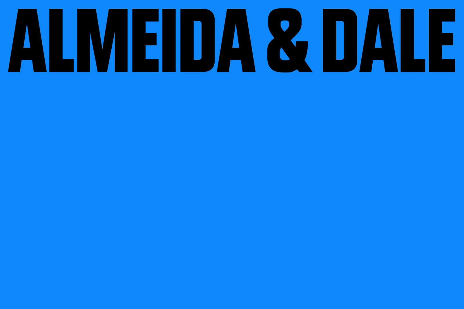
Most type treats accents as an afterthought. Here they are part of the design, which turns a detail of the Portuguese language into something only this gallery owns. The condensed forms are loud enough to hold a wall or a book cover but never compete with a painting, and the typewriter face stops the whole thing from feeling too polished. The blue is the sharpest move. In a category that defaults to black, white, and grey, one committed color makes the gallery recognizable at a glance.
Logo
Applications
Typography
Images and video from portorocha.com, by PORTO ROCHA.