The Brand Monograph
Call of Duty brand identity by Koto
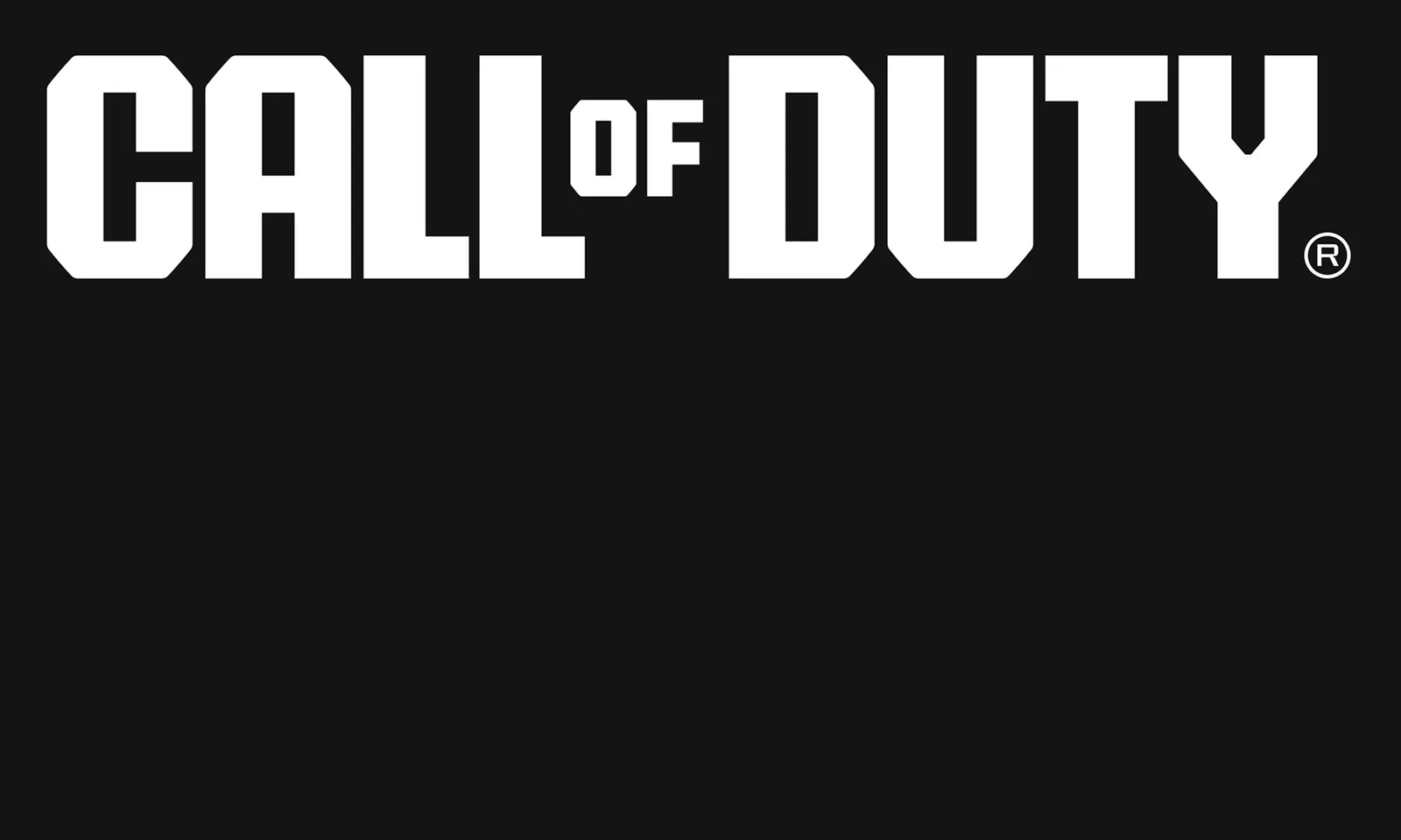
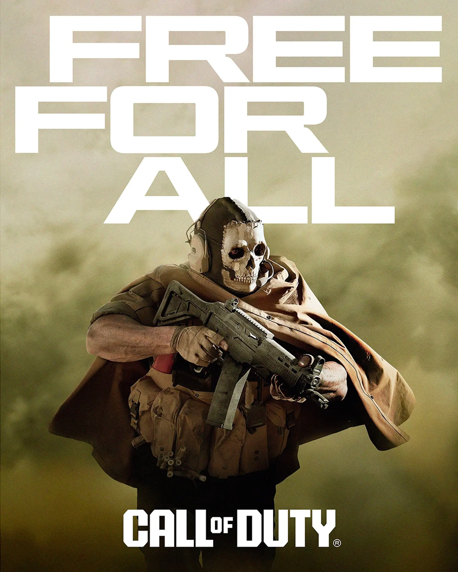
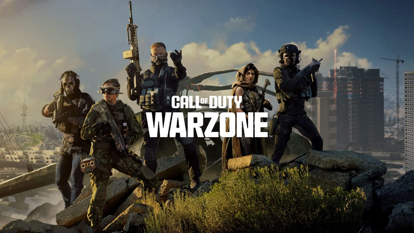
↗Koto has given Call of Duty its first single identity, retiring a wordmark that had been set in Impact since 2003. For a franchise this big, that's a quiet kind of risk: the old lettering was familiar to millions of players, and the internet had also long treated it as a joke.
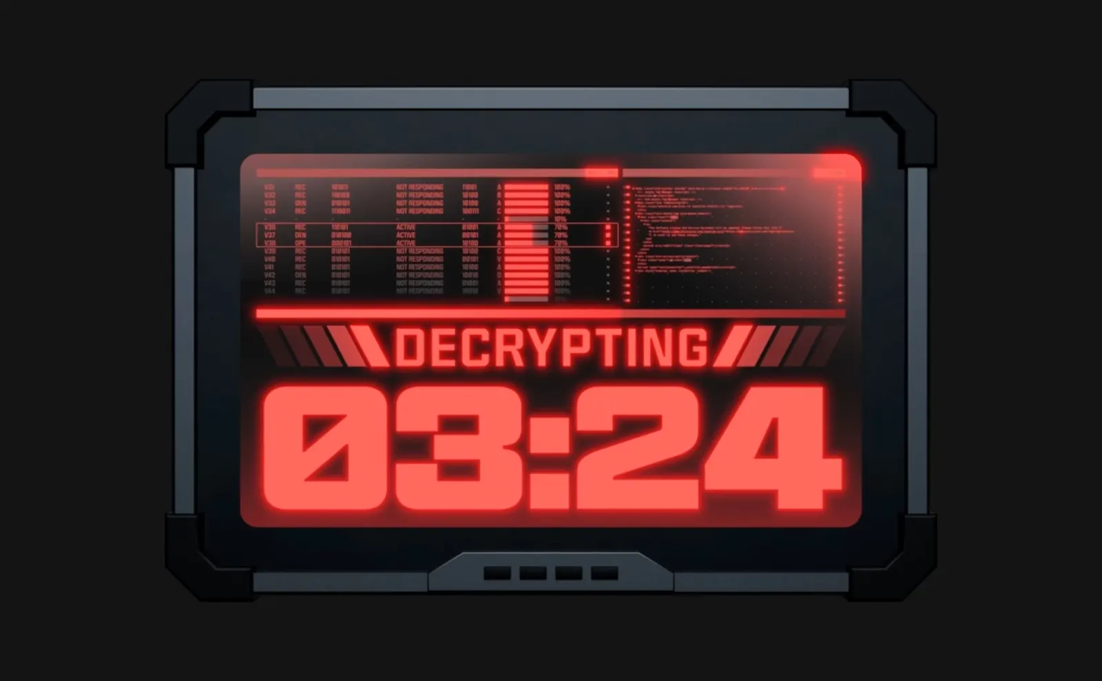
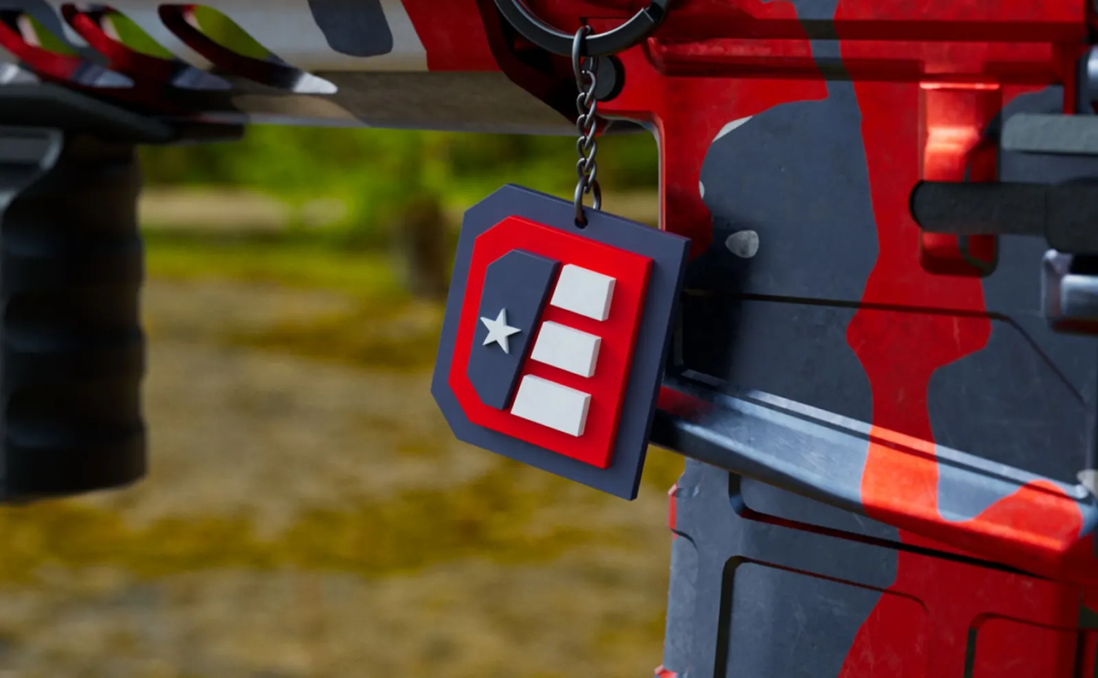
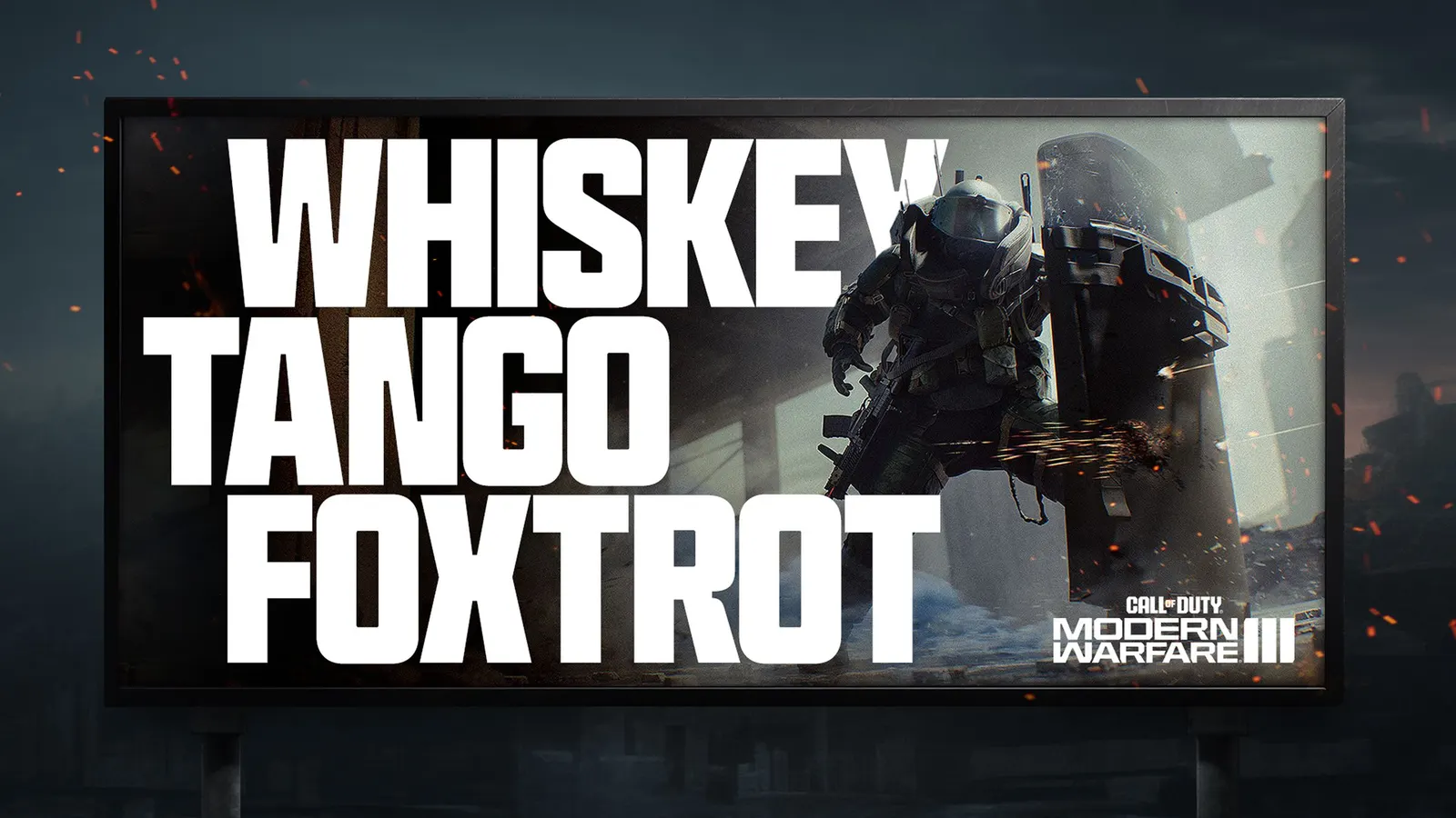
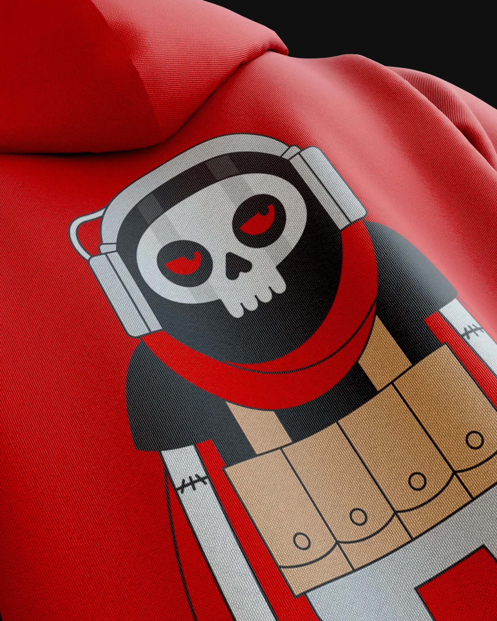
The brief was to pull a sprawl of sub-brands and annual releases into one masterbrand covering gaming, esports, partnerships, and philanthropy. Koto answered with a design system anchored by Hitmarker, a custom variable typeface developed with the foundry NaN, with bespoke weights that run from restrained to loud. Motion principles take their cues from how the game plays, its speed and its kick. Design credits extend to NaN and Petrol, with PETROL Advertising handling illustration. The system is built so collaborators, from Snoop Dogg to Skeletor, can slot in and keep their own personality.
Why it works
Typography carries the weight here, and Koto treated it that way. Swapping a borrowed, overexposed typeface for a proprietary one gives the franchise letterforms it can own, which matters in a category where shooters tend to share the same gritty vocabulary. Making it variable lets a single family cover a thumbnail, an in-game menu, and a stage screen without the voice drifting. Tying motion to the feel of play keeps the brand from reading as decoration. And a system that welcomes odd partners shows confidence in its center.
Applications
Logo
Images and video from koto.com, by Koto.