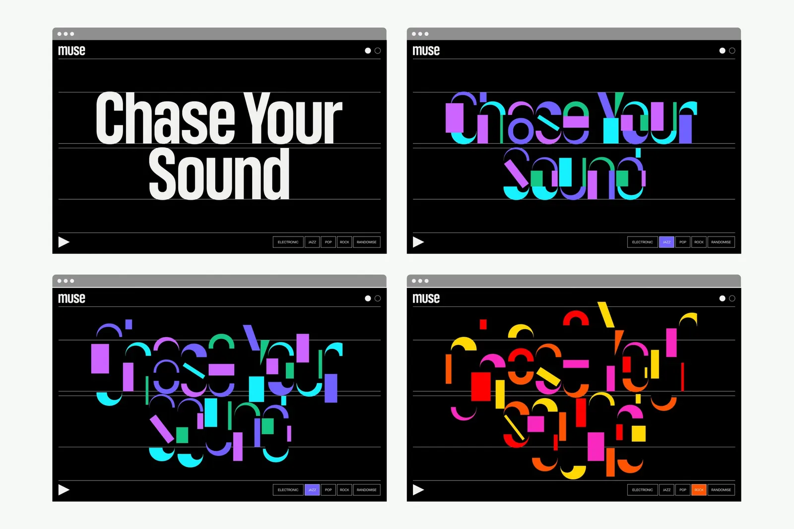
The Brand Monograph
Twitch brand identity by Porto Rocha
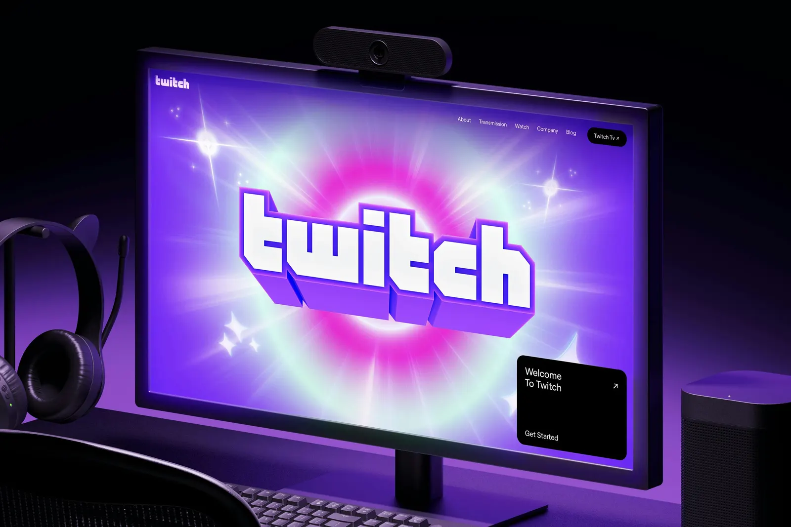
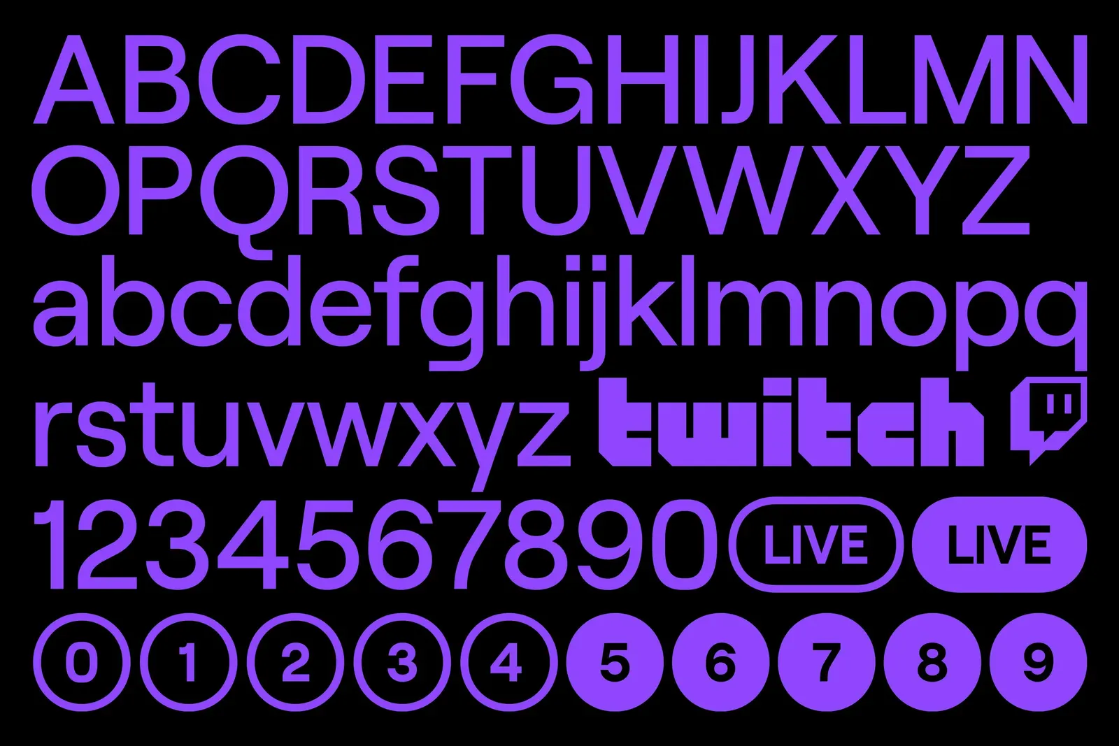
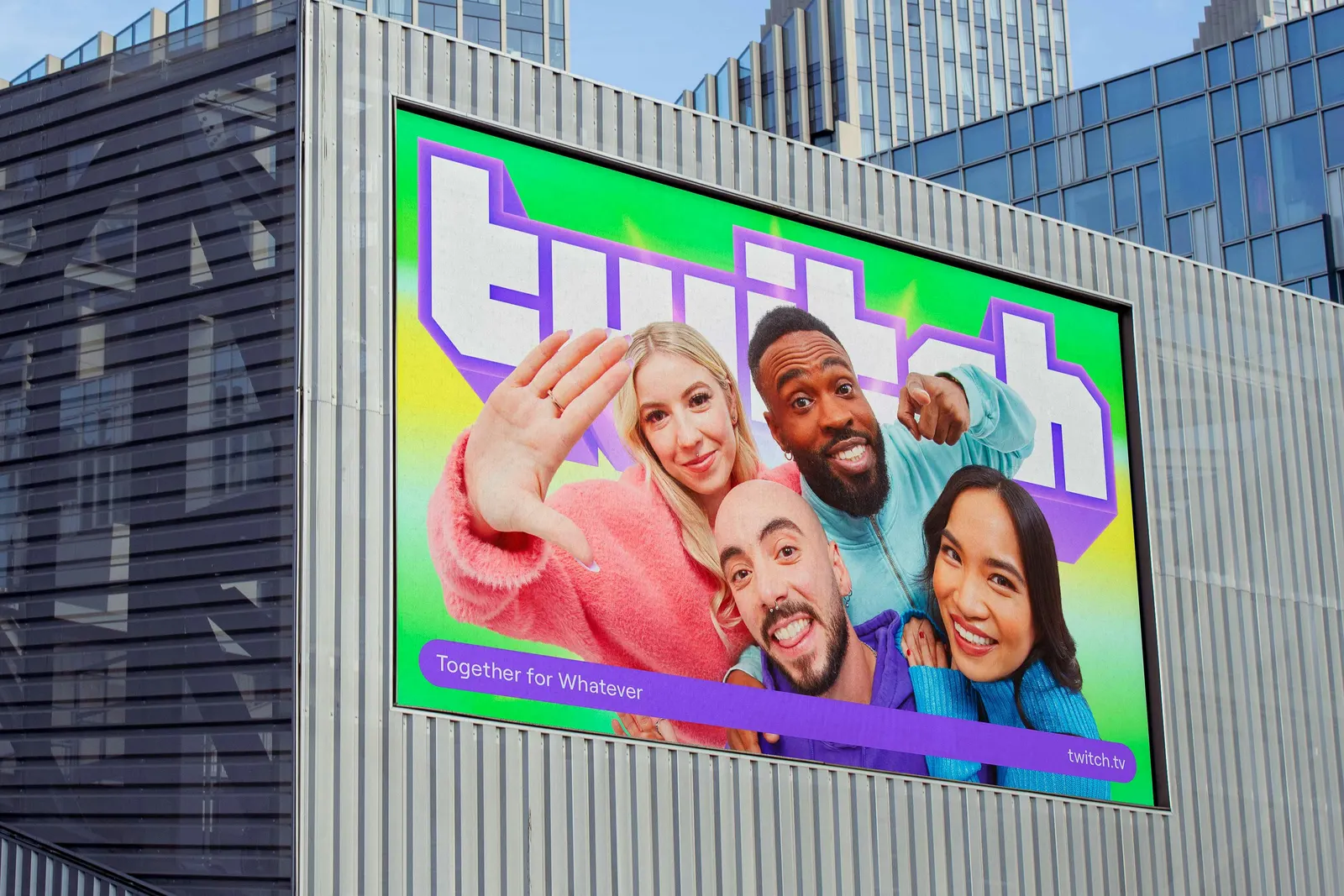
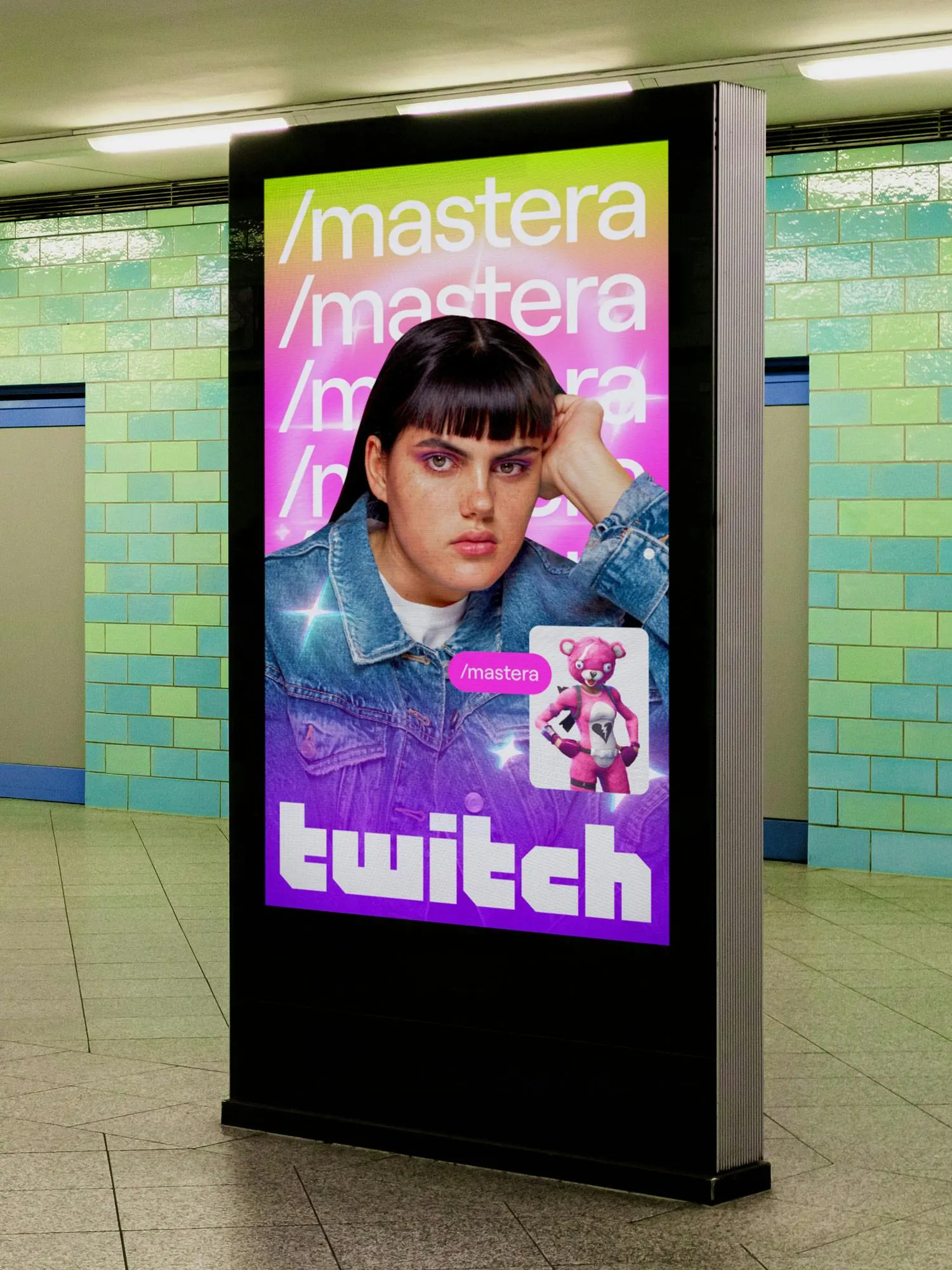
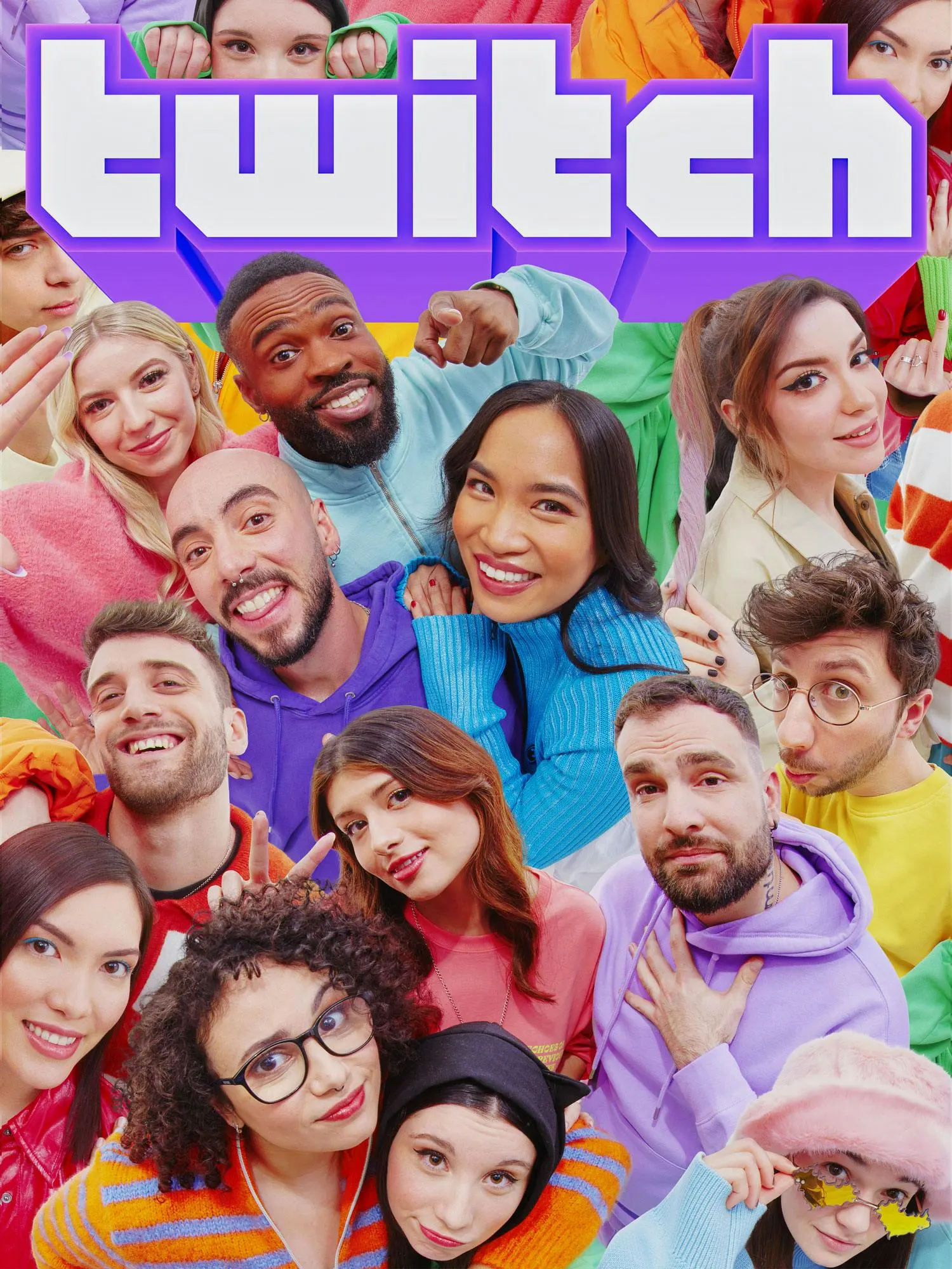
↗What stands out about PORTO ROCHA's work for Twitch is its range. The same identity can sit almost silent behind a streamer or pile up into a swarm of 3D objects, sprites, and emotes. Twitch, with more than 30 million daily visitors, had outgrown a system built for a smaller platform. The studio, with strategists Felipe Rocha and Leo Porto, kept the wordmark, the Glitch mascot, Roobert, and Twitch Purple, then stretched everything around them.
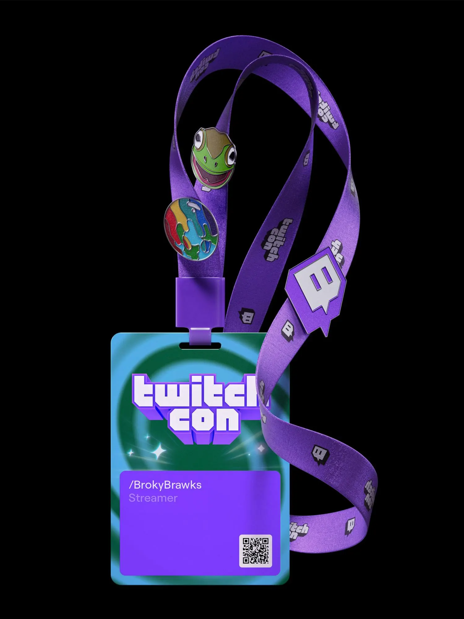
The craft sits in the layers. Displaay and Marek Nedelka updated Roobert and simplified the type system, while Lukas Kawakami and Pedro Veneziano contributed 3D work. Cutout photography joins gradients and motion that runs from small typographic gestures to dense collage, with Caio Berns Pereira, Josh Krauth-Harding, and Thales Muniz behind the movement. In the interface, new purple tints and shades cover light and dark modes, and rounded modules echo the pill-shaped type. At TwitchCon 2023, illustrations became sculptures and emotes became giants.
Why it works
The smartest move is leaving the core assets alone. Because the mark, mascot, and purple stay put, the identity can get loud without losing recognition. Emotes and sprites come from the community's own visual habits, so the brand looks like it belongs in chat rather than talking at it. The quiet end of the range matters just as much: on a platform where creators are the product, a restrained interface with purple as the connective tissue keeps the brand from competing with them.
Applications
Logo
Images and video from portorocha.com, by Porto Rocha.