The Brand Monograph
Borussia Dortmund brand identity by Further
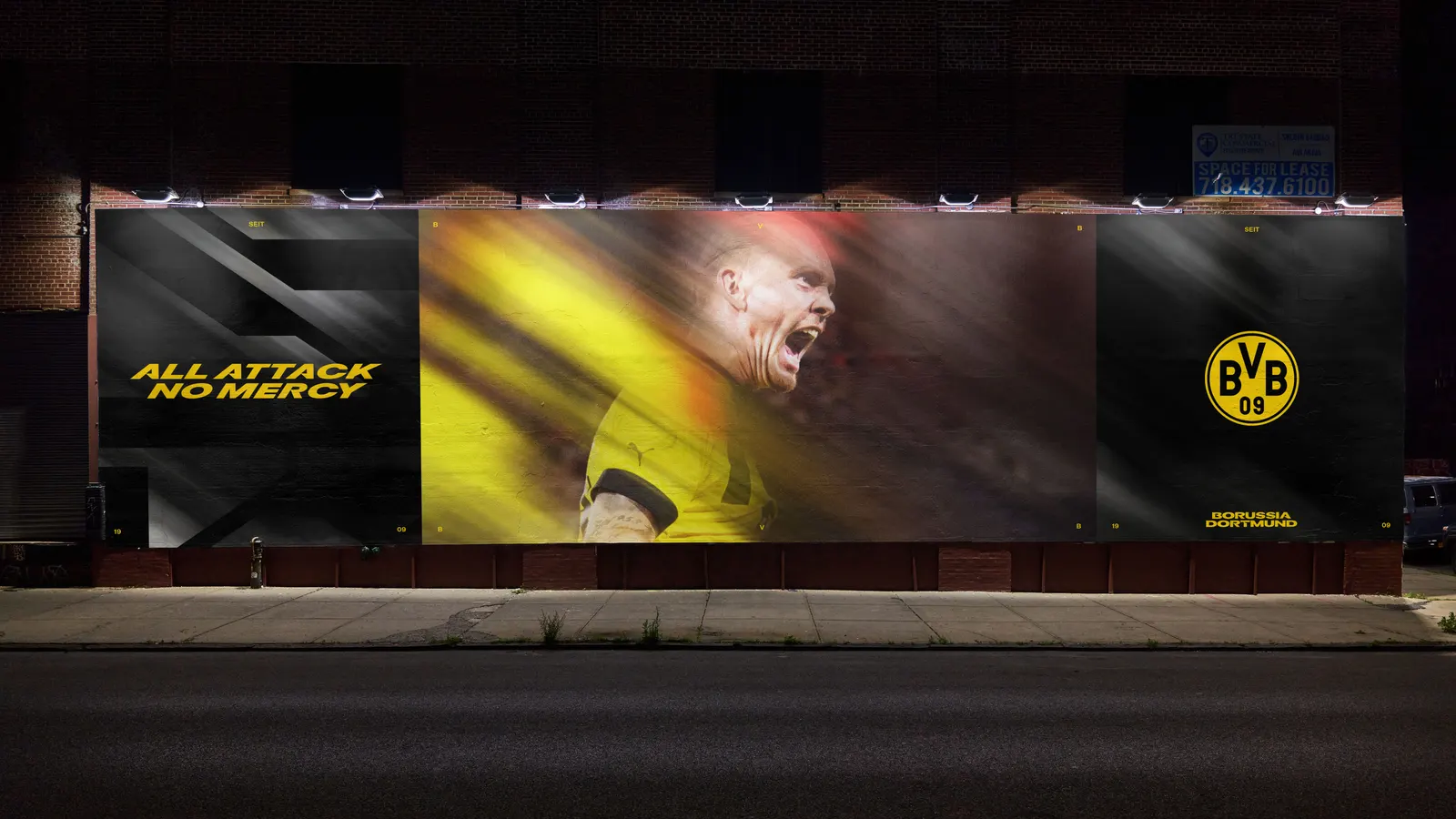
↗Further's work for Borussia Dortmund starts from a smart move: instead of reaching for the badge, the studio looked at the stadium. The 34º slope of the standing terrace at Signal Iduna Park, home of the Yellow Wall, becomes the single tilt that organizes everything the club puts out, from the mark to motion.
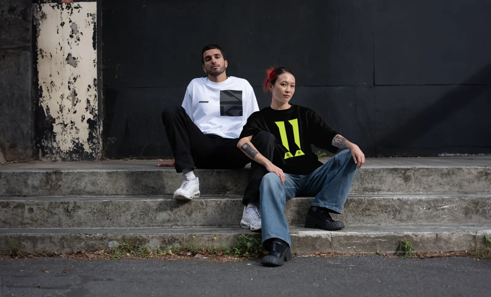
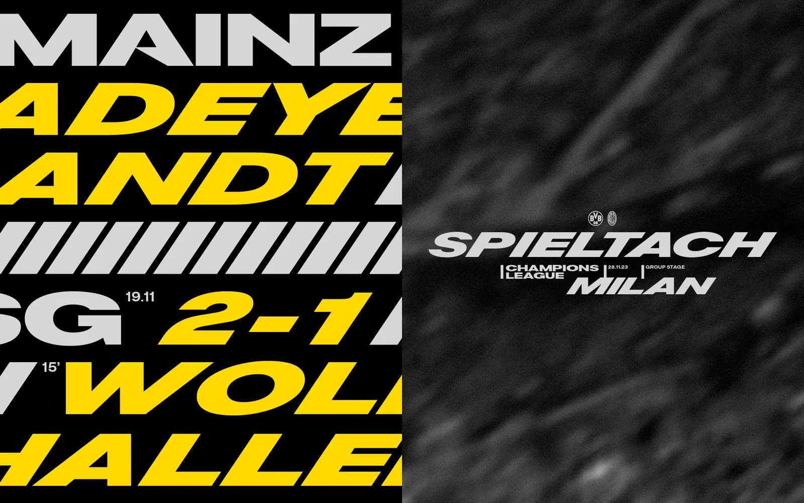
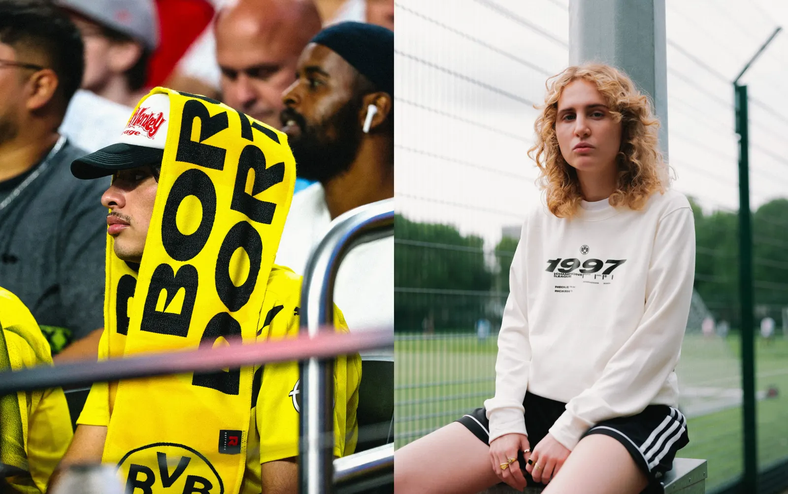
The brief was to help a club built on local devotion, captured in Echte Liebe, compete as a global brand without losing that feeling. Further kept black and yellow, then added neons and greys pulled from the stadium, vintage shirts, and the city, along with textures drawn from Dortmund's industrial landscape. With Blaze Type, it built a custom type suite on the same slope, including the word mark, an expressive headline face, a plainer text face, and numerals shaped by the device's horizontals and diagonals.
Why it works
The angle isn't invented. It comes from a place fans have physically stood, so a simple geometric device carries meaning that a generic speed line never could. Because it's just a slope, it travels easily across the word mark, numerals, and image treatments without needing explanation. Black and yellow stay intact, which protects recognition, while the neons and greys give the club a sharper, more contemporary feel on screen. The result looks like a football club, not a tech startup.
Applications
Logo
Typography
Images and video from further.group, by Further.