The Brand Monograph
Sundance Film Festival brand identity by Porto Rocha
↗Porto Rocha gave Sundance Film Festival something it had never had: a permanent visual identity. The largest and longest-running independent film festival in the United States had been rebuilding its look from zero every year, which strained resources and left its team with little guidance for communicating between editions.
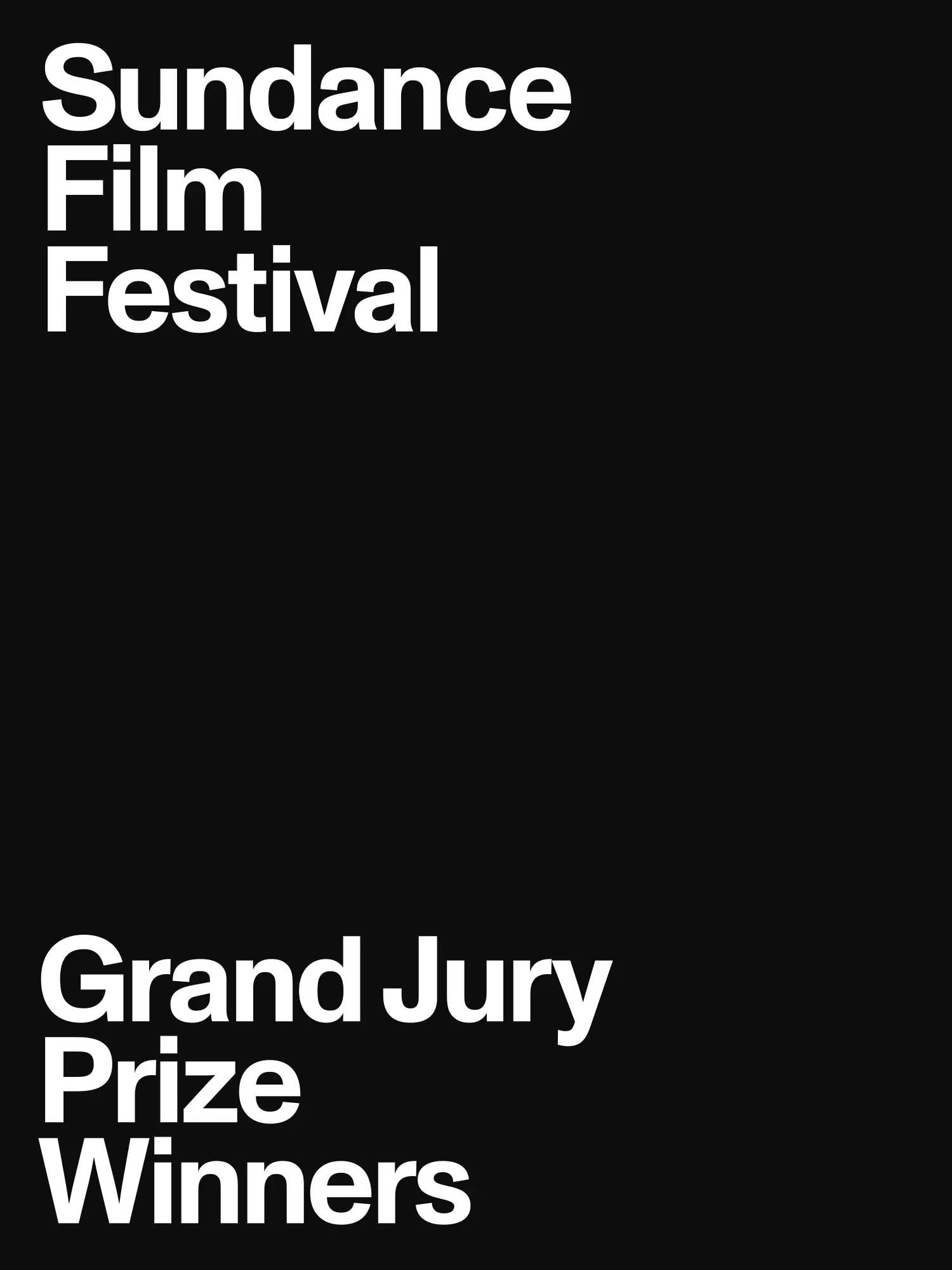
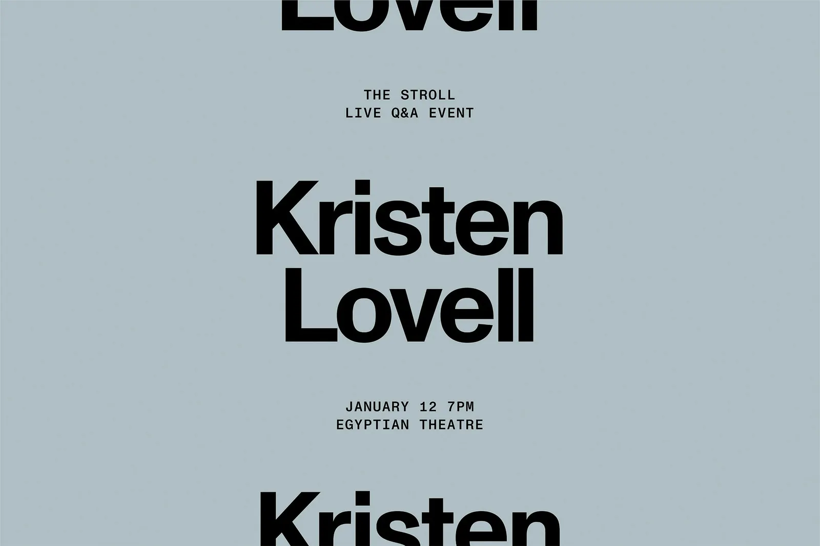
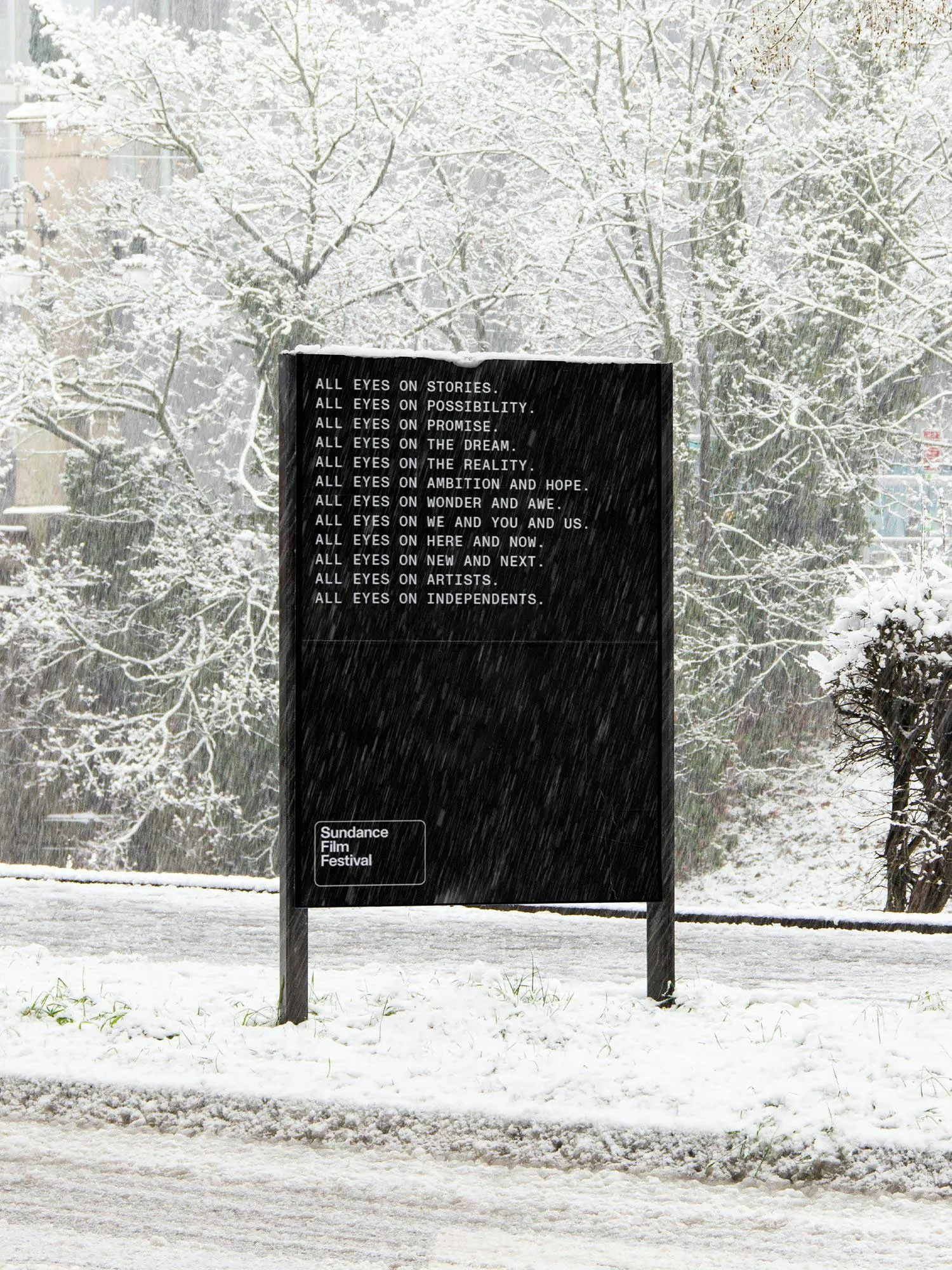
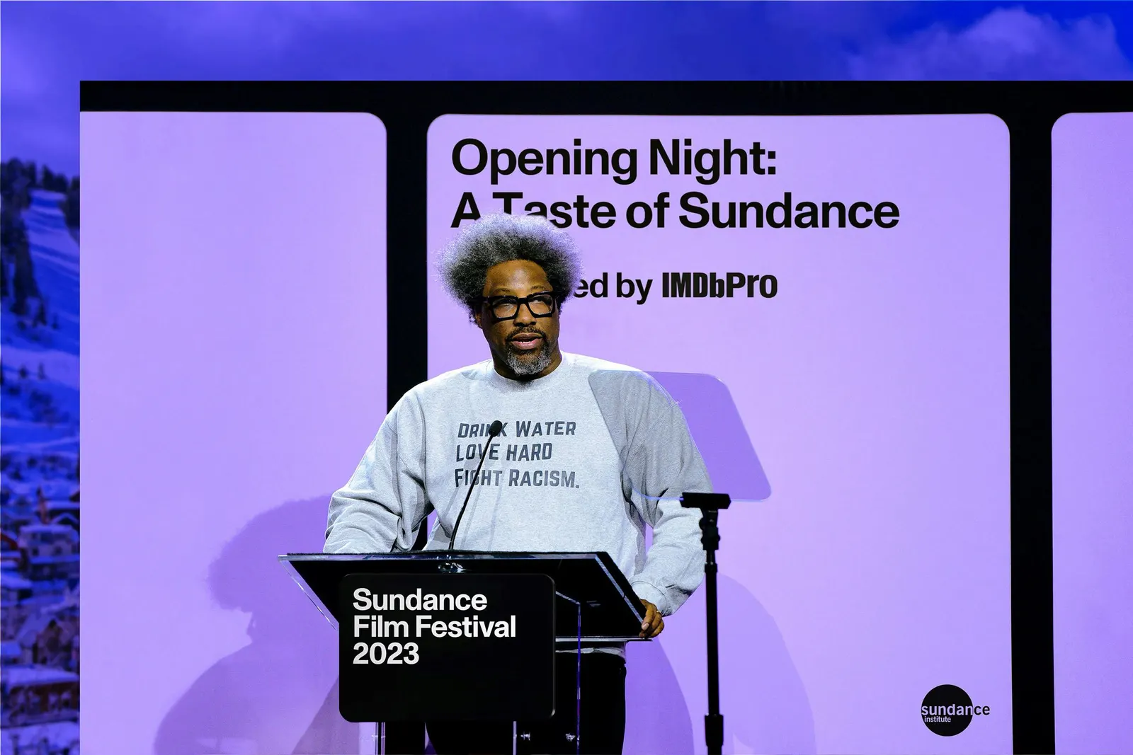
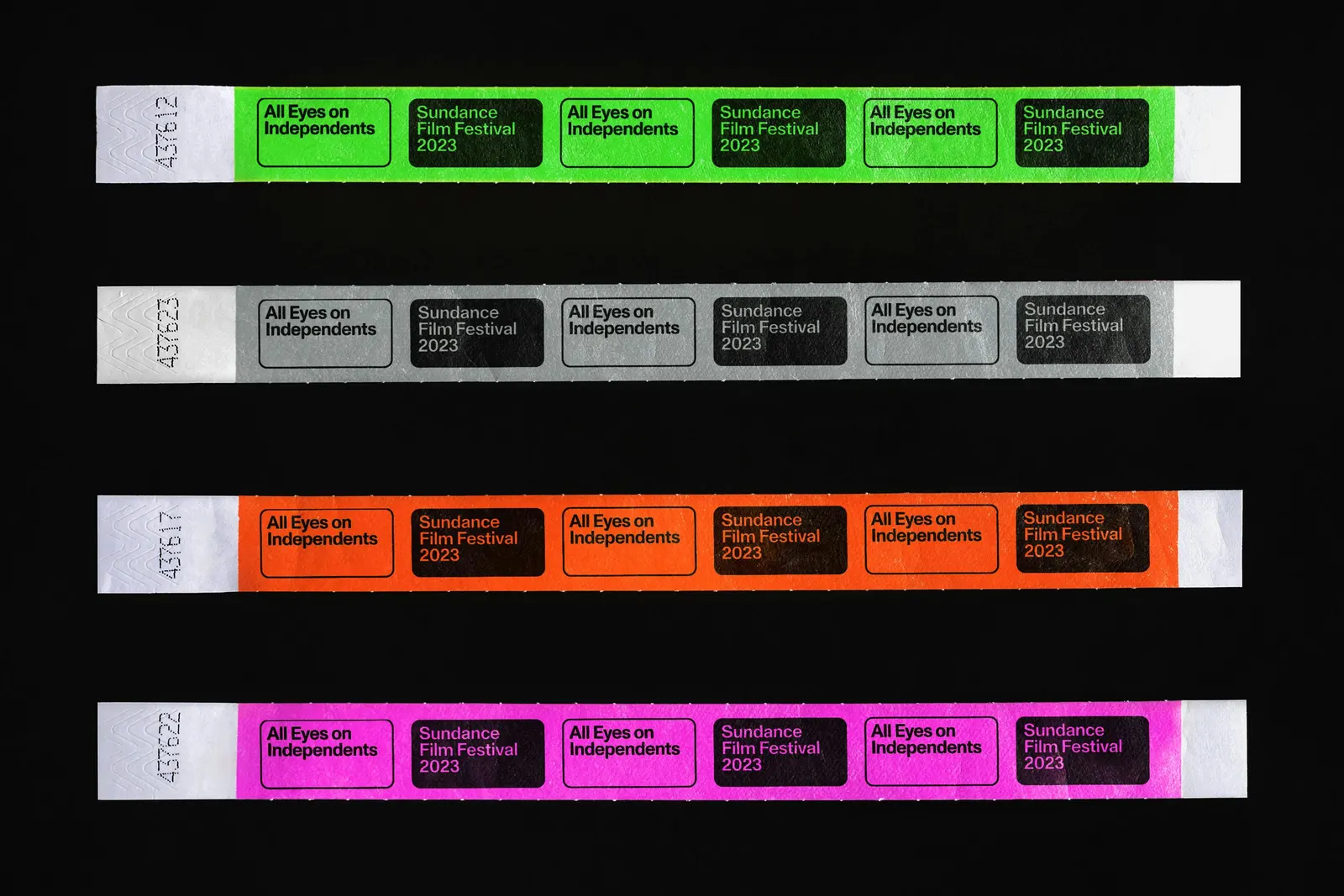
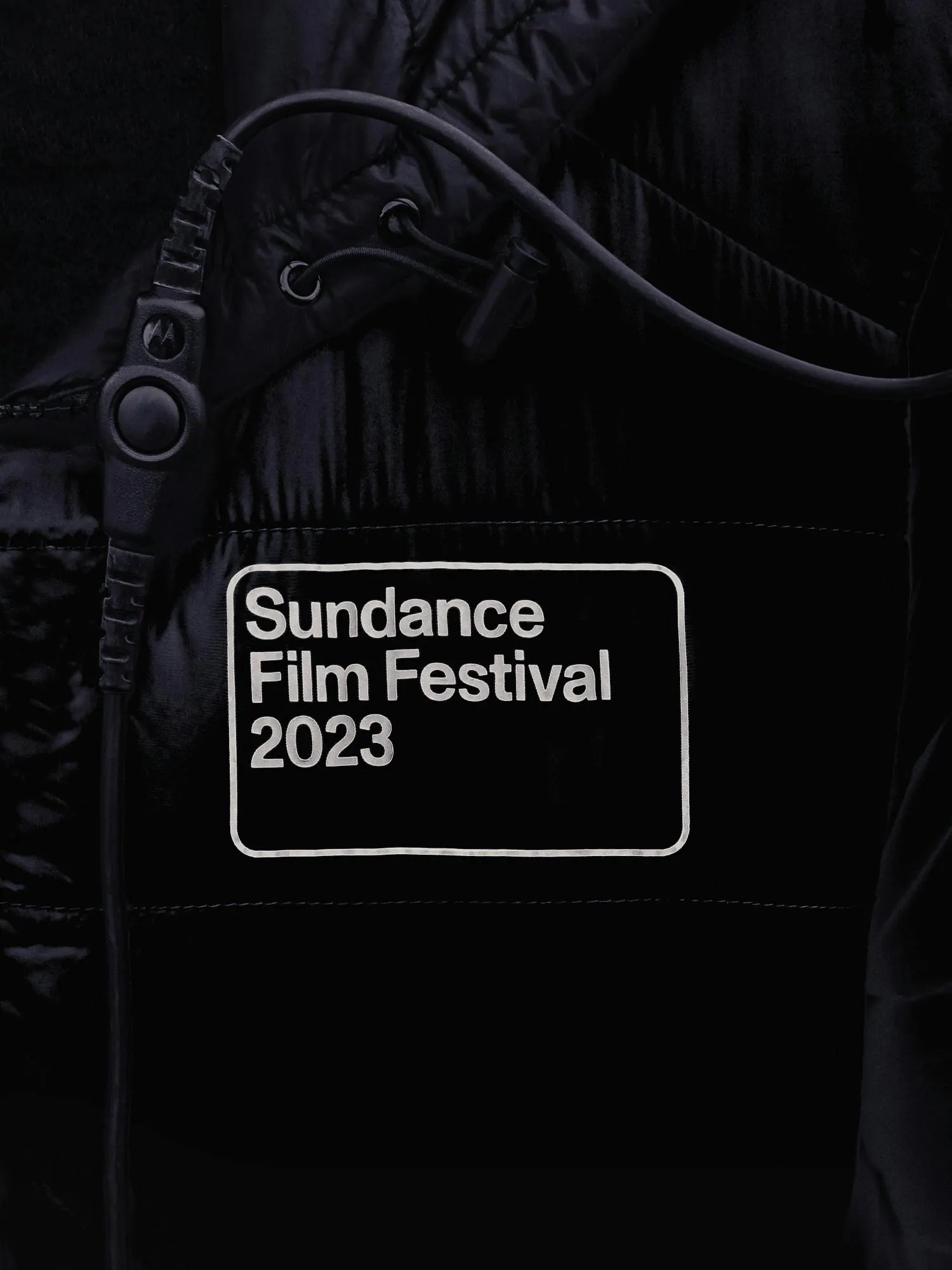
The studio's answer starts with a logo cut to a cinematic aspect ratio, so it works as both signature and viewfinder. It sits over festival footage and archive stills to isolate a face, a gesture, or a mood. Dinamo's Monument Grotesk is neutral enough to sit beside any genre. Layouts borrow the repeating cells of a film strip, motion draws on how films are cut and shot, and a narrator persona gives the writing a voice that can celebrate and explain, backed by a tagline that puts independent artists first.
Why it works
The frame is the smartest decision here. A mark that holds other people's work, rather than competing with it, lets the films supply the color and personality, which suits an institution whose output changes every year. The restrained typeface keeps the festival from favoring any one genre, while the film strip rhythm gives the system a recognizable structure. Together they make Sundance look like a curator with a point of view rather than a brand with its own agenda.
Applications
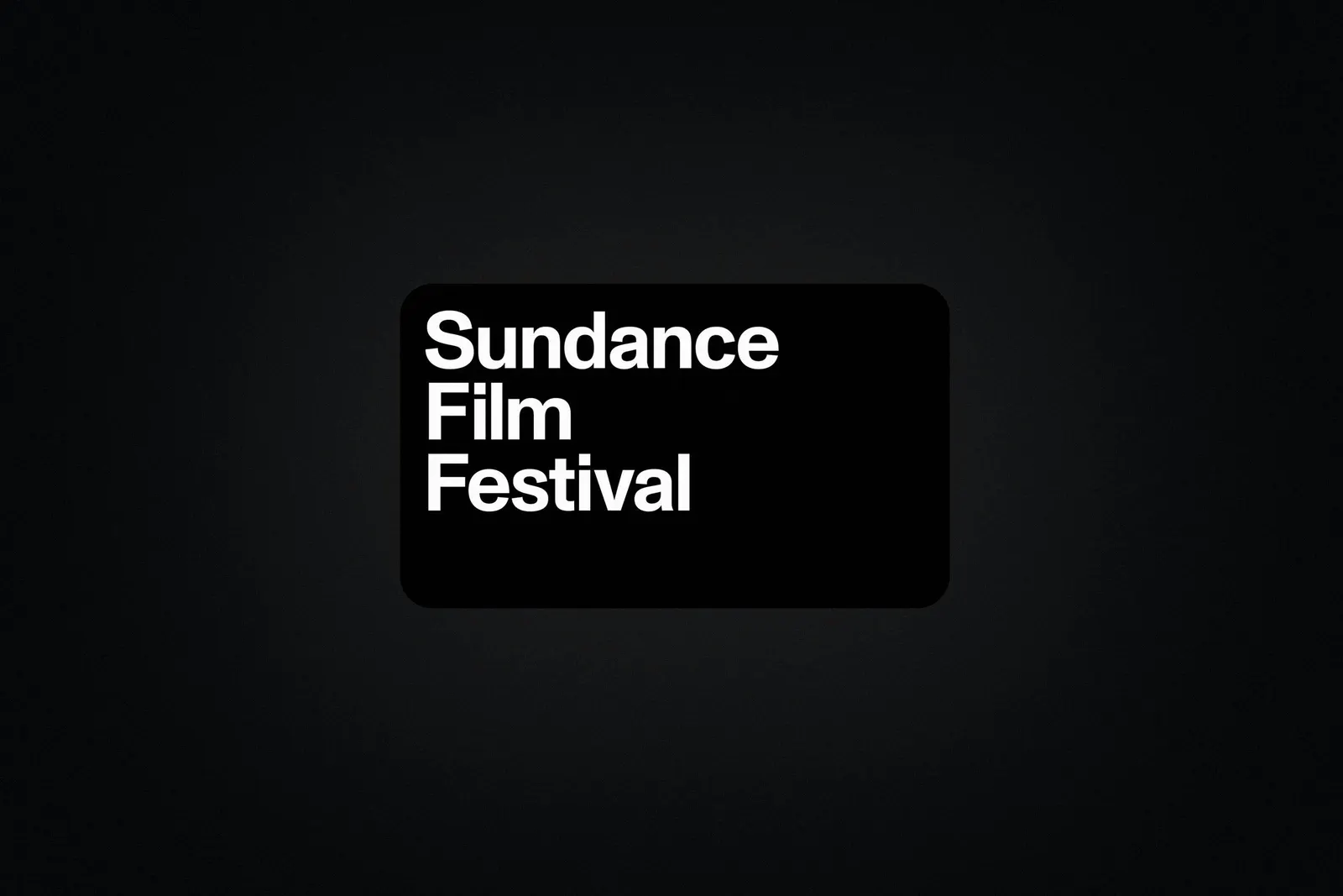
Logo
Images and video from portorocha.com, by Porto Rocha.