The Brand Monograph
MASP brand identity by Porto Rocha
↗PORTO ROCHA's identity for MASP made the front pages of Brazil's two biggest newspapers, which is rare for a museum rebrand. It was timed to the opening of a second building beside Lina Bo Bardi's landmark on Avenida Paulista. The brief was to carry an institution of nearly 80 years into a larger physical and digital future without breaking from its past.
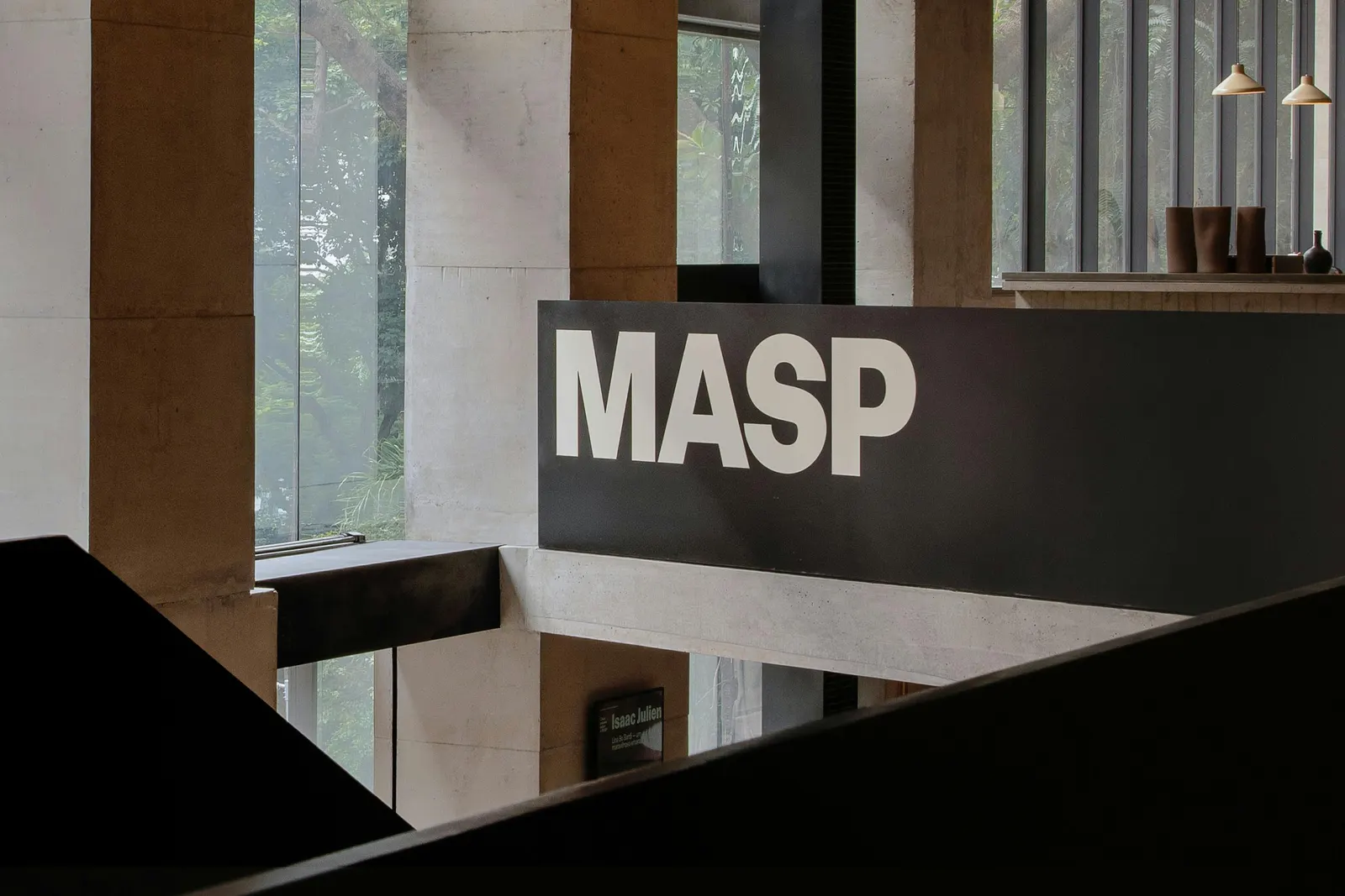
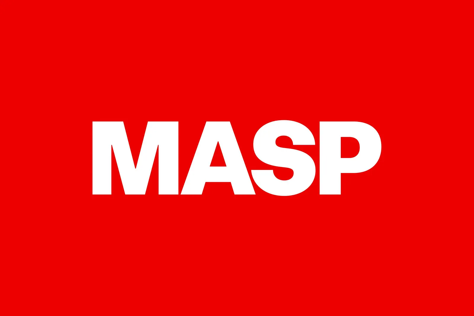
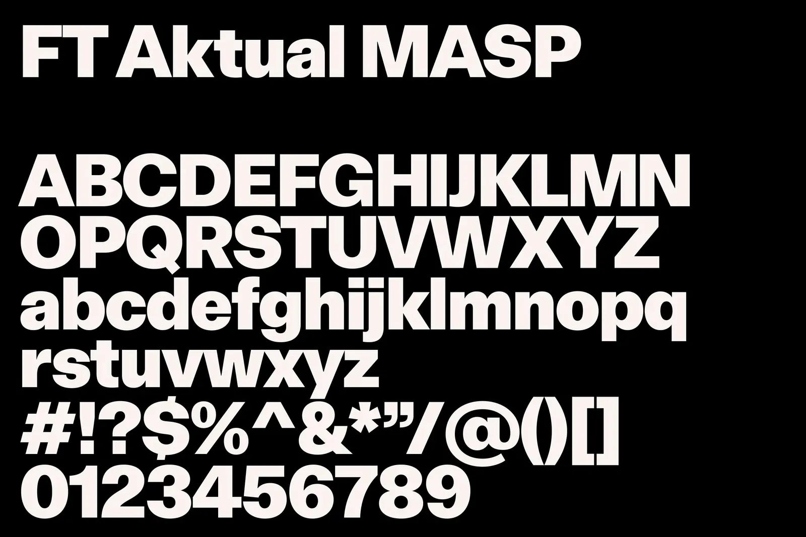
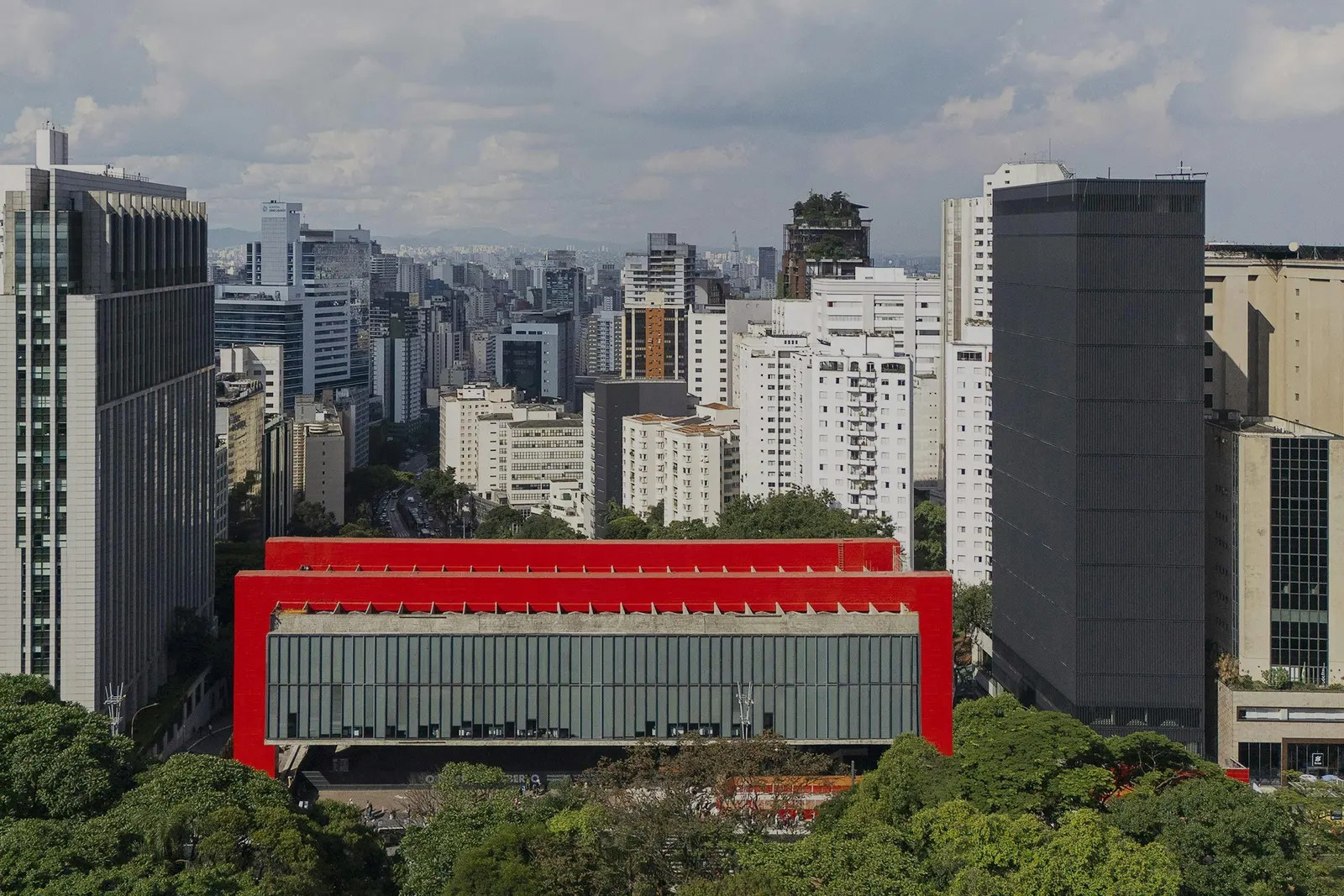
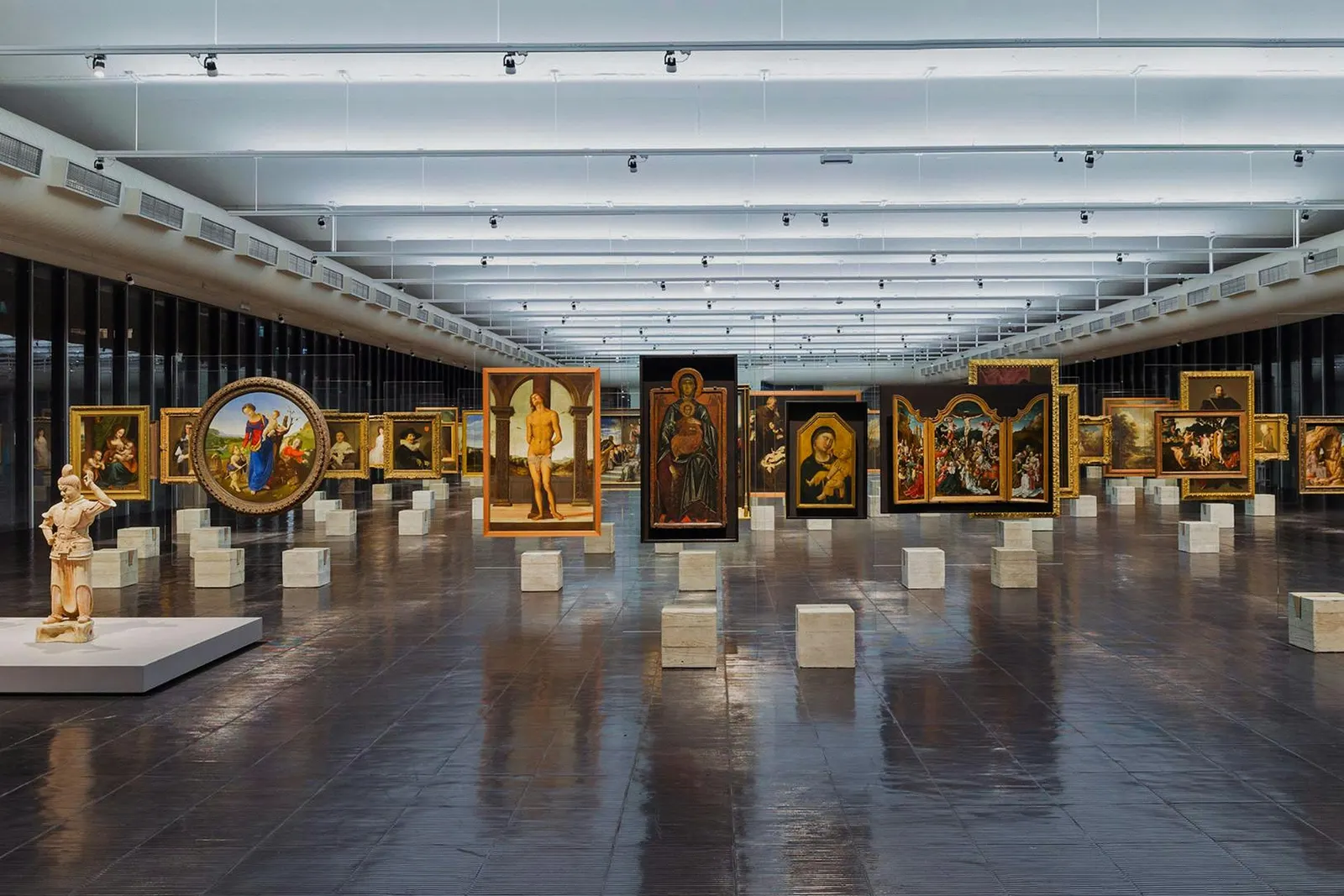
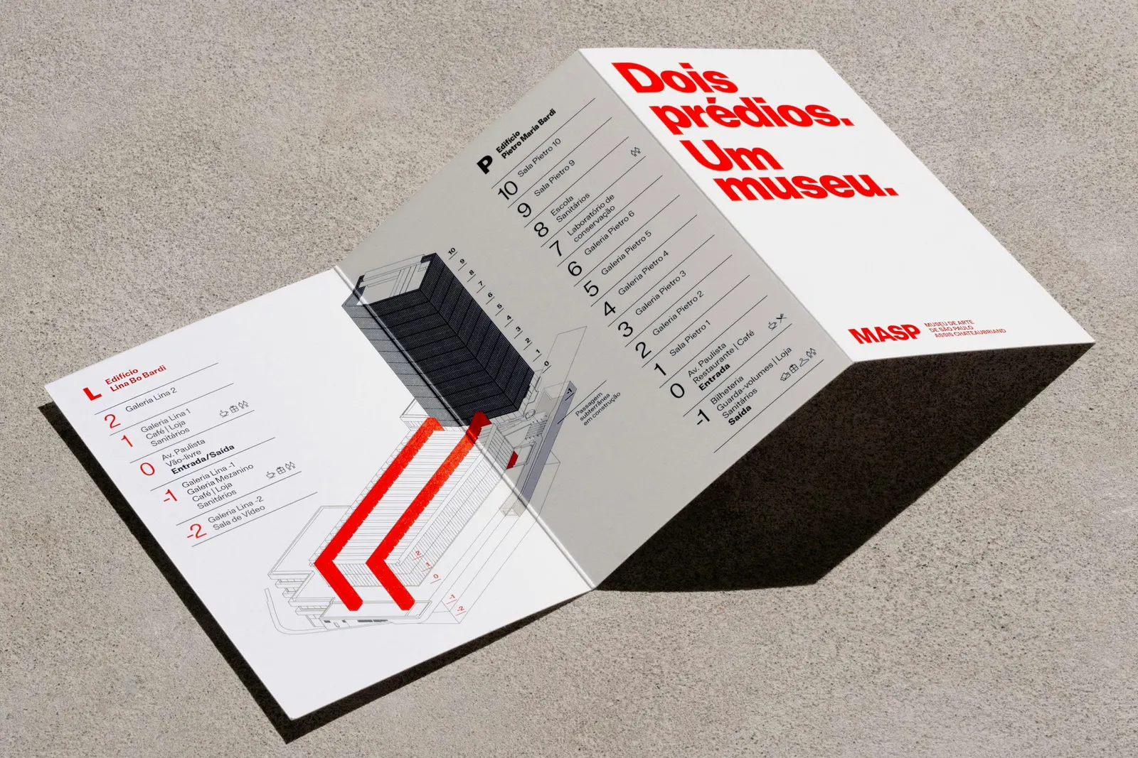
The studio built the system on Brazilian modernist design. A blocky, rectilinear wordmark echoes the concrete-and-glass architecture and anchors a modular grid that stretches across signage, screens, and the redesigned website. A simple pictogram of the two buildings, one red and one black, serves as the emblem. Josh Krauth-Harding and Thales Muniz shaped the first motion language, which plays with scale and borrows from Bo Bardi's glass easels. Formula Type handled typography, and Claren Walker wrote the copy.
Why it works
The pictogram says the one thing visitors need to know: there are now two buildings, and they belong together. The red-and-black pairing is blunt enough to read from a passing car on Avenida Paulista, and it gives the museum a color code that is not tied to a single exhibition. Because the wordmark and grid borrow from the architecture and from local design history, MASP looks like itself rather than like the neutral sans-serif museums around the world. That rootedness is what lets it feel global.
Applications
Logo
Typography
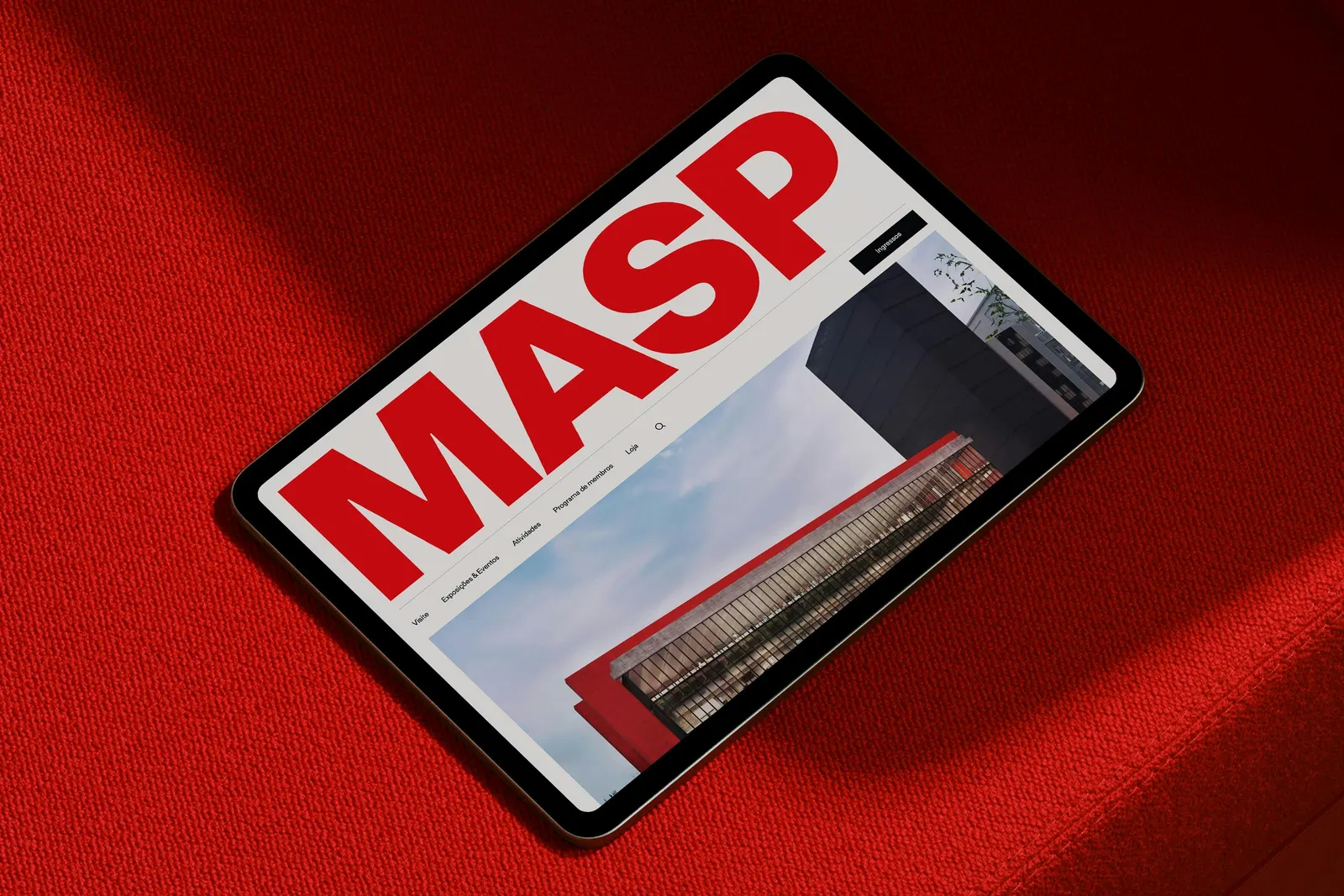
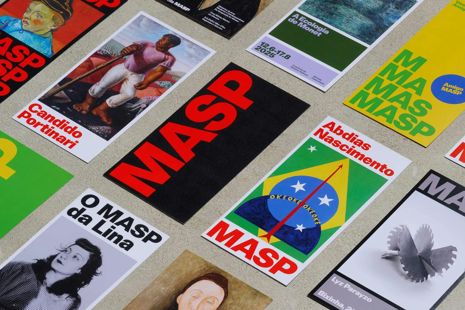
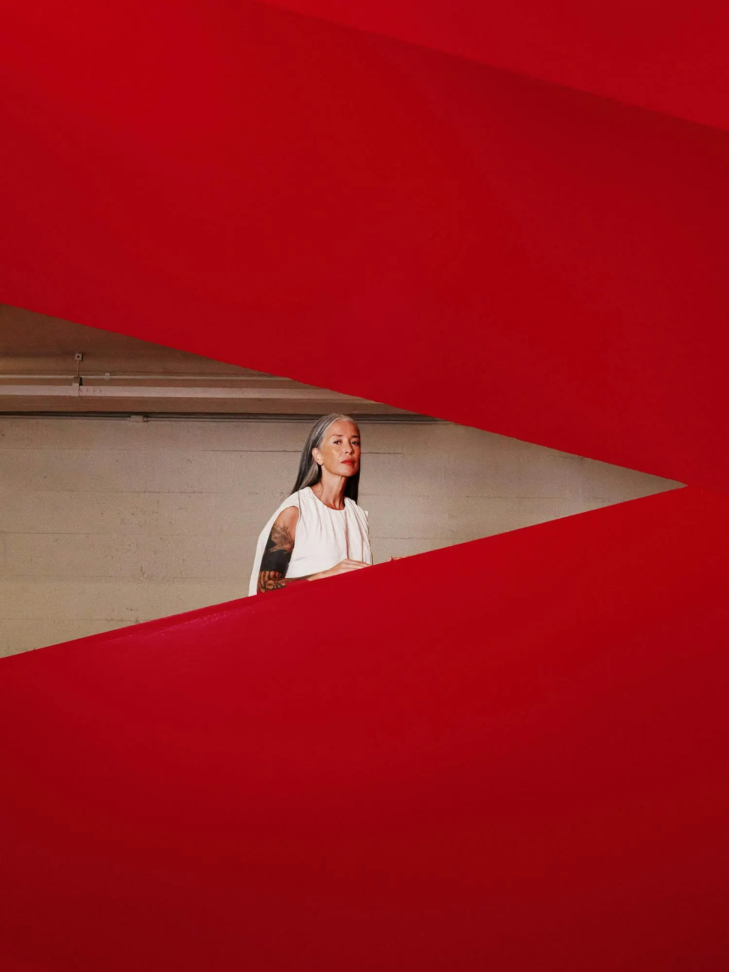
Images and video from portorocha.com, by Porto Rocha.