The Brand Monograph
P•TAL brand identity by Mother Tongue Design
↗A dot is an unlikely hero for a rebrand, yet it does a lot of work for P•TAL, a cookware brand built on a UNESCO-listed Indian metalworking tradition. Mother Tongue Design used it to link ripples, tree rings, and hammered metal, then built an identity, packaging system, and online store around it. The payoff has been real: over 100,000 customers and a category repositioned.
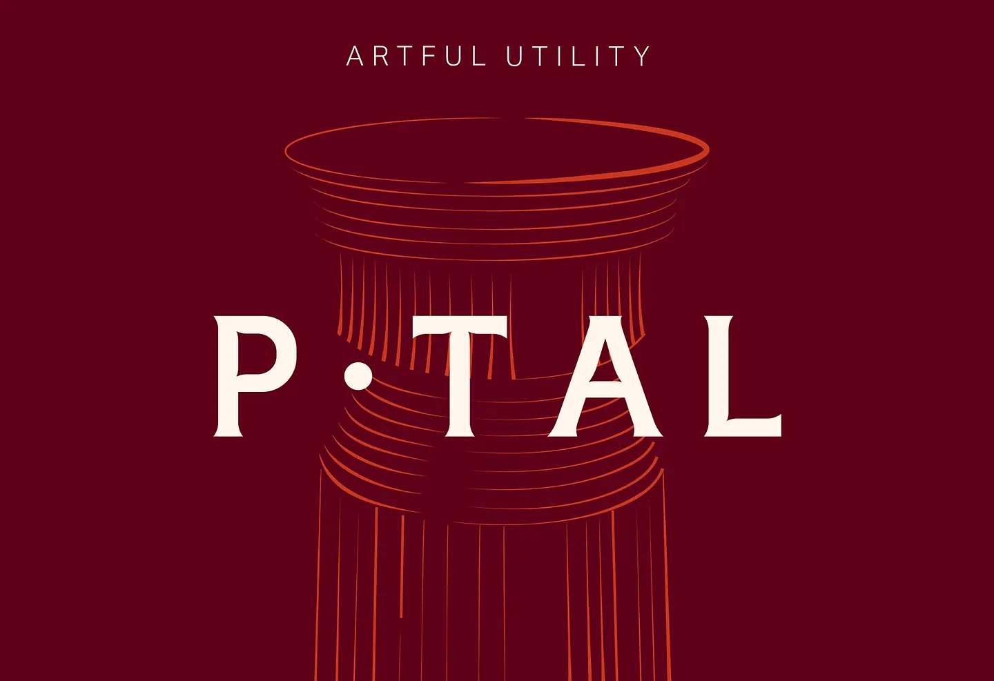
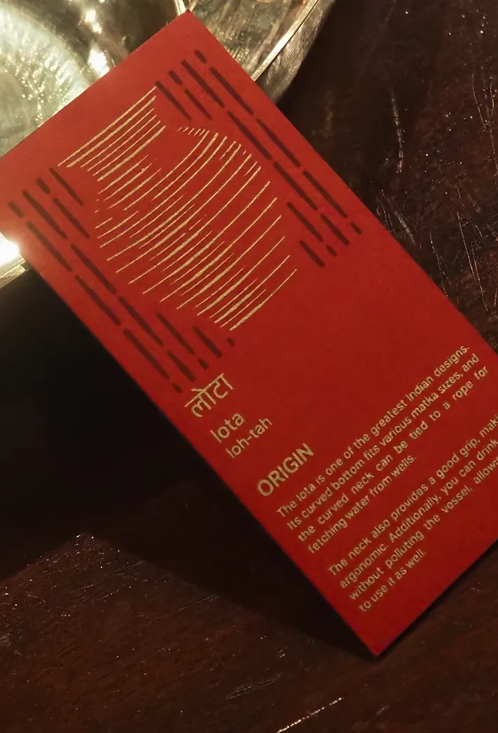
The brief was to carry a fading craft into modern kitchens without flattening the people behind it. The studio listened to the metal in the artisans' village and turned its rhythm into circular patterns and illustrations of each vessel. The wordmark takes cues from the artisans' tools, with flared serifs echoing vessel shapes, and the palette follows the materials, from copper and brass to tamarind and charcoal. Packaging adds artisan thumbprints, handmade labels, gold foil, and a magnet, while the website extends the dot into icons and type.
Why it works
The dot is both a brand mark and part of the product's story. It sits in the name, so the identity is spoken and seen at once, and it is simple enough to repeat on a label or an icon without wearing thin. The flared serifs and metal-derived palette give the brand warmth and heritage, setting it apart from the cold steel and glossy nonstick that dominate the shelf. Thumbprints and handmade labels keep the craft promise physical, so the premium price feels earned rather than applied.
Applications

Logo
Color
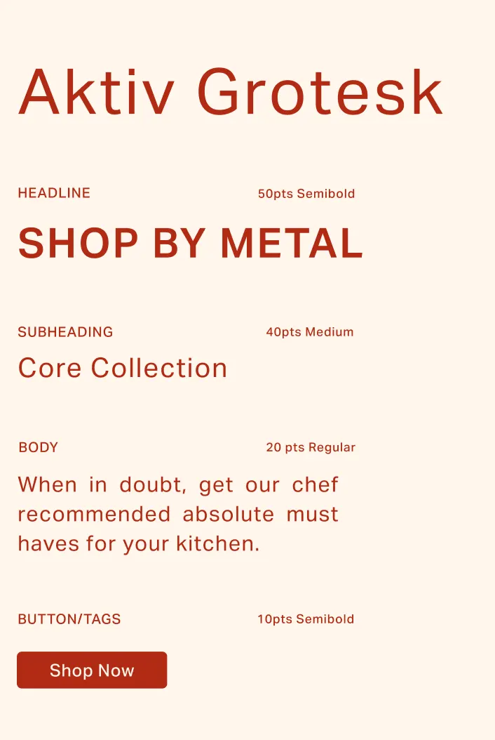
Typography
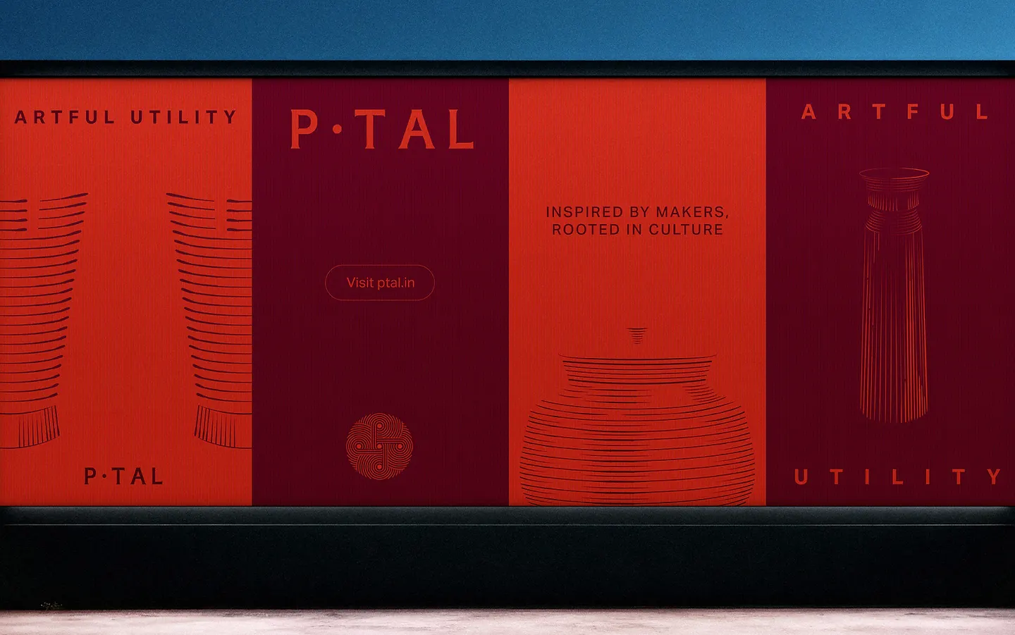
Images and video from mothertonguedesign.com, by Mother Tongue Design.