The Brand Monograph
Free Soul brand identity by Ragged Edge
↗Few rebrands have a result as easy to measure as this one. Ragged Edge took Free Soul from a TikTok Shop favorite to shelves in 420 Tesco and 300 Boots stores within five months. The studio's brief was to give a fast-growing range of women's supplements, blends, and solutions the footing of a real brand, with a new identity, packaging, and website.
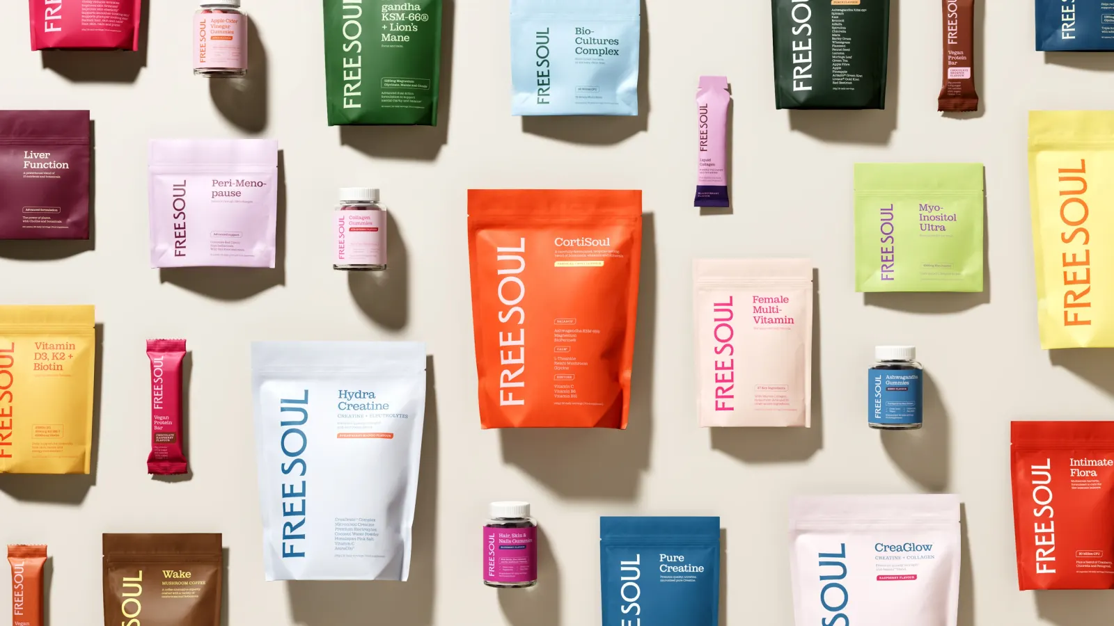
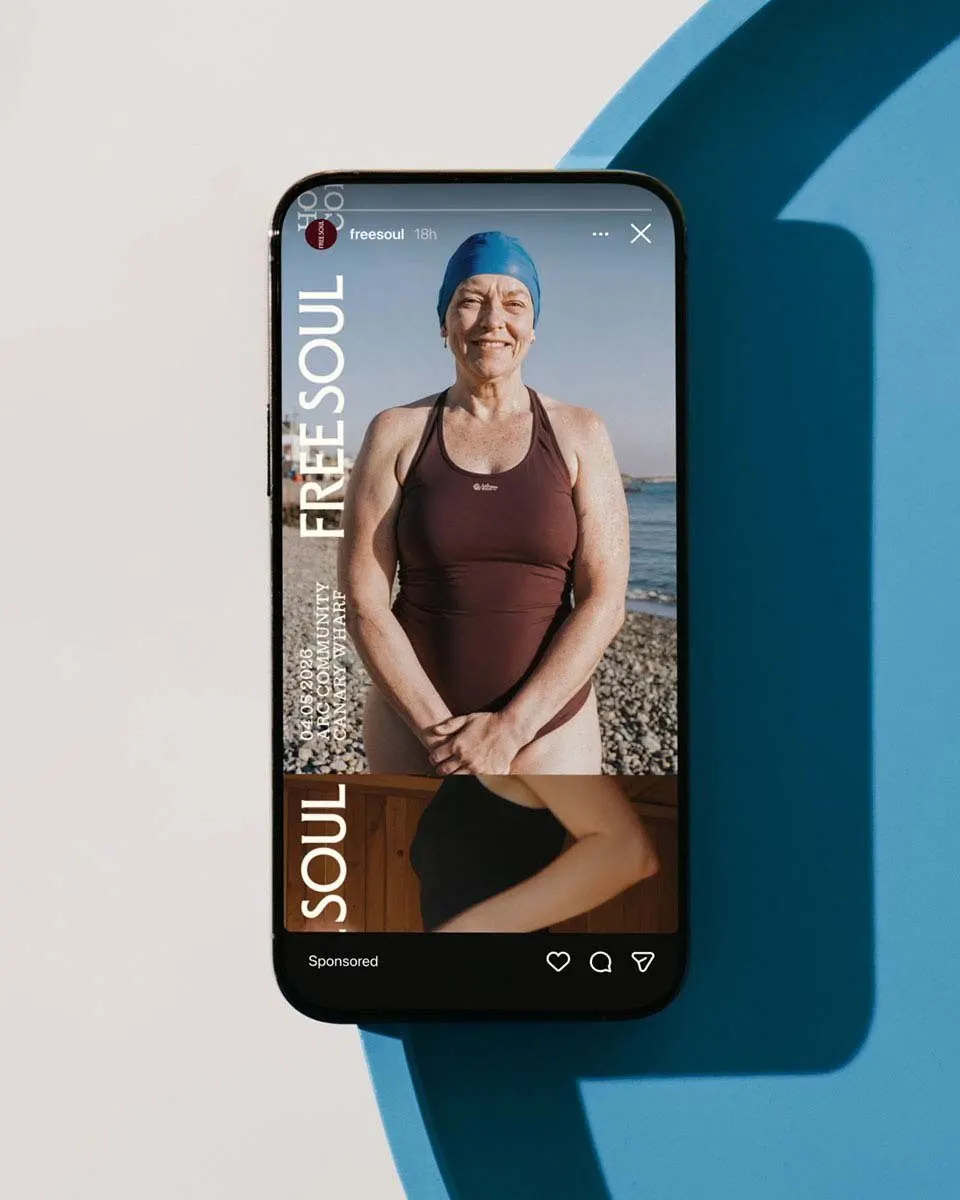
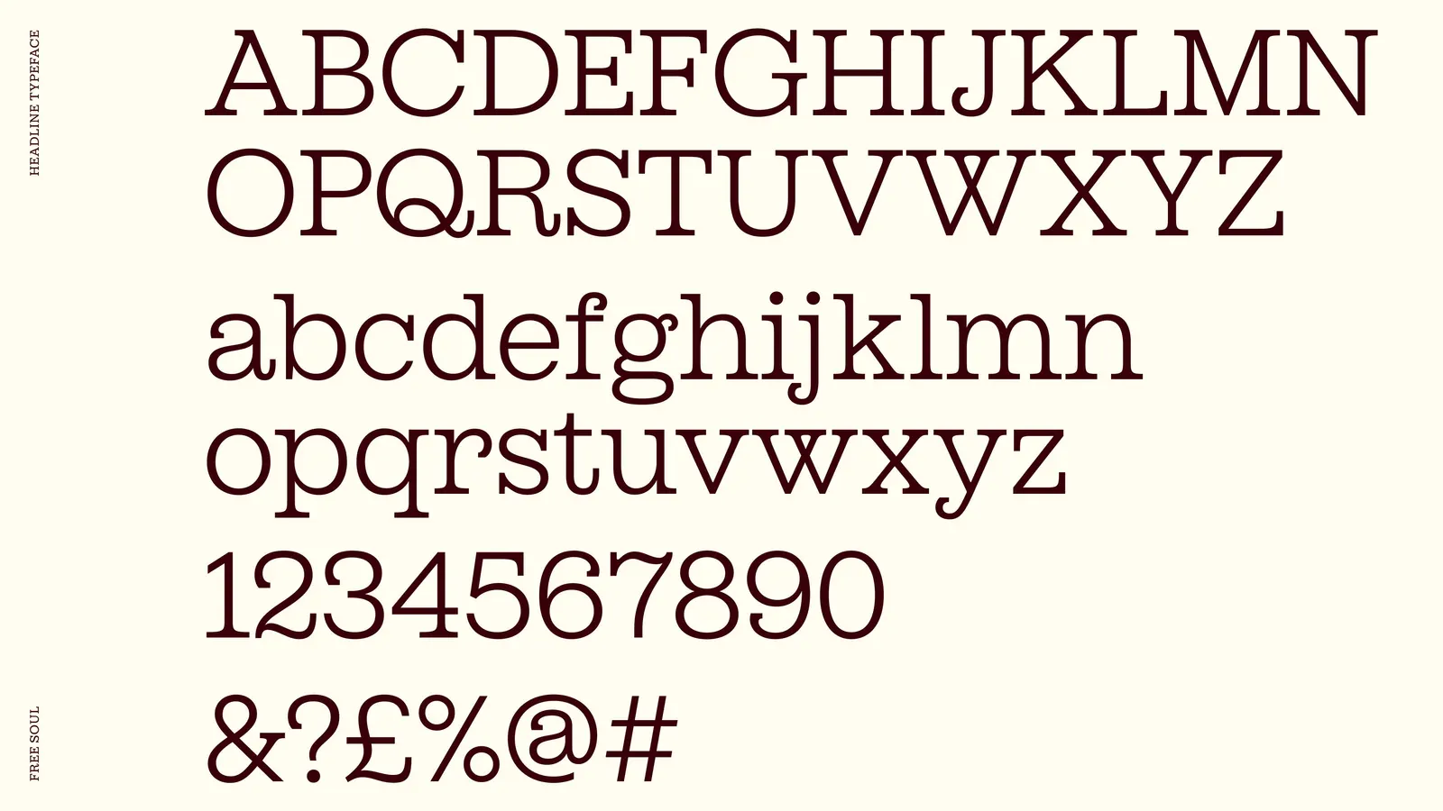
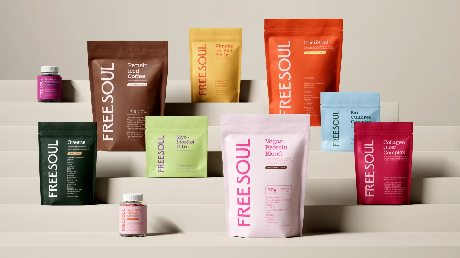
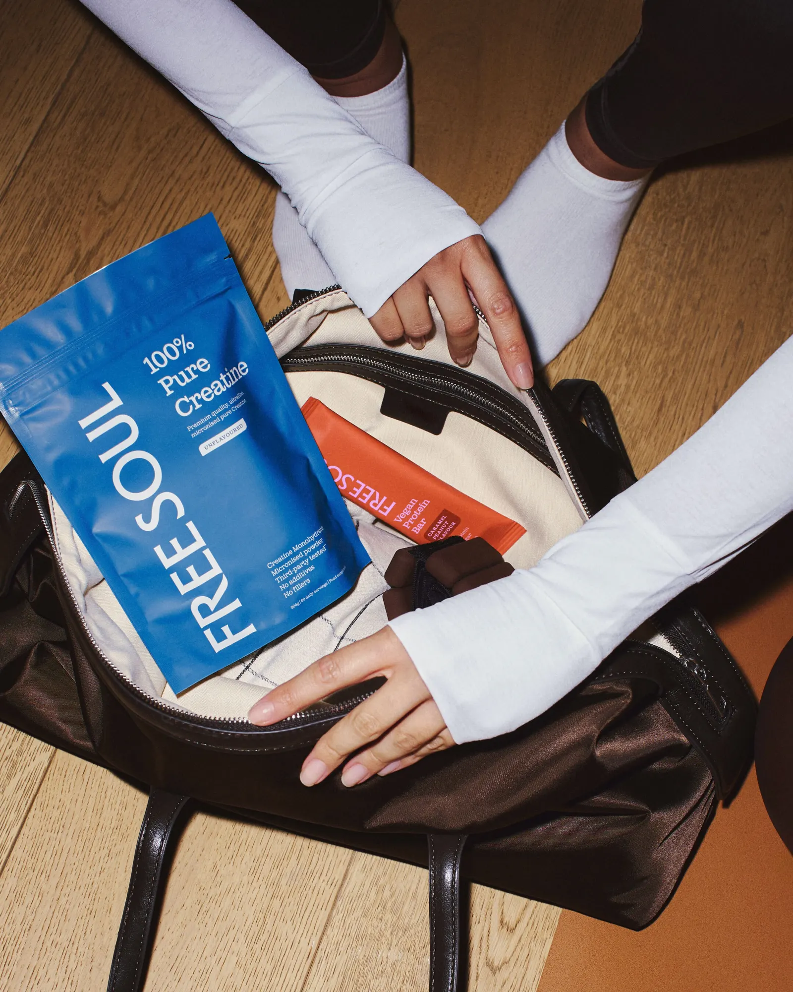
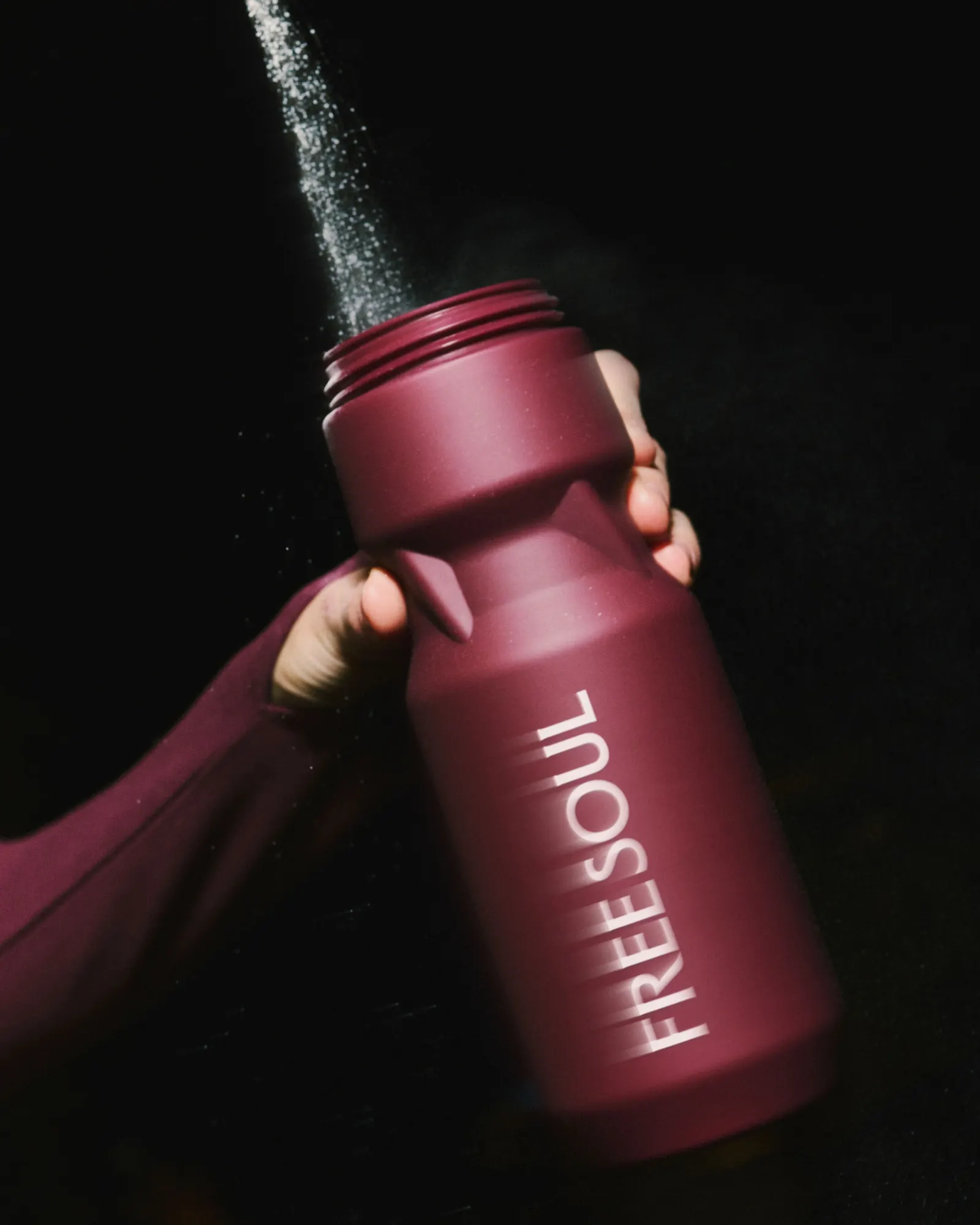
Research with Free Soul's community pointed to a simple insight: women respond to being met where they are, not instructed. That became a platform rooted in the everyday reality of being a woman, delivered in an empathetic, knowing voice. The craft sits in the system: a vertical logo that stays consistent on pack and off, packaging that gives brand and product equal weight, and a typeface from Dinamo Typefaces and Newglyph that handles big headlines and dense nutritional copy. A TikTok takeover and London billboards launched it, with Free Soul's in-house team.
Why it works
The vertical logo is the smartest move here. It has an unusual shape in a category full of familiar wordmarks, so it gives the brand a recognizable silhouette on a crowded shelf. The typography does quiet strategic work too. Warmth in the headlines keeps the brand approachable, while precision in the small print reassures shoppers who want to check what they're buying. Treating the pack as a brand asset means the identity doesn't depend on the feed to be understood.
Applications
Typography
Images and video from raggededge.com, by Ragged Edge.