The Brand Monograph
Eager brand identity by Ragged Edge
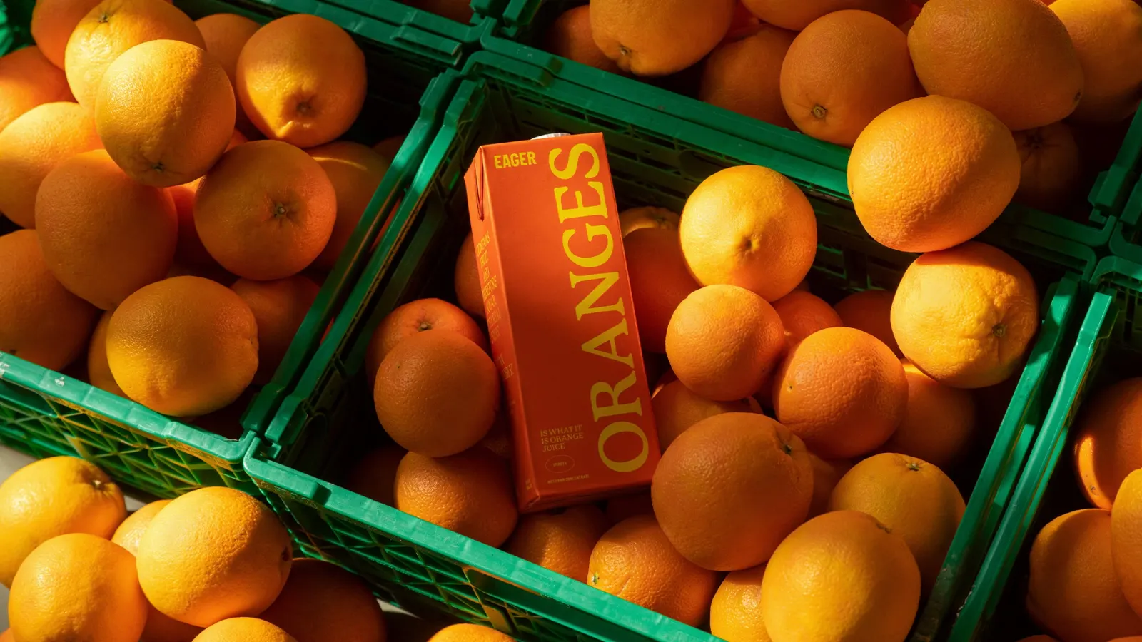
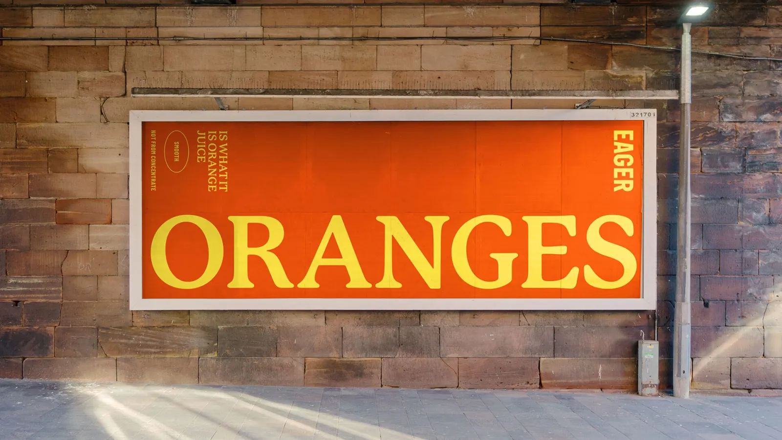
↗Juice shelves are loud with fruit splashes, wellness badges, and promises of purity. Ragged Edge's rebrand of Eager stands out by being the quiet, wry one in the aisle. The studio's brief was to take a juice bartenders had favored since 2007 and make it work for shoppers, in stores and online, without losing the credibility it earned in bars.
Ragged Edge's idea was to admit the juice is perfectly ordinary and let every part of the brand follow from that. The identity, packaging system, and ecommerce site are all pared back, and the writing gets its laughs from gently mocking the category's exaggerations. Charlie McKay shot the photography. Eager is now in every Whole Foods Market in the US, and the work won a D&AD Graphite Pencil for Brand Refresh and first place in Soft Drinks at the 2023 Dieline Awards.
Why it works
In a category where nearly every pack competes to look healthier than the next, restraint becomes the most distinctive thing on the shelf. A plain pack reads as confidence rather than absence, and because the copy and the site make the same point as the packaging, nothing in the system contradicts it. That consistency matters for the audience. Bartenders are hard to impress and quick to spot spin, and shoppers have learned to distrust juice labels too. A brand that visibly refuses to oversell gives both a reason to believe it.
Applications
Logo
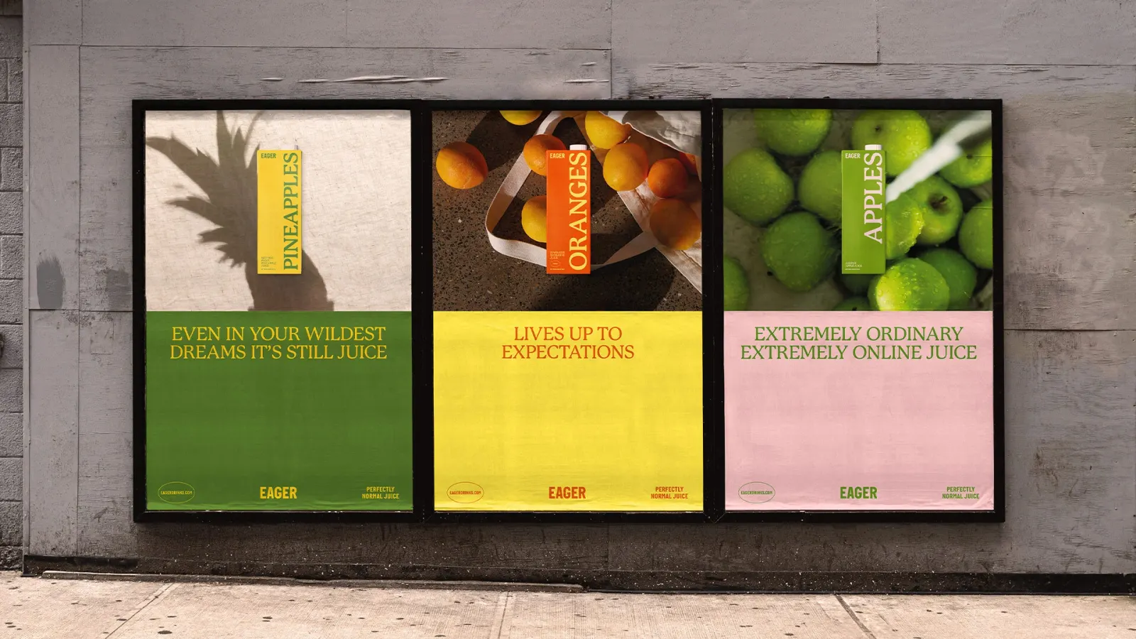
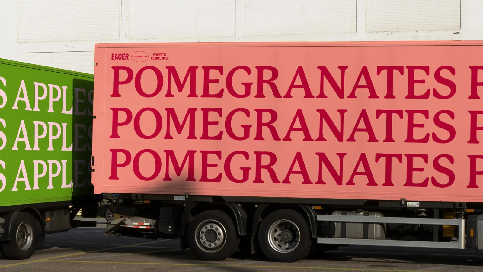
Images and video from raggededge.com, by Ragged Edge.