The Brand Monograph
ZOE brand identity by Ragged Edge
↗Ragged Edge's work for ZOE takes a subject that usually looks clinical, personal health data, and gives it a friendly face without loosening the rigor. ZOE arrived with a waiting list of 250,000 and plans to reach far more people, in a category crowded with programs that overpromise. The brief was an identity that could stretch across new products, markets, and channels.
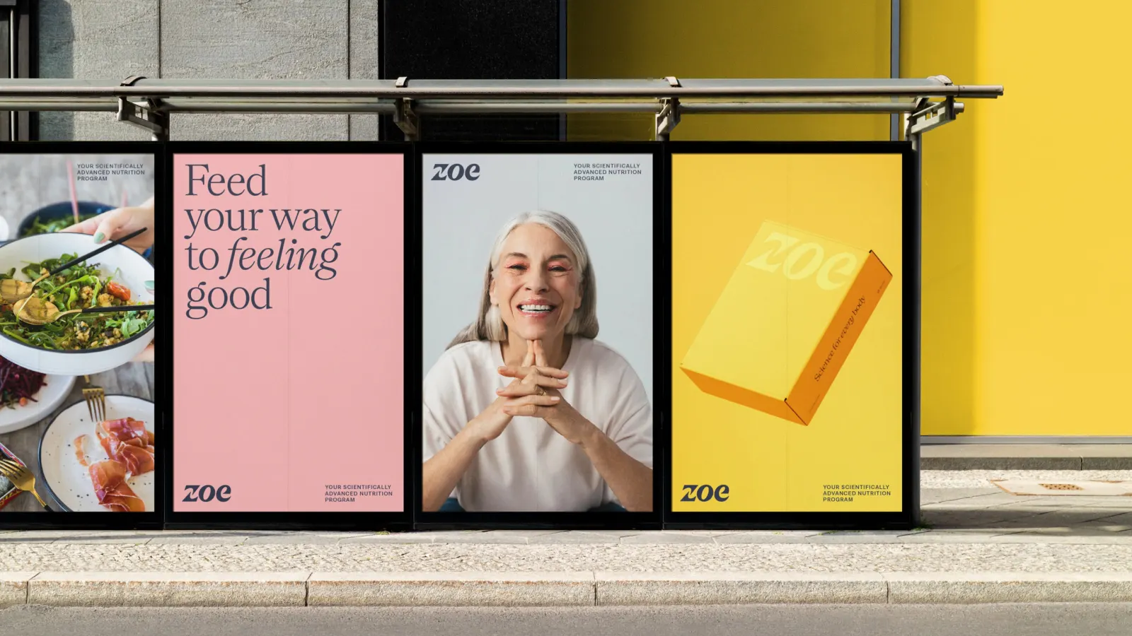
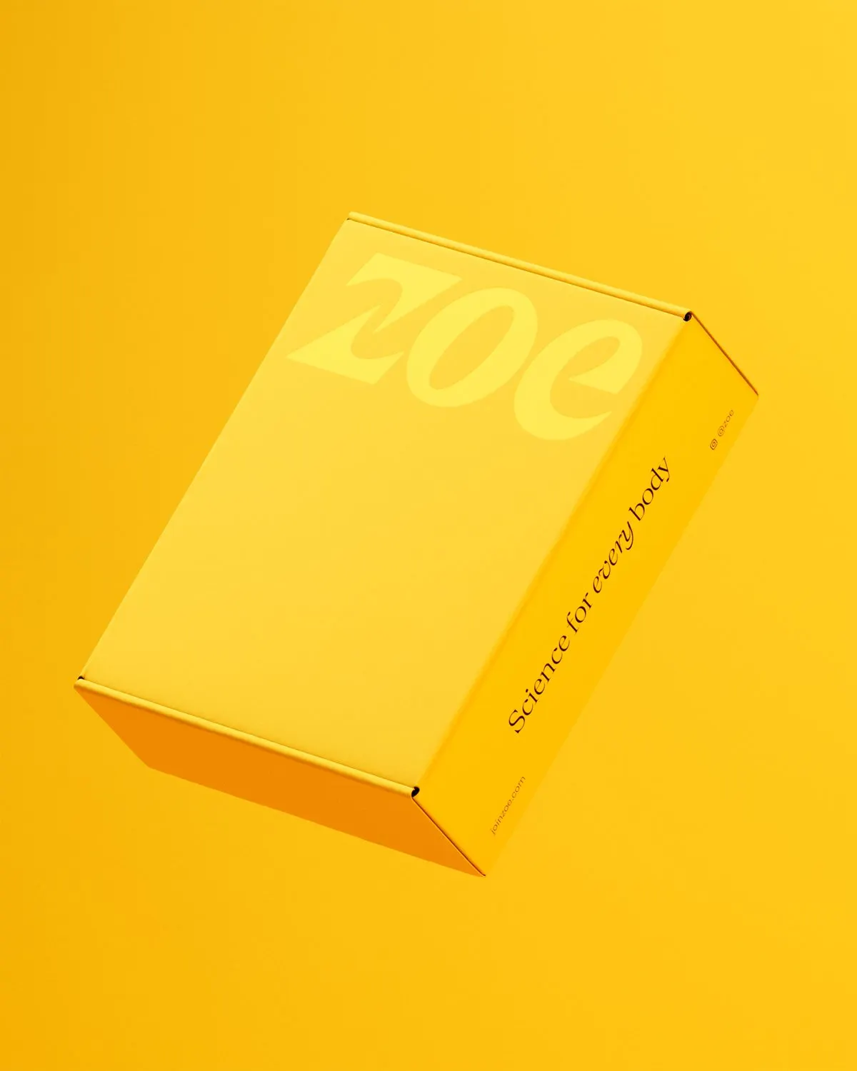
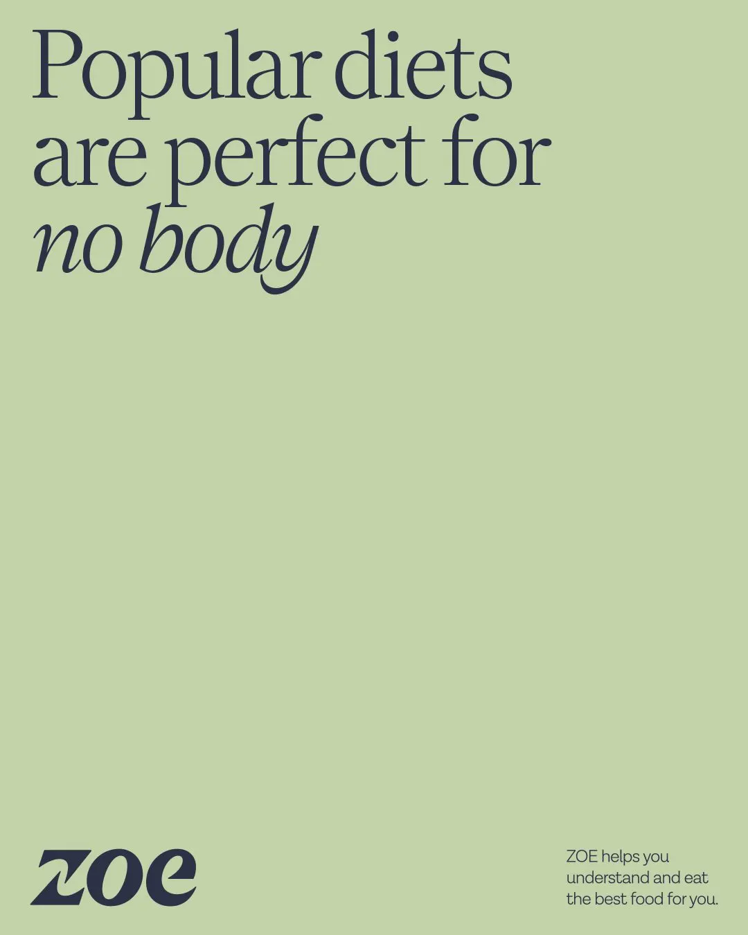
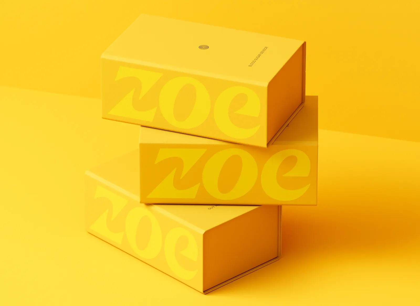
The studio delivered a full rebrand and packaging system for the US and UK. A precise design language anchors the science, while a bold yellow and emotive headlines supply the human side. Dinamo Typefaces and Newglyph worked on the typography, which, alongside the verbal identity, takes the edge off all that exactness. Ragged Edge designed the unboxing experience for the at-home test kit and a distinctive Continuous Glucose Monitor patch, while ZOE's in-house team carried the system across the website and digital product. A $30.7 million Series B followed, along with ZOE's first move into retail.
Why it works
Yellow is a confident choice in a category that tends to default to clinical white or wellness green. It is easy to spot on a shelf, a box, or a screen, and it reads as optimistic rather than medical. Pairing strict, structured layouts with warm, emotive headlines makes the data feel addressed to one person. The patch matters too: it is worn on the body, and giving it its own look turns a medical device into something people might not mind being seen with.
Applications
Logo

Images and video from raggededge.com, by Ragged Edge.