The Brand Monograph
Ozen brand identity by Mother Design
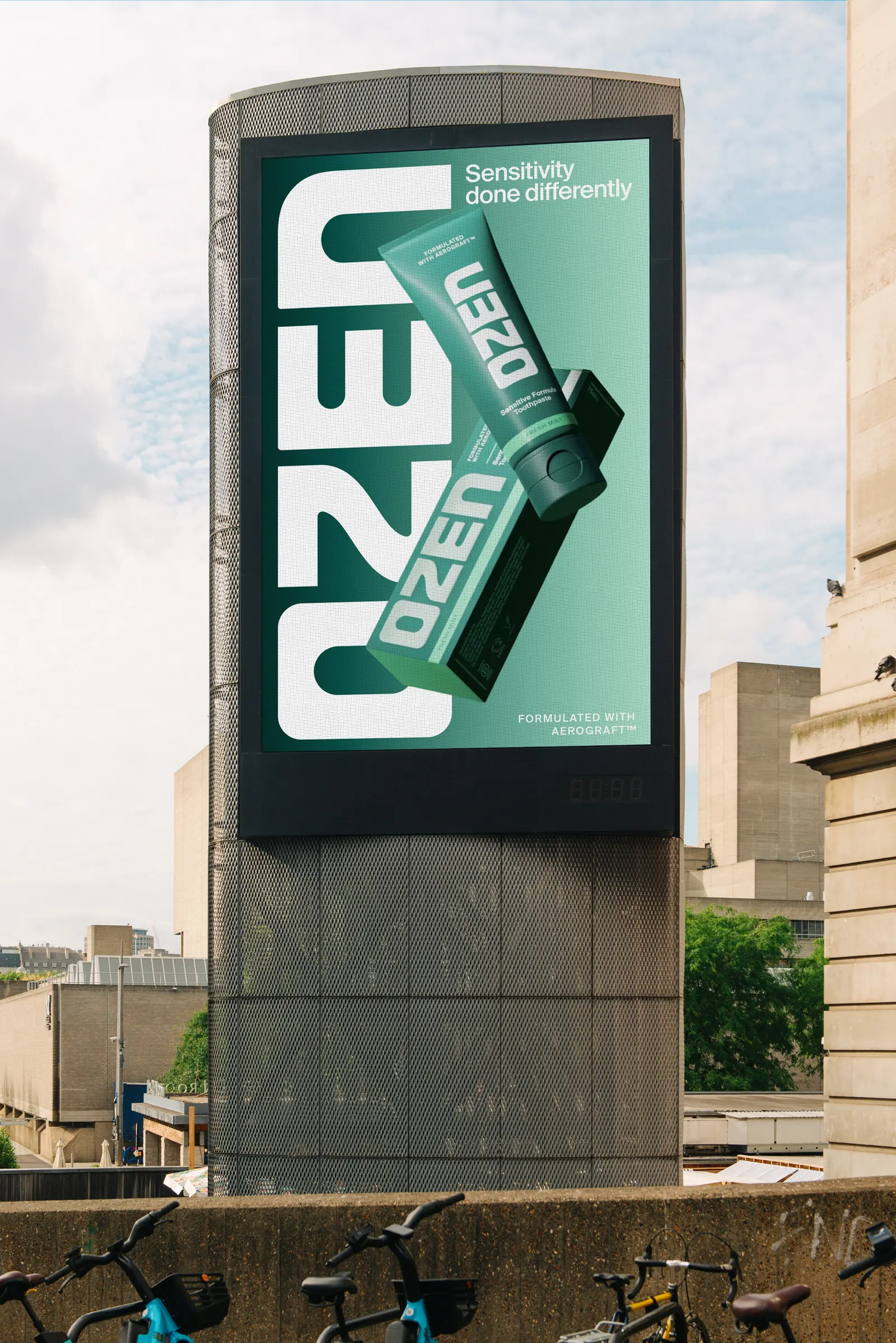
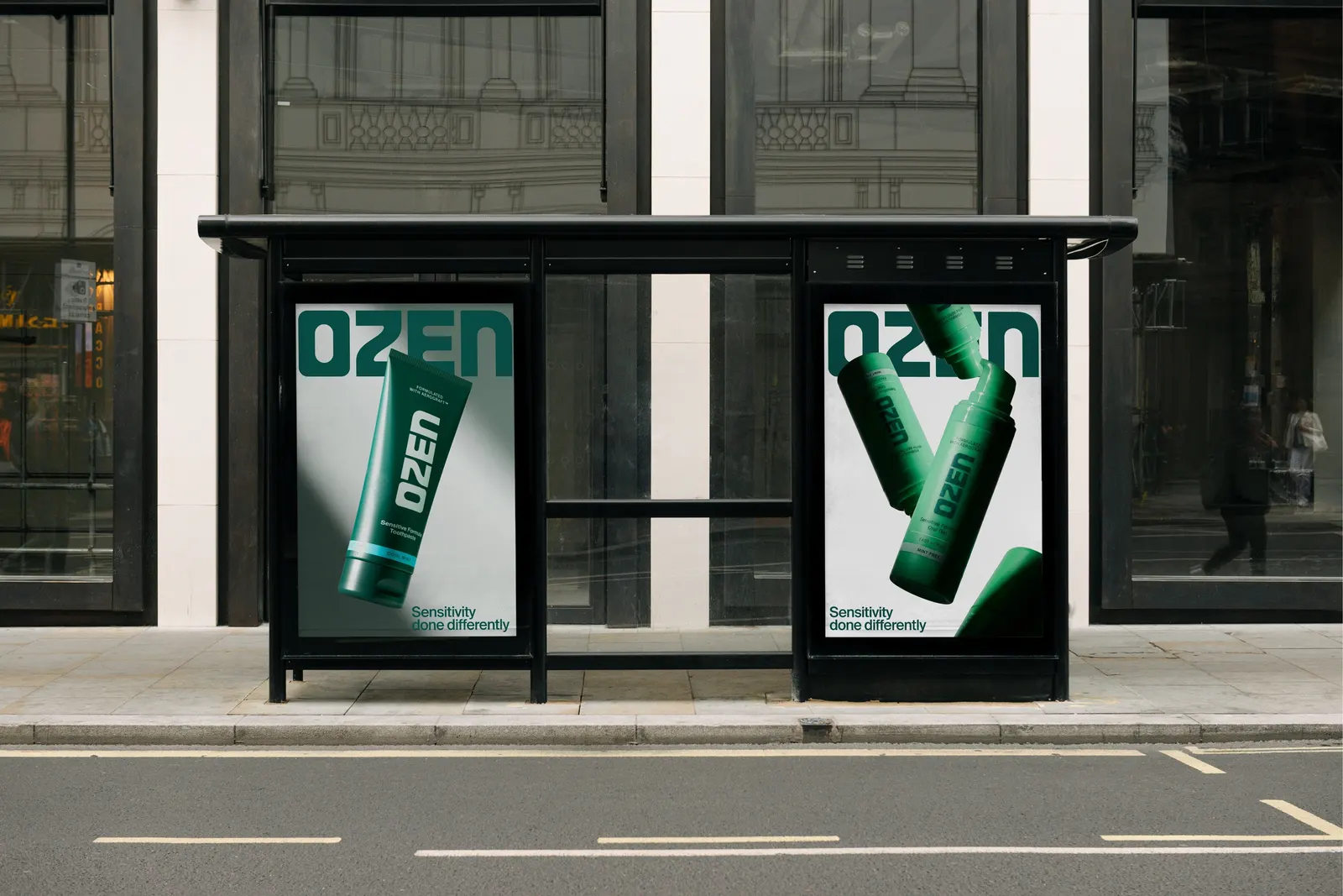
↗Toothpaste packaging tends to sort itself into clinical blue or bright and breezy, so Mother Design's identity for Ozen stands out just by having a point of view. The brand sells a sensitivity treatment called Aerograft™, and the studio had to make an unfamiliar technology feel credible without turning the shelf into a pharmacy.
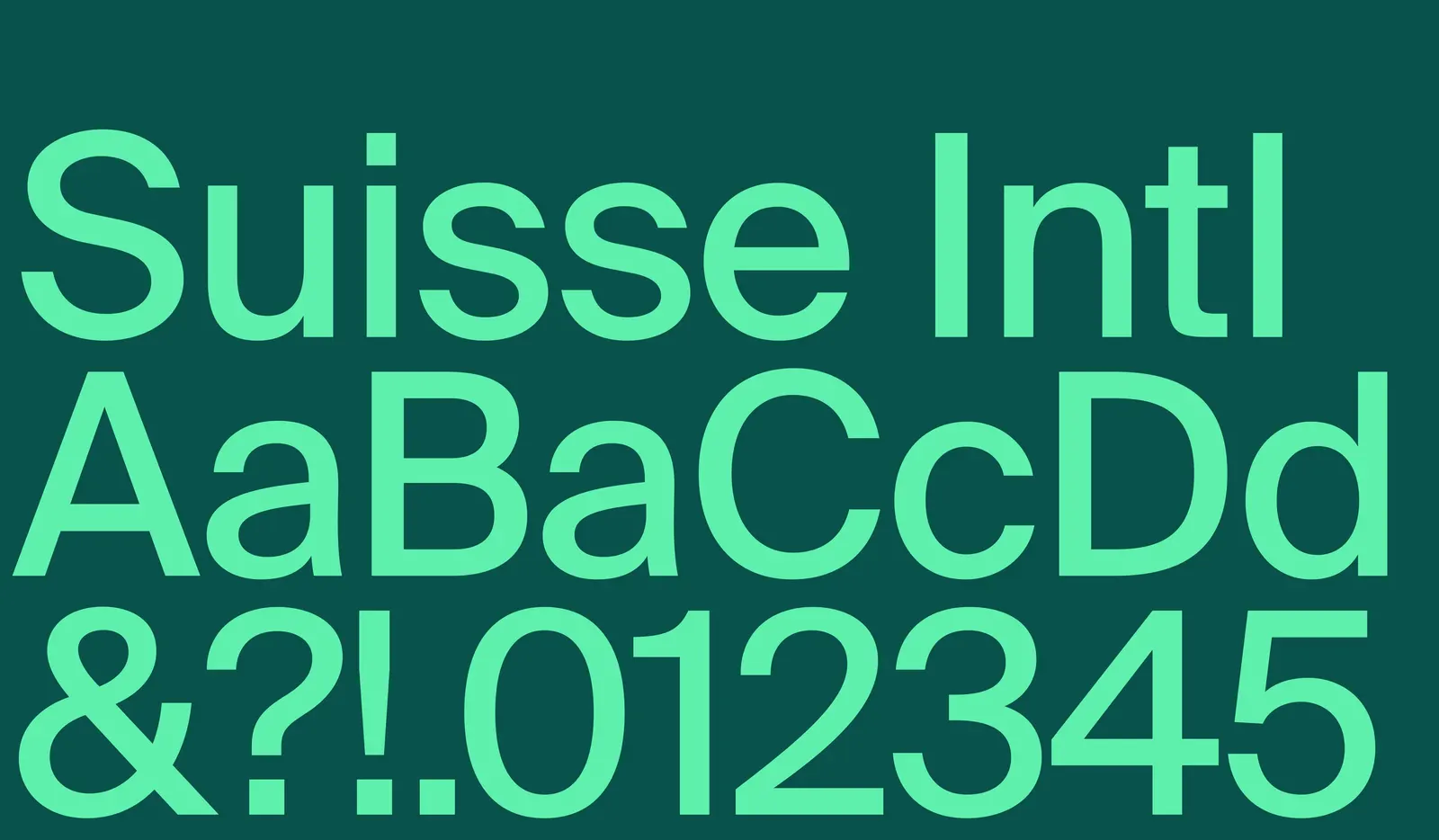
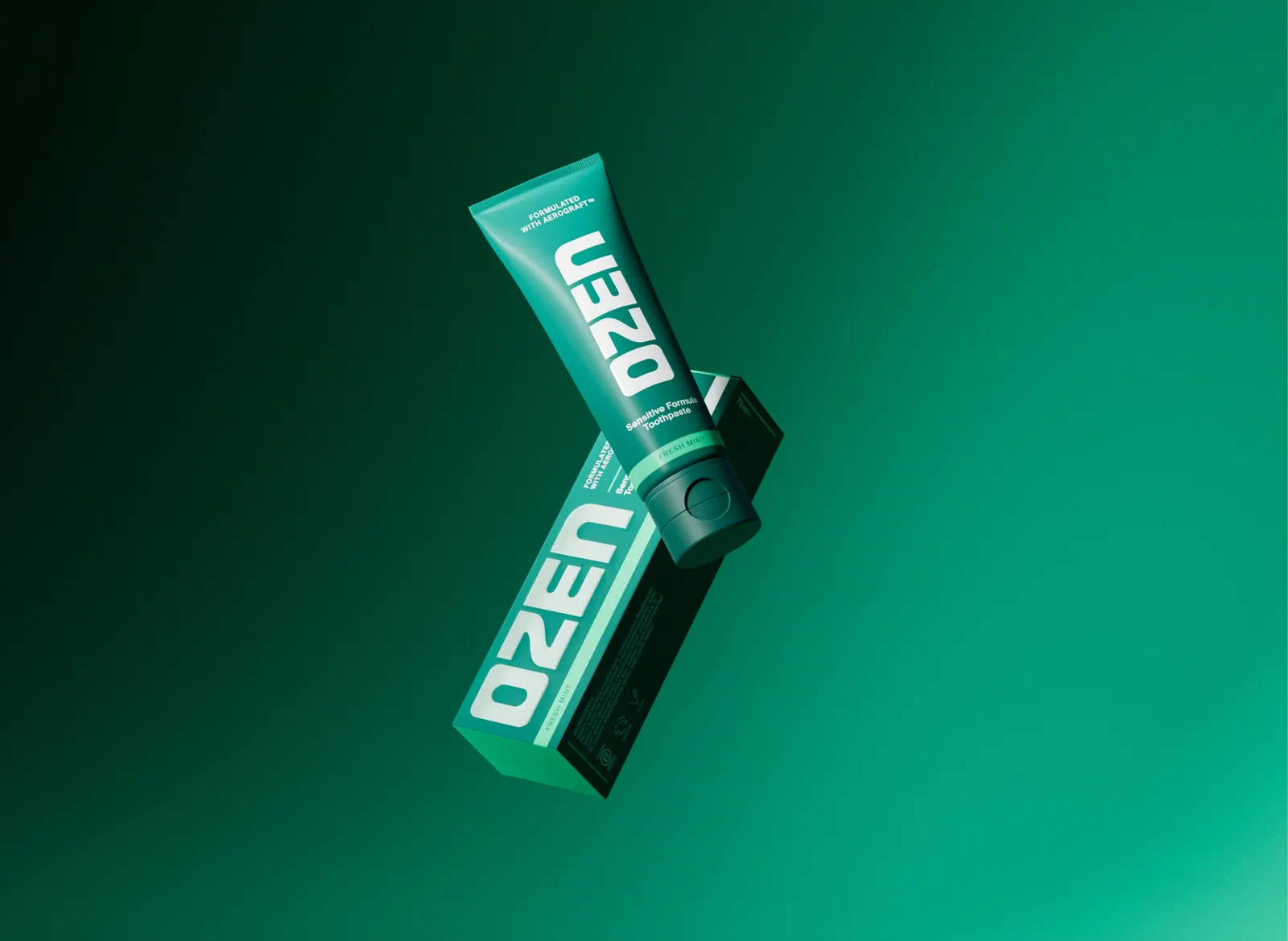
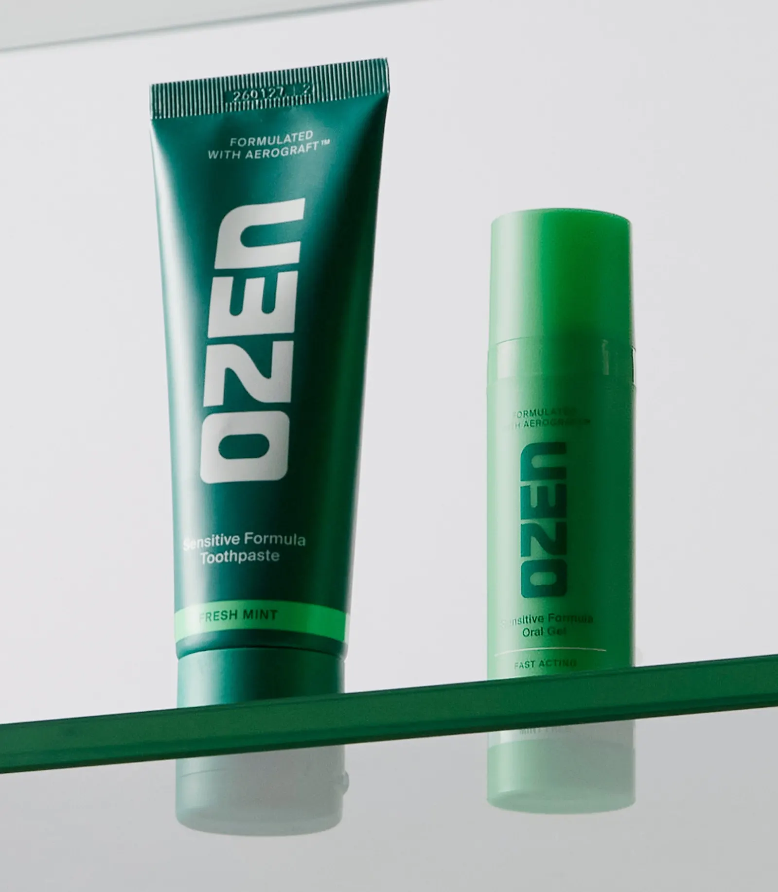
Working with Broody on strategy, Mother Design anchored the identity in the origin story. Founder Dr. Niall Kent came across aerogels while helping his brother, a Royal Academy sculptor, research new materials. That crossover shows up in a dense, sculptural logo, a type pairing that nods to both scientific journals and minimalism, and structural lines borrowed from medical symbolism. Photography combines clinical lighting and angles with a lighter, everyday touch, and the dark green and mint palette reverses the usual cues.
Why it works
The palette does the most strategic work. Dark green gives the pack a premium, unexpected presence on shelf, while mint keeps the freshness signal shoppers look for, so it reads as toothpaste first and as something new second. The heavy, solid logo suits a product that forms a lasting barrier, conveying durability before any claim is read. The type and structural lines make the science visible without leaning on jargon. The result is an identity that gives a real innovation its own look, rather than borrowing the category's.
Logo

Typography

Applications
Images and video from motherdesign.com, by Mother Design.