The Brand Monograph
M&S brand identity by Mother Design
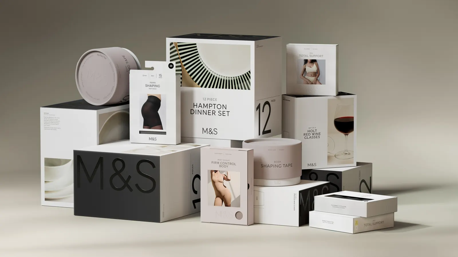
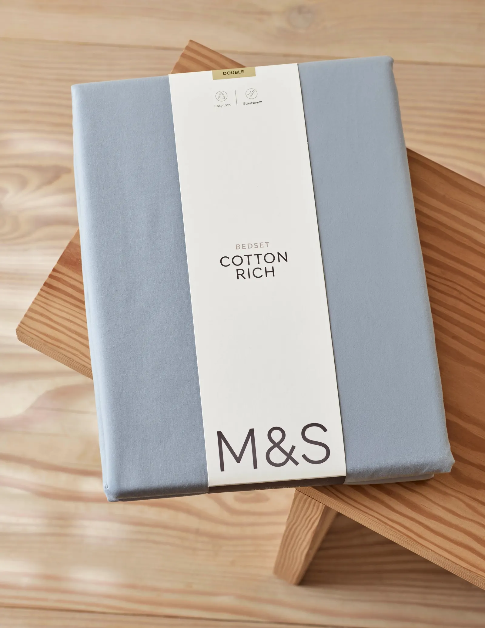
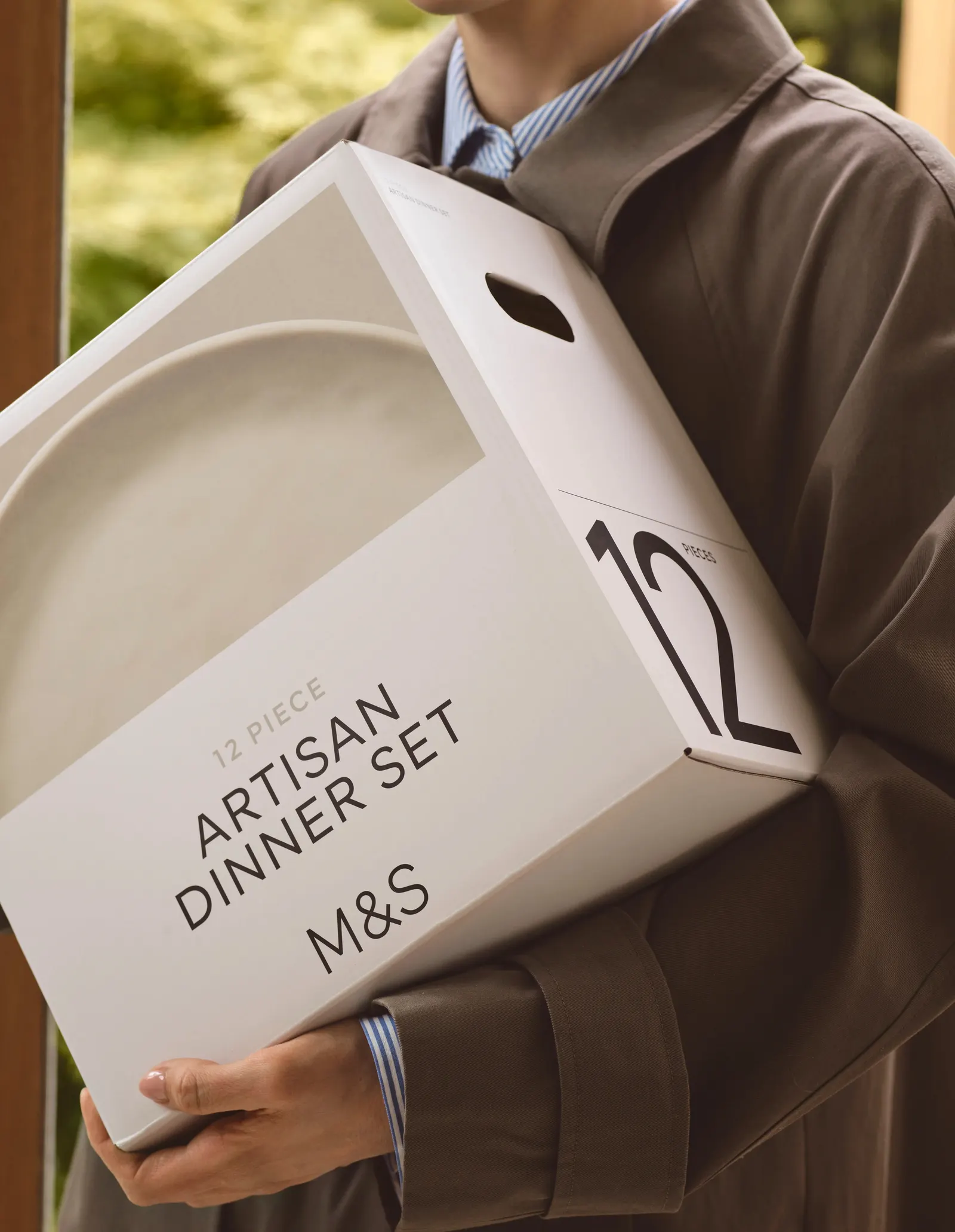
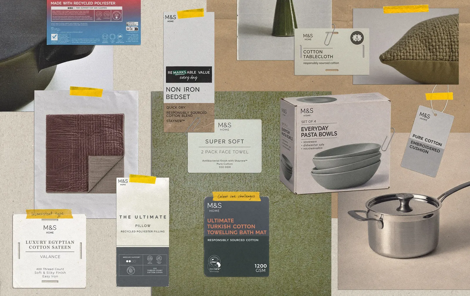
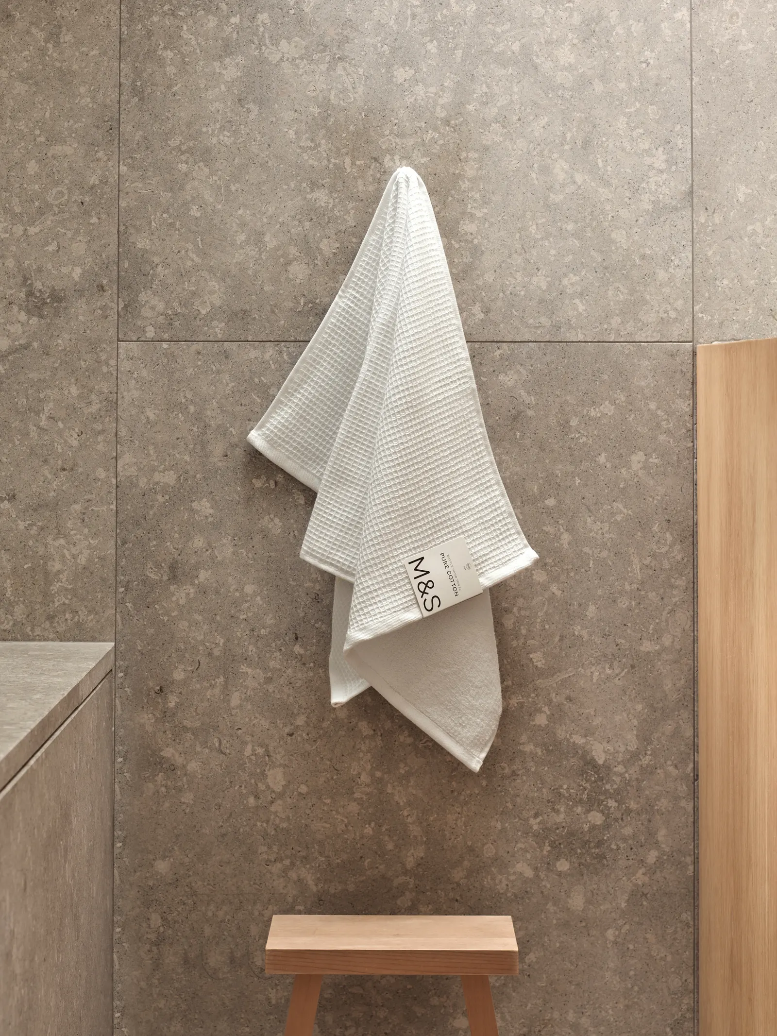
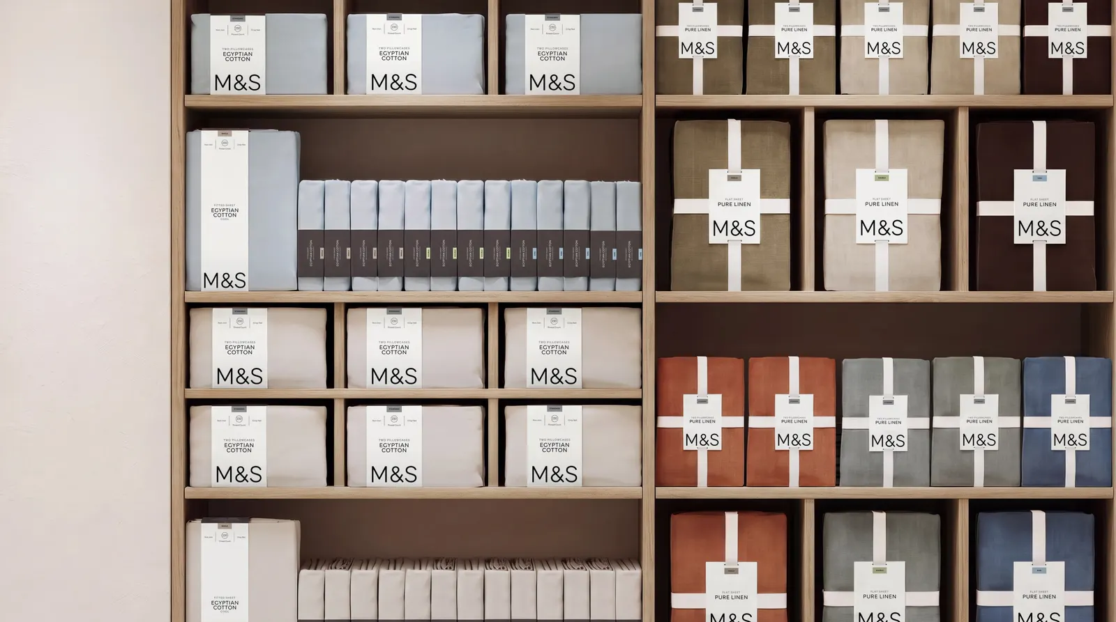
↗Mother Design's packaging for M&S Home and Lingerie is a lesson in editing. M&S had become one of the most talked-about names on the high street, but its boxes and wrappers were still crowded with sub-brands, range names, and claims, in stores where shoppers increasingly browse alone. The studio cut back to clear product names, a large M&S logo as a constant anchor, and one typeface, MS London, flexed through weight, size, and shade.
The details reward a closer look: spot-varnished black-on-black logos, a benefits grid, a simplified icon set, a custom numeral set, and Home names drawn from British towns and villages. Lingerie gets a softer version, with colour-coded navigation, warm whites, charcoal type, embossing, and cut-outs. The Body shapewear line also becomes a range within the core brand.
Why it works
The restraint suits a brand whose biggest asset is familiarity. Putting the logo up front makes M&S itself the signal of quality, so each product doesn't have to argue its own case. Black-on-black varnish is a quiet detail you feel before you read it, which fits a shopper moving quickly along a shelf. In Lingerie, warm whites and charcoal type keep the system from feeling clinical in an intimate category. And because everything shares one typeface, a saucepan and a pair of pajamas still look like family.
Applications
Logo
Typography
Images and video from motherdesign.com, by Mother Design.