The Brand Monograph
UCO Bakery brand identity by Dennis Studio
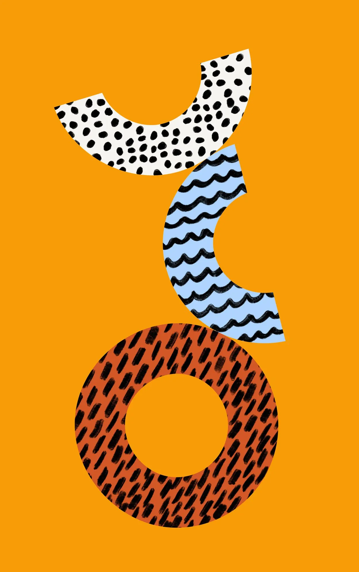
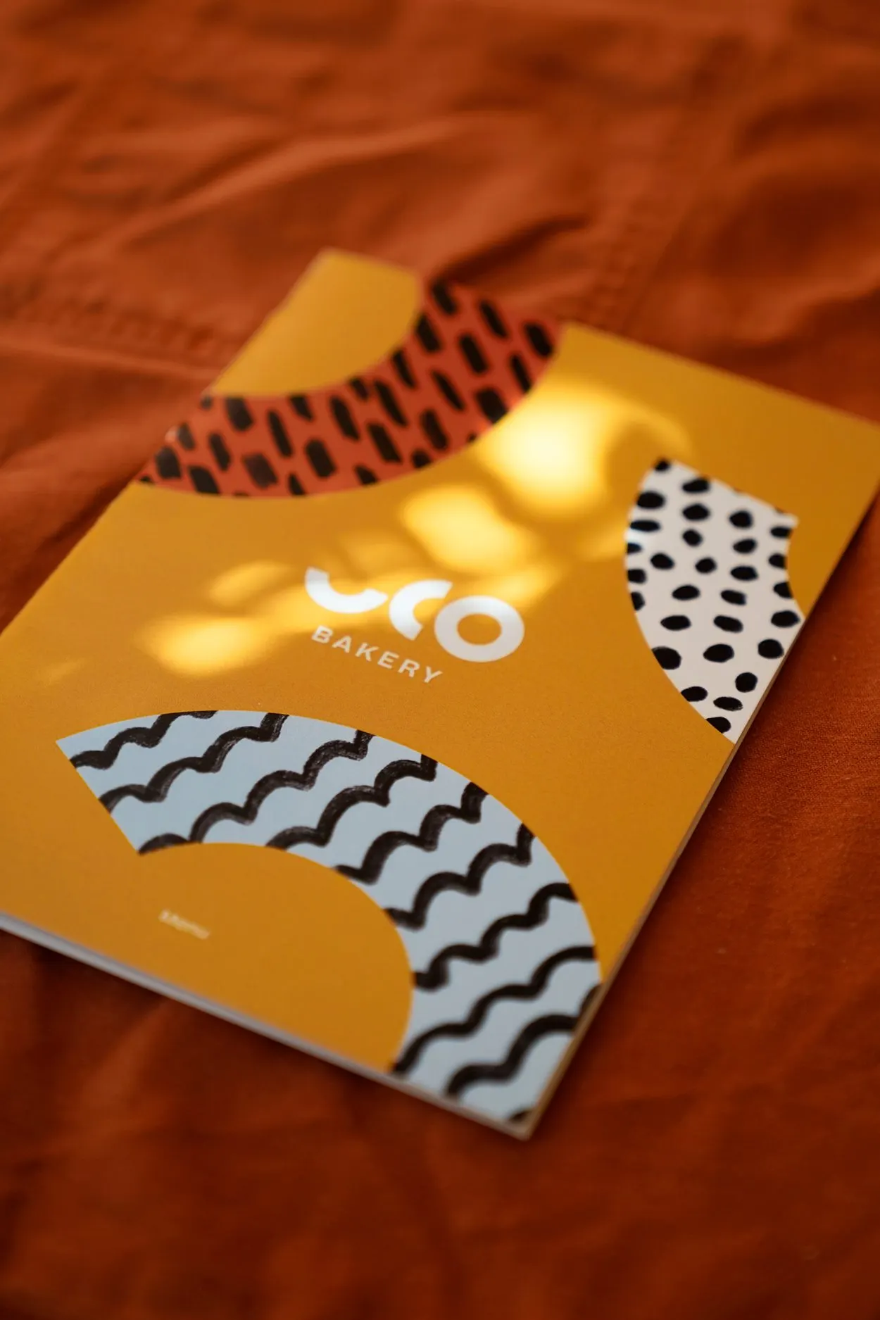
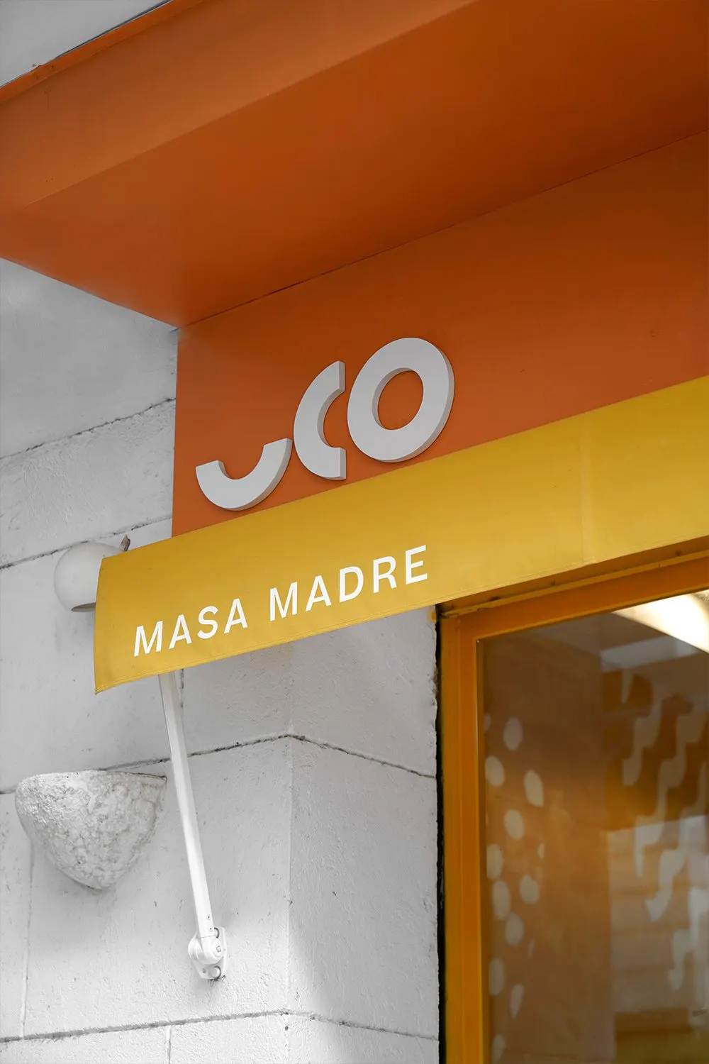
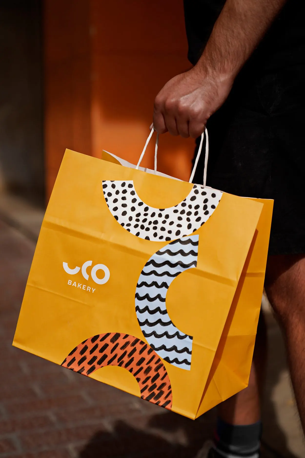
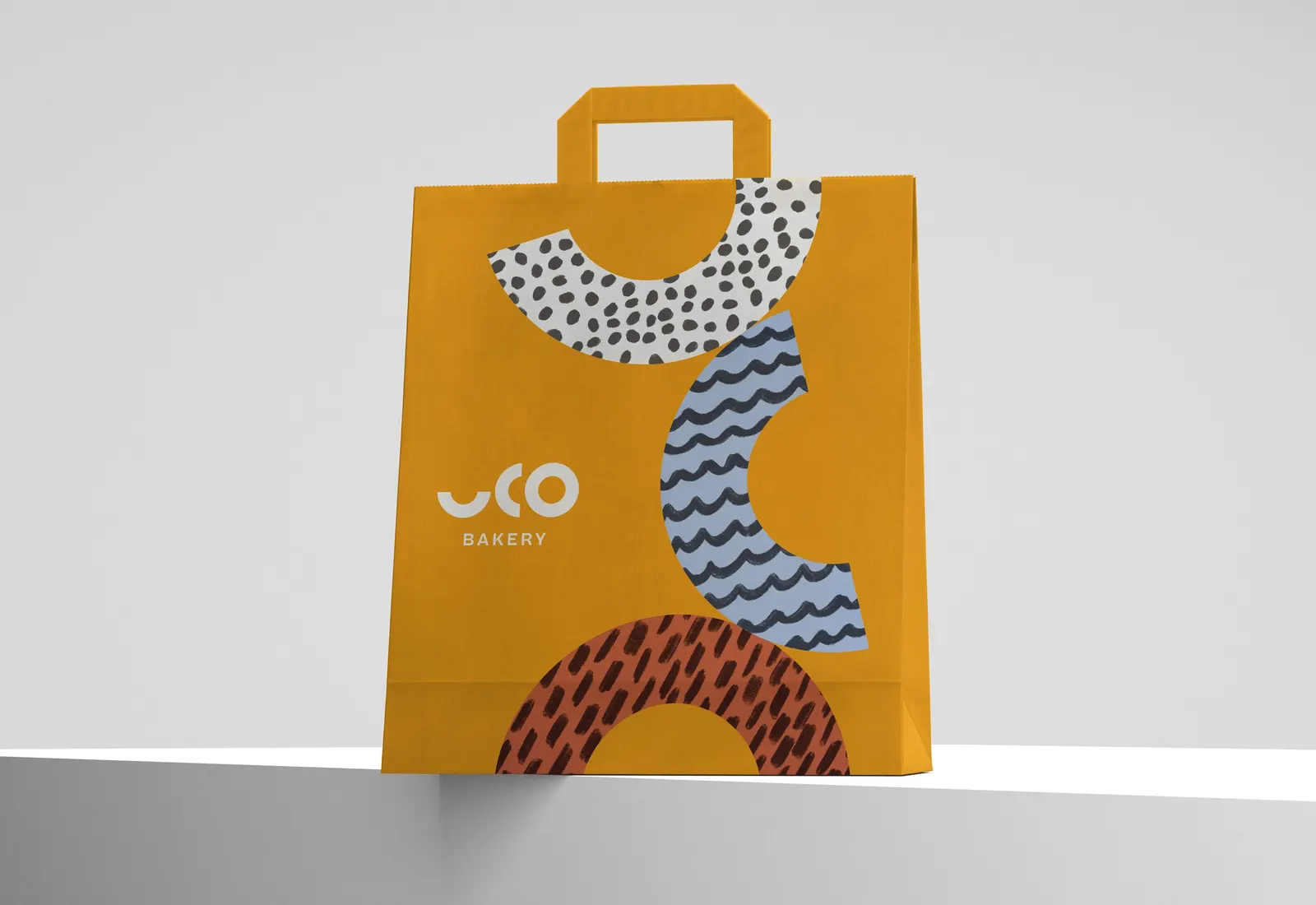
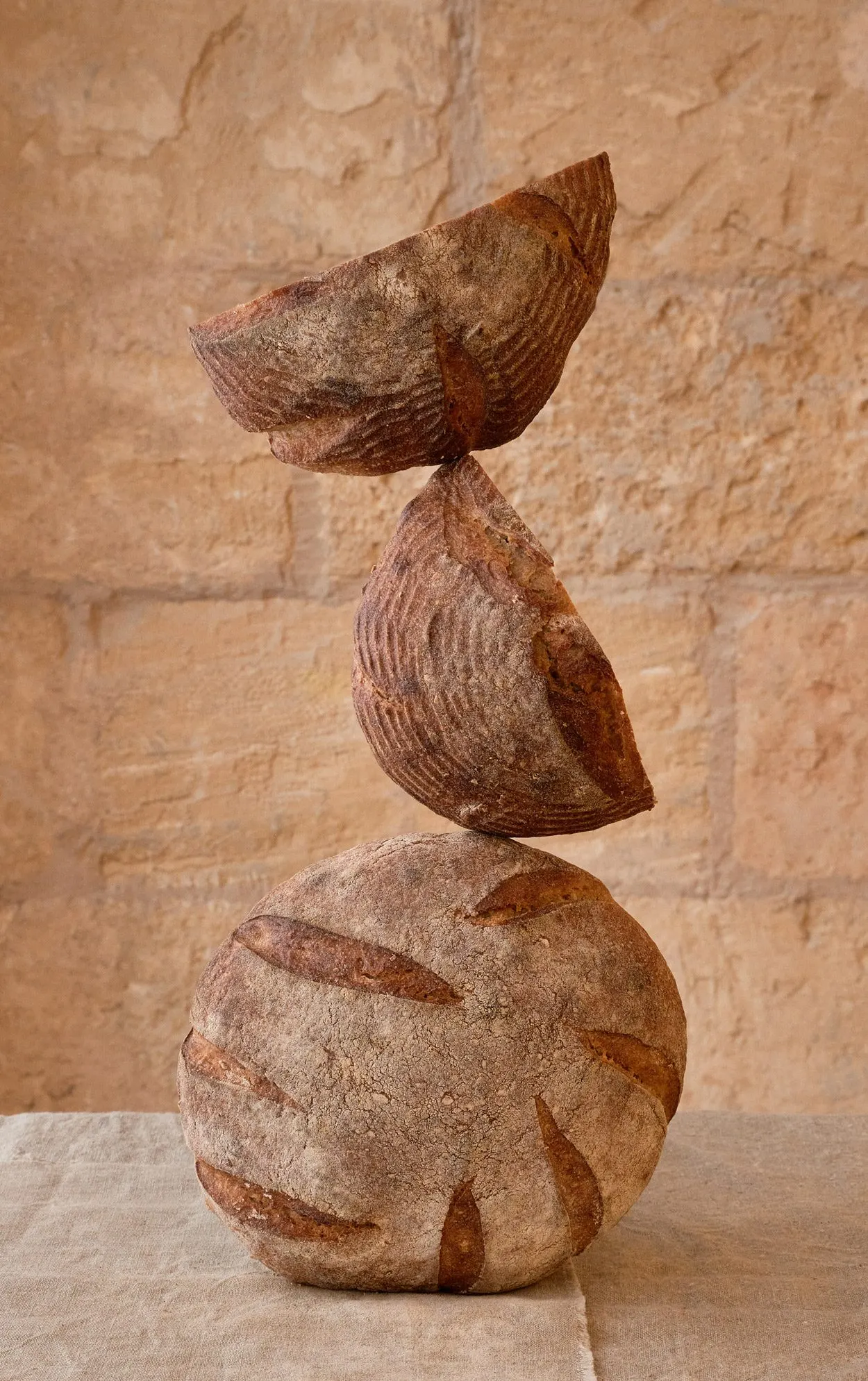
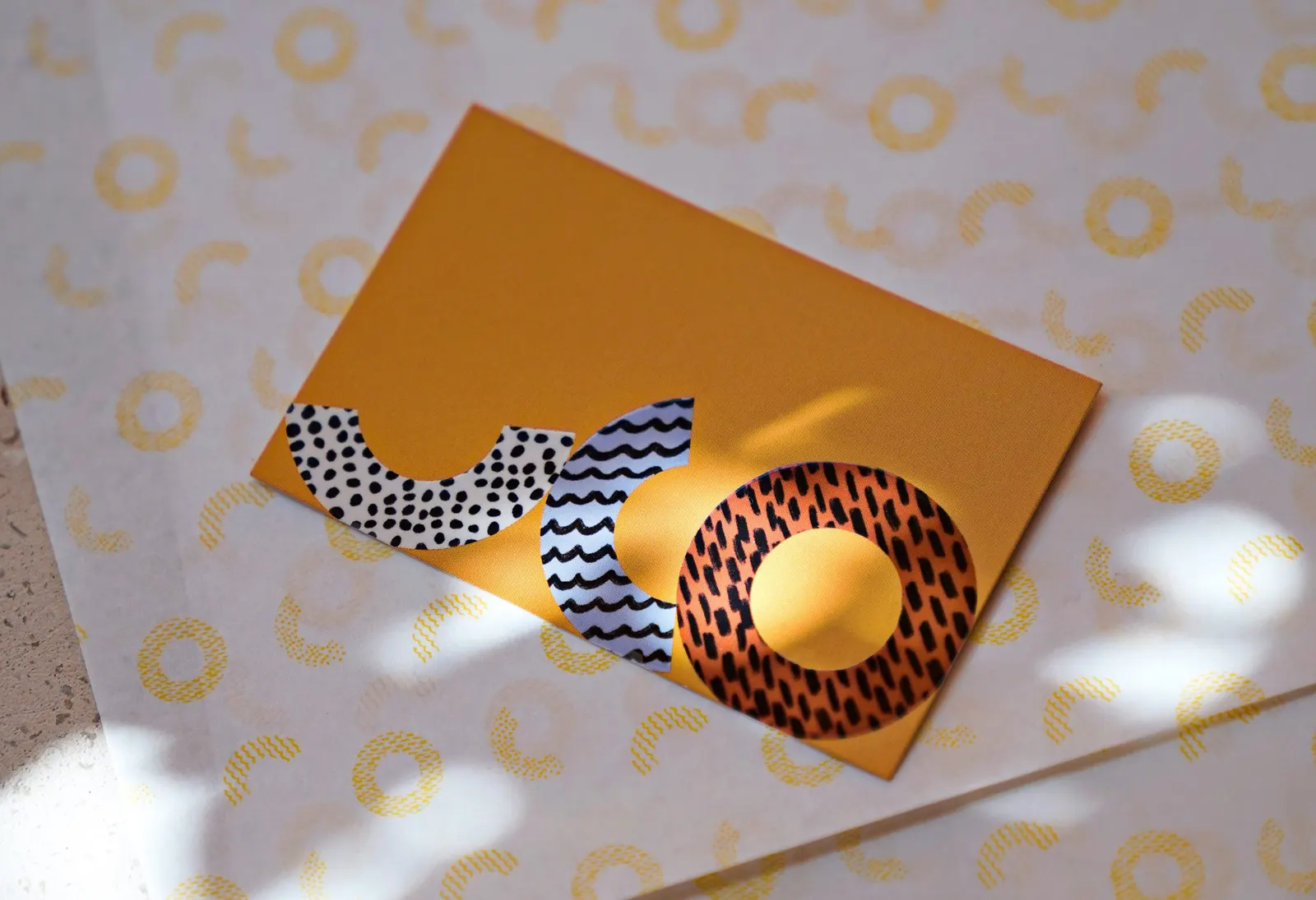
↗UCO Bakery's wordmark looks like a loaf that has just been sliced open. Dennis Studio drew the letters as cross-sections of bread, then let them move around: stacked in blocks, standing upright, or scattered across a surface depending on the job at hand.
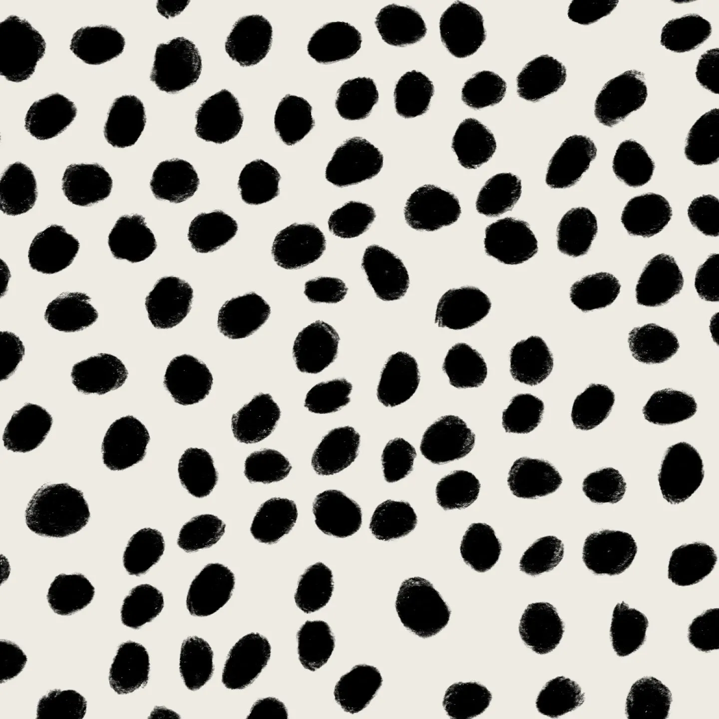
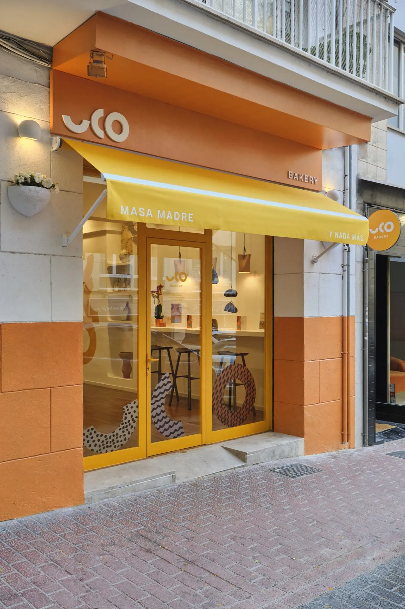
The family-run bakery started in Mendoza, Argentina, and opened its first shop in Palma de Mallorca, selling sourdough and nothing else. The studio treated the lettering as a flexible illustration rather than a fixed logo. Patterns and colors inside the forms stand for the four ingredients: salt, water, wheat, and heat. Núria Amengual Interiorista designed the shop interior, while Alba Gine and Egg Motion contributed photography. The result is a system that runs across packaging, print, space, and screen with plenty of room to breathe.
Why it works
A bakery with a single product can't lean on variety, so the identity makes one idea do a lot of work. Because the letters are the illustration, there's no separate mascot or icon to keep in step with the logo, and the brand stays recognizable even when the word is broken apart. The ingredient-coded patterns give a simple product a quiet story without any copy. Bold, warm color and loose arrangements also feel more like a neighborhood bakery than a polished food label, which suits a shop that wants to belong to its island.
Logo

Applications
Images and video from dennis.studio, by Dennis Studio.