The Brand Monograph
Primally Pure brand identity by Forner
↗Natural skin care often defaults to pale, wispy minimalism, and Forner took Primally Pure in a sturdier direction. The farm-founded company wanted its rebrand to connect what grows in the ground with what goes on the body. The studio handled strategy, identity, and packaging as a single piece of work, so the thinking carries through every touchpoint.
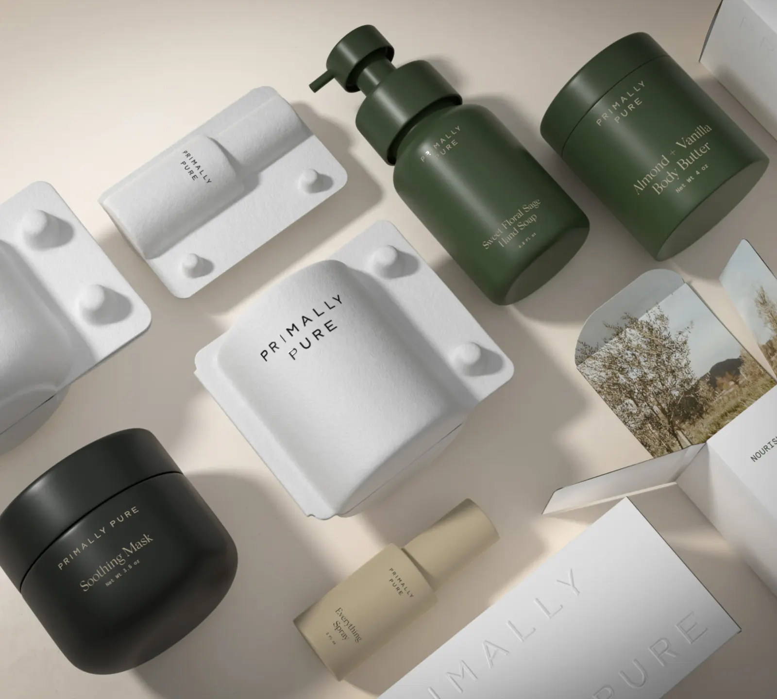
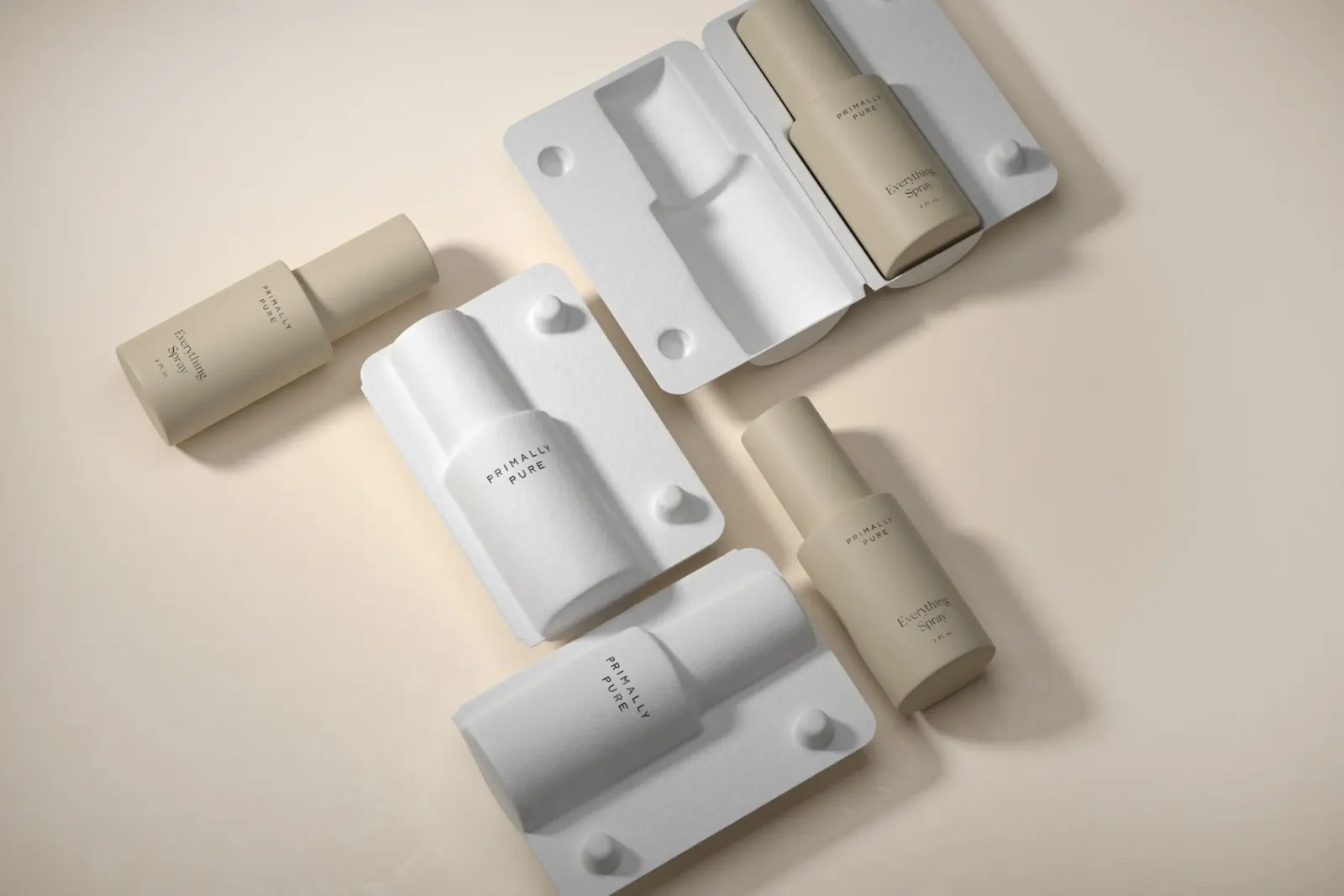
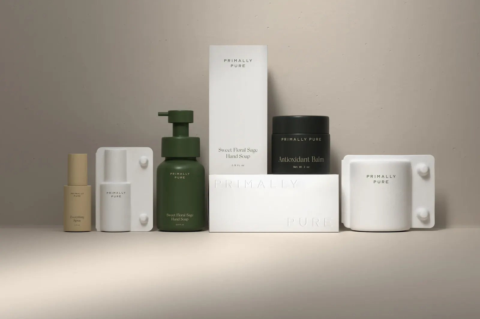
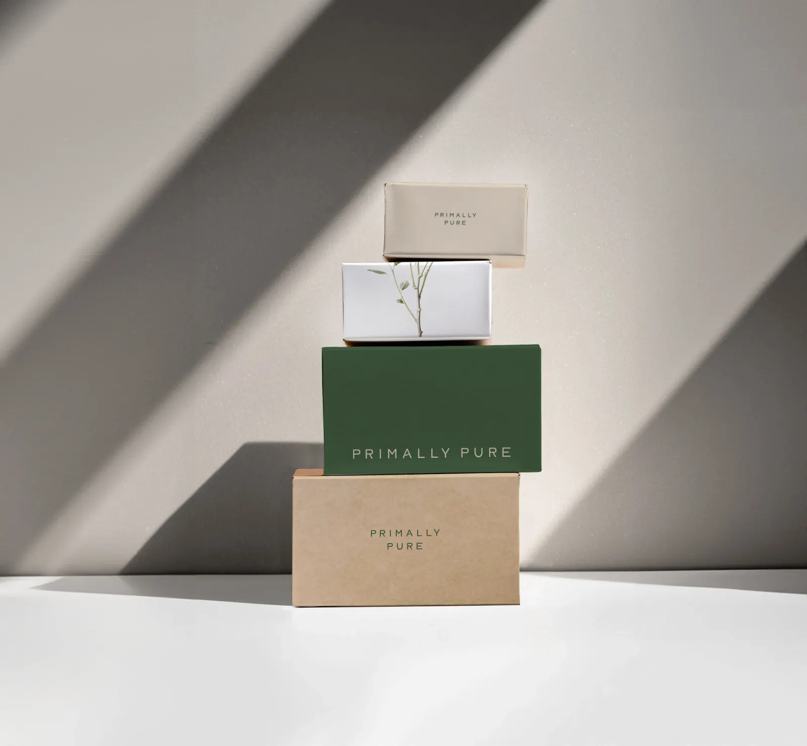
The logomark gets its character from two moves: heavier letterforms and one added curve in the A. The writing is plainspoken and rooted in the land rather than clinical. On the shelf, clean, modern bottles and jars in natural tones sit inside molded pulp boxes, so the sustainability shows up in the material itself.
Why it works
Restraint is what makes this identity credible. Added weight gives the wordmark authority in a category crowded with thin serifs and delicate scripts, and the single curve suggests something grown without resorting to a leaf icon. The modern vessels keep the products believable for shoppers who expect performance, while the pulp packaging makes the farm story tangible at the moment of unboxing. Each choice supports the same idea, so nothing feels like decoration.
Applications
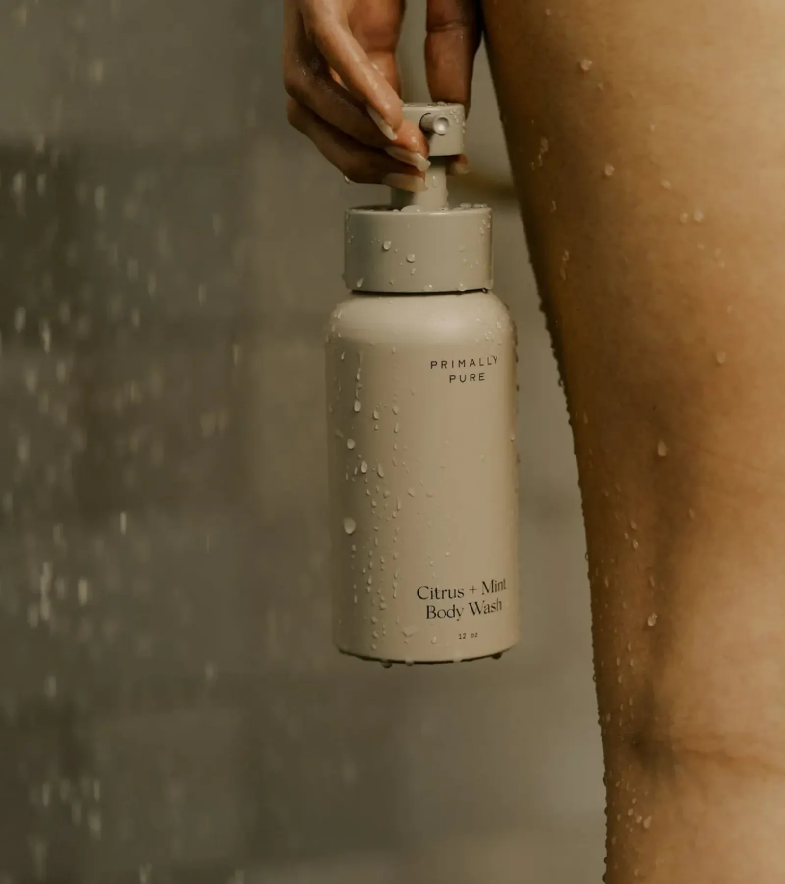
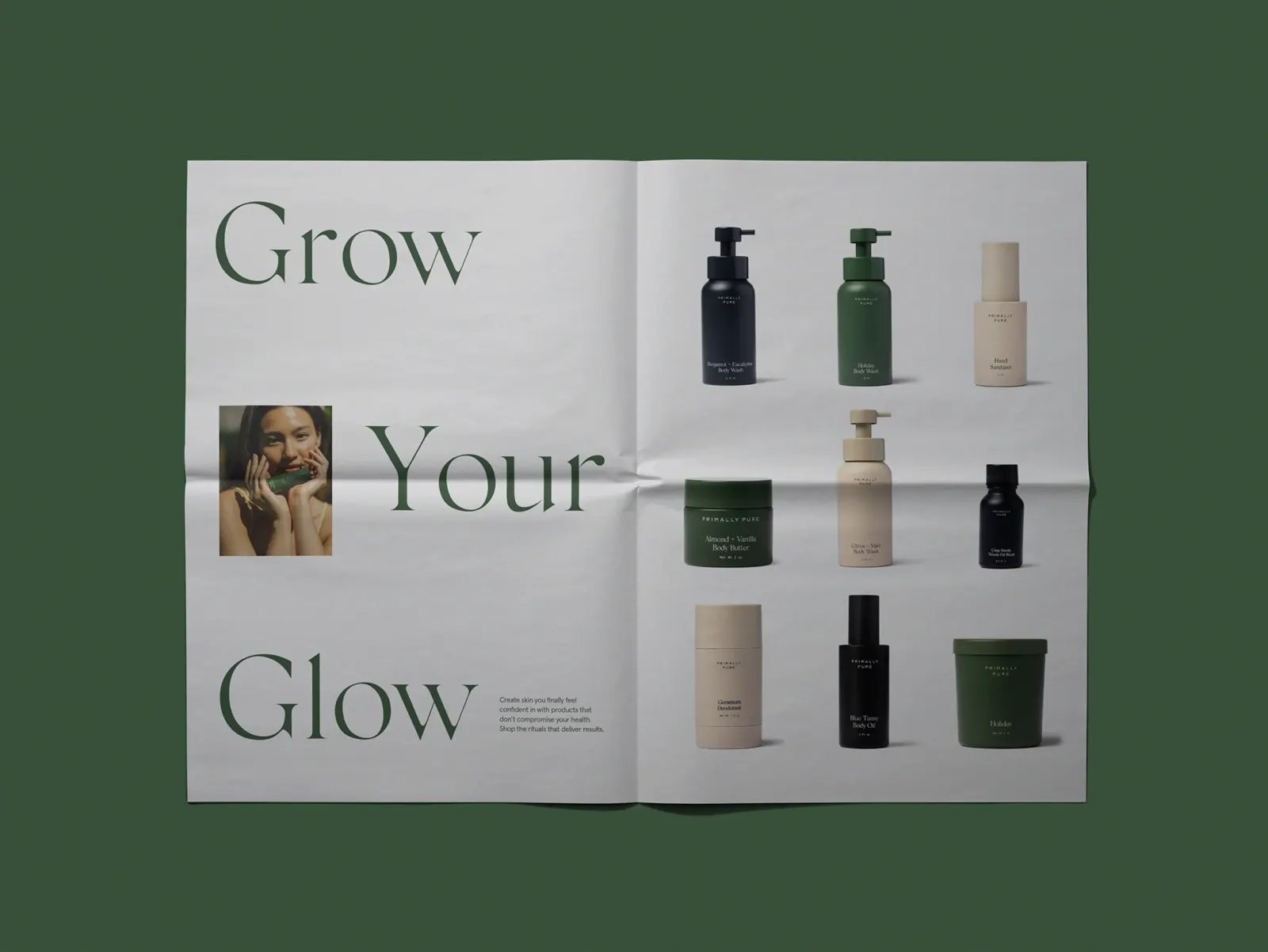
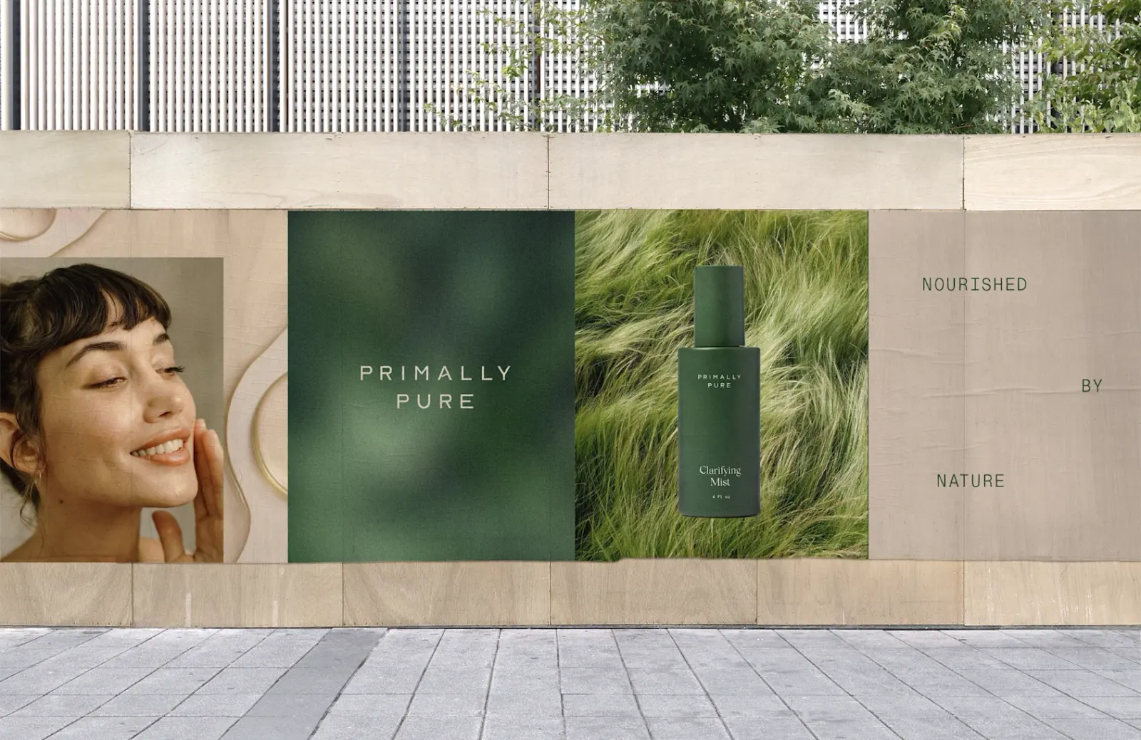
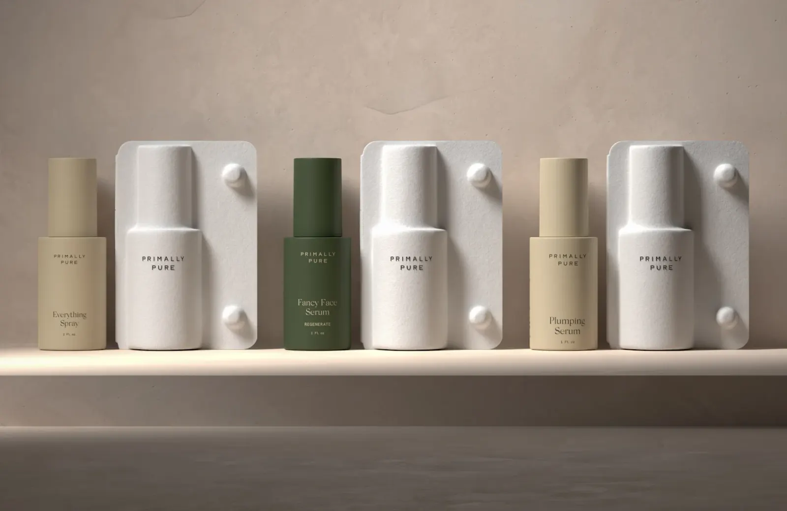
Images and video from forner.studio, by Forner.