The Brand Monograph
Keen brand identity by Mother Design
↗Most wellness brands chase a wider audience by turning the volume down: pale palettes, soft sans serifs, plenty of white space. Mother Design went the other way for Keen, a psychic platform with 25 years behind it and a devoted but small following. The brief was to make a reading feel as routine as opening a meditation app, which meant repositioning the whole category, not just one company.
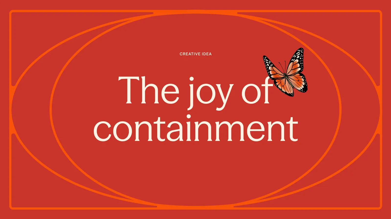
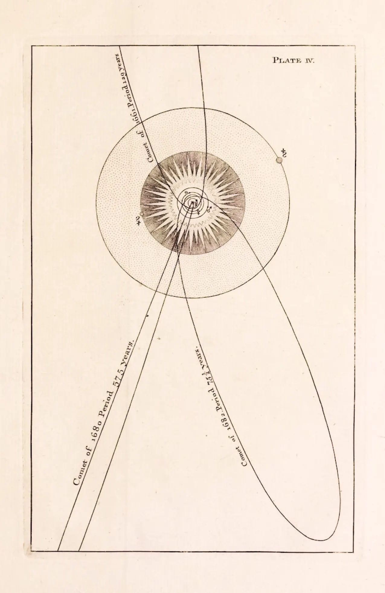
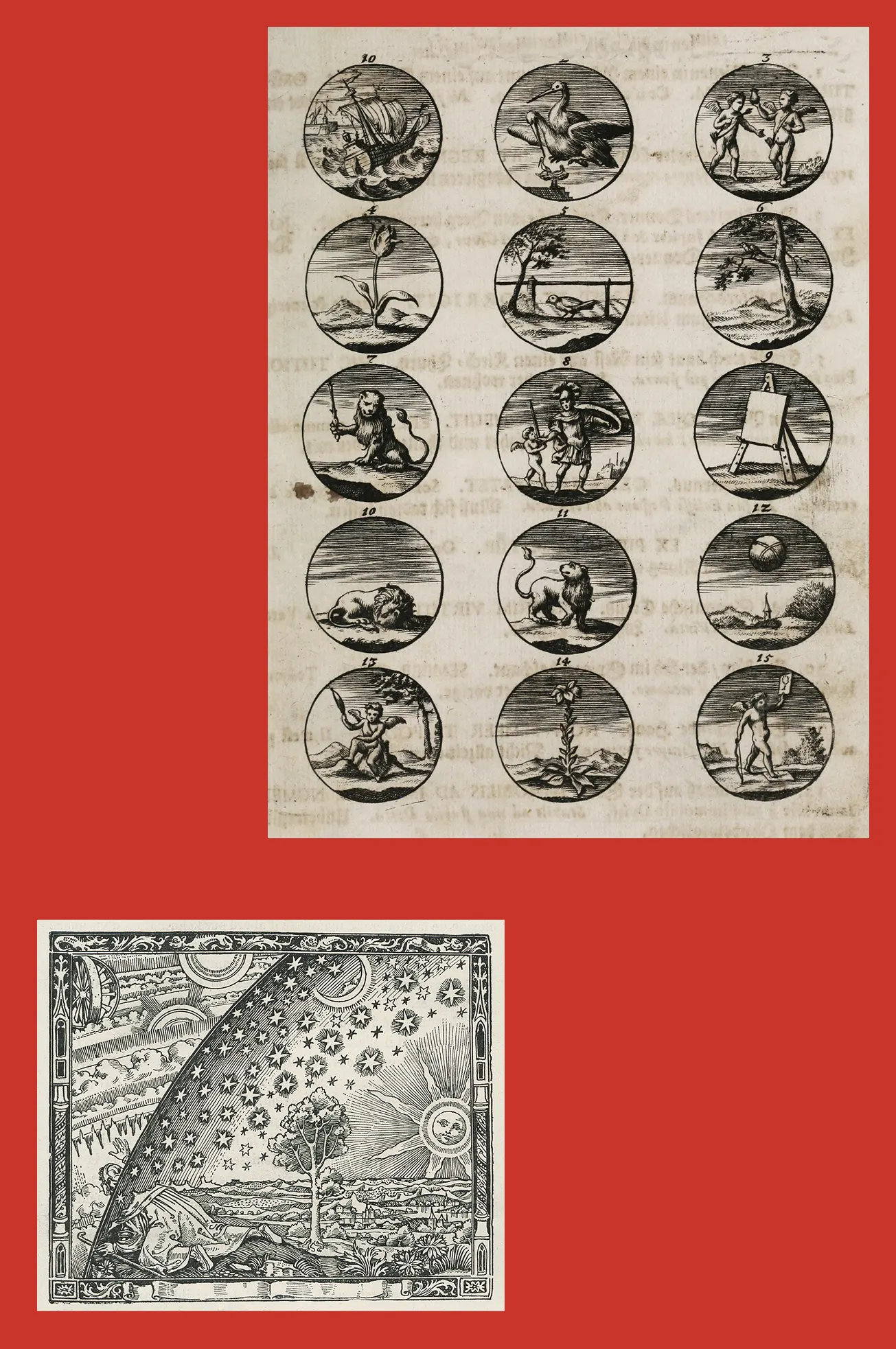
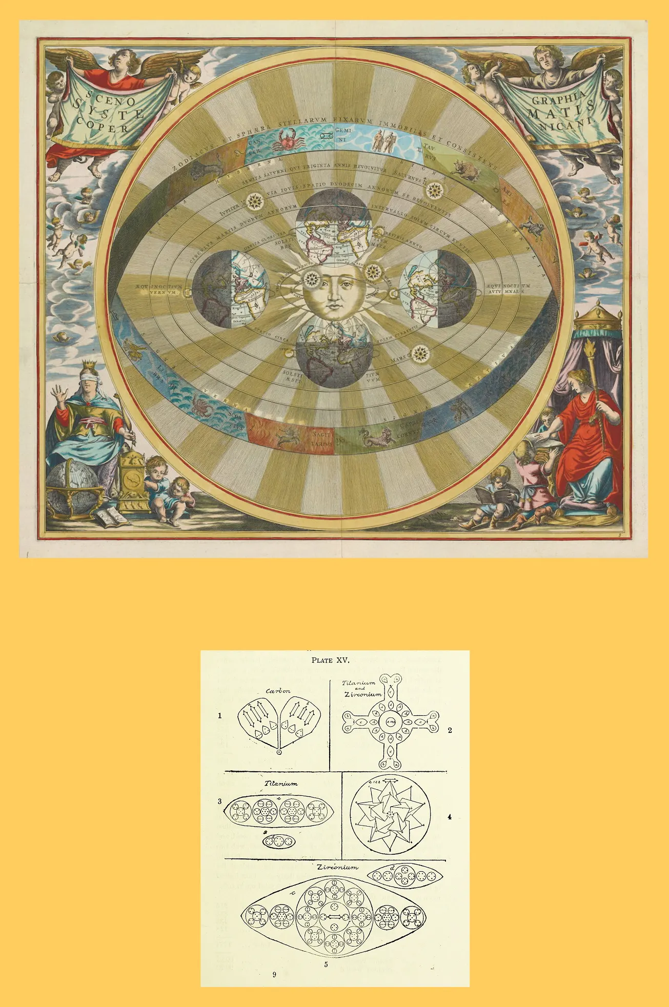
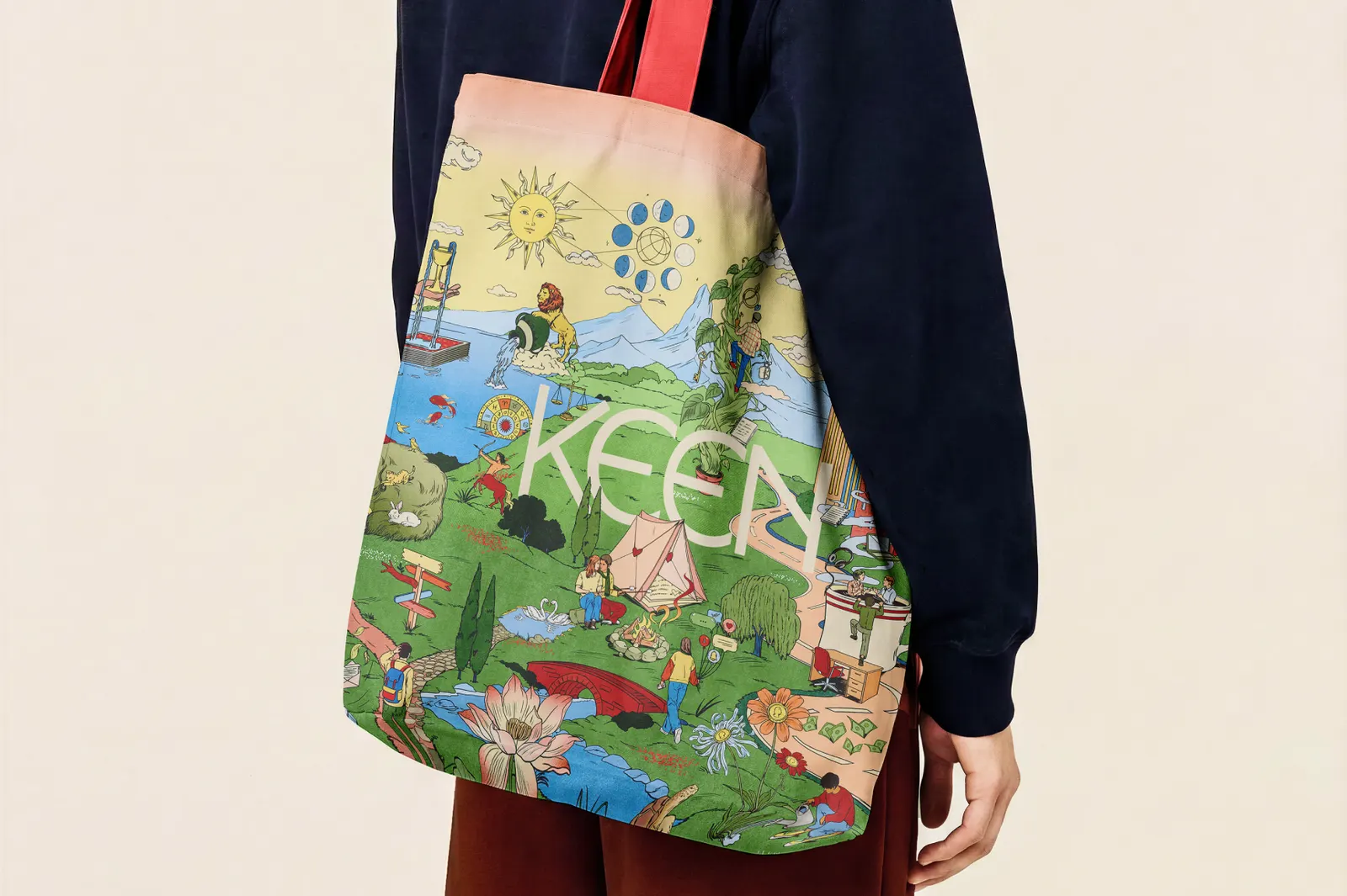
Research showed people seek out psychics for a human point of view rather than predictions, and the identity grew from there. With María Jesús Contreras handling design and illustration, the studio built a sprawling illustrated landscape of spiritual symbols and everyday scenes with surreal touches, which breaks down into small illustrations for other uses. Circles organize the system, Season runs in three cuts beside a friendly sans, and earthy reds pair with brighter screen colors. On the website, the artwork sits right beside familiar product interface.
Why it works
The illustration does what a chatbot can't: it makes the service feel authored by people. Red is a bold call in a category full of beige, sage, and pale blue, and it makes Keen recognizable at a glance while still feeling warm. The serif gives the brand gravity and history, while the plain sans keeps booking and browsing feeling like an app. Because the circle device gives the dense artwork a consistent logic, the richness reads as inviting rather than busy.
Logo
Typography
Applications


Images and video from motherdesign.com, by Mother Design.