The Brand Monograph
Fuku brand identity by Red Antler
↗Fuku began as an off-menu item at Momofuku Noodle Bar in the East Village, then outgrew its host and earned a restaurant of its own. Red Antler's task was to give that spin-off an identity that still feels like it came out of a kitchen rather than a boardroom.
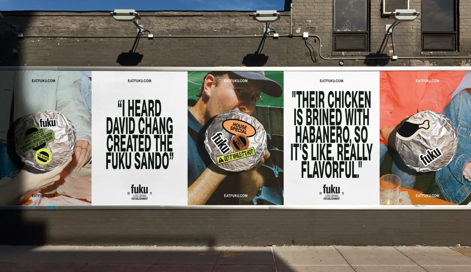
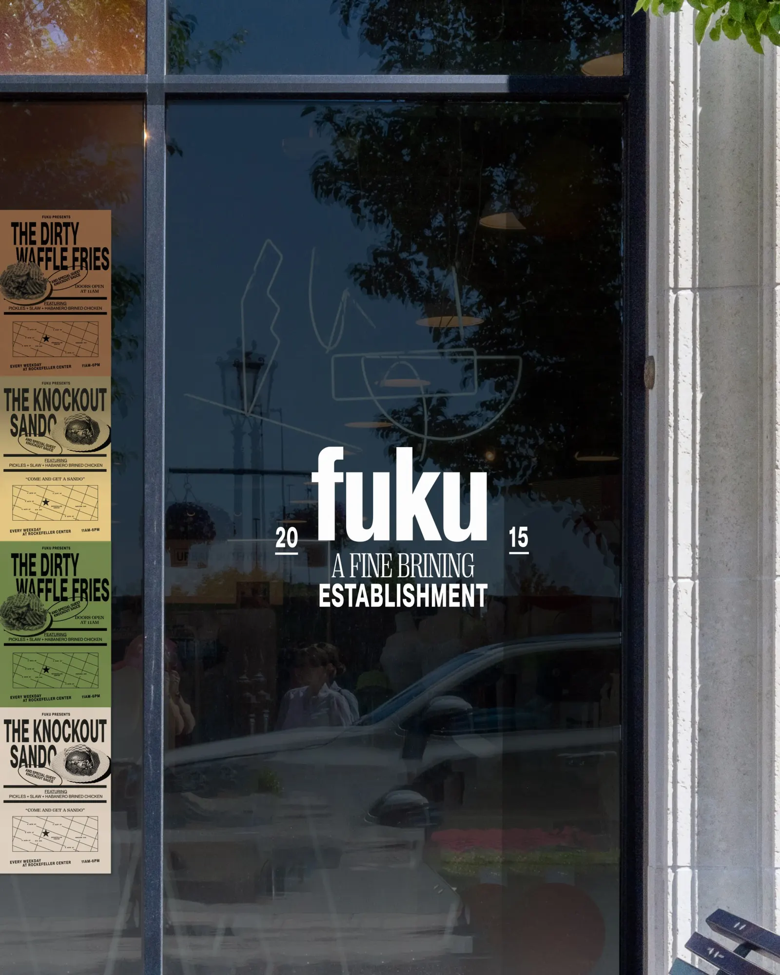
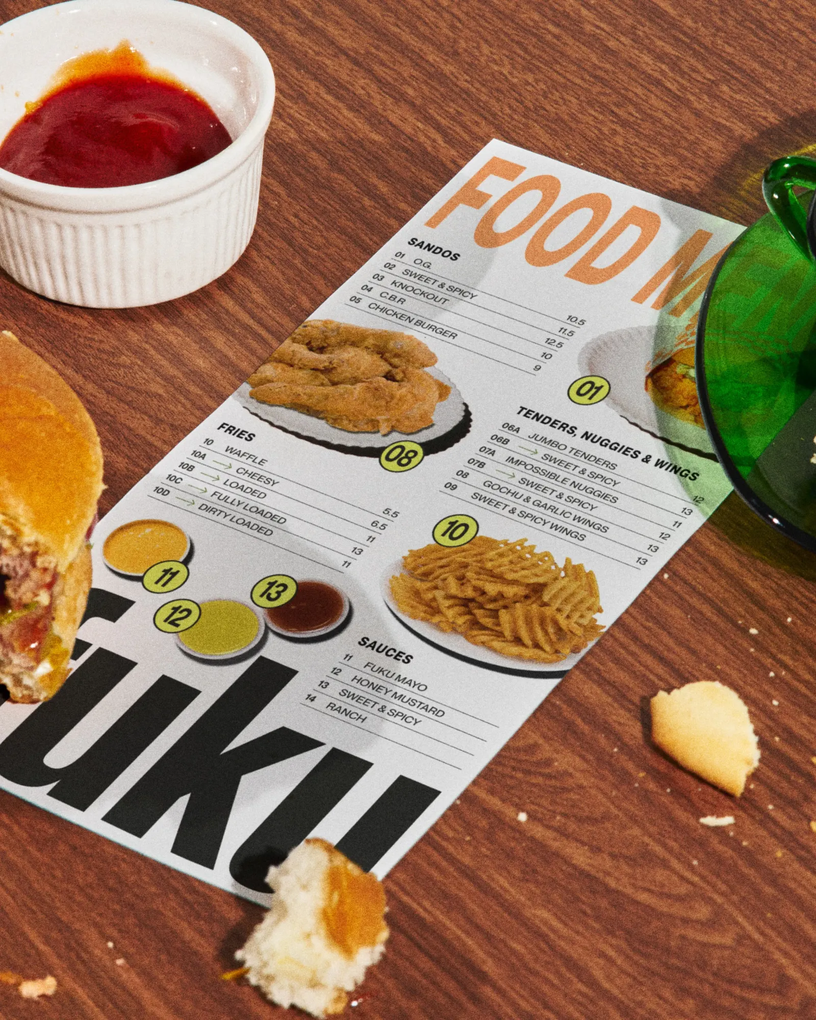
The studio built the visual system from two New York references: the hand-the-customer-the-facts lettering on downtown storefronts and the look of nightlife snapshots lit by direct flash. Pangram Pangram Foundry supplied the typography, so letterforms carry much of the personality. The writing is just as deliberate. It leans on taste, heat, and texture, and it talks to customers bluntly, with a platform line that offers a choice and no alternatives.
Why it works
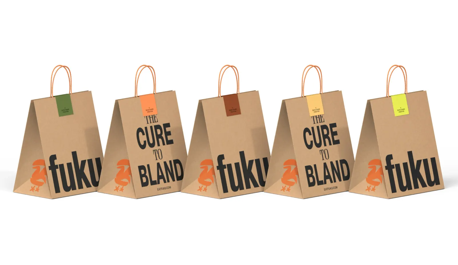
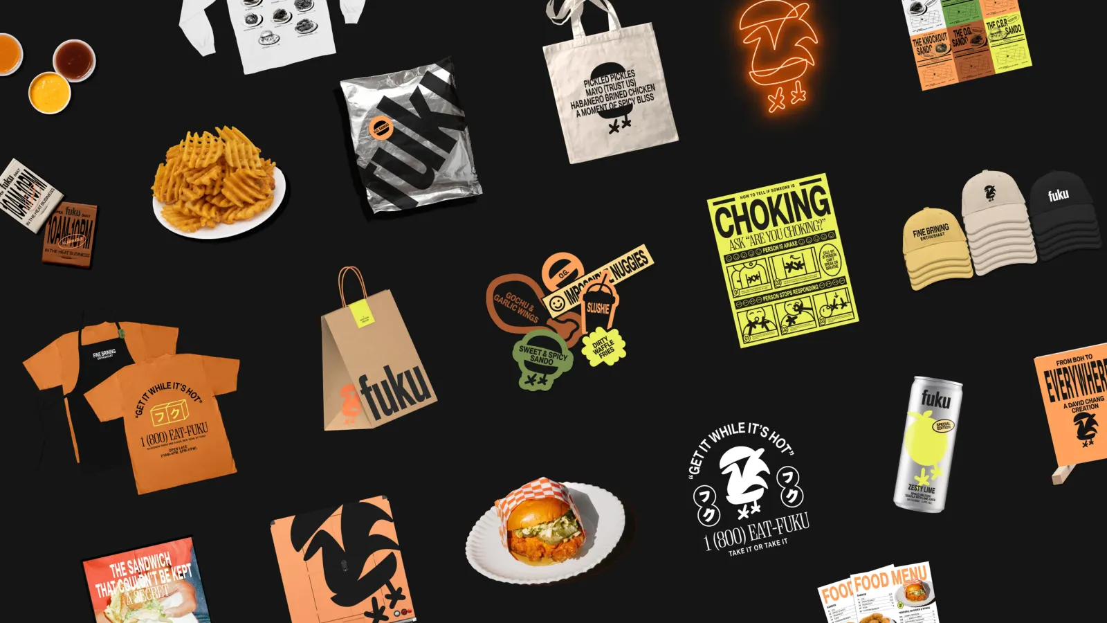
Fast-casual chicken is a crowded category, and much of it signals freshness with soft shapes and friendly tones. Fuku's loud, street-level type and night-out photography place it closer to a late-night spot, which suits a sandwich known for its heat. Leading with type also makes the system easy to stretch across menus, packaging, and signs without a precious logo to protect. The Momofuku lineage comes through as attitude, not borrowed visuals, and the blunt copy backs it up.
Applications
Logo
Typography
Images and video from redantler.com, by Red Antler.