The Brand Monograph
Fluz brand identity by Koto
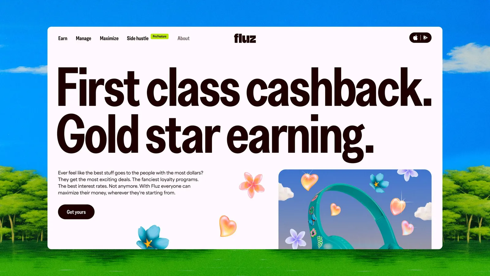
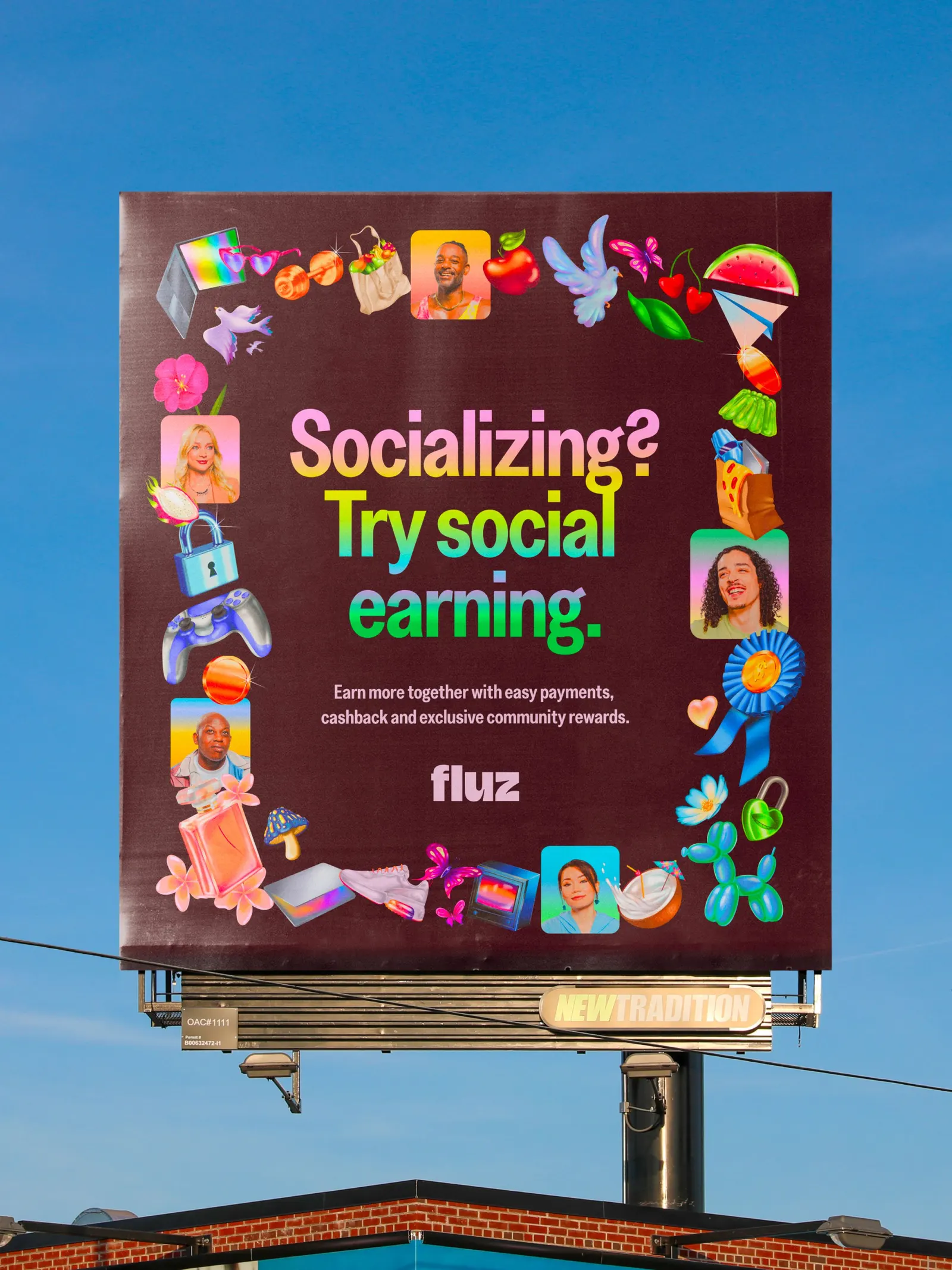
↗Fintech rarely looks like it's having fun, which is what makes Fluz easy to spot. Koto took an app that blurred loyalty, banking, and social, and gave it one loud, cheerful personality that's hard to confuse with anything else in the category.
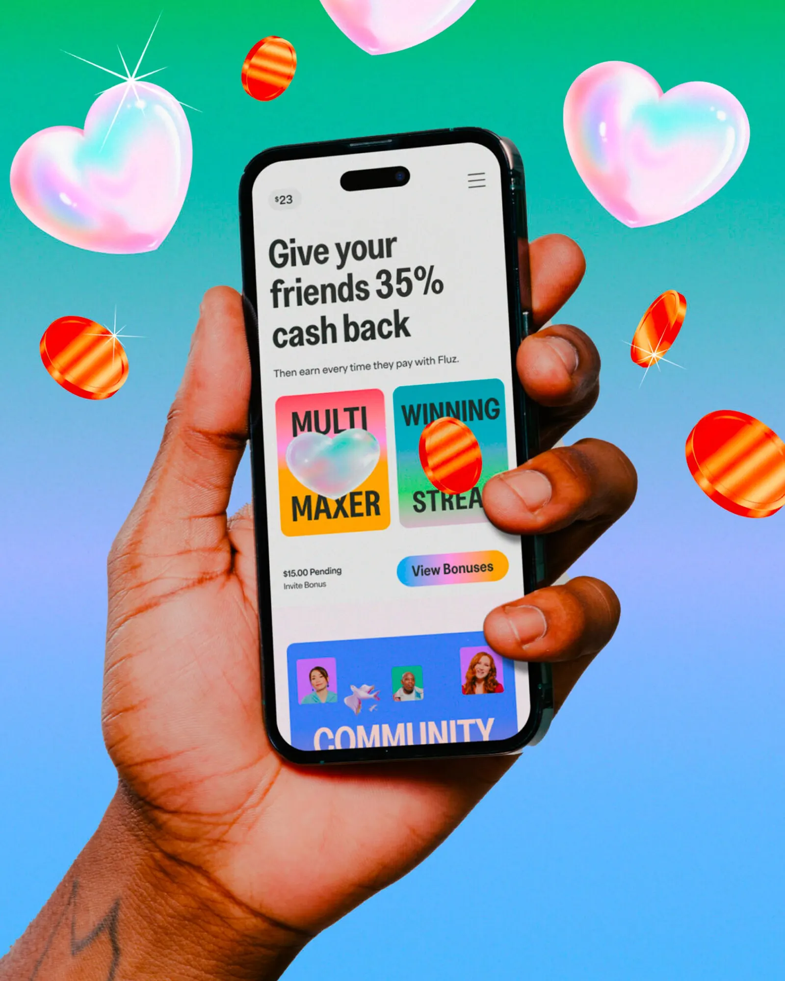
The brief centered on a rewards model that pays cashback on every purchase, and also when people in your network spend, in an industry where an estimated $121 billion in perks goes unclaimed each year. Koto positioned Fluz around earning together and built the Life on Max idea to carry it. The identity stretches the wordmark, floods layouts with saturated gradients, sets oversized type, and adds surreal illustration. The same energy runs through the app interface and the social campaigns.
Why it works
Most fintech brands signal trust with restraint: navy, green, and tidy sans serifs. Fluz borrows the swagger of VIP culture instead and hands it to everyone else. The stretched wordmark makes the idea of "more" visible in the logo itself, and the heavy type and vivid gradients give the app a confidence that feels earned rather than loud for its own sake. Surreal illustration adds humor, which makes money feel less intimidating and a network-based reward system easier to picture.
Applications
Logo

Typography





Images and video from koto.com, by Koto.