The Brand Monograph
The Mora brand identity by Further
↗The Mora stands out because it gives a luxury hotel brand a different job. Instead of promising a break from real life, it treats a stay as something guests steer themselves. TUI Hotels & Resorts wanted a way into the upscale market, and Further started from zero, delivering the strategy, name, verbal and visual identity, and art direction.
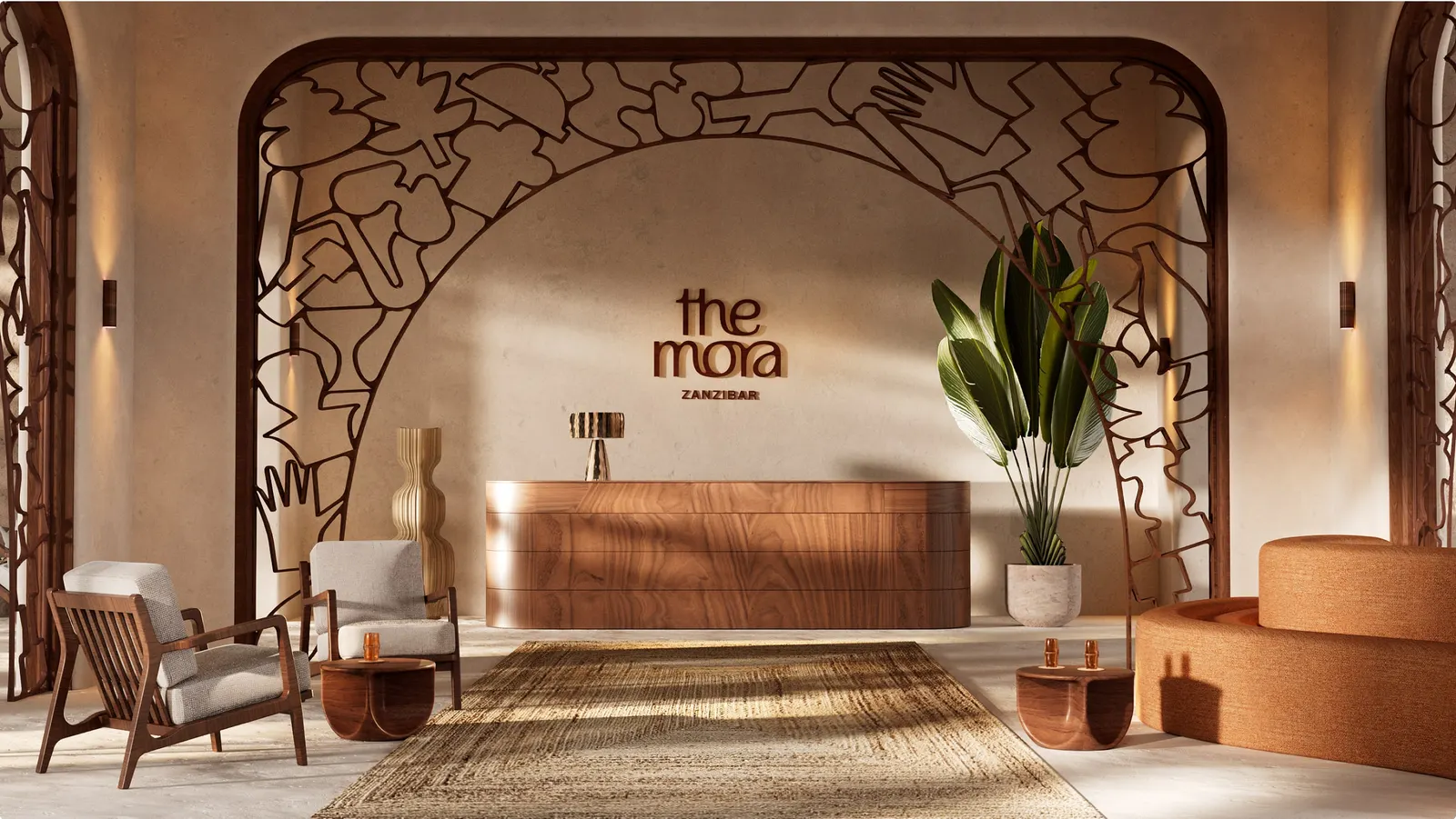
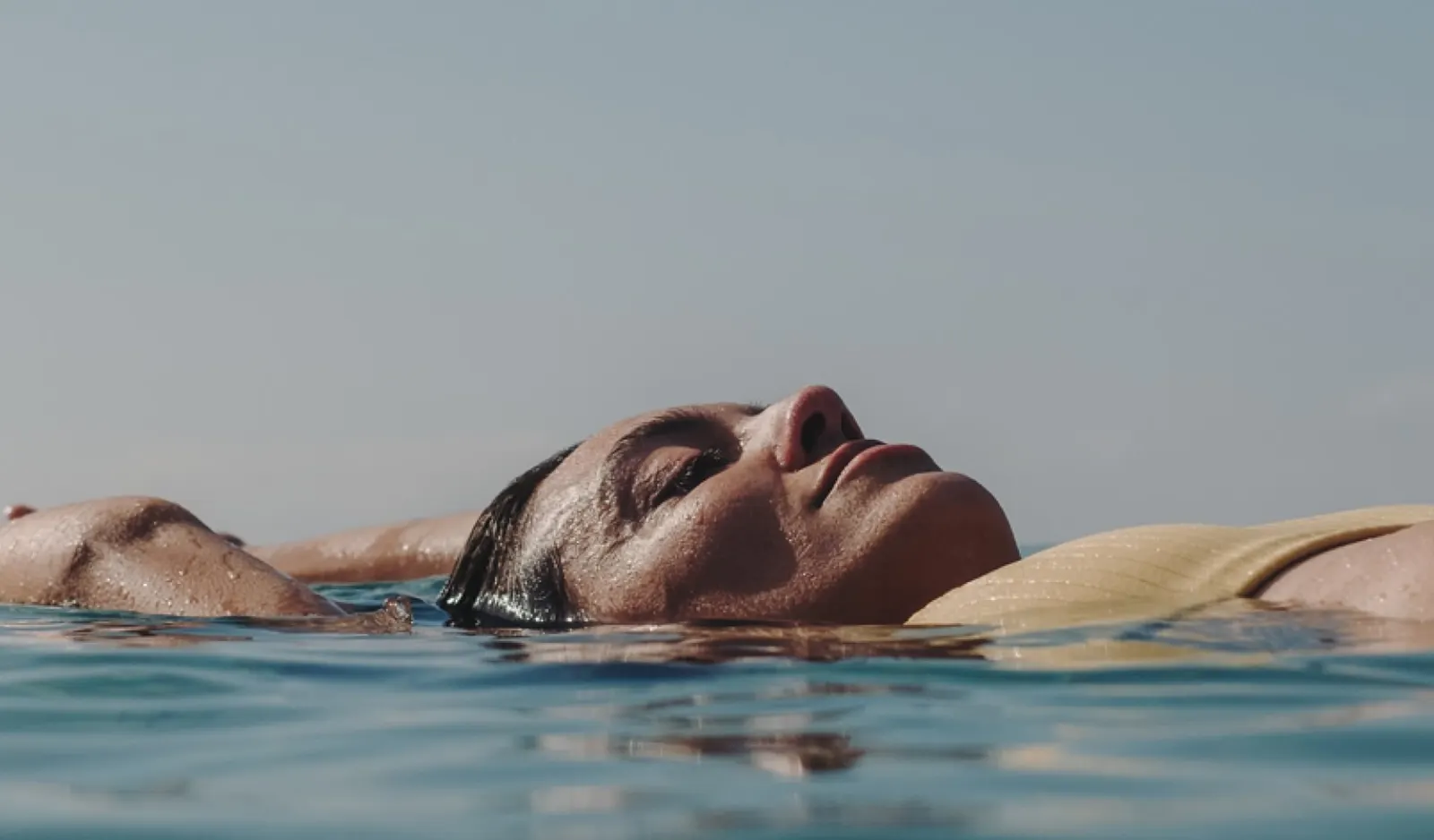
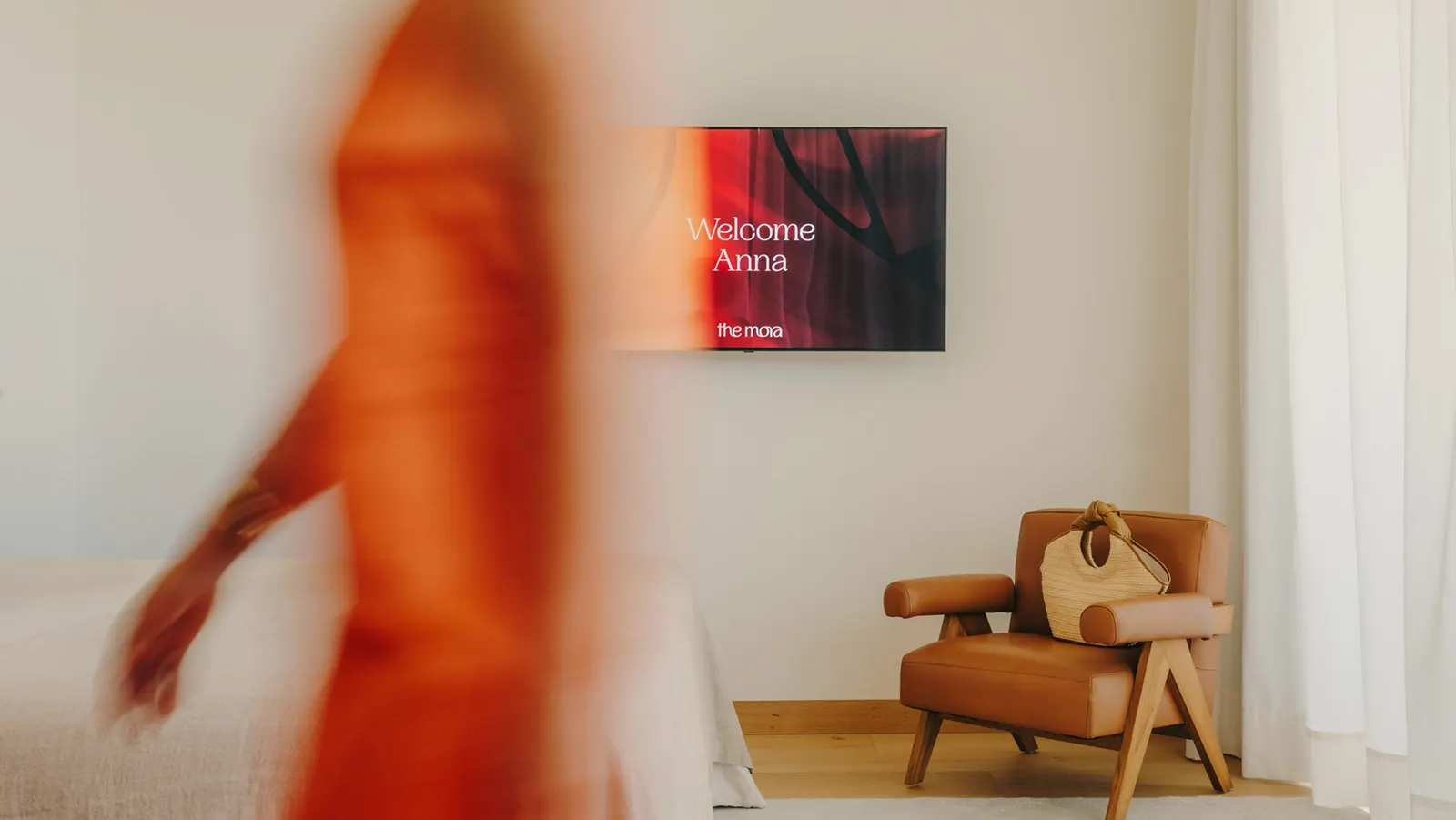
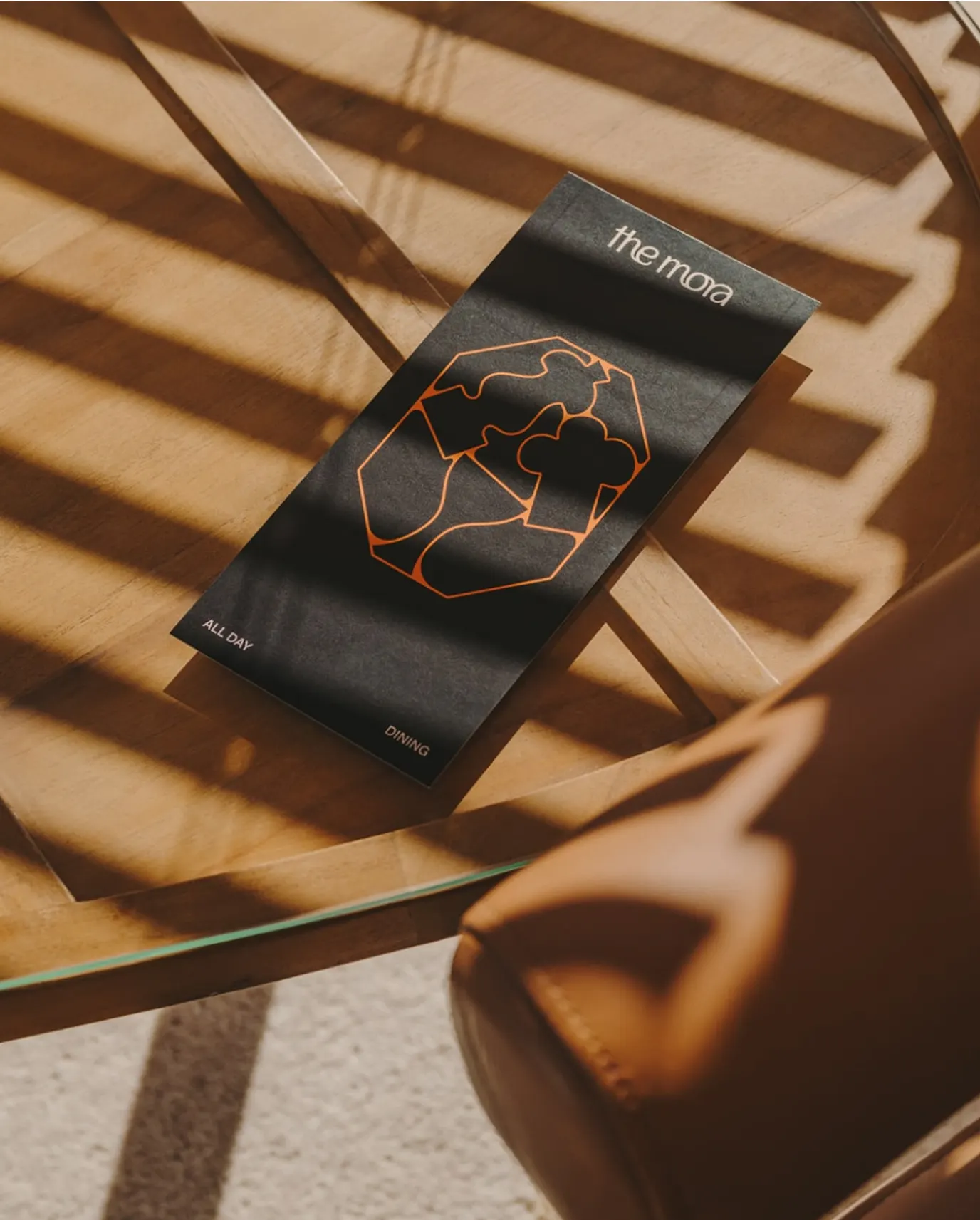
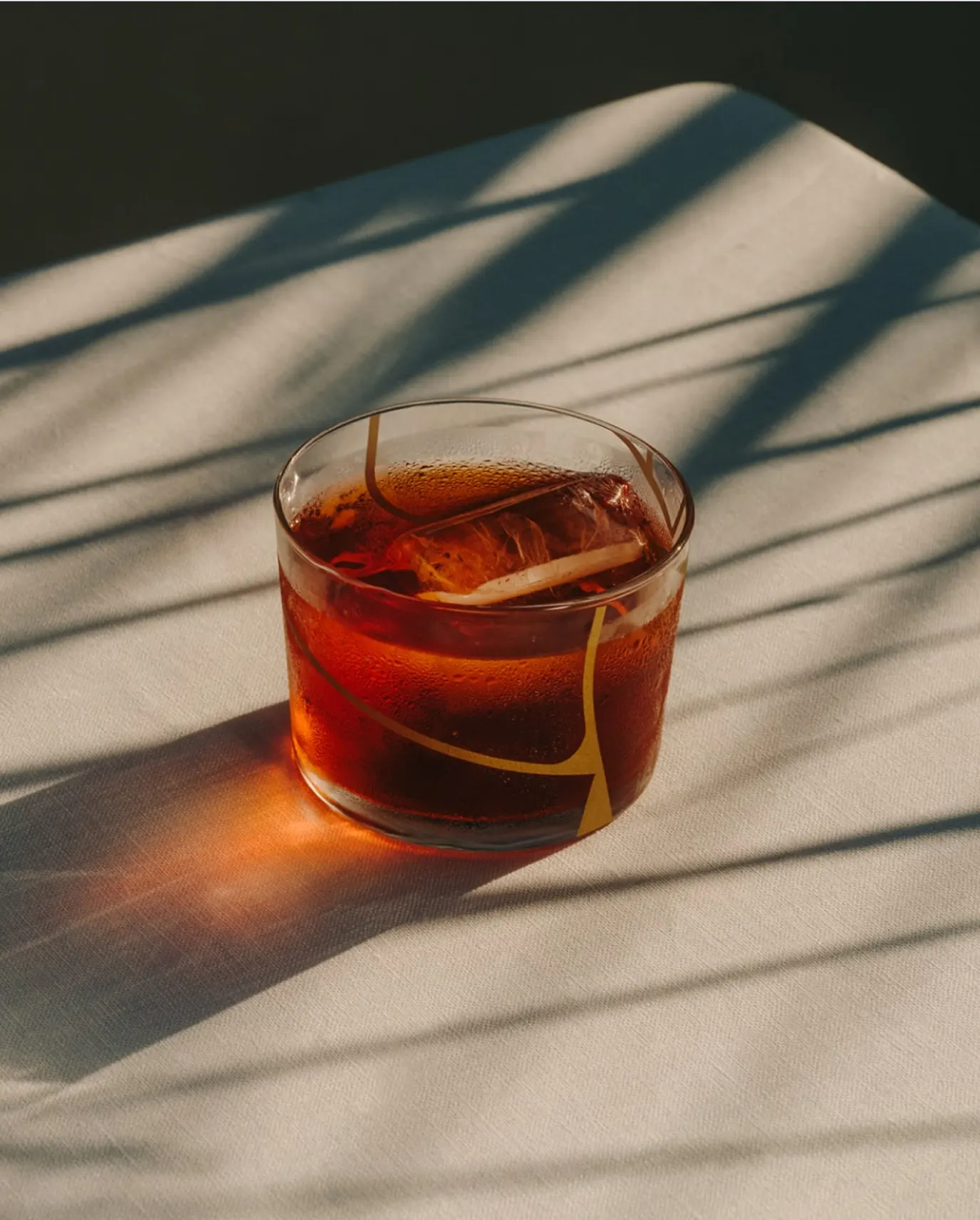
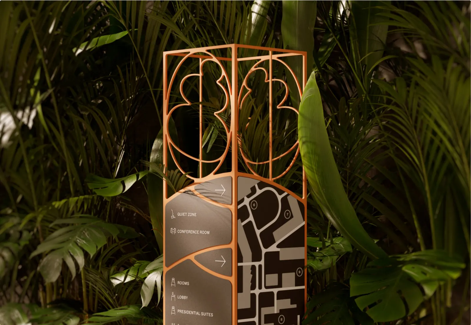
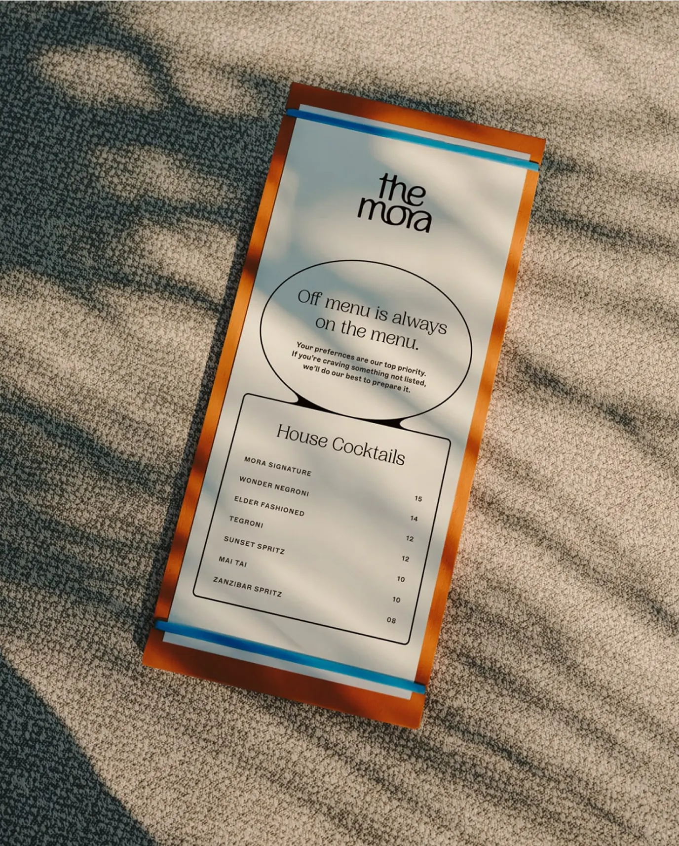
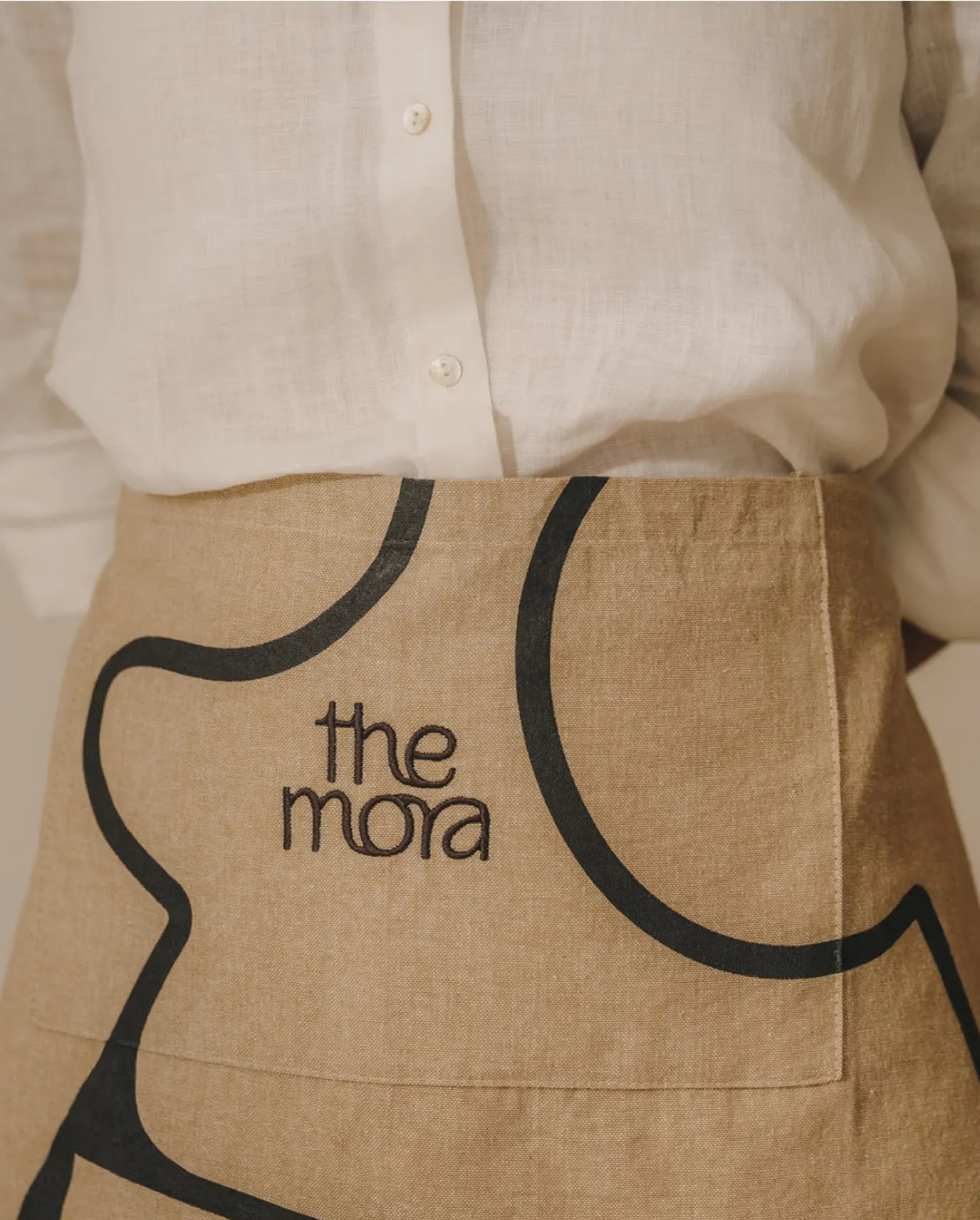
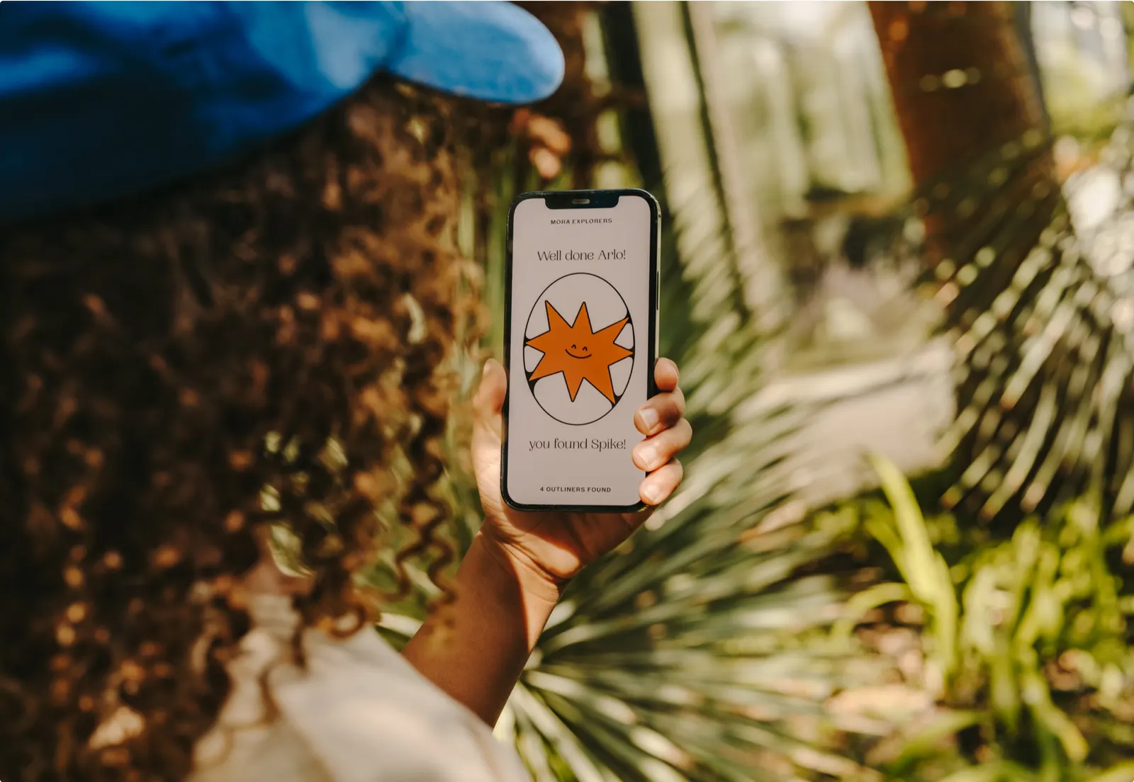
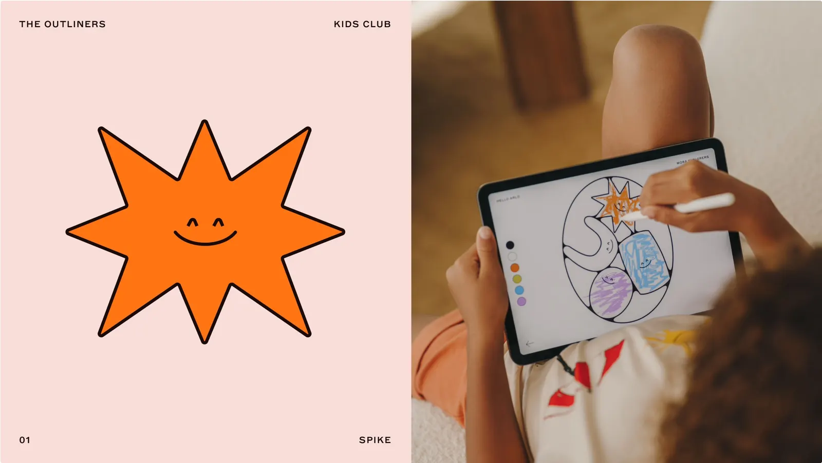
The name is Latin for a pause, and the identity makes that pause feel active. A custom wordmark sits alongside a headline serif and a spare, sharp secondary typeface. Around them, a system of outlines gets filled with objects tied to the brand's three experience principles. Colors follow the light across a day, with textures to match, and Salva López's photography keeps the mood relaxed but polished.
Why it works
The outline is the smartest move here. It lets the wordmark stay calm and confident while the content does the talking, so no two applications need to look alike, which suits guests who resist being handed a formula. The restrained serif and crisp secondary face keep the brand firmly in luxury territory, while the time-of-day palette adds warmth that hotels at this level often avoid. Color becomes a signal of mood rather than decoration, which ties the visuals directly back to the strategy.
Applications
Images and video from further.group, by Further.