The Brand Monograph
MoN Takanawa brand identity by Pentagram
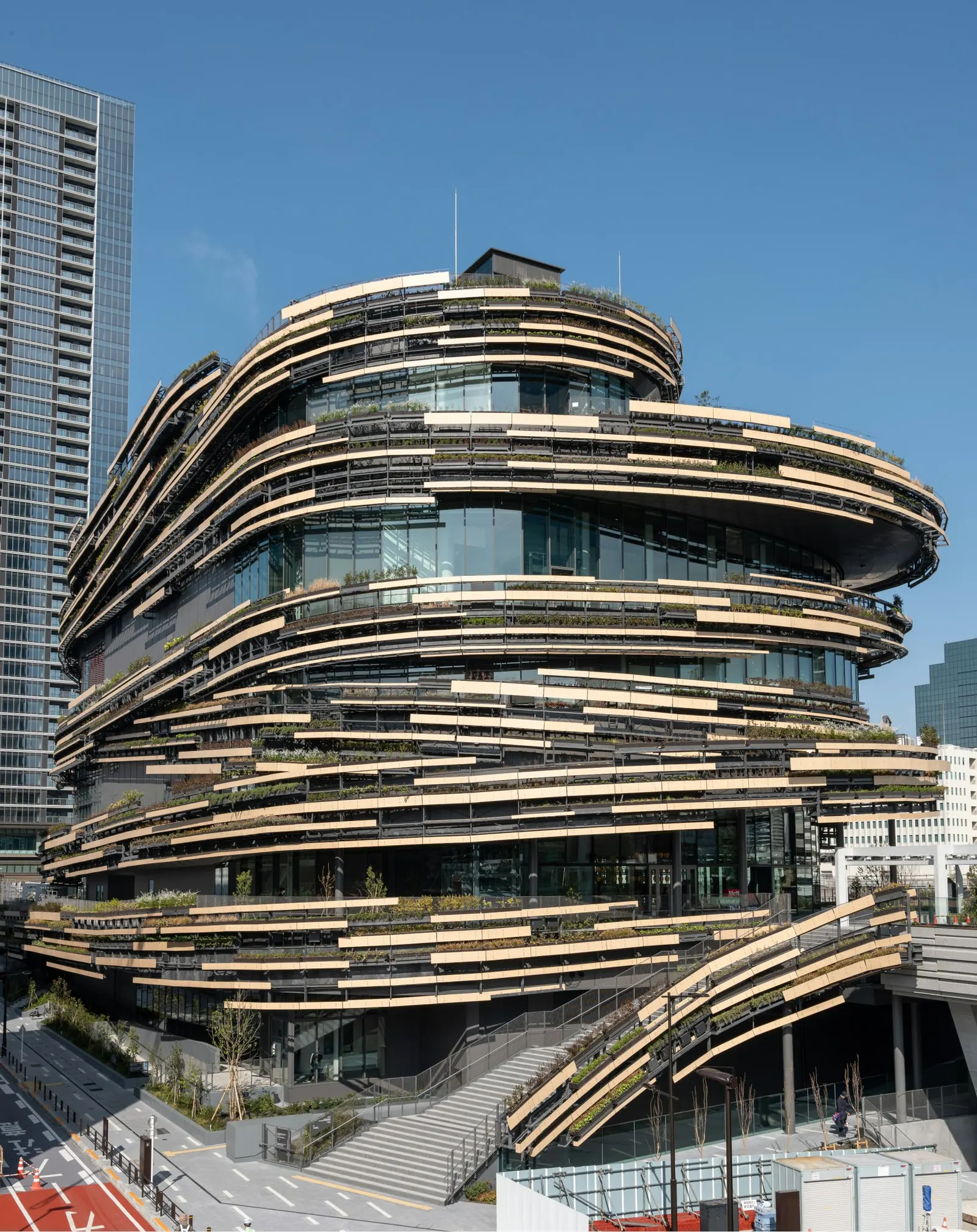
↗Pentagram's identity for MoN is a rare case of a cultural brand whose logic lives in its geometry. Working with Turnstone Consulting on strategy, the studio had to name and brand a Tokyo destination in Takanawa Gateway City that could host manga, rakugo, ballet, and electronica without becoming a generic arts venue.
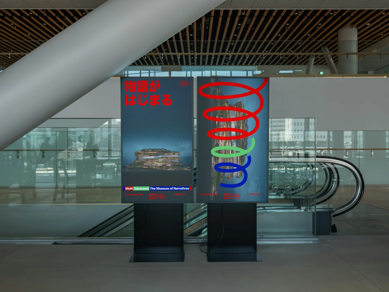
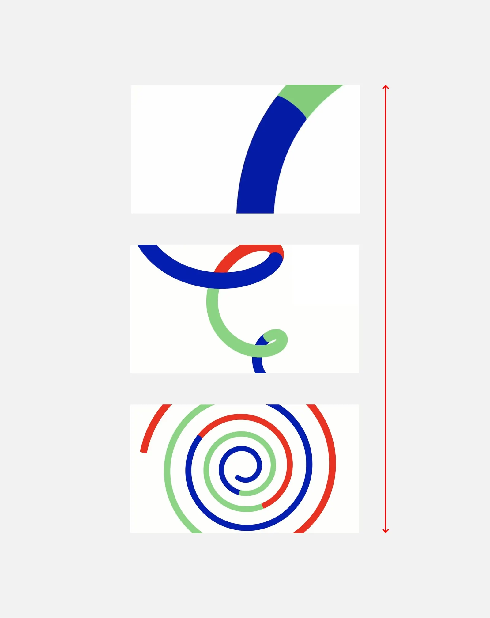
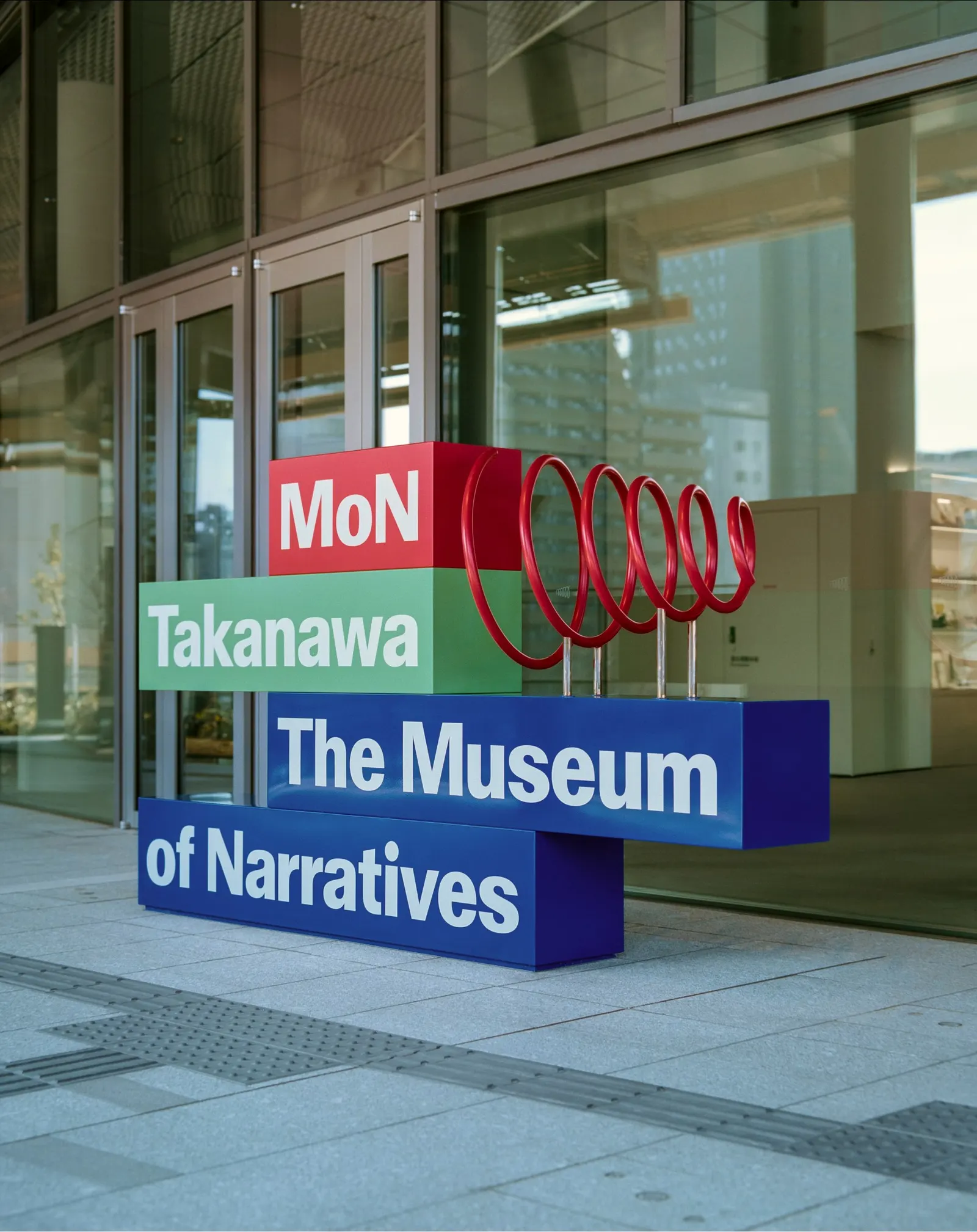
The name means gate in Japanese and also stands for Museum of Narratives. The idea behind it is that time feels linear while culture keeps looping back. A spiral, in which you can read M, O, and N, sets the layout and zooms from a century-long outlook to a single evening. A straightened version, the bar, frames content and presses off the edges of the page. Type gives Japanese and English equal weight, and the palette of sun, land, and water follows natural cycles. Teo Josserand's photography sits within a system designed by a team including Jody Hudson-Powell, Luke Powell, and Alice Sherwin.
Why it works
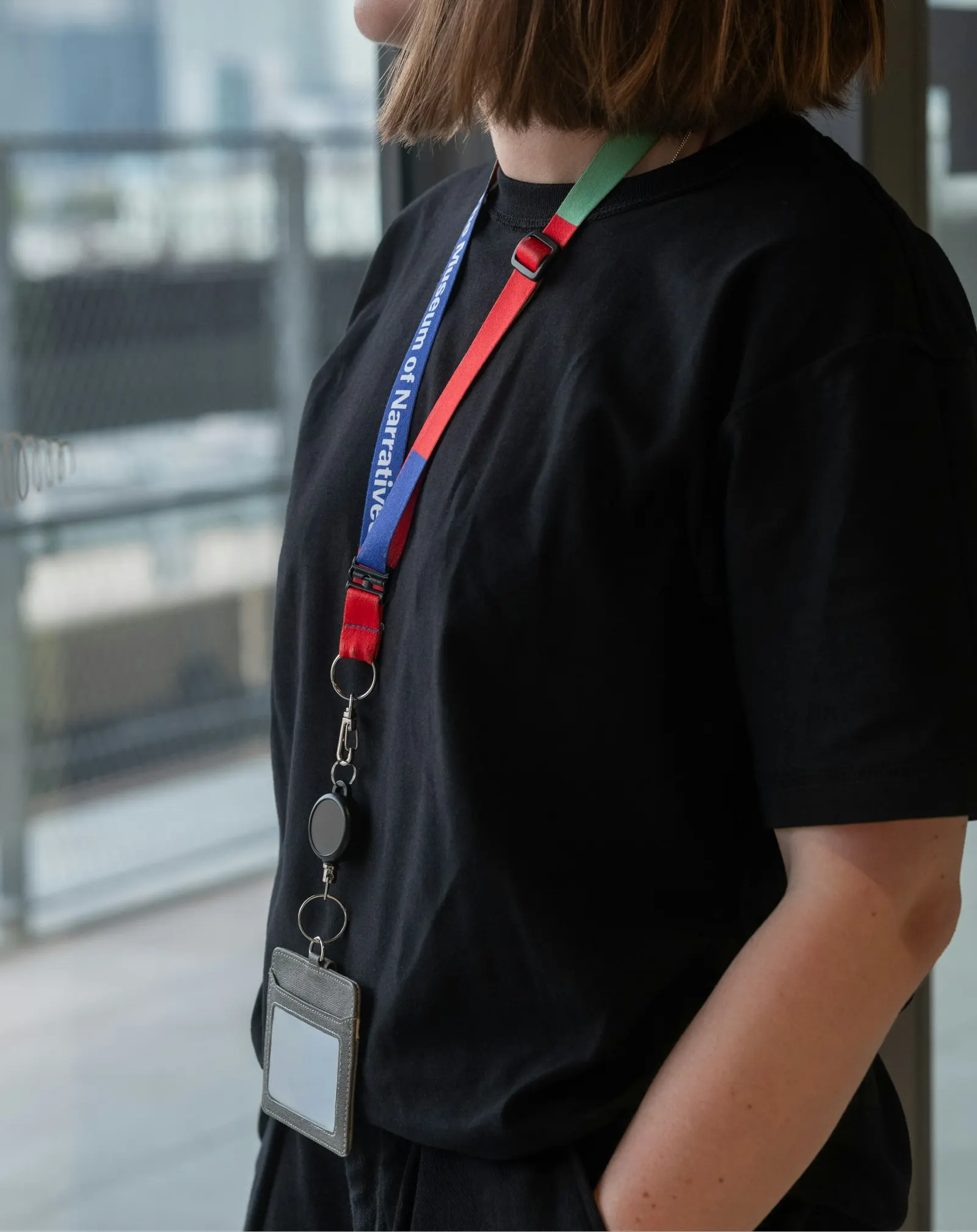
Most cultural brands handle range by staying neutral and letting the programming supply the color. Pentagram did the opposite and gave MoN a point of view that the content can change without breaking. Because the spiral is both a mark and a layout rule, the identity scales from a century to an evening without needing a second idea. The bar adds a practical, repeatable container. And equal-weight bilingual type tells neighbors and international visitors alike that neither is the guest.
Applications
Color
Logo
Images and video from pentagram.com, by Pentagram.