The Brand Monograph
Tilt brand identity by Ragged Edge
↗Most financial brands talk about trust in the same cool, glassy language. Ragged Edge took Empower, a company that had outgrown its origins as an emergency cash option, and gave it a new name, Tilt, and an identity that physically leans. The word works as both a promise and a design instruction, and the studio carries it through the whole system.
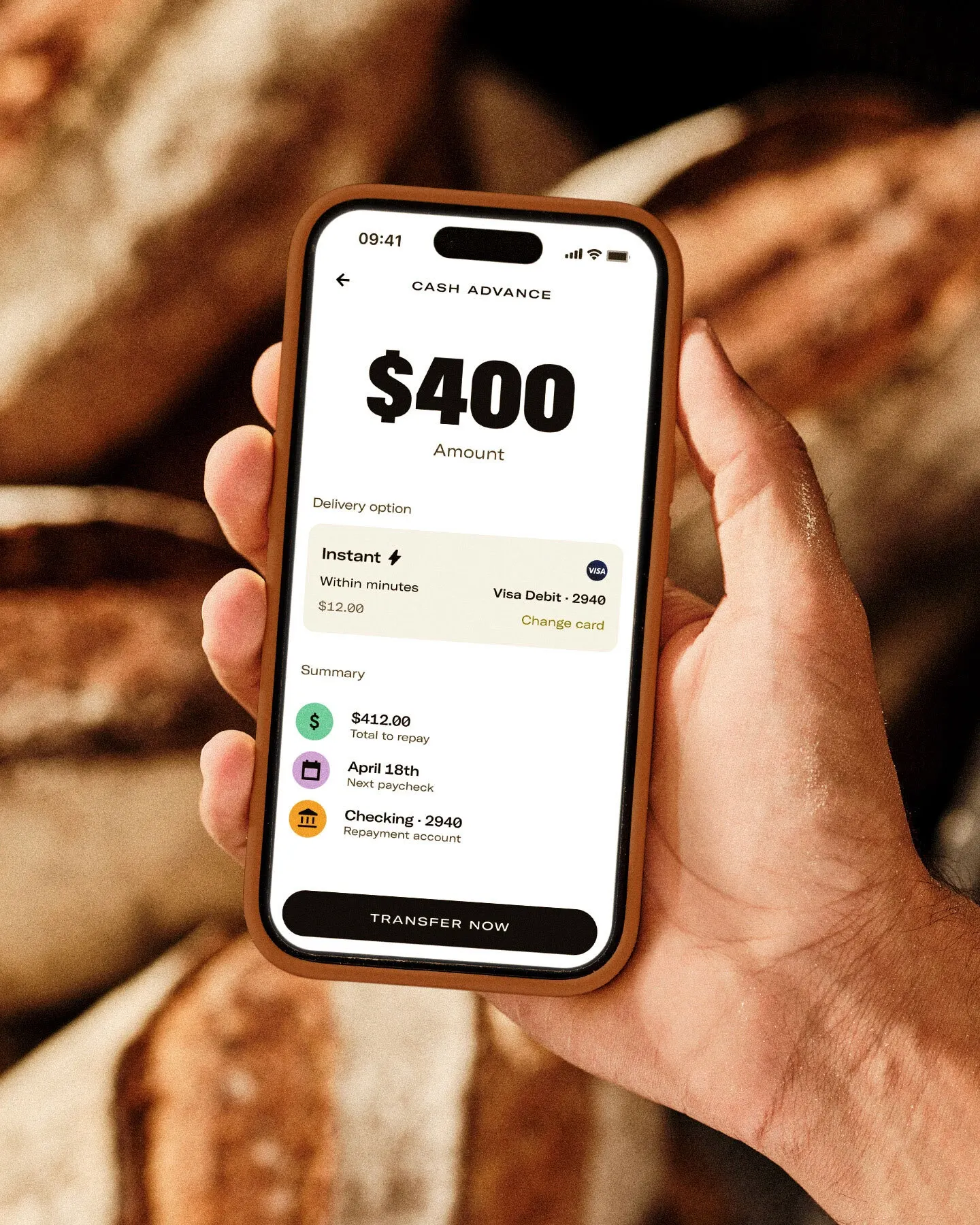
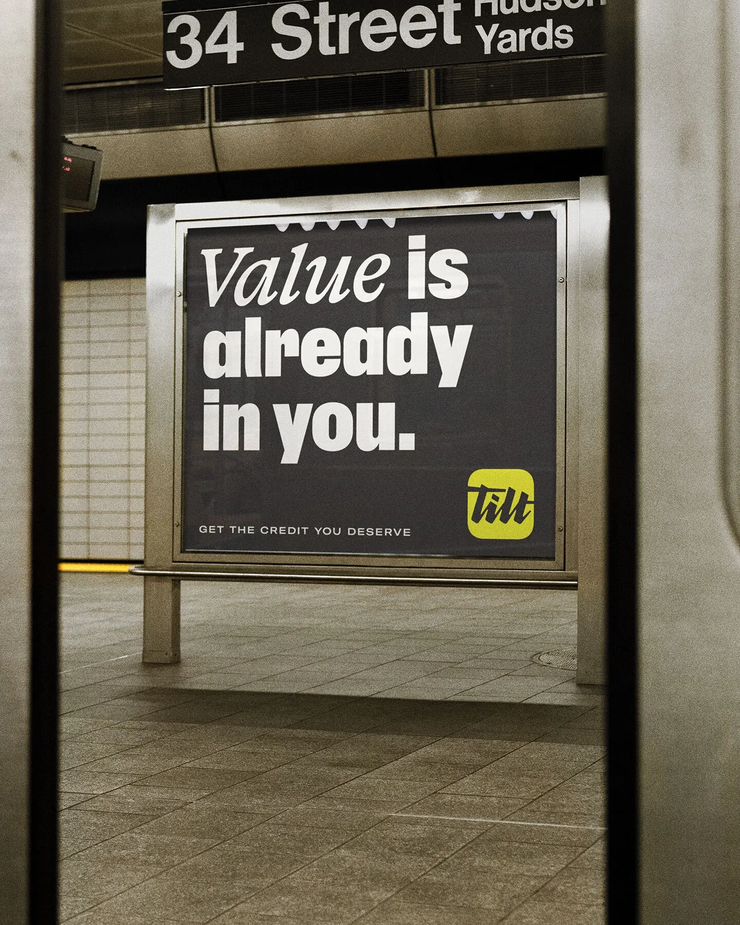
The brief covered positioning, naming, and identity for a business now offering a ladder of products, underwritten on more than 250 non-traditional signals rather than credit checks. Ragged Edge delivered a handwritten-style logo, headline lettering set at an angle, and a steady, assured voice. It then advised Tilt's team on the website and product, working with illustrator Pearl Chuaynarong on brushstroke spot and scene illustrations, alongside photography by Charlie McKay. Click through rates on Meta rose 70%.
Why it works
The name is short and active, and it signals movement rather than rescue, which sets it apart from lenders that sell relief. A logo that reads like a signature feels personal in a sector of sterile wordmarks, and slanted headlines put urgency into the typography instead of alarmed copy. The brushwork illustration is the smartest choice for this audience. It shows effort as human and unpolished, where much of the category would quietly shame it. Because every piece sounds like the same voice, the brand holds together in a crowded paid social feed.
Applications
Logo
Typography
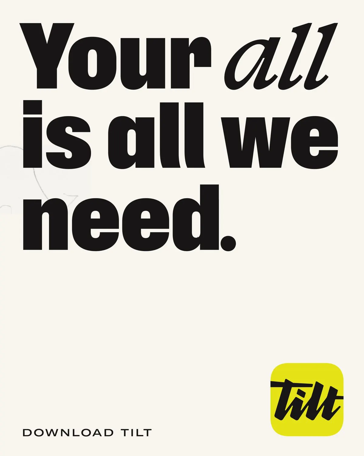

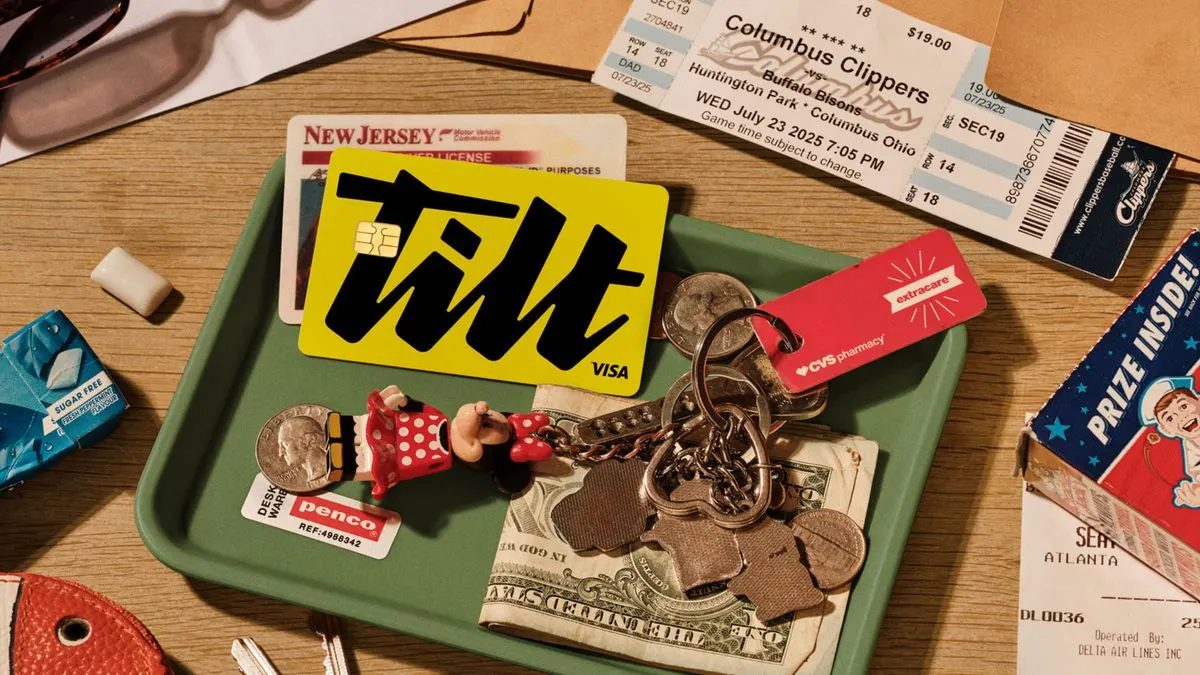
Images and video from raggededge.com, by Ragged Edge.